Usage
For a reference guide about the LG QCircle design template library, see the API reference guide included in the design template compressed file.
When an error occurred while using the LG QCircle design template library, a ‘warning’ appears on the Android logcat, reference the log when application of the design templates does not work
In order to make an application for QuickCircle with the LG QCircle design template, you have to set the circle layout. You have to use an instance from QCircleTemplate class included in the library in order to use LG QCircle design template in the application. This section describes the basic guide for QCircleTemplate class along with the codes.
You have to create a QCircleTemplate instance in order to apply the circle layout provided by LG QCircle design template to the application. Select which circle layout to use while creating the QCircleTemplate instance. The circle layout of QCircleTemplate cannot be changed once it has been created.
Following code is for applying the content with a horizontal sidebar circle layout.
QCircleTemplate template = new QCircleTemplate(
                                           this,
                                           TemplateType.CIRCLE_HORIZONTAL
                                 );
The first parameter is for the Activity to apply this layout, and the second parameter refers to the content with a horizontal sidebar. When no second parameter is input, QCircleTemplate basically applies an Empty content circle layout.
Usable layout is defined in the TemplateType class. The following table shows the layouts for constants for each type.
| Constants | Circle Layout |
|---|---|
TemplateType.CIRCLE_EMPTY |
Empty content |
TemplateType.CIRCLE_HORIZONTAL |
Content with a horizontal sidebar |
TemplateType.CIRCLE_VERTICAL |
Content with a vertical sidebar |
TemplateType.CIRCLE_COMPLEX |
Content with two topbars |
TemplateType.CIRCLE_SIDEBAR |
Content with two sidebars |
In order to show the circular layout, use setContentView() in Android Activity. QCircle template library has an API, getView(), which returns the View of the created template.
The following codes will set the view in your Activity.
setContentView(Template.getView());You can see the initial circular layout you set when you execute the above code line.
There is no title bar or a back button in the initial circle layout. These two elements should be added to each layout, if necessary. The following section explains how to add a title bar or a back button.
Once it adds a title bar to the circle layout, the title appears at the top of QuickCircle. A title bar consists of a TextView with a transparent background.
To add a title bar, use the following code.
QCircleTitle mTitle;
mTitle = new QCircleTitle(this, "My Title");
The first parameter is the text which appears as the title bar, the second parameter is a ratio of title bar's height. The ratio of title bar height refers to the ratio between the occupied height by the title bar and the entire height of QuickCircle. If this value is not entered, then the default value of 20% is used (LG QCircle UI/UX guide presents this value).
The title bar added to the content layout with a horizontal sidebar is as follows:

The height of the left sidebar and the height of the main content window are adjusted automatically to avoid overlapping with the title bar. Since the background of the title bar is transparent, the background picture is displayed below the title bar, as well when any background color or picture is applied for the entire QuickCircle.
When you want to use a complex layout that includes an image, etc. instead of a text on the title bar, create a XML layout file or generate a layout with Java code and apply it to the title. The following code is for applying a XML layout file to the title.
mTitle.setView(titleView);When a back button is added to the circle layout, it appears at the bottom of QuickCircle. The back button consists of a single button and the background is light gray. The back button's height is fixed at 20% of QuickCircle's height. If you tap this back button, it shuts down the current Activity.
When you create a
QCircleTemplateinstance, the back button only works after the current Activity is handed over as a Context.
To add a back button, use the following code:
QCircleBackbutton mBackbutton;
mBackbutton = new QCircleBackbutton(this);
The added back button to the content layout with a horizontal sidebar is as follows:

The added title bar and a back button to the content layout with a horizontal sidebar are as follows:

The height of the left sidebar and the height of the main content window are adjusted automatically to avoid overlapping with the title bar.
The back button cannot be adjusted by developers. When you need to modify it, you should use a back button that you have created, instead of the button provided in QCircle design template.
However, you can make the background of the back button transparent to apply the QuickCircle's background. The way to do this is described in the section Customizing layout.
There is a content area and a sidebar on a circle layout provided in the QCircle design template. Each of them can be freely decorated by developers. This section explains how to add content to the content area or sidebars on the layout.
Adjusting the size of sidebar
There is a content area and a sidebar on the circle layout. Each space can be modified according to the developer’s preference.
QCircle design template provides the API that controls the space ratio between the sidebar and the content area when using content layouts with a horizontal sidebar, a vertical sidebar, and two top bars. The following code sets the sidebar size to 50% of the entire circle content window.
template.setSidebarRatio(0.5f);The first parameter is the sidebar ratio. This ratio does not relate to the entire QuickCircle, but rather to the total circle content window. That is, if there is an area occupied by a title bar or a back button, this ratio excludes those areas.
If you use the content with a horizontal sidebar, the ratio is about the width of the sidebar and if you use either the content with a vertical sidebar or the content with two top bars, then the ratio is about the height of the sidebar.
The above method references the properties of circle layout when called. Therefore, the sidebar space ratio will not change by adding a title bar or a back button after the above method is called.
If you want to change the sidebar ratio according to the rest of circle content area after you add a title bar or a back button, call the above method again.
Setting the UI properties per area
The content area and the sidebar belong to the RelativeLayout. QCircleTemplate provides the API that returns RelativeLayout in order for developers to modify each area for themselves.
The following code imports theRelativeLayout for the main content area.
RelativeLayout main = template.getLayoutById(TemplateTag.CONTENT_MAIN); The first parameter refers to an ID that assigns the area of the circle layout. The IDs for each area are saved in the TemplateTag class. Provided constants for area IDs are as follows:
| ID constant | Description |
|---|---|
TemplateTag.CONTENT |
The entire circle content window (excluding the title bar and the back button). Because this layout includes the content area and the sidebar, you must be careful not to twist the layouts of existing child Views when adding other layouts to this layout. |
TemplateTag.CONTENT_MAIN |
The main content window. It is the same as the content window in the Empty content. |
TemplateTag.CONTENT_SIDE_1 |
The first sidebar. It has no significance when there is no sidebar in the layout. |
TemplateTag.CONTENT_SIDE_2 |
The second sidebar. It has no significance when there are less than two sidebars in the layout. |
You can find out where each area is placed in each circle layout in the section What kind of templates does the library support?
You can change the properties of the imported RelativeLayout using Android API.
The following code changes the background color of the main content.
main.setBackgroundColor(Color.BLUE);Like the content with two sidebars, there is a layout that does not provide API to control the sidebar's size on the QCircleTemplate. In this case, you can adjust the size using the Android API.
The following code changes the width of the first sidebar in the content layout with two sidebars.
RelativeLayout side1 = template.getLayoutById(TemplateTag.CONTENT_SIDE_1);
LayoutParams params = side1.getLayoutParams();
params.width = 400;
side1.setLayoutParams(params);
Caution You must be careful when changing layout parameters of each area using the Android API. The layout can be twisted when changed by developers because the circle layout that LG QCircle design template provides configures the layout parameters in order for each area to be positioned properly.
Setting the entire background
You can specify the background for each area by using the method described above. However, even if you use TemplateTag.CONTENT, it does not affect the title bar or the back button's area. If you want to set a background for the entire QuickCircle including the title bar and the back button, use the following code:
// set background color
template.setBackgroundColor(Color.BLACK, true);

// set background image
Drawable mypic = getResources().getDrawable(R.drawable.beanbird);
template.setBackgroundDrawable(mypic, true);
The first parameter refers to the color or image source to be applied to the background, the second parameter refers to a flag to make the back button background transparent.
The title bar area is set to be transparent by default. If you specified a custom title using the setTitle(View view, Context context), then the title's background should be set to be transparent to apply the above code.
The following image shows the content layout with a horizontal sidebar that applied the entire background image. To display the sidebar's position, it paints a translucent color on the sidebar.

The information provided by the application should be output on the content area or the sidebar of the circle layout.
As mentioned previously, you can add the Android UI component freely to this layout because the content area and the sidebar are the RelativeLayout.
For example, you can add a TextView to the content area or add an ImageView to the sidebar. You can also add a complex layout that has both a TextView and an ImageView.
Similar to the previous description, add the desired UI component using the Android API after retrieving the RelativeLayout for each area.
The following code is to add the layout generated with the layout XML to the content area and to add the image to the sidebar.
// main content
View myContent = (View) getLayoutInflater().inflate(R.layout.activity_main, null);
RelativeLayout main = template.getLayoutById(TemplateTag.CONTENT_MAIN);
main.addView(myContent);

// sidebar
RelativeLayout side1 = template.getLayoutById(TemplateTag.CONTENT_SIDE_1);
side1.setBackgroundResource(R.drawable.sidebarimg);
The image below shows that a content layout with a horizontal sidebar which has an icon on the sidebar as well as the text and a button on the content area.

Quick Circle applications run circle activity or full screen activity depending on cover events they received. To receive cover events, you have to implement and register a BroadcastReceiver. Fortunately, QCircle design template provides a basic BroadcastReceiver; you do not need to implement it.
Add the following code into your application to register and unregister the BroadcastReceiver in QCircle design template.
@Override
protected void onCreate(Bundle savedInstanceState) {
super.onCreate(savedInstanceState);
...
    template.registerIntentReceiver();
...
}

@Override
protected void onDestroy() {
super.onDestroy();
...
template.unregisterReceiver();
}
Of course, you can use your own BroadcastReceiver.
The application for LG QuickCircle has to display a circle layout when the QuickCircle case is closed, and display a full screen layout when the case is open.
LG QCircle design template enables running a specific Intent when the case is open. When this Intent is a general Android's Activity, it runs as full screen by default.
You can set which Intent to run by using the following code:
Intent intent = new Intent(this, FullActivity.class);
template.setFullscreenIntent(intent);
You should first select the Activity to run as full screen. In order to use a new Activity, first make the Activity in the application and then create an Intent that runs the Activity as shown above.
QCircleTemplate does not care which Intent is set, it just runs it by using startActivity(). Therefore, the information and properties of Intent that you want to run should be set in your application.
When you want to open a dialog in Quick Circle, you have to move the dialog to display it in Quick Circle, in general. To solve this inconvenience, QCircle design template provides dialog template for Quick Circle - QCircleDialog.
You can create a Circle Dialog instance using a Builder. The following code shows how to create a single-button dialog with title, text message and image.
QCircleDialog dialog = new QCircleDialog.Builder()
      .setTitle("Dialog")
       .setText("Hello")
       .setImage(getResources().getDrawable(R.drawable.ic_launcher))
       .setMode(QCircleDialog.DialogMode.Ok)
       .create();

dialog.show(MainActivity.this, template);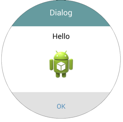
QCircleDialog has various modes. Set the mode of your dialog using setMode, and then the basic buttons will appear depending on the mode. Functions for buttons can be modified if you want. For detailed information, see API references.
QCircleDialog is contributed by Yoav Sternberg (+YoavSternberg1999 ). Thanks to Yoav. You can also provide your component to QCircle Design Template. See Contributing to QCircle Design Template.