An ultra lightweight set of promise based HTML modals: prompt, alert, confirm and veil.
npm install basic-modals
This is the parameter list accepted by alert. All of them are optional.
message: Text content. The default value is "Default Message".button_ok_content: Text for the "ok button". Default value is "Ok".title: A title on the top of the modal. By default alert modals don't have any title.className: A class attribute applied to the alert's root element.id: An id attribute applied to the alert's root element.
const { alert } = require('basic-modals')

alert('hello world')alert( { message: 'hello world', button_ok_content: 'close' } )alert( 'Accept this' )
.then( _ => console.log('The alert modal has been closed') )<script>
BasicModals.alert('hello world')
</script>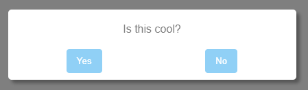
This is the parameter list accepted by confirm. All of them are optional.
question: Text content for the question. Default value is "Default Question".button_yes_content: Text for the "yes button". Default value is "Yes".button_no_content: Text for the "no button". Default value is "No".button_cancel_content: Text for the "cancel button". Default value is null. By default confirm modals don't have a cancel button.title: A title on the top of the modal. By default confirm modals don't have any title.className: A class attribute applied to the confirm's root element.id: An id attribute applied to the confirm's root element.
const { confirm } = require('basic-modals')

confirm('is this cool?')
.then( response => console.log(`The user said ${ response ? 'yes' : 'no' }`) )confirm( { question: 'like notifications?', button_yes_content: 'always', button_no_content:'never' } )
.then( response => { /* ... */ } )For adding a cancel button, just add a button_cancel_content parameter with the button text content.
confirm({
    question: 'save changes?',
    button_yes_content: 'Of course',
    button_no_content:'Never',
    button_cancel_content:'Cancel'
    })
    .then( saved => { /* saved = true if button_yes was clicked, false if button_no was clicked */ } )
    .catch( _ => { /* catch section is executed when button_cancel is clicked */ })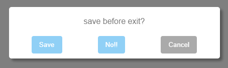
<script>
    BasicModals.confirm('do you want some pizza?')
        .then( response => { /* ... */ })
</script>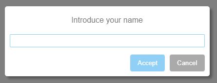
This is the parameter list accepted by prompt. All of them are optional.
question: Text content for the question. Default value is "Default Question".value: Default value in place for the input text box. Default value is '' (empty string).placeholder: Placeholder value for the input text box. Default value is '' (empty string).button_accept_content: Text for the "yes button". Default value is "Accept".button_cancel_content: Text for the "cancel button". Default value is "Cancel".title: A title on the top of the modal. Ny default prompt modals don't have any title.validate: A function to validate the input with each key press. This function will receive the value of the input field as first parameter, if the function returns...- An empty string: The input will be considered as valid, the modal will allow to the user clicks on the accept button.
- A non empty string: The input won't be considered as valid, an error message will be displayed and the accept button will be disabled.
className: A class attribute applied to the prompt's root element.id: An id attribute applied to the prompt's root element.
const { prompt } = require('basic-modals')

prompt("what's your name?")
.then( name => console.log(`The user's name is ${name}`) )prompt("what's your name?")
.then( name => console.log(`The user's name is ${name}`) )
.catch( _ => console.warning('The user closed the modal') )prompt( {
question: "what's your name?",
value: 'Eric',
placeholder: 'Your name here',
button_accept_content: 'Next',
button_cancel_content:'Quit',
})
.then( response => { /* ... */ } )const validate = value => {
const forbidden_values = ['hello', 'world']
return forbidden_values.includes(value) ? 'Value not allowed' : ''
}
prompt( { validate }).then( response => { /* ... */ } )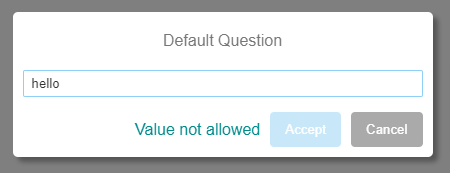
<script>
    BasicModals.prompt("what's your name?").then( response => { /* ... */ })
</script>An empty veil to block the viewport. It returns a function which will remove the veil when called.
This is the parameter list accepted by veil. All of them are optional.
text: Text content. The default value is '' (empty string).className: A class attribute applied to the veil's root element.id: An id attribute applied to the veil's root element.
const { veil } = require('basic-modals')

// render the veil
const close = veil()
// remove the veil after 3 seconds
setTimeout( close, 3000)const close = veil('some text here')
setTimeout( close, 3000)or
const close = veil({ text : 'some text here' })
setTimeout( close, 3000)When calling close the veil won't be removed immediately, it will be removed asynchronously once a fade out transition ends. If you need to know when the veil is removed from the DOM you can use the promise returned by the close method.
const close = veil()
close().then( _ => do_something() )<script>
const close = BasicModals.veil( { text: 'loading... please wait' } )
</script>This package will add a style tag with the modal's CSS in your head section. The classes are prefixed by .BasicModals and they should be self-explanatory, so you can add your own CSS selectors for those classes in your CSS and override / expand the default style.
Example:
/* This will turn the Ok button red for all the modals */
.BasicModalsButtonOk:hover: {
    background: red
}
Every modal is a children of a "veil" div with one of the following classes: BasicModalsVeilAlert, BasicModalsVeilConfirm and BasicModalsVeilPrompt. You can use this to customize the style of the different modals separately.
/* this will affect only confirm modals */
.BasicModalsVeilConfirm .BasicModalsButtonOk:hover: {
    background: red
}TIP: If you need to increase the specificity of your selectors to override the default ones, just use a body tag before your selector:
body .BasicModalsButtonOk:hover: {
    background: red
}
or any redundant selector fragment to increase the specificity.
You can add default values for any parameter, so you don't need to set them again and again.
const { defaults } = require('basic-modals')or, in a browser's scope:
const defaults = BasicModals.defaultsdefaults.alert.button_ok_content = 'Agree'Then, for the scenario below:
alert('hello')

alert( { message: 'world' } )
in both cases the "button ok" will have the text 'Agree' instead of the default 'Ok'.
The defaults object schema is:
defaults[modal_type][parameter_name]So, the defaults are available for every parameter of every modal, a few examples below:
// setting a default for the ok button in alert modals
defaults.alert.button_ok_content = 'Agree'

// setting a default for "yes" and "no" buttons in confirm modals
defaults.confirm.button_yes_content = 'Yep!'
defaults.confirm.button_no_content = 'Nope'

/* setting a default for the question and the cancel button in a
   single line, overriding the original default objects */
defaults.prompt = { question:'¿?', button_cancel_content: 'Back' }

// setting a default for the veil text
defaults.veil.text = 'loading'

// setting a default for the validate function
defaults.prompt.validate = value => global_validator( value )