-
-
Notifications
You must be signed in to change notification settings - Fork 163
New issue
Have a question about this project? Sign up for a free GitHub account to open an issue and contact its maintainers and the community.
By clicking “Sign up for GitHub”, you agree to our terms of service and privacy statement. We’ll occasionally send you account related emails.
Already on GitHub? Sign in to your account
Code guide vertical lines are broken by differing indentation #10
Comments
|
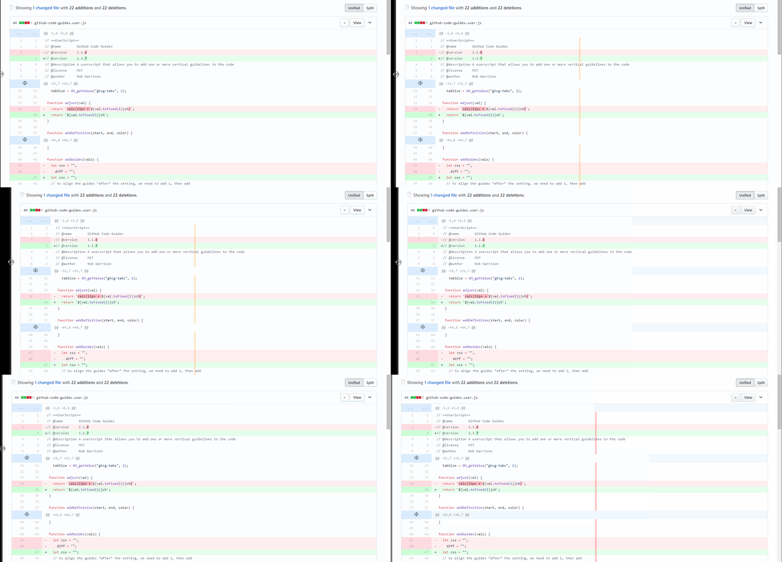
Hi @aspiers! Well, the code guides no longer appear in non-code blocks, but when you expand the code, the guide lines will still be staggered by 10 pixels. This is because the expanded code has a padding of 10 px on the inside of the table cell, whereas the original code guides are applied to a span inside the table cell. If I add padding to line up the guides, the actual guide would then be off by 10 pixels. |
|
Sorry, I'm being stupid, but I don't quite understand "the actual guide would then be off by 10 pixels". What do you mean by "the actual guide", and it would be off what by 10 pixels? BTW, how do you capture these cool animated images? |
|
Sorry, I should have explained better. The guides are added as a linear-gradient background image to the "blob-code-inner" class elements. Note the differences in the following examples:
The "Init" and "Diff" have essentially the same HTML, except the "Diff" has expandable code blocks. GitHub adds an extra space, a "+" or "-" at the beginning of the code. Therefore the guides end up being shifted to the right by 1 character (12px font-size). The HTML for the code diff, is a table cell with a class of "blob-code" which adds a <td class="blob-code blob-code-context">
<button class="btn-link add-line-comment js-add-line-comment js-add-single-line-comment">
<svg aria-hidden="true" class="octicon octicon-plus" height="16" version="1.1" viewBox="0 0 12 16" width="12">
<path d="M12 9H7v5H5V9H0V7h5V2h2v5h5z"></path>
</svg>
</button>
<span class="blob-code-inner">
+<span class="pl-c">// code is here</span>
</span>
</td>When the code is expanded, the HTML looks like this: <tr class="blob-expanded">
...
<td class="blob-code blob-code-inner">
<span class="pl-c">// code is here</span>
</td>
</tr>Again, the "blob-code" adds a So logic dictates that the way to solve the misalignment would be to shift the guide by 10px to the right for the expanded code and shift the diff non-expanded code to the left by 1em (.75em appears to work better). I changed this function to do it: function addGuides(vals) {
let css = "",
tddiff = "",
spdiff = "";
// to align the guides *after* the setting, we need to add 1, then add
// another 0.1 to give the guide a tiny bit of white space to the left
vals.forEach(guide => {
let start = parseFloat(guide.chars) + 1.1;
// eslint-disable-next-line one-var
const size = parseFloat(guide.width) || 0.2,
// each line needs to be at least 0.2ch in width to be visible
end = (start + (size > 0.2 ? size : 0.2)).toFixed(1),
color = guide.color || "rgba(0, 0, 0, .3)";
start = start.toFixed(1);
css += `transparent ${start}ch, ${color} ${start}ch, ${color} ${end}ch, transparent ${end}ch, `;
tddiff += `transparent calc(${start}ch + 10px), ${color} calc(${start}ch + 10px), ${color} calc(${end}ch + 10px), transparent calc(${end}ch + 10px), `;
spdiff += `transparent calc(${start}ch - .75em), ${color} calc(${start}ch - .75em), ${color} calc(${end}ch - .75em), transparent calc(${end}ch - .75em), `;
});
style.textContent = `
span.blob-code-inner {
font-family: "${font}", Consolas, "Liberation Mono", Menlo, Courier, monospace !important;
}
span.blob-code-inner, td.blob-code-inner:not(.blob-code-hunk) {
display: block !important;
background: linear-gradient(to right, transparent 0%, ${css} transparent 100%) !important;
}
.blob-expanded td.blob-code-inner:not(.blob-code-hunk) {
background: linear-gradient(to right, transparent 0%, ${tddiff} transparent 100%) !important;
}
.diff-table span.blob-code-inner {
background: linear-gradient(to right, transparent 0%, ${spdiff} transparent 100%) !important;
}
`;
}And the guide appears to be much more accurate, but there is still a shift. It is also possible to remove the It's been very frustrating trying to get everything to line up. And to answer the last question... I use LICEcap for the animated screen capture (no lice are involved). |
|
Wow, thanks for the great explanation! This is super clear now, and I really appreciate your efforts in hunting for the perfect solution :-) |
Alignment is still slightly off. See #10
|
And in case anyone is wondering why the guidelines look all wide and blurry, it's a Chrome bug - https://bugs.chromium.org/p/chromium/issues/detail?id=729727 |
|
I looks like finally got the alignment issue fixed, at least it looks that way... the bug with Chrome's linear gradient rendering is really annoying - see the gif I added in the last comment. The guides look great in Firefox! I think I'll leave this issue open for now. |
|
Closing this issue... I've added a new known issues wiki page with an entry linking to the Chrome rendering bug. |


As reported in https://greasyfork.org/en/forum/discussion/11754/x; filing here to ease tracking of resolution :-)
The text was updated successfully, but these errors were encountered: