User xi (Tobias Bengfort) created an unauthorized repo called "apca-introduction" which unfortunately is misleading. This fork is intended to clarify, make corrections, and set the record straight. The corrected "The missing introduction to APCA" below was revised for accuracy only, with the intention of maintaining xi's original tone and simplicity. At the bottom is a rebuttal of certain statements he made.
- Note that the actual introduction was not missing, it is Why APCA.
- And new in 2023, there is a new plain language overview: "Easy Intro to APCA"
It is a supra-threshold visual contrast prediction model, that is specifically tuned to readability on self-illuminated displays. It follows human perception, including critical aspects such as spatial characteristics, meaning font weight and size or line thickness. The APCA guidelines also inform various use cases, such as body text, fluent text, sub-fluent text and spot reading text, and non-text items.
APCA is enough of a paradigm shift that it is not directly backwards compatible with the old WCAG 2 contrast, and WCAG 3 is some time away from being the recommendation. However, this is not due as much to the APCA math per se, but because the APCA math is accurate, it allows for more flexible and useful design guidelines.
APCA thresholds can certainly be set to levels that are backwards compatible, but at a loss of design flexibility. This approach is used in the Bridge-PCA, which is backward compatible to WCAG 2, but using APCA technology. One of the urgent reasons Bridge-PCA is needed is the rise in popularity of "Dark Mode."
As shown above, WCAG 2 contrast fails most with dark colors, and the results are relatively meaningless for colors for Dark Mode. APCA and Bridge PCA do very well with contrast prediction and guidance for dark mode.
Here's a short linktree of related links.
And a more in depth link catalog.
The Accessible Perceptual Contrast Algorithm (APCA) is a new algorithm to predict the perceived lightness contrast between two adjacent colors. It was developed to address some issues in earlier algorithms, especially for dark colors, or when the text is lighter than the background.
APCA was created by Andrew Somers at Myndex Research, and under the oversight of the Visual Contrast subgroup of Silver, and is the candidate method for contrast for WCAG 3 (W3C Accessibility Guidelines).
The official interactive demo is available at apcacontrast.com. No other link is canonical nor officially approved.
// Estimated screen Ys from simple RGB int array [255,255,255]
function sRGBtoY(srgb) {
  var r = Math.pow(srgb[0] / 255, 2.4);
  var g = Math.pow(srgb[1] / 255, 2.4);
  var b = Math.pow(srgb[2] / 255, 2.4);
  var ys = 0.2126729 * r + 0.7151522 * g + 0.0721750 * b;

  // Soft black clamp for flare and other purposes.
  if (ys < 0.022) {
    ys += Math.pow(0.022 - ys, 1.414);
  }
  return ys;
}

// Send text and bg color, as simple RGB int arrays [255,255,255]
function contrastAPCA(tx, bg) {
  var ystx = sRGBtoY(tx);
  var ysbg = sRGBtoY(bg);
  var sapc = 1.14;
  var offset = 0.027;

  // Calculate raw SAPC contrast value
  if (ysbg > ystx) {
    sapc *= Math.pow(ysbg, 0.56) - Math.pow(ystx, 0.57);
  } else {
    sapc *= Math.pow(ysbg, 0.65) - Math.pow(ystx, 0.62);
  }

  // Clamp low Lc values to 0, otherwise offset.
  if (Math.abs(sapc) < 0.1) {
    return 0;
  } else if (sapc > 0) {
    sapc -= offset;
  } else {
    sapc += offset;
  }

  // return APCA Lc value as a signed number
  return sapc * 100;
}(Source)
Output Values
- WCAG 2.x produces a ratio between 1:1 and 21:1. APCA produces a value roughly between -108 to 0 for light text (on a dark background), and 0 to 106 for dark text.
- Unlike WCAG 2.x, APCA reports different values when you switch text color and background color (polarity sensitivity).
- The result of APCA is negative for light text on dark background. You will usually work with the absolute value though, except for maximum contrast which is presently set at Lc -90.
Thresholds
- WCAG 2.x defined three thresholds: 3:1, 4.5:1, and 7:1.
- These roughly correspond to Lc45, Lc60, and Lc75 as functionally equivalent, but not backwards compatible.
- The backwards compatible levels are APCA Lc58, Lc72, Lc85, provided the lightest color is sent to the "background" input of APCA. (i.e. disregard polarity just as WCAG 2 does).
- APCA Bronze Level Defines six thresholds from Lc15, Lc30, Lc45, Lc60, Lc75, and Lc90
- Lc15: Invisibility point for some individuals.
- Lc30: Minimum for any sub-fluent or spot text of any use case.
- Lc45: Large (>36px) fluent text, or subfluent text minimum.
- Lc60: Medium (>24px) fluent text
- Lc75: Minimum for body text (>18px)
- Lc90: Preferred for body text
Practical Application
- Compared to WCAG 2.x, APCA reports drastically lower contrast for darker colors. It also reports slightly higher contrast for lighter colors. This is in accordance with human perception.
- Unlike WCAG 2.x, APCA divides needed contrast into use case categories.
- In some use cases, such as for columns of body text, APCA is stricter.
- APCA is more flexible though, by handling for "derated" use cases. For instance, non-content text like a copyright bug are permitted lower contrast (prevents distraction).
Also see APCA In A Nutshell.
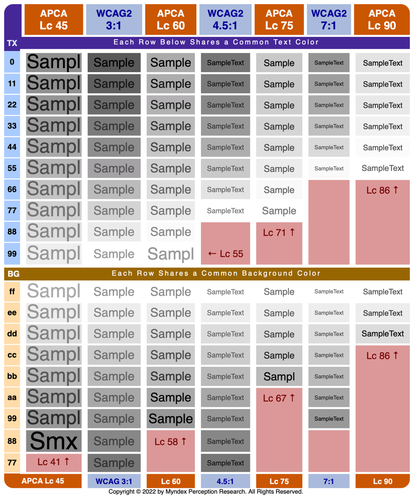
These examples are based on xi's example script. The original script and method was deeply flawed, and has been corrected. These examples below are intended to maintain the same comparative intent as xi claims to have intended, but using useful and correct math.


This comparison uses achromatic grays as those define readability, making the comparative differences clearly evident.
WCAG 2 is a guideline developed and recommended by the W3.org. While WCAG 2 is not legally binding itself, it has become a normative part of some regulations in some specific jurisdictions around the globe. The fact that there is a need to define contrast specifications for legal reasons makes it all the more important that there be a perceptually accurate contrast method to do so. This need was the Genesis of the APCA.
Currently both APCA and the future WCAG 3.0 are in active development. At the time of this writing, neither is officially recommended by the W3C.
APCA is also being developed independently for use in other standards and guidelines beyond web content, and is rapidly being adopted by software developers and content designers.
Evaluating a contrast algorithm is fairly straight forward as far as determining perceptual uniformity, or in other words, efficacy in terms of the predicted, relative amount of contrast across the visual range. This is because all sighted users have similarly shaped contrast sensitivity curves when it comes to achromatic luminance (literally, the colorless, black to white range of lightness).
Luminance is the measure of light coming from the display, and perceived lightness is how a human judges the lightness or brightness, in the context of the surrounding environment. Luminance is processed by the human vision system in a manner that makes it critical for readability.
On the other hand, the thresholds chosen for guidelines—i.e., how much contrast does a given element need—is more complicated. All sighted users have substantial contrast needs for best readability. Some users have impairments that cause a reduced contrast sensitivity, and those users may need higher contrasts in general.
Note: there are some claims that some users may be over-sensitive to very high contrasts, and they then need lower contrasts in some situations such as with large bold elements. Examining this aspect of contrast perception, we find it is more related to excessively high luminance relative to a particular adaptation state. In other words it's not contrast per se, but an excessive luminance peak value, or a luminous intensity that causes significant glare and related issues. Unfortunately, this idea has been misinterpreted, resulting in poor contrast across the web. Article: "Please Stop Using Gray Text"
For a deeper dive, start with "Easy Intro to APCA" and the short linktree and the more in depth link catalog of related resources.
This is a rebuttal and discussion of xi's "Why This Document". In the original, xi claimed he created the repo because:
...it was born out of my personal frustration with the original documentation. Some important pieces of information (e.g. the actual algorithm) get buried under all that text...
This argument is unpersuasive.
- First, there was a clearly marked plain language introduction called Why APCA which was published a year before xi created this repo.
- Second, the actual algorithm is literally the very first document in the documentation folder. And the remaining documentation is broken down by subject, again in that folder.
This indicates that xi did not actually read nor look into the documentation folder. In fact I even explained all of this to him directly in a thread at the APCA repo a few weeks before he created his repo. As a matter of my own opinion, this points to underlying motivations which I'll discuss below.
Perhaps it's useful to add that a chairperson of the W3C AGWG had asked me to "remove the math" from the basic front page documentation to make it easier to read. In response, I put the math into its own separate file clearly marked at the top of the documentation folder.
The original documentation also contains absolute statements like "APCA is perceptually uniform" and that the old algorithm produces "invalid results".
This statement is verifiably false.
Nowhere in the published documentation have I ever stated that "WCAG 2 produced invalid results". Nowhere. What I have said is "WCAG 2 far overstates contrast for dark colors" which is verifiably true. I have stated that WCAG 2 has inherent problems, but then listing specifically what those problems are. xi's use of provocative language such as "...contains absolute statements..." is surely intended to disparage. Nevertheless, APCA is perceptually uniform in the context of text on a self-illuminated display. This has been tested, studied, peer-reviewed, and discussed at length. It is the principal reason that APCA is being widely adopted today.
Again, this points to motivation.
...in my opinion is wrong as perceptual uniformity is an ideal that can never be reached completely. So I felt like there was room for a more balanced introduction.
xi is, by his own admission, not knowledgable in the field of vision science. From his analysis document he states (emphasis added):
I am a regular web developer with a bachelor's degree in math, but without any training in the science around visual perception. That's why I cannot evaluate whether APCA is better than WCAG 2.x.
I don't know if I should read this as a form of gaslighting? Because the rest of his documentation is indeed purporting to evaluate. What then is the purpose of his repo and discussions? Despite good faith best efforts to present xi with references to the relevant science, and help him climb the learning curve, he has not made a visible effort to understand. Mea culpa for any writing of mine where I am not presenting the information in an easy-to-digest fashion, but I question if that would be of help.
Motivation is the question at this point. It is well known that there are a small group of individuals that are opposed to myself (personally) and my work, for reasons that are unclear. They have directly and maliciously obstructed my work with the W3C. xi has links in his repo that appear to connect him to these individuals in some way, and the nature of his issue post #651 in silver would appear to support this conclusion. Is xi associated with the obstructionist group? And to what degree? I don't know conclusively at this time, as the evidence is circumstantial.
Nevertheless, what is the motivation here? Are we lost in translation?
His claims for why he created the parent repo fall flat, as his view implies he did not so much as open the documentation folder, where the relevant documentation is and clearly labeled. This despite the aforementioned discussion thread where I was directly at his disposal, answering his queries in good faith. The implication here, or at least the appearance, is that a third party fed a narrative, or encouraged a bias.
The most important deficit of xi's assertions is the failure to recognize spatial characteristics as the primary driver of contrast for text. It appears his demonstrations and calculations are biased to obfuscate that fact, using test elements spatially above the point of contrast constancy, and not using the actual APCA code nor methods. These issues were corrected here. The other documents in the repo have also been revised or commented on, including his "analysis".
- The easy to read plain language overview is: "Easy Intro to APCA"
- A comprehensive peer-reviewed overview of the relevant vision and color science is: Realities and Myths of Color and Contrast
- The first comment on this article is from xi (Tobias Bengfort) to which I provided an in-depth reply.
- There is an open discussion area for APCA at the main repo discussion area. Please feel free to comment or ask questions.