Vehicle orders GUI: Learning from other games #9551
Replies: 7 comments 1 reply
-
|
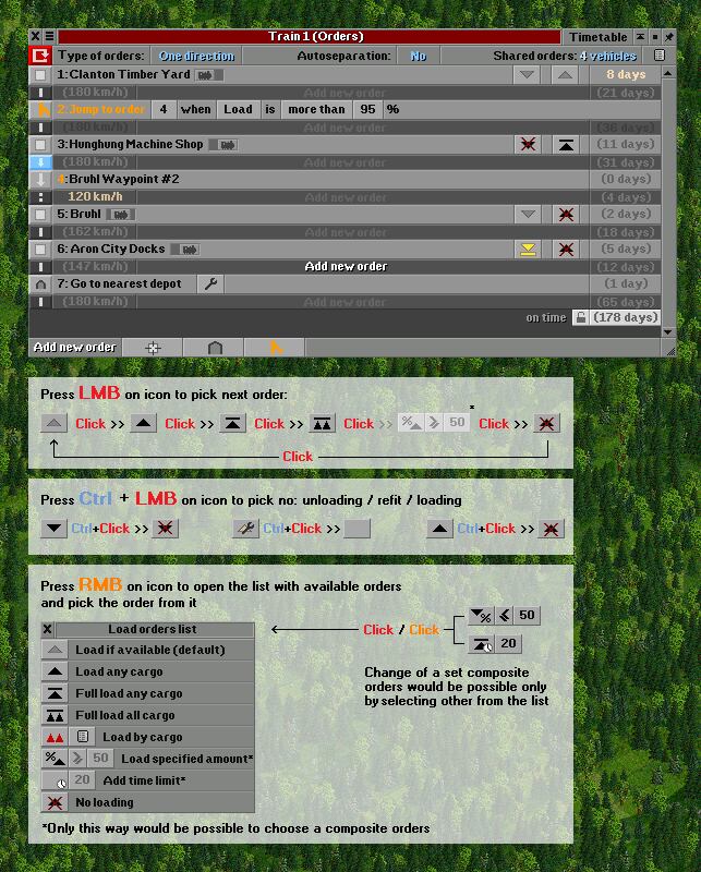
(PS: awesome thread @2TallTyler , tnx for all the investigation above) I had some talks about this pretty recently, so let me put them here too. Discord DMs might not be the place to store these ideas. I think we should move away from the "order" concept, and go into a "route" / "lines" concept. The reasoning is simple: if you play OpenTTD for a bit of time, you rarely have a single train on a route. Shared orders are the bread and butter to make a successful empire, so why not center a bit more around that. Currently, shared orders are very hidden unless you know what you are looking for. This is often confusing to me, so I assume for many people. What I would do is make somewhere, not sure where yet, where you can define routes. You select the stations, waypoints and buoys to make a route. You also select which depots can be used for the route, for service, new trains, etc. From this window you can also make new trains, which assigns them on the route. On a train you can see which route it is following. Here basically it is like the current orders. From a technical point, not much changes really. As shared orders are really routes. Just .. pivoted from the order, instead of from the route. And make a GUI dedicated for routes, instead of for trains. Additionally, I think we should change how we plan those routes. In the most basic form, we want to tell where a train has to go: go to station A, next to station B, etc. This is the primary information, and everything else should be second. And that should be collapsible. Maybe with some icons we can show a short summary of what it set, like in the above case This is basically a bit of an hybrid of a few of the above ideas. But it stays close to what we currently have, so not much technical changes are needed. It mostly is changing how the GUI represents it. Anyway, still a very rough idea. I should prototype it a bit to give more of an impression. But see this is (another) conversation starter :) |
Beta Was this translation helpful? Give feedback.
-
I think it would really make sense and could even be a significant simplification not only for new players. But I also think that creating something too revolutionary would not necessarily be good. Yes, from what I see very often in the game, many players don't notice at all that vehicles can form groups of common orders. This is very hided and not obvious idea, but this knowlege is quite important if you want to develop your company and have fun from the game so I think that some improvements would be very useful.
I hope it won't be offtop, but I would have some concept here. :)
Recently I came to the conclusion that dividing vehicles into groups according to two criteria and creating two tabs is not very useful at all and it would be possible to keep one list.
A few assumptions:
|

Beta Was this translation helpful? Give feedback.
-
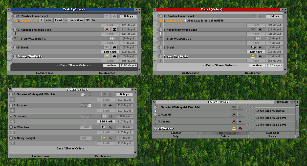
Mashinky and Voxel Tycoon: New lines for order propertiesBoth of these modern TTD-inspired games use new lines below each station order to indicate any special behavior which needs to happen at the above order. I quite like this approach, but in my opinion Mashinky makes them look too much like station orders while Voxel Tycoon takes up too much space making them distinct. I'd like to see a middle ground in compactness. Also, the manner of adding stations is different in each game. Mashinky has buttons for each order (and doesn't seem to have a "Quick order creation" mode where the Add Station button remains pressed after clicking on each station), while Voxel Tycoon prompts you for the order behavior when adding each station — see below. Mashinky
Voxel TycoonThis menu appears when you click on a station to add it, forcing you to choose a behavior:
You can also modify orders later:
|


Beta Was this translation helpful? Give feedback.
-
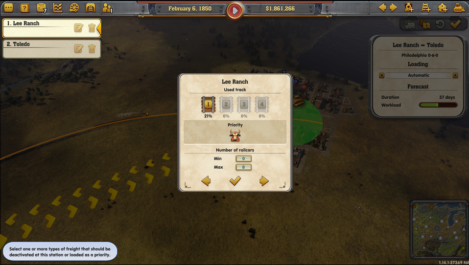
The Railroad Tycoon approach: Open a new window to modify order propertiesRailroad Tycoon-inspired games (as opposed to TTD-inspired games) tend to load multiple cargo types onto each train, and when modifying a route, clicking on a station order opens a new window to give players granular control over what is loaded at that station. I don't think there's much to copy from this approach, since it's so different from OpenTTD gameplay. Railroad Tycoon 3
Railway Empire
Sid Meier's Railroads
|

Beta Was this translation helpful? Give feedback.
-
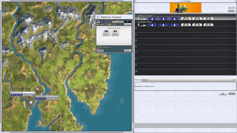
Simutrans: Similar to OpenTTD, with slightly more granularityThe top box with the highlighted text is a percentage-based minimum load control similar to "Full Load" in OpenTTD.
|

Beta Was this translation helpful? Give feedback.
-
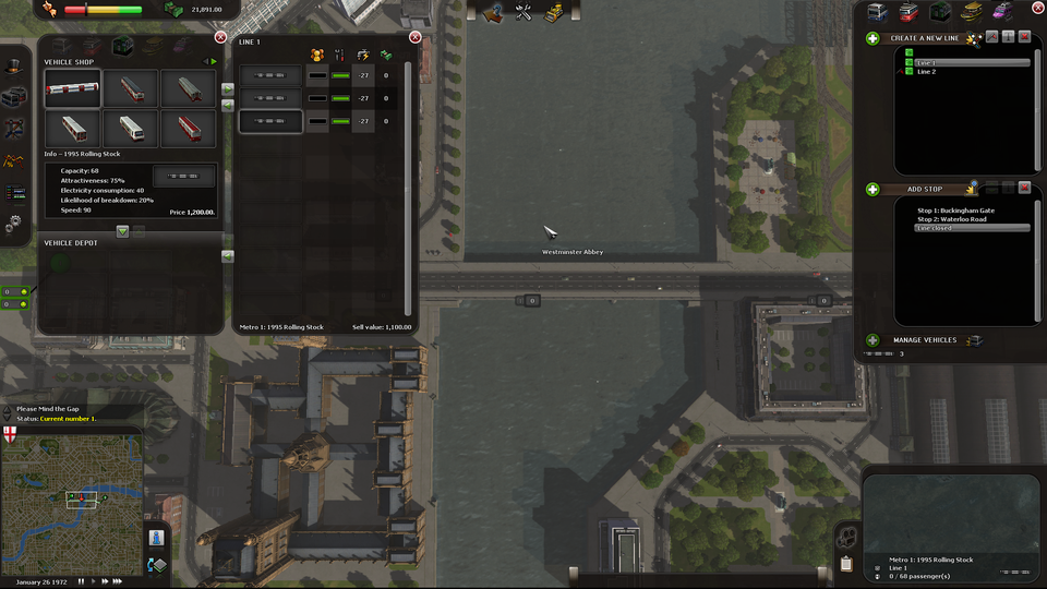
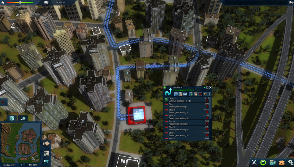
Cities in Motion: Timetables, not really ordersThese public transit simulators don't have any concept of waiting until full, so they are just a list of stops. Interestingly, CiM2 shows the expected timetable distance from the first stop, but this is more relevant to a discussion of timetables (which is probably a separate conversation, since OpenTTD timetables have more issues than simply the GUI, like no auto-separation). I don't see much we can take from this. Cities in Motion 1
Cities in Motion 2
|
Beta Was this translation helpful? Give feedback.
-
Transport Fever 2: Icons in the order listTpF2 is clearly TTD-inspired, but uses orders for an entire line with multiple vehicles instead of shared orders in OpenTTD. Nevertheless, the order windows work the same. Here, the text only indicates the station/waypoint name, and the icons to the right indicate the special behavior, including track selection (track number), loading behavior (two boxes), and which cargos are loaded (gear). I particularly like how they've eliminated the extraneous "Go non-stop to" at the beginning of each OpenTTD order, and the icon to indicate waypoints. Also note that all trains seem to load and unload in the center of station platforms in TpF2, eliminating even more text.
|

Beta Was this translation helpful? Give feedback.
-
|
Orders / Timetables / Lines window
It could certainly be much clearer than it is today. However, the problem with such a system appears when the instruction list is long, which is not uncommon in OTTD, but maybe there is some way in it. Regarding the presented by 2TallTyler solutions from different games, well... a bit of a shame to admit, but I haven't played any of them except Simutrans, so I can't really comment on which of these solutions was good. However, when it comes to Simutrans, I gave up on this game quite quickly, precisely because of the way of creating timetables. Maybe I was too used to how it is dealt with in OTTD, but for me it was not very intuitive. There was too much of everything, and I didn't feel like delving into it. Maybe the conclusion I can draw from this is that the game, getting to know its basic functions necessary to start the game and start enjoying it should be as simple as possible. Any complexity may arise over time, but should not overwhelm the player at the start. In any case, I see this topic as a search for solutions that are worthy and unworthy of attention. So I would also like to add a few of the solutions I have been thinking about. I admit that of all the sketches to improve the various interface elements, the orders creation window was probably the first, because it was something I thought and still think it needs to be changed the most. I am not completely satisfied with any of the sketches, most of them are also incomplete, but I think they can be useful in some way as well. The assumptions that guided me were primarily:
Solutions that make sense to me:
Version 1 - first attempt
Two windows were joined into one. Icons instead of text. First version, so many features are missing. The part of adding new commands looks quite interesting, but I'm not sure if it fits the rest of the interface. Version 1.X - Several other earlier and later variants of the first version
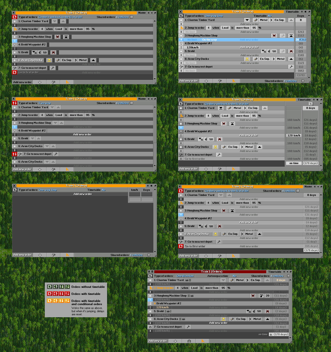
Version 2.9 - currently the latest
I have posted this graphic probably twice already. Sorry for the repetition, but I think it fits the topic. The method of choosing the orders is described, although I am curious if it would be difficult for you to guess what the icons mean without it. :) What is not described, I will mention in points:
Version 2.X - Several earlier drafts
Version 3 - minimum variant with colored text
Likewise, two windows were merged into one. Here, instead of icons, buttons with text have been preserved. There is no auto-separation and speed setting option. The settings for the stop are shown, keeping the sequence of events (unload > refit > load). LMB selects the next available order, RMB opens the list of available orders. By pressing part of the journey it would be possible to set the time, speed and the possibility of an additional stop ("Go to"). For a better effect, it would be nice to be able to choose other font colors. |


Beta Was this translation helpful? Give feedback.
-
It's no secret that the current vehicle orders GUI needs some love. It's text-heavy and has a lot of buttons, some of which are rarely used. It even has duplicate Refit buttons in depot orders.
I recognize that any redesign of this GUI would be...contentious. But in preparation for somebody (maybe me, maybe not) tackling it someday, I thought it would be helpful to see how other games handle vehicle orders, particularly how properties of each order like "Wait for Full Load" are selected and shown.
As we've done in other discussion posts, I'll be creating a separate post in this discussion thread for each strategy, to better sort discussions of each.
Beta Was this translation helpful? Give feedback.
All reactions