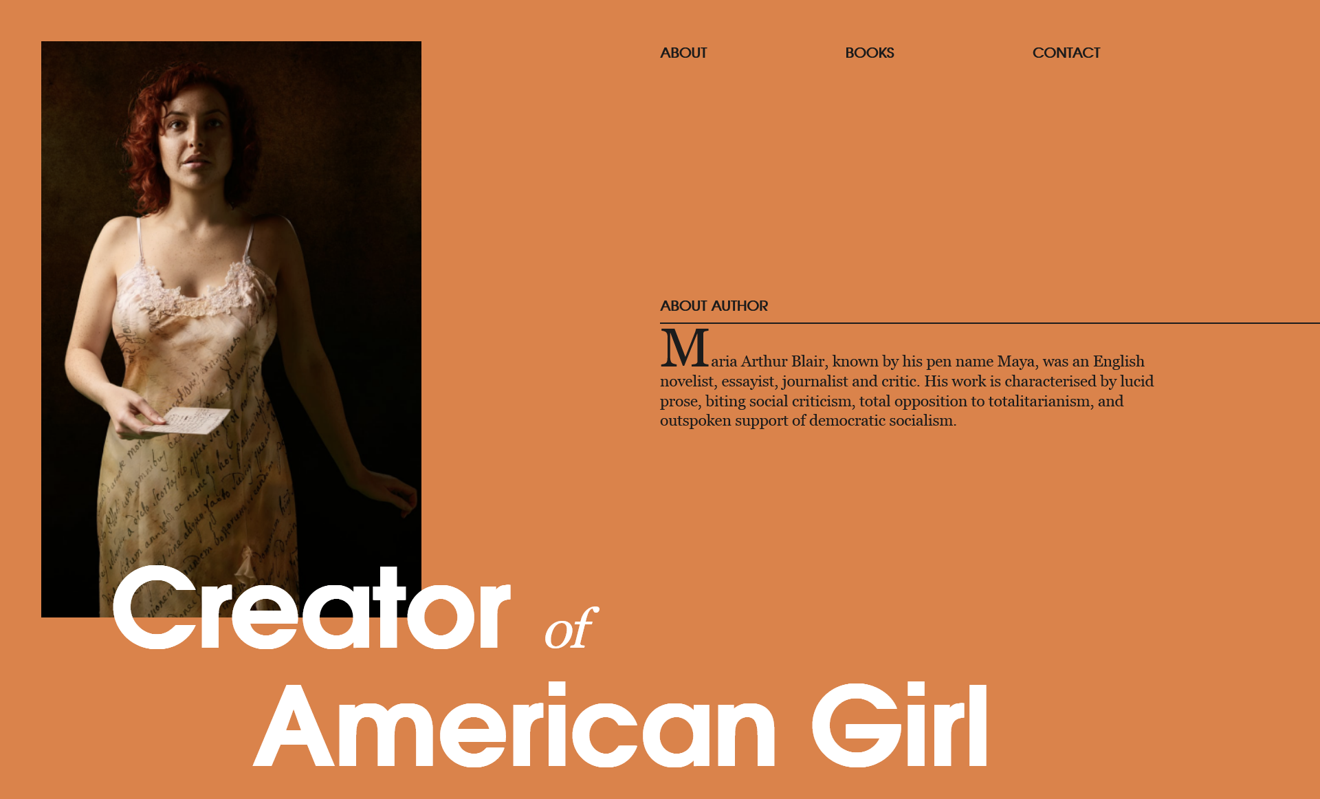
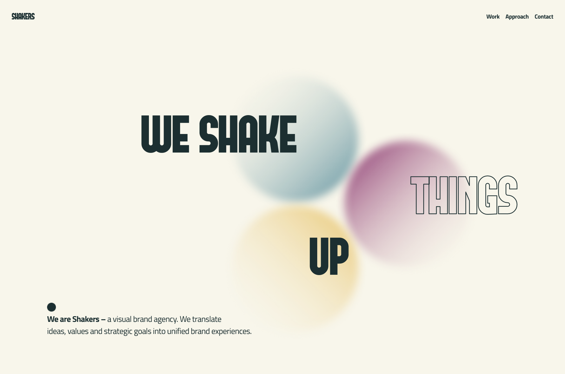
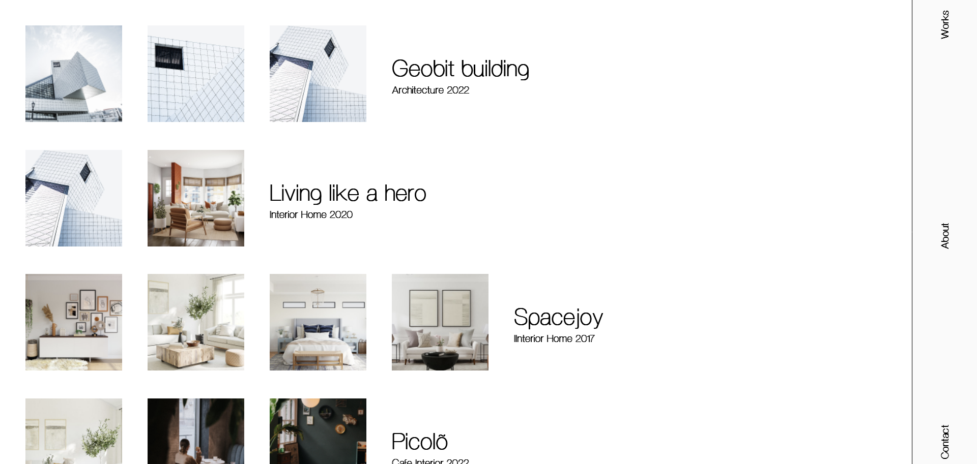
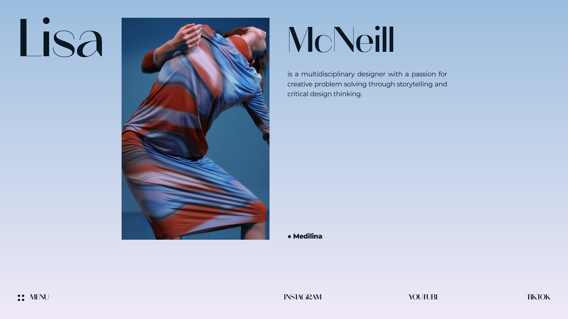
Modern layouts strengthen skills in thinking of complex grid layouts with a responsive nature. I used various native CSS Grid techniques. The ASCII-Art Method and the Named grid line technique tempted me to develop around 50 modern layouts. In fact, I wrote a dedicated article for the ASCII-Art Method at CSS-TRICKS (It received significant attention from fellow developers and was even featured as "POPULAR OF THE MONTH).
50 days challenge on Modern Layouts using CSS Grid.

❌ No Absolute or Relative positioning
✅ Use a 12-column grid layout
✅ Responsive to each breakpoint

❌ No Absolute or Relative positioning
✅ Use a 12-column grid layout
✅ Responsive to each breakpoint
✅ Placing items using Named Template Areas

❌ No Absolute or Relative positioning
✅ Use Line-based placement
✅ Responsive to each breakpoint
✅ Using the power of Grid Auto-Placement Rule

✅ Use Line-based placement
✅ Responsive to each breakpoint

✅ Use Named Grid Lines Placement
✅ Responsive to each breakpoint

❌ No Absolute or Relative positioning
✅ Use Named Grid Lines Placement
✅ Responsive to each breakpoint
✅ Use a 12-column grid for desktop Breakpoint
✅ Use an 8-column grid for Large Tablet and Laptop Breakpoint
✅ Use a 4-column grid for Mobile Breakpoint
✅ Use Named Grid Lines Placement
✅ Responsive to each breakpoint
✅ Use a 12-column grid

✅ Use Named Template Area Placement
✅ ASCII-ART method of grid layout
✅ Responsive to each breakpoint
✅ Use a 12-column grid

❌ No Absolute or Relative positioning
✅ Use Line-based placement
✅ Responsive to each breakpoint
✅ Use a 12-column grid
❌ No Absolute or Relative positioning
✅ Use Line-based placement
✅ Responsive to each breakpoint

✅ Use Named Grid Lines Placement
✅ Responsive to each breakpoint
✅ Use a 12-column grid
✅ Use Named Template Area Placement
✅ ASCII-ART method of grid layout
✅ Responsive to each breakpoint
✅ Use a 12-column grid

❌ No Absolute or Relative positioning
✅ Use Line-based placement
✅ Responsive to each breakpoint
✅ Use a 12-column grid

✅ Use Named Grid Lines Placement
✅ Responsive to each breakpoint
✅ Use a 12-column grid

✅ Use Line Based Placement
✅ Responsive to each breakpoint
✅ Use a 12-column grid

❌ No Absolute or Relative positioning
✅ Use Line-based placement
✅ Responsive to each breakpoint
✅ Use a 12-column grid

✅ Use Line-based placement
✅ Responsive to each breakpoint
✅ Use the power of Grid Auto Placement Rule

✅ Use Line-based placement
✅ Responsive to each breakpoint
❌ No Absolute or Relative positioning

✅ Use Named Grid Lines placement
✅ Responsive to each breakpoint
❌ No Absolute or Relative positioning

✅ Use FlexBox
✅ Responsive to each breakpoint
❌ No Absolute or Relative positioning

✅ Use Line Based placement
✅ Responsive to each breakpoint
✅ Use a 12-column grid layout
❌ No Absolute or Relative positioning
✅ Use FlexBox
✅ Responsive to each breakpoint
✅ Use Named Grid Lines Placement
✅ Responsive to each breakpoint
✅ Use a 12-column grid
❌ No Absolute or Relative positioning
✅ Use Named Grid Template areas Placement
✅ Responsive to each breakpoint
✅ Use a 12-column grid
❌ No Absolute or Relative positioning

✅ Use CSS Grid line-based placement
✅ Use a 12-column grid
✅ Responsive to each breakpoint

✅ Use ASCII ART METHOD of CSS Grid
✅ Responsive to each breakpoint
✅ Use a 12-column grid
❌ No Absolute or Relative positioning

✅ Use Line Based Placement
✅ Responsive to each breakpoint
✅ Use Single Column grid
❌ No Absolute or Relative positioning

✅ Use CSS Grid line-based placement
✅ Use a 12-column grid
✅ Responsive to each breakpoint

✅ Use CSS Grid line-based placement
✅ Responsive to each breakpoint
✅ Use CSS Grid line-based placement
✅ Use the power of Grid's Auto Placement Algorithm.
✅ Responsive to each breakpoint
✅ Use FlexBox
✅ Responsive to each breakpoint
❌ No Absolute or Relative positioning

✅ Use CSS Grid line-based placement
✅ Use 12-column grid
✅ Responsive to each breakpoint

✅ Use CSS Grid line-based placement
✅ Use 12-column grid
✅ Responsive to each breakpoint

✅ Use Single Column Grid
✅ FlexBox Enriched Layout
✅ Responsive to each breakpoint

✅ Use Named Grid Lines Placement
✅ Responsive to each breakpoint
✅ Use a 12-column grid

✅ Use Named Grid Lines Placement
✅ Responsive to each breakpoint
✅ Use a 12-column grid

✅ Use Line Based Placement
✅ Responsive to each breakpoint
✅ Use a 12-column grid
✅ Use Line Based Placement
✅ Responsive to each breakpoint
✅ Use 12-column grid

✅ Use Named Grid Lines Placement
✅ Responsive to each breakpoint
✅ Use a 12-column grid

✅ Use Named Grid Lines Placement
✅ Responsive to each breakpoint
✅ Use a 12-column grid
✅ Use FlexBox
✅ Responsive to each breakpoint
❌ No Absolute or Relative positioning

✅ Use CSS Grid line-based placement
✅ Use the power of Grid's Auto Placement Algorithm.
✅ Responsive to each breakpoint

✅ Use CSS Grid line-based placement
✅ Responsive to each breakpoint

✅ Use CSS Grid line-based placement
✅ Use a 12-column Grid
✅ Responsive to each breakpoint
✅ Use Named Grid Lines Placement
✅ Responsive to each breakpoint
✅ Use a 12-column grid

✅ Use CSS Grid Line Based Placement
✅ Use a 12-Column Grid.
✅ Responsive to each breakpoint

✅ Use Named Grid Lines Placement
✅ Responsive to each breakpoint
✅ Use a 12-column grid

✅ Use Named Grid Lines Placement
✅ Responsive to each breakpoint
✅ Use a 12-column grid

✅ Use CSS Grid Line Based Placement
✅ Use a 12-column grid.
✅ Responsive to each breakpoint
✅ Use CSS Grid Line Based Placement
✅ Use a 12-Column Grid.
✅ Responsive to each breakpoint