Construct is an ultra-simple, Sass-based grid boilerplate system that is mobile first (~7KB Minified). The goal is to only provide the absolute necessities and stay out of your way for the rest. Construct provides style normalization, a simple grid system, and a small number of helper classes to make life a little easier. Construct doesn't make any changes to page colours, fonts (except base size), backgrounds, form elements, or anything of the sort.
Clone this repo or simply pull the compiled CSS file into any project you're working on.
<link rel="stylesheet" type="text/css" href="path/to/construct.css">Alternatively, you can run npm install construct-css to download it as an npm module.
Construct works in terms of rows and columns, meaning each row has a series of nested columns that indicate their relative widths (more on the grid below). For example, the basic structure is as follows:
<div class="row">
    <div class="sm-6 column">
        Column Content Here
    </div>
    <div class="sm-6 column">
        Column Content Here
    </div>
</div>
For more extensive examples on how to use the grid, take a look at the index.html within the project repo.
The grid system works in terms of small, medium, large, and extra large screen sizes (defined within _variables.scss). The grid works mobile-first, meaning if you apply a class at a smaller screen size, it will ripple up to larger screen sizes unless any of the larger screen sizes have their own class applied.
By default, rows consist of a total of 12 columns (this can be changed within _variables.scss), therefore when defining columns for a row, they should total 12. The basic syntax is SIZE-#COLS. The available sizes are small (sm), medium (md), large (lg), and extra large (xl). An example usage is as follows:
<div class="row">
    <div class="sm-6 lg-8 column">
        Column Content Here
    </div>
    <div class="sm-6 lg-4 column">
        Column Content Here
    </div>
</div>
The above example has both columns 6 wide on both small and medium screens and 8 and 4 wide respectively on large and extra large screens. The column class is added to each column to indicate that its a column and if it's the only class defined, it will default to a full row width column.
The default screen sizes are as follows:
- Small: 0 - 639px
- Medium: 640px - 1023px
- Large: 1024px - 1439px
- Extra Large: 1440px onwards
Rows can also be nested easily by defining another row + column pair within a parent column. For example:
<div class="row">
    <div class="md-6 column">
        md-6 column
    </div>
    <div class="md-6 column">
        <div class="row">
            <div class="md-8 column">
                md-8 column
            </div>
            <div class="md-4 column">
                md-4 column
            </div>
        </div>
    </div>
</div>
To see it in action, take a look at the "Nested Grid" section of index.html.
If you don't necessarily need columns taking up the entire row, you can offset columns as well. For example:
<div class="row">
    <div class="sm-4 column">
        sm-4 column
    </div>
    <div class="sm-4 sm-offset-4 column">
        sm-4 sm-offset-4 column
    </div>
</div>
The above example has 2 columns, both 4 wide, however the second column offsets by 4 as well, so the end result would be a 4-width column on the left and a 4-width column on the right, with 4 column space in the middle.
To see it in action, take a look at the "Offsets" section of index.html.
You can change the order of columns by utilizing SIZE-push-NUM & SIZE-pull-NUM. For example:
<div class="row">
    <div class="sm-4 md-push-8 column">
        sm-4 md-push-8 column
    </div>
    <div class="sm-8 md-pull-4 column">
        sm-8 md-pull-4 column
    </div>
</div>
On small screens, the order will be the 4-col and then the 8-col, however once you hit a medium screen and up, the order will be the 8-col and then the 4-col. In order to use push/pull, you must use push on the first column in the amount of the second column and pull on the second column in the amount of the first column.
If you don't want a row to be capped by the max-width for whatever reason, you can simply add a .full-width class to the row to make it fill the width of the viewport. For example:
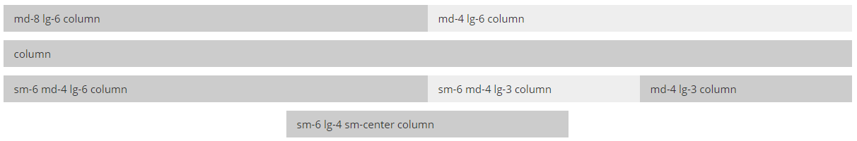
<div class="row full-width">
    <div class="sm-6 md-4 lg-6 column">
        sm-6 md-4 lg-6 column
    </div>
    <div class="sm-6 md-4 lg-3 column">
        sm-6 md-4 lg-3 column
    </div>
    <div class="md-4 lg-3 column">
        md-4 lg-3 column
    </div>
</div>
To see it in action, take a look at the "Full Width" section of index.html.
Construct comes with a number of helper classes to try and make life a little easier. The helpers currently available are:
| Name | Description | Class |
|---|---|---|
| Clearfix | Self-clears it's child elements | .clearfix |
| Text Center | Centers text within an element | .text-center |
| Small Center | Centers a column on small size and up | .sm-center |
| Medium Center | Centers a column on medium size and up | .md-center |
| Large Center | Centers a column on large size and up | .lg-center |
| Extra Large Center | Centers a column on extra large size and up | .xl-center |
| Hide Small | Hides an element only on small sizes | .hide-sm |
| Hide Medium | Hides an element only on medium sizes | .hide-md |
| Hide Large | Hides an element only on large sizes | .hide-lg |
| Hide Extra Large | Hides an element only on extra large sizes | .hide-xl |
| Hide Medium Up | Hides an element on medium sizes and up | .hide-md-up |
| Hide Large Up | Hides an element on large sizes and up | .hide-lg-up |
| No Print | Hides an element on print | .no-print |
- Normalize.css for style normalization