Calendar
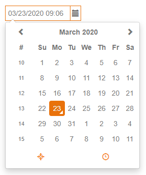
Table of contents
The Calendar offers a few key bindings to allow a user to set or change a date by simply hitting a key:
| Key | Result |
|---|---|
| Numpad + | Adds one day |
| Numpad - | Substracts one day |
| t | Today |
| y | Yesterday |
| b | Beginning of the month |
| e | End of the month |
The component has the following properties:
| Property | Type | Default | Description |
|---|---|---|---|
| dataProvider | dataprovider | The dataprovider (a date column or variable) | |
| enabled | Boolean | true | Whether the component is enabled or not; blocks onAction, onDataChange events. |
| format | String | A format string that can be used to format the display value and to provide a format of data entry | |
| pickerOnly | Boolean | false | Whether to only allow data entry through the date picker or not |
| placeholderText | String | An optional placeholder text shown when no value is set yet (i18n supported) | |
| readOnly | Boolean | false | Whether the component is read only or not; blocks onAction, onDataChange events. |
| selectOnEnter | Boolean | false | Whether the whole content is selected when the field gets focus |
| styleClass | String | Style class of this calendar | |
| tabSeq | Number | Tab sequence index of the form | |
| toolTipText | String | Tooltip text shown when hovering over the calendar (i18n is supported) | |
| visible | Boolean | true | Whether the calendar is visible or not |
Each button in the calendar has a tooltip. The default tooltips for the buttons are the following: http://eonasdan.github.io/bootstrap-datetimepicker/Options/#tooltips.
To enable the i18n messages for the tooltips of the buttons, the following keys(with messages) should be added into the i18n table in servoy developer: "servoy.datetimepicker.today", "servoy.datetimepicker.clear", "servoy.datetimepicker.close", "servoy.datetimepicker.selectmonth", "servoy.datetimepicker.prevmonth", "servoy.datetimepicker.nextmonth", "servoy.datetimepicker.selectyear", "servoy.datetimepicker.prevyear", "servoy.datetimepicker.nextyear", "servoy.datetimepicker.selectdecade", "servoy.datetimepicker.prevdecade", "servoy.datetimepicker.nextdecade", "servoy.datetimepicker.prevcentury", "servoy.datetimepicker.nextcentury", "servoy.datetimepicker.pickhour", "servoy.datetimepicker.incrementhour", "servoy.datetimepicker.decrementhour", "servoy.datetimepicker.pickminute", "servoy.datetimepicker.incrementminute", "servoy.datetimepicker.decrementminute", "servoy.datetimepicker.picksecond", "servoy.datetimepicker.incrementsecond", "servoy.datetimepicker.decrementsecond", "servoy.datetimepicker.toggleperiod", "servoy.datetimepicker.selecttime"
These keys are also used for Servoy-Default-Calendar and Inline-Calendar.
The component allows to attach handlers for the following events:
| Event | Parameters | Return | Description |
|---|---|---|---|
| onAction | event:JSEvent | Fired when the enter key is hit | |
| onDataChange | oldValue:Date, newValue:Date, event:JSEvent | Boolean | Fired when the value is changed |
| onFocusGained | event:JSEvent | Fired when the calendar gets focus | |
| onFocusLost | event:JSEvent | Fired when the calendar loses focus |
The component offers the following API methods:
| Method | Parameters | Return | Description |
|---|---|---|---|
| requestFocus | Sets the focus to this calendar. | ||
| disableDates | dateArray:Date[], keepInvalid:Boolean | Sets a list of dates that cannot be selected in the picker | |
| disableDays | dayArray:Number[], keepInvalid:Boolean | Sets a list of days that cannot be selected in the picker | |
| setMinMaxDate | minDate:Date, maxDate:Date, keepInvalid:Boolean | Sets the minimum and maximum date that can be selected in the picker |