Home
Bootstrap components are a complete set of UI components based on the bootstrap CSS. While the Servoy default components can be used in all of Servoy's deployment flavors (Smart, Web and NG Client), bootstrap components are NG Client only components. They are optimized to be used in a browser only environment and can be used in responsive layouts.
Many styling related legacy properties (e.g. background, borderType, fontType) have been removed as they can be more easily applied using CSS. On the other hand, many bootstrap components offer capabilities that only work in a browser environment. For NG Client only development, bootstrap component should be preferred over Servoy default components.
The suite of components currently features
Collapsible content panels
You guessed it
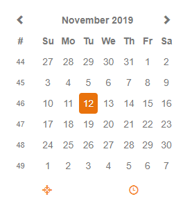
Date entry component with a user friendly date picker
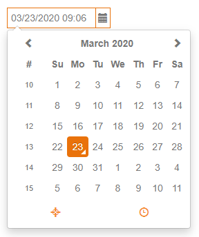
Date picker component
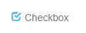
Simple checkbox component
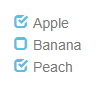
Choice group for either/or or multiple selections of predefined values
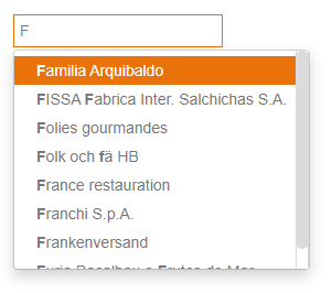
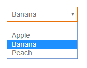
Value list driven drop down
A label that can show dynamic text and possibly an image.
Simple label showing a text
Value list driven drop down using the html 'select' tag, useful for mobile apps to keep the native look and feel
Value list driven drop down using the html 'datalist' tag, useful for mobile apps to keep the native look and feel
Shows another form inside a panel on a form
Show several forms inside a panel on a form
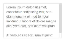
A multi-line text field
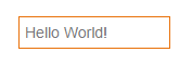
A text field
A text field with a valuelist, filtering out values matching user input