Gridlines
Utilities that overlay a grid to help visually aid the design process.
Apply to the body element to overlay across the whole page, or on individual elements to line up that element's content specifically.
The grid will be sized according to your base grid cell size. Each subdivision utility is based on a common denominator of the spacing fractions that are less than 1.
| Class | Preview |
|---|---|
| gridlines-dots |  |
| gridlines-unit | 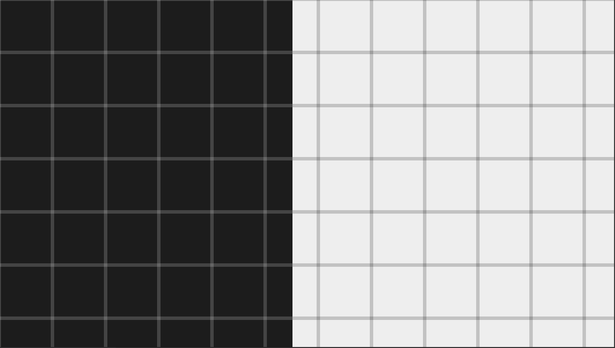 |
| gridlines-thirds | 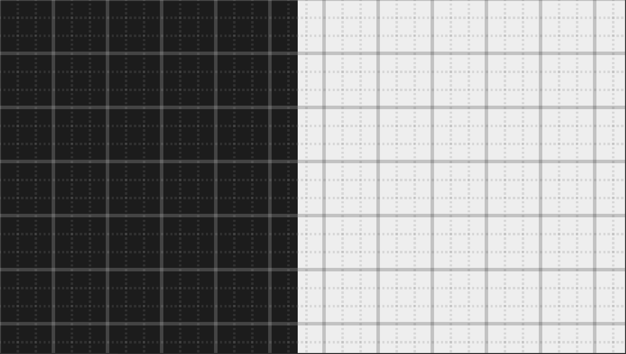 |
| gridlines-quads | 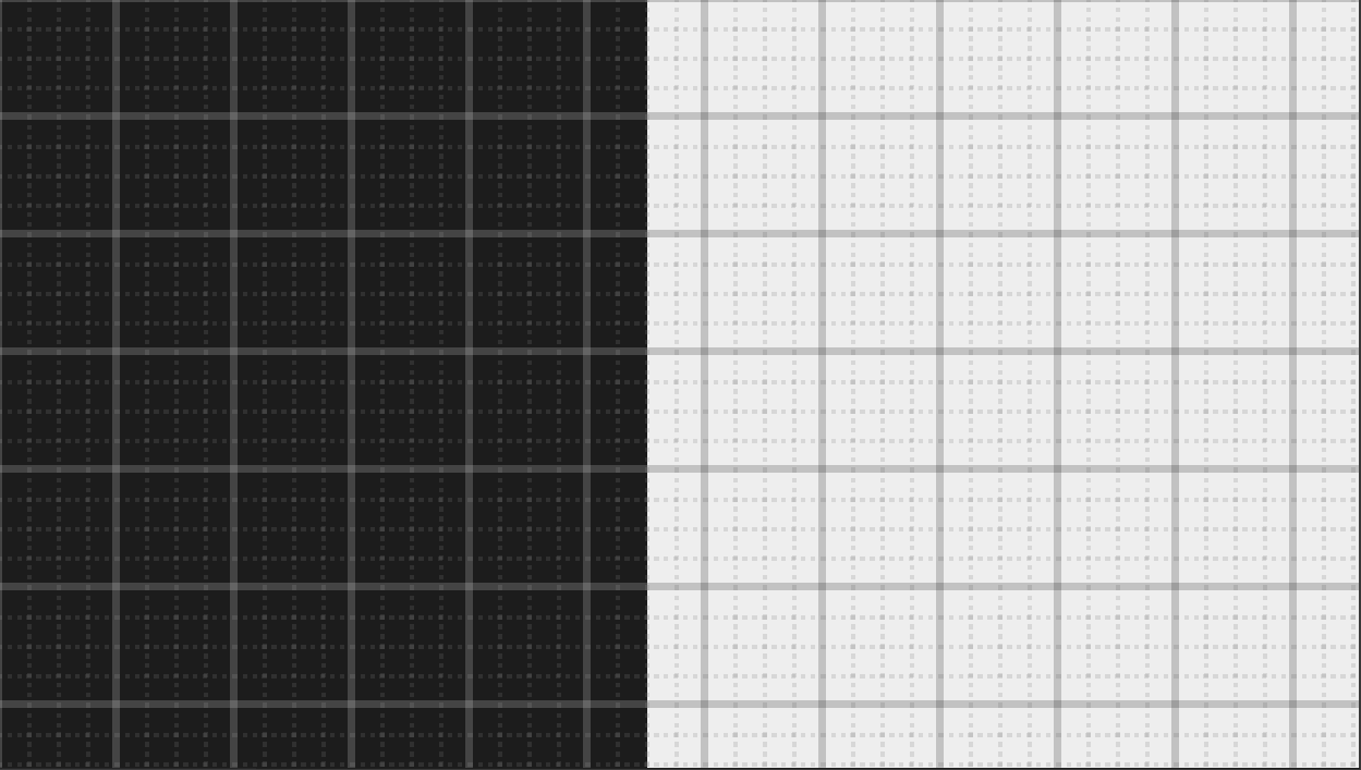 |
| gridlines-fifths | 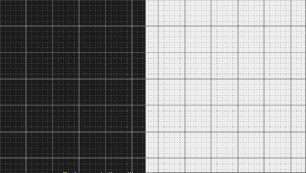 |
| gridlines-octs | 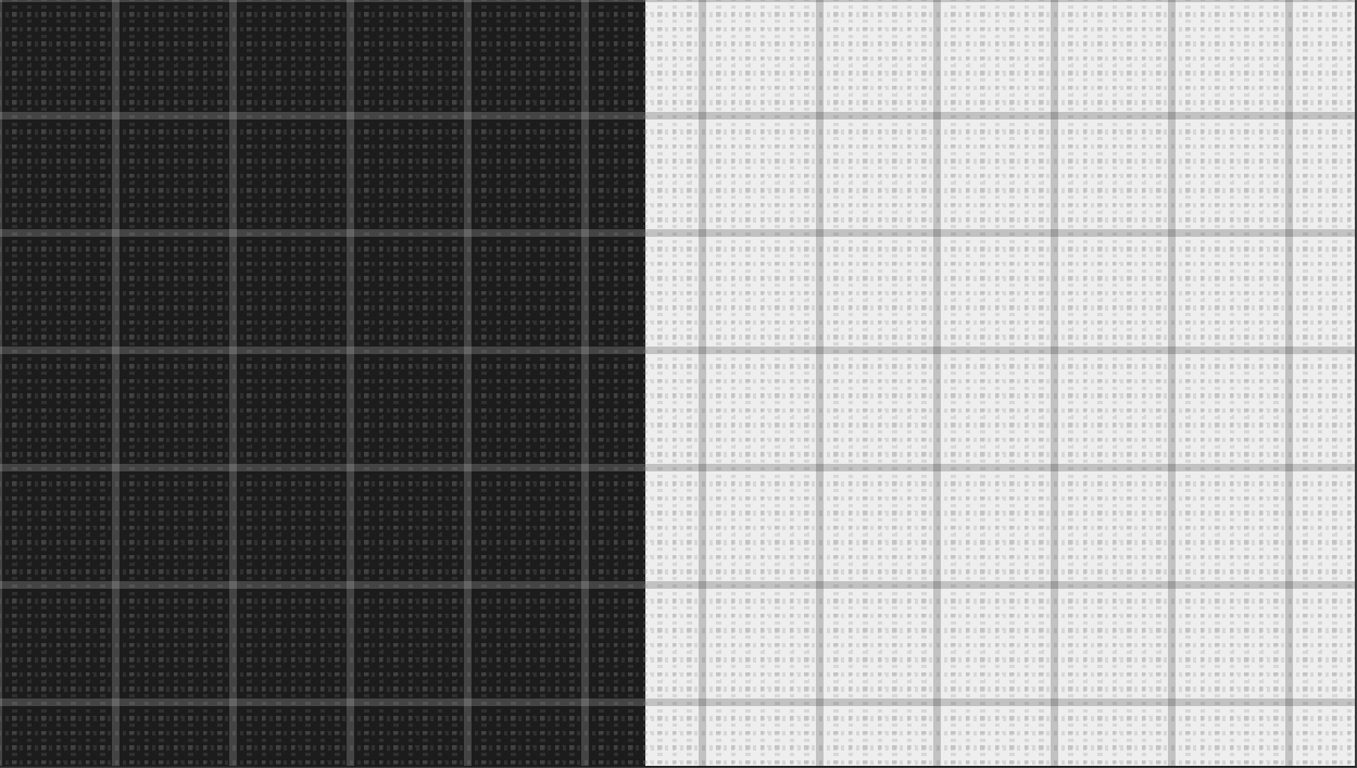 |
By default the grid's origin is positioned at the top left of the element it is applied on. These utilities help you position the gridlines if you are working with elements that have a different origin, such as a panel that is anchored to the right edge of the screen.
| Class | Value Applied To Gridlines |
|---|---|
| gridlines-top-left | background-position: top left; |
| gridlines-left | background-position: left; |
| gridlines-bottom-left | background-position: bottom left; |
| gridlines-center | background-position: center; |
| gridlines-top-right | background-position: top right; |
| gridlines-right | background-position: right; |
| gridlines-bottom-right | background-position: bottom right; |
The grid uses mix-blend-mode: difference; to make sure the rules are visible at different contrasts. You can customize the rule colors by editing the theme.gridlines value of your Tailwind config like so:
// tailwind.config.js

module.exports = {
  theme: {
    gridlines: {
      ruleColor: 'rgba(255,0,0, 0.5)', // Half-opaque red unit rules
      ruleSecondaryColor: 'rgba(255,0,0, 0.1)' // Almost-transparent red subdivision rules
    }
  },
  // ...
}This utility uses the ::after pseudo-element to overlay the grid and is therefore incompatible with any utility or CSS that also uses the pseudo-element.