Data taken from surveys was used to investigate as to whether the perceptions of schools by 1) Students, 2) Teachers, and 3) Parents appeared correlated to the academic success of students from that school (the metric for academic success being SAT scores).
We also investigated how these 3 groups of surveyed people differed in their perceptions. Relationships between SAT scores and a school's various demographic factors were also explored.
Data used in this project (including the data dictionary) was publically available and can be found here.
The four perception measures used are:
- Safety
- Engagement
- Communication
- Academics
We are also categorizing the survey respondents into 3 categories - 1) Students, 2) Teachers, and 3) Parents.
- Download the
2011 School Survey.zipfile found in the link above and add it to the R-Directory. - Open
NYCSchoolsPerception.Rmdin RStudio - Run all (Ctrl+Alt+R)
- Knit to HTML (Ctrl+Shift+K)
- Since we're primarily looking at the SAT performance, and only High School Students take the SATs, we filtered the Dataset to only show high school students.
- Due to the extremely large amount of columns in both datasets initially (over 1700), we reduced the number of columns to only 32 by including just the columns that had the information we needed on SAT scores, school info, and perceptions.
- We also merged both datasets after standardizing column names.
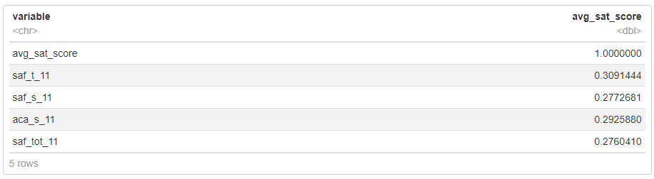
- To get an idea of which demographic and test score variables may be related to parent, teacher, and student perceptions of NYC school quality, a correlation matrix was used to look for notable correlations.
- Only correlation values above 0.25 or below -0.25 were looked at because these represent note-worthy positive or negative correlation values.
Scatter Plots were constructed to visualize the relationships of the 4 variables seen in the correlation matrix above with average SAT score.
To analyze how Students, Teachers, and Parents differed in their perceptions, the tibble was re-shaped using a key-value pair like so:

After the re-shaping, columns were renamed to more readily represent the respone type (i.e. which category of person it came from).
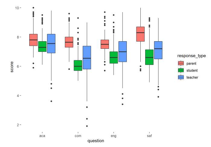
One trend consistently observed across all 4 variables is that parents have the most favorable perceptions, and students have the least favorable perceptions. For parents, the variable most strongly correlated with SAT scores is the category of “Safety and Respect”.
For students and teachers, the category best correlated with SAT scores is their perception of a school’s Academic prowess. This makes sense, as since students and teachers come from the school environment, they probably have more information on the academic standings as which school, thus they’re able to give more informed opinions when asked to score schools by their perception of said schools’ academic prowess.
In this part of the project, the same datasets were investigated. Python was used analyze and then draw relationships between the average SAT score of a school, and its various demographic factors.
-
First both datasets were cleaned so they could be merged on a unique column. This involved having to standardize the
dbncolumn, which required things like:- Lower-casing the column name
- Padding the number of digits in the column values so they were the same
-
Latitude and Longitude columns were also cleaned, since we were interested in physical locations. This entailed:
- Acquiring the column containing the latitude and longtitude, and splitting it appropriately.
- Using regex to derive the latitude and longitude, and assigning them to new columns.
- Converting the columns to the numeric type.
-
Filtered Datasets to include only students from grades 9-12, then combined both datasets on the
dbncolumn after it was standardized.
A correlation matrix between the average SAT score and other variables was constructed and visualized.
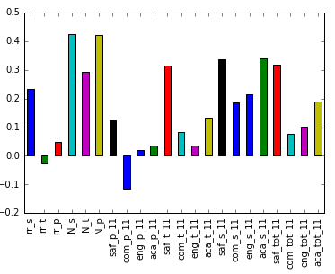
Perceptions of academic success by students and teachers both correlated well with SAT scores. Perceptions of Safety are also correlated with SAT scores by these two groups.
We constructed Scatter Plots to investigate the correlation with safety further:
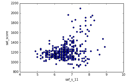
In general, there is a fair correlation with safety perceptions of students, and the average SAT score. This trend mostly holds true, except for 5 anomalous cases of schools with safety scores of more than 8, but average SAT scores of less than 1500. Note that all schools with average SAT scores of 1600 or more had a safety score of more than 6.5.
We then grouped safety scores by district, aggregating them by the mean safety score, and then visualized this on a map of NYC, using the mpl_toolkits.basemap library:
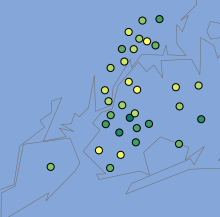
Green spots indicate lower safety scores, and yellow spots indicate higher safety scores.
From the map of NYC, it looks like Manhattan and the Bronx tend to have higher safety scores, whereas Brooklyn has lower safety scores.
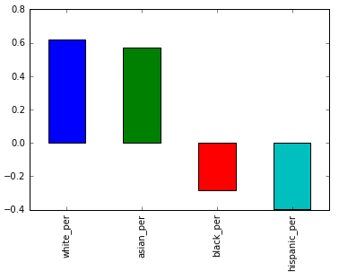
Schools with higher proportions of Asians and White students have higher SAT scores on average, whereas those with higher Black and Hispanic students perform more poorly. This is most likely correlated to socioeconomic factors that also happen to correlate to race. For instance, black and hispanic families tend to do less well financially.
Further Analysis was also done in the project on SAT score differences based on gender proportion, as well as the frequency of Advanced Placement exam taking rates.