


A calendar component which is highly customizable yet plug and play for most usual use cases.
- Why should I use this?
- I want to give it a try!
- Get Started
- Usage
- Component Props
- TypeScript Support
- Contribute
- Roadmap
- Maintainers
- ✅ Get things done quickly with
singleSelectionandrangeSelectionmodes - 🎨 Or do your own thing with
custommode and get creative - 📅 Calendar events? We've got you covered
- 📱 Responsive and mobile first
- 🔥 Continuously updated
- ✅ Layout built with the flexible CSS Grid
- ⏰ Built on top of the modern and lightweight Luxon
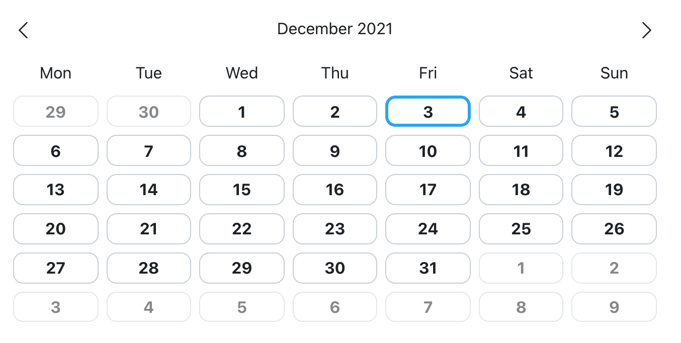
You can check out the demo here.
Install the package
$ npm i wink-react-calendar
or
$ yarn add wink-react-calendar
- Import the css module
import 'wink-react-calendar/dist/css/style.css';
- Import and use the component
import { CalendarMonth } from 'wink-react-calendar';

...

const [date, setDate] = useState();

...

<CalendarMonth
  mode='singleSelection'
  selectedDate={date}
  onCellClick={setDate}
/>
CalendarMonth
| Name | Type | Default | Description |
|---|---|---|---|
| mode | 'singleSelection' | 'rangeSelection' | 'custom' | undefined | Define the mode of the calendar |
| currentMonth | Timestamp | Current month | Current month visualized on the calendar |
| className | string | undefined | Custom class for the outer container |
| weekDaysExceptions | WeekDay[] | [] | Weekdays to exclude from being rendered |
| cellsConfig | BaseCalendarMonthCellConfig[] | [] | Custom config for any cell based on date |
| minDate | Timestamp | undefined | Disable any cell which date is before this param |
| maxDate | Timestamp | undefined | Disable any cell which date is after this param |
| weeks | number | 6 | Number of weeks to be rendered at the same time |
| opaqueExtraMonthCells | boolean | true | Render cells which date doesn't belong to current month with a opaque style |
| borderCurrentDay | boolean | true | Render current day with a bordered style |
| navigateToCorrespondingMonth | boolean | true | Navigate to the corresponding month of a cell which date doesn't belong to current month |
| showWeekDaysLabels | boolean | true | Show weekdays labels on top |
| height | string | number | '100%' | Height of the calendar |
| width | string | number | '100%' | Width of the calendar |
| showExtraMonthCells | boolean | true | Render or not cells which date doesn't belong to current month |
| events | CalendarEvent[] | [] | Events to be shown inside of the calendar cells |
| selectedDate | Timestamp | undefined | (singleSelection mode only) The current selected day which by default is shown with an active style |
| startDate | Timestamp | undefined | (rangeSelection mode only) Starting date of the range |
| endDate | Timestamp | undefined | (rangeSelection mode only) Ending date of the range |
| cellComponent | (props: CalendarMonthCellProps) => JSX.Element | CalendarMonthCell | Component for the cell of a day |
| onCellClick | (date: Timestamp) => void | undefined | Triggered when a cell is clicked |
| onMonthChange | (date: Timestamp) => void | undefined | Triggered when the current month is changed |
| onSelectStartDate | (date?: Timestamp) => void | undefined | (rangeSelection mode only) Triggered when first date is selected |
| onSelectEndDate | (date?: Timestamp) => void | undefined | (rangeSelection mode only) Triggered when second date is selected |
| onCellMouseEnter | (date: Timestamp) => void | undefined | Triggered when a cell is hovered |
| onCellMouseLeave | (date: Timestamp) => void | undefined | Triggered when a cell is no longer hovered |
The package comes with types included.
Contributions are very welcome. Not all PRs may be merged but please don't take it personally!
-
Fork and clone the repository
-
Install package dependencies
npm install -
Build on file changes
npm run watch:scssand on another terminal
npm run watch:tsc -
Or build once
npm run build
- Add instructions in the README on how to build and run this package for contributors.
- Separate CSS in two separate modules:
- Unstyled which contains layout only CSS. Developer may only import this to style in their own way.
- Styled which contains CSS that provides developers a ready-to-use styled calendar.
- Make sure that all elements have a (good) classname set to them so that developers can easily style them through CSS.
- Make a documentation on all those classnames.
- Optionally style differently weekend days.
- Add picker of months, years, (decades?) accessible through the header.
- We could provide style customization through SASS similiar to what Bootstrap does.