Full Site Editing: Add new sidebar for navigating between templates, posts, and pages without leaving the editor #23939
Comments
I think navigating to a template can get confusing. The idea is to navigate to a page that uses the template you want to edit. |
|
Transitioning a user to other pages/posts/templates/template parts/etc without having to exit the Editor is important in context to FSE, so thanks for exploring this! 😍 I'd like to see the flow for switching between a Page and a Post or Template in more detail here. I think you had some mockups that provided a higher level that displayed "Pages, Posts, Templates, and Template Parts"? I do like the idea of "Recently updated" pages and posts instead of a full list of All pages. I can search in place, so that solves the problem for pages I don't see but know I have. If I want to "browse" all pages, I can then go back to the wp-admin and navigate to the Pages list view. This would apply to any Page, Post, Template, or Template Part, I would imagine. A couple things to look into:
|
At least in the context of the site editor, wouldn't navigating to any page/post display that page/post in the context of its template? |
|
Love the page preview! A couple of thoughts on searching: do you think it needs to be this prominent? It adds some visual noise, and is probably most useful for sites with looooots of pages. I imagine that is an exception more than the norm. Could something like this streamline things a bit? Or, might we do something intelligent like auto-reveal the search input when there are more than X pages at the site? Speaking of looooots of pages - would they lazy load ad infinitum as you scroll the sidepanel? +1 from me on ordering by the most recently updated content. Thinking about this pattern scaling up to other CPTs, keeping posts/pages separate might be better - if everything gets combined in a single list it may become awkward to navigate. |
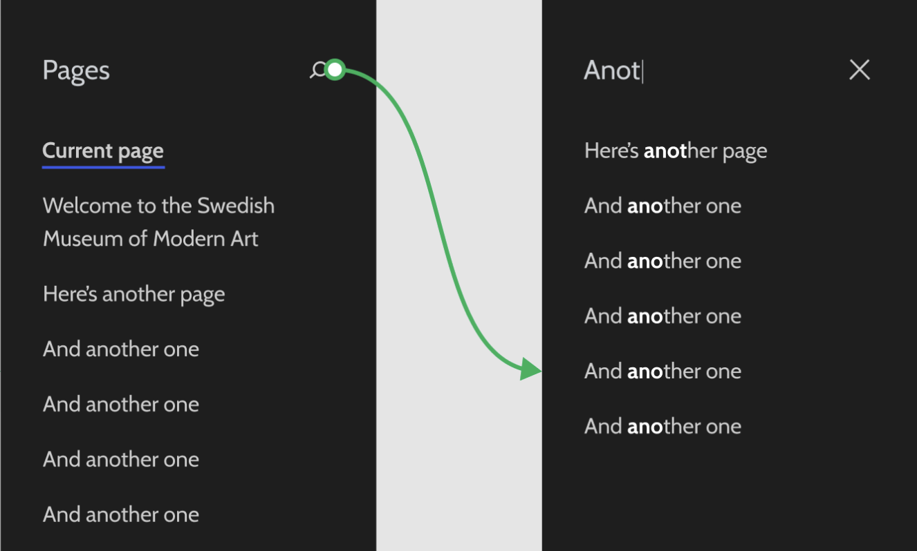
No, it probably doesn't. Here's a variation that reduces the search down to an icon which can be pressed to show the search input:
I had avoided this originally as I wanted to match the style of the editor's Library search, where the search icon is placed on the right:
-- The WordPress logo was recently replaced in
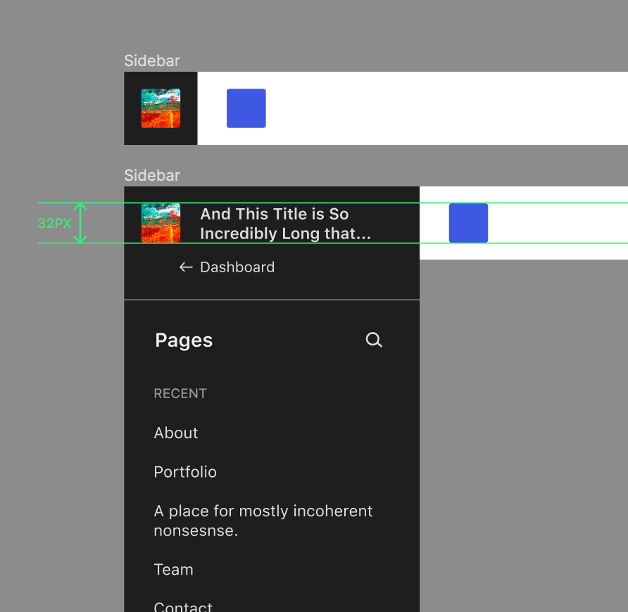
The site title can adjust depending on the length, with hopes of avoiding wrapping to move than a few lines and disturbing the layout below it:
|


Are you referring to the font-size? Or just the positioning? I think truncating it after so many characters, as you have it, works well. I think the back arrow is a bit too far from the "Dashboard" text. Have you tried aligning it to the right side of the site icon? Auto-revealing the search looks great! The white input field is pretty bold here though. Any reason you veered from the more subtle search field? |
|
@shaunandrews This is ace! I love the page previews! After chatting with @ItsJonQ a bit, I'm wondering about the "Add new page" flow and how it works with the sidebar. If I added a new page, would the new blank page be reflected somewhere in the sidebar to indicate the page I'm on? I also think we could show "All pages" below the Drafts list. |
|
Search looks great! :) +1 on two-line wrapping & truncation. With the addition of the site icon, ~40 characters seems adequate to communicate the site title. I was curious to see how this would look with the text and color styles from the new figma library applied, and everything aligned to a 4px scale. There were some nice little harmonic wins, particularly around the site icon / title and the block inserter button in the top bar: Figma link here in case this is at all useful. I also autolayout'd the whole thing for easy adjustment. |
|
Thank you for the discussion so far. It seems it's diving into a lot of the difficult and good questions that can help us having a richer sidebar. I'd like to split a bit the conversation between the visual solution, and the content we want there, hoping that it makes sense in approaching this. Trying to summarize the why of the current content items being discussed, trying a more information architecture angle here:
These three elements I thing that could be modulated to a good extent in our explorations: "Recents" could be just the currently edited item, or a list of items limited to the last 3 this user has opened, or even the last 3 published. Drafts similarly could be limited, or full. We could also consider mixing Recent and Drafts. I personally thing a simpler approach would be ideal to start with, but I also see how some of the other solutions if solved well for the various cases could work equally well. — Two things to note:
— One of the problems we hit is "how do we highlight the currently open document, if it's both in recents and drafts"?
Here's a quick mock of the three:
I've a preference, but I'd like to throw the options out first as it's easier to evaluate also against the things we decide that for sure won't work. — The mocks above also include a couple of visual suggestions for he discussion:
A couple of accessibility notes:
|

|
I created proposal Figma components for the elements required in this design here. |
|
Very cool seeing this progress. @folletto In your most recent mockup, #2 feels like the clearest solution to me. Or rather, the "Currently editing" section feels clear. I believe the two most used actions on this view will be search and new post. Perhaps search should be focused as soon as this panel is open? Is there a more prominent location for "new post"? |
|
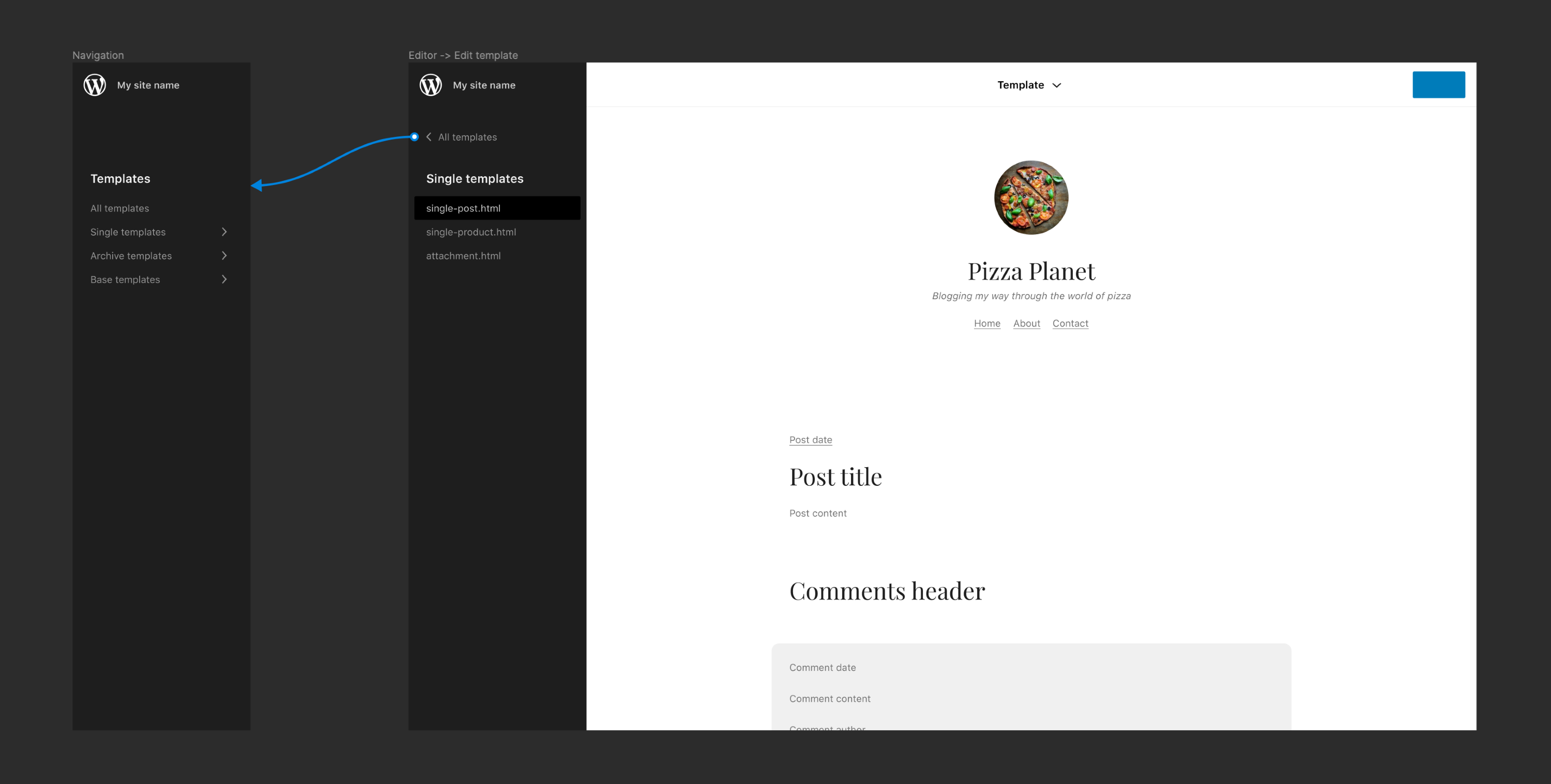
How would this look for templates and template parts? |
On a basic level the W button could reveal a list of templates comprised of the one currently being edited, and any adjacent templates. There is likely scope to represent templates more visually here. Maybe something like: |
|
Let's get the templates part asap so we can decouple it from the editor header. |
|
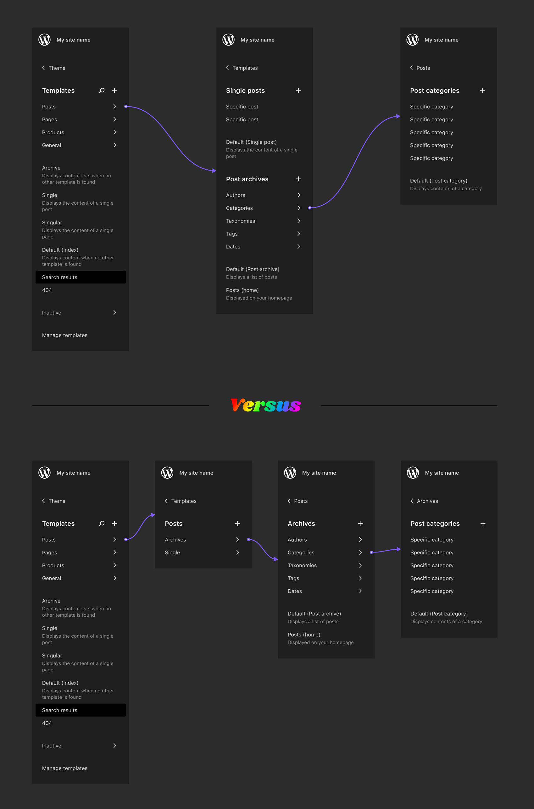
I wonder about using the nested pattern for the template list. I think we could maybe use a single list and group the templates with some headings. I'd expect many sites/themes will have a select few standard templates, but the list could still grow to include groupings for archives and plugins:
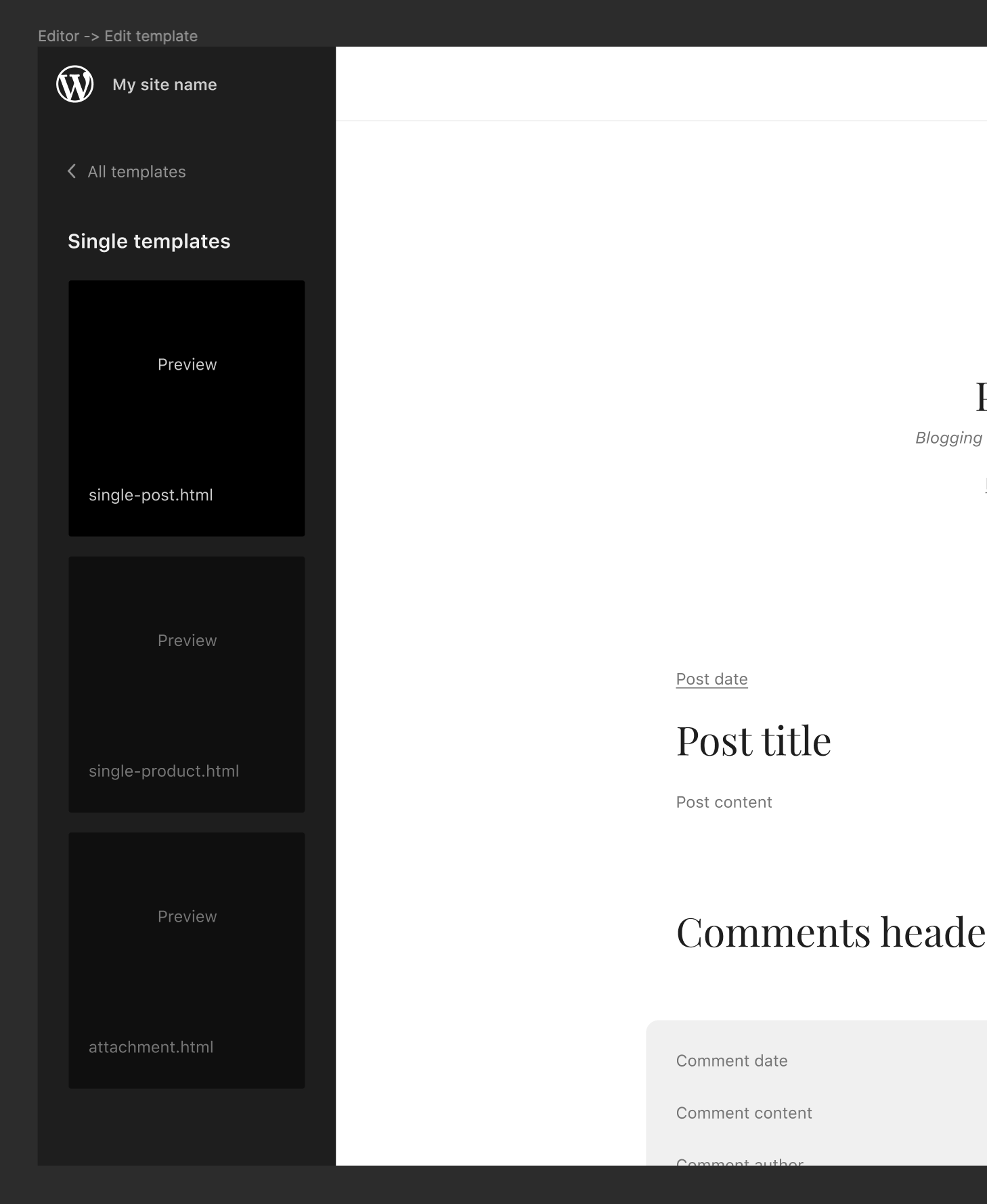
Like blocks, I wonder if we could show an preview when hovering:
|


The current template selector has this, so we should just migrate it.
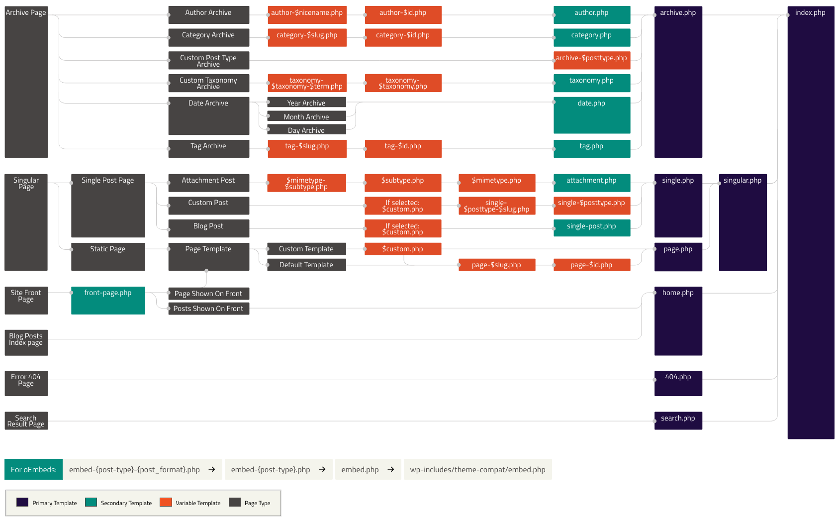
Grouping could make sense, but we should lean on the theme hierarchy groupings — "Archive Page", "Singular Page" etc — and reflect it a bit better if possible. |
Agreed on this. It probably goes without saying that this grouping should align with whatever design we come up with for the "mosaic" template view. At the highest level, Archive and Single templates make sense. I was thinking of a generic "Base" (or similar name) group as well for things like the index template, 404, and search results. These groupings will be very useful in the create-custom-template flow as they provide some context when selecting what content the new template can be applied to. We can consider using things like post types and taxonomies for more hierarchy. Quick example;
Clearly this gets quite nebulous, but if the levels are only exposed as/when more specific (likely user-created) templates are added, I think it might be ok. One drawback with displaying all templates in a single list is that the list could be very long and subsequently difficult to navigate, especially on mobile. There's a balance to be struck that serves both simple and complex sites equally well. A search input might be a helpful addition. |
|
Agreed, also considering a site could conceivably have 100s of templates for specific categories and such. Search and maybe pagination are going to be necessary. Otherwise it might be reasonable to direct people to the regular list views to manage all templates. |
|
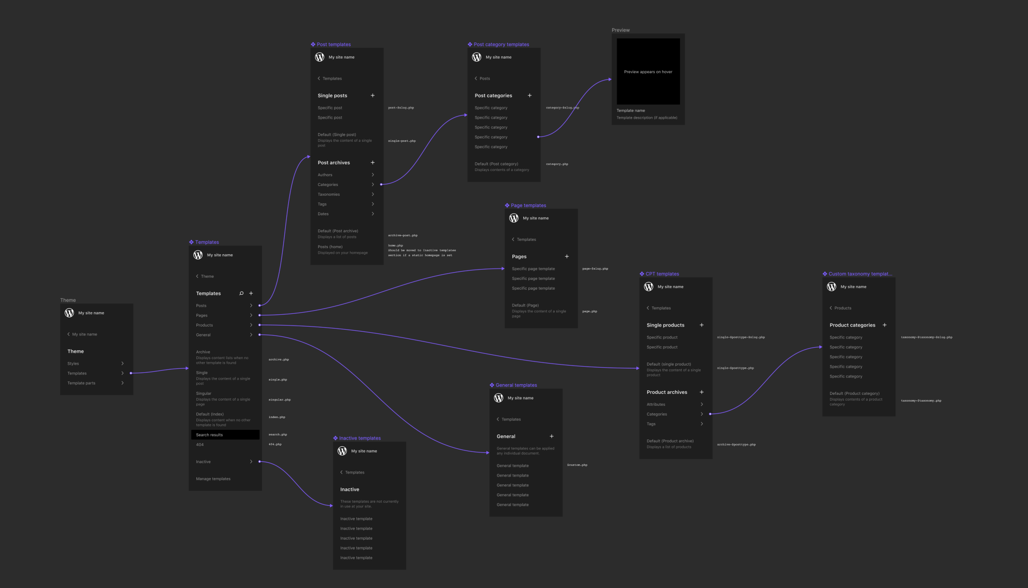
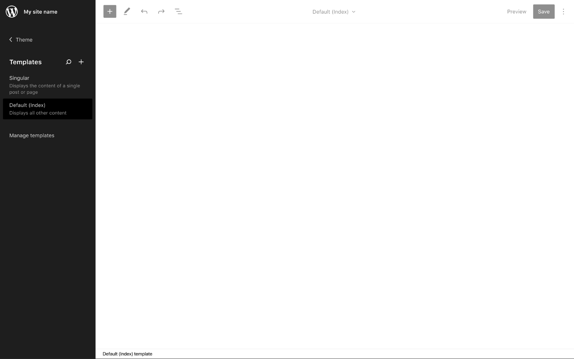
I've been exploring how we can offer Site Editor template navigation using the drilldown pattern discussed in this issue. To dive right in at the deep end, here's a gif illustrating how I might navigate from editing my search results template to my post category template on a complex web site with lots of templates: This gif briefly demonstrates the inherent complexities of the WP template hierarchy, and illustrates why the scalability of the drilldown pattern can be so valuable. For a more detailed inspection, here's how I think the information architecture can be arranged: While this appears rather intense, I'm optimistic that looking at it through the eyes of an administrator whose site contains (potentially) hundreds of different templates, it will feel intuitive – or at the very least quick to learn. Simulating that context is challenging though, so there is undoubtedly room for optimisation. One element that I'm not 100% sold on is the positioning of base templates. Things like Single, Singular, Index, are unique in the sense that they can be applied to any post type. So they could potentially be grouped into their own section adjacent to the post type sections in order to clean up the root template view. Then again, these templates are likely to feature prominently on simpler web sites, so having them in the root view presents a lot of value. Another thing I've gone back and forth on is whether single and archive templates should be displayed concurrently when drilling down in to a post type section (as above). An alternative would be to split them into separate additional drilldowns: This one feels like a case of clarity versus clicks. However we decide to optimise these nuances, I think we can simplify the overall experience significantly by applying the following two principles to the UI: Hide empty sectionsIf you don't have any templates specific to the "Post" post type on your site then the "Posts" section should not appear. De-emphasise unused templatesIf – for example – you had Page, Single, and Singular templates at your site, that Singular template would never actually be resolved to display any documents. The Page template would resolve for pages, and the Single template for all other post types. In a case like this it seems unlikely that you'd want to actively edit the Singular template, so we can de-emphasise it by moving it to an "Inactive" section. I did consider removing unused templates altogether, but there might be situations (IE installing a plugin, or registering a new CPT) that can cause inactive templates to become active again. Having the templates accessible but de-emphasised plants the seed that they exist, and might help explain why they suddenly appear more prominently in template navigation when one of the aforementioned situations occur. The concept of determining whether a template is in use or not is also powerful because it allows us to provide more contextual descriptions for some of WordPress' more ambiguous templates. Putting it all togetherWhen these principles combine, the complexity of the WP template hierarchy can be simplified dramatically, and visually displayed in an intuitive way. As a very simple demo, here are the templates you would see if you had a fresh WP install with a block theme like Seedlet activated: Just two templates, with clear descriptions of where / when they are used. All wrapped up in a UI that will scale to infinity and beyond as you add more custom templates. You'll notice that there are affordances for searching and adding templates here as well (the search and + icons, respectively). Searching templates would function the same way as post searching (see examples elsewhere in this issue). Adding custom templates is a little more complex, and something I have ideas for, but would prefer to leave off the table in the context of this particular issue. |
|
There is a lot of very cool work going on here exploring how we can use the left sidebar menu. The left WP sidebar is so very much ingrained in us that it contains the default wp admin menu sections. Adding associated pages/posts can work well, but adding something entirely different (foreign to the left WP sidebar), creates a totally new UX method. I am not sure we should go there. As the wp admin sidebar menu will very likely at some point be adjusted. An existing Gutenberg UI pattern. Going back to what James shared above. Awesome work, James! As I mentioned using the WP left sidebar in this way is pretty foreign. It would not be consistent with how Gutenberg works today. So instead of opening the WP left sidebar one could open the right settings to show various information associated with templates. Bottom line as I see it is move the template information from the left sidebar to the right settings sidebar and keep the consistency with Gutenberg UI. Btw one could click the Search results seen in the middle top bar and automatically have the right settings open to show the various panel options. One could also adjust the right sidebar settings to better fit in with how one wants to present template options. |
Just for transparency, I'll share here what I mentioned to you on Slack. The "information" in the left sidebar as presented in this concept is navigational – it is not settings. It provides an affordance to quickly move from editing one template to another (or one post to another, as in the designs further up in the issue). Such a navigational component does not currently exist in the editor, which is why this new design (and location) is warranted. Edit to clarify: I do not think that choosing which template to apply to a document should happen in the navigational (left) sidebar. That should be handled elsewhere. I think this may have been a source of confusion here :) |
|
The "drilldown" pattern looks a whole lot like the Customizer slide-in/slide-out sidebars, which have been criticized by the accessibility team for being very poor for accessibility/usability. Pinging @afercia to check this out. |
|
This pattern performed exceptionally well in the last round of usability testing we performed for WooCommerce navigation. I'm excited to explore ways that we might address any accessibility issues. |
|
One thing I my above comment I did forget to say is the background color contrast between other areas that have a white background and the left sidebar that uses a black background. As one then moves between interacting with a black/white backgrounds. It becomes a huge shift of colors. |
|
@paaljoachim that is intentional, and seeks to illustrate that the function of this feature is different to everything else on the screen. Light background = editing |
|
I'd +1 the current choice of both color contrast and positioning, as both contribute to reinforcing the IA of the page. The color recalls the same color contrast and function of WP Admin, where the sidebar is high-contrast compared to the rest. So it both creates an echo of "same structure - same functionality" across the two screens, and helps separating the function as well as making it more familiar. The positioning also reinforces the information hierarchy: as it's navigation, that section of the page drives what's loaded inside the editor (WP Admin → Posts → individual post → edit). Placing it somewhere "inside" the page would instead break the structure of the content that is being presented. |
|
@ZebulanStanphill thanks for the ping.
That's correct.
@jameskoster I'm sorry but I'm not sure I understand how this kind of user testing can help in a project like WordPress that aims to be accessible. I'm saying this because I'm pretty sure the testing sessions that performed "exceptionally well" didn't include any user of assistive technology or with accessibility needs, correct? If so, stating that it performed well is certainly true for the specific group of users you involved in the testing sessions. Unfortunately, this doesn't prove the pattern is usable and performs well tor alll users. Also, as far as I see, this so called "drilldown" pattern is basically what the Customizer already uses. The accessibility team received for years a lot of complaints about it being a terrible experience for assistive technology users so I'm pretty skeptical about keeping using this pattern, as we have direct feedback that it's inherently hard or impossible to use for some users Worth also noting that the accessibility team is discussing the general sidebars pattern as the team is not convinced that sidebars, even the "non-drilldown" ones, are an ideal pattern to use for an accessible interface. See for example #24975. I'd also like to point out that referring to data that come from user testing sessions performed from a private company to support a design choice is a bit unfair in the context of an open source project like WordPress, unless this data are made publicly available. Only public data can help all the WordPress contributors to make a judgment on the testing methodology and thus make better informed decisions.
There is no accessible design pattern to represent this "drilldown" sidebar. That is: there's no corresponding ARIA widget or any expected semantics and interaction patterns that can be used for such a sidebar. Very roughly, there are two big options to build accessible interfaces: either use native HTML, standard interactions, ARIA design patterns etc. or build a custom implementation trying to make it accessible. The latter option would require extensive, thorough, testing with users with accessibility needs, which is something costly and very time-consuming. WordPress doesn't even have a way to involve large groups of users with accessibility needs and perform testing sessions in a professional way. Overall, I do think that instead of this "drilldown" pattern, we should strive to keep things as simple as possible and radically change the design approach here. |
@jameskoster I've been pondering about it and its implications, and if it makes more sense to keep empty sections visible anyway. There are readability trade-offs with both cases, but I'm trying to look at it from the point of view of a user unfamiliar with the WP template hierarchy. Hiding all empty sections means that the initial state will be relatively empty, with just a handful of templates (depending on the theme, of course), making the sidebar perfectly readable. By showing the whole hierarchy, instead, we would overload the user with informations from the get go. I understand that navigating through empty menus is not a great UX and could be annoying, but IMHO it might be a straightforward way to teach users about the template hierarchy. |
Good question! :) The answer very much depends on the scenario. I happen to think it will be common to enter the template creation experience from the edit screen of the thing you want to create a new template for. So for your example a user might go to Posts > Categories > Uncategorized and click a "New template" (or similar) button. In this case the context is predetermined and we can drop folks directly in the Site Editor and display the appropriate content. On save the new section(s) appear in the template sidebar as intended. Of course that won't always be the case though, and we'll also need a discrete "from scratch" flow for scope selection when creating a new template. I anticipate that flow would be initiated when you click the Perhaps we could add an option (more likely a filter) to reveal empty template sections and inactive templates. But on balance I think hiding by default creates a better initial UX. Much like how operating systems hide system files by default. Templates are a complex concept, anything we can do to simplify that initial touch feels like a win to me. The designs for the "from scratch" scope selection when creating new templates are TBD.
I'm hopeful that new sections appearing upon creation of templates will work well in illustrating the template hierarchy. |
|
The initial PRs for removing template and page selector dropdowns and porting that functionality into sidebar have been merged. I think we can close this issue and start opening more specific ones for further improvements to the current functionality, starting with unaddressed items from the discussion above. |
It would be nice to make it easier to jump between templates, pages, and posts without having to leave the editor. This issue looks to propose a new sidebar, triggered by the W icon, which lists these items and allows you to open them in the editor. Here's a quick mockup for how it could look/work for editing your site's pages:
Essentially, this would remove the need for this current dropdown:
The above GIF shows a hierarchical list of pages when editing a page. But it might be more useful to access recent pages and posts, rather than a full list.
This could adapt to include templates as well, highlighting recently used templates.
The text was updated successfully, but these errors were encountered: