Rethinking the "Current Document" display and settings #20877
Comments
 mtias
added
General Interface
mtias
added
General Interface
|
I really dig this! Would this be an area to edit the title too, or is that still managed within the canvas? (I think that makes the most sense especially with the move toward FSE) |
|
Here some other iterations. In order to avoid too many focal points in the top bar with too many arrow-down here a couple of options. Also related to top toolbar mode: 20592 |

|
I assume that, if this were to happen, the "Top toolbar" mode would change so that the block toolbar is placed underneath the document toolbar? I'd be okay with that change, but I don't know about everyone else. Either way, I agree that it makes sense to put the template and post title in the header, and provide a more obvious place to edit the title/permalink without the current fake block that the post editor uses. One question I have is whether it makes sense from an accessibility perspective to put the title in the middle of a toolbar like this. Also, with regard to chevron arrows, I thought we were moving away from those on toolbar controls with dropdowns anyway, so perhaps neither the title nor the Preview button should have a chevron. |
Both! I think it should be possible to rename a post / page / cpt from the header title but also form any in canvas block if it's present. It should synchronize in real time anyways. The chevrons in the header controls are still a bit undefined (as seen in the "preview" having and not having it). I think we'll coalesce into something a bit more consistent once we get a better feeling for it. @pablohoneyhoney I like the dot better, I think, but I'm missing some difference between the template and the post. At first glance it can misguide me to think I'm looking at a post titled "Single Musings on Philosophy". |
|
Maybe a colon would work best, e.g. "Single post: Hello world!" |
|
Perhaps it would be best to put the template and post dropdowns/buttons on the left, rather than the center? From an accessibility standpoint, it's a bit weird to have them in the middle of the top toolbar, isn't it? |
|
@ZebulanStanphill makes a valid point, but I think it doesn't go far enough. The average user doesn't know and doesn't care what template is being edited. And they shouldn't have to. Only developers care about this. The average user spends 1000x more time in the post editor than a developer. This is all gibberish to 99.99% of your user base: Would it be nice to know what template is being used? Sure, for a developer. It doesn't need to be displayed by default though. It's simply not meaningful information to the average user. |

|
To clarify, this concept is not being proposed for the regular post editor but in the new site editing views (full-site editing project), where the template is the primary source being edited. |
Thanks - this was not clear and is confusing to have lumped in with the block editor, which is seen as a post editor. This was all I could find on it: https://wptavern.com/gutenberg-team-explores-the-future-of-full-site-editing-with-new-prototype Please release this as a separate project/plugin, rather than lumping it in with the post block editor. I can speak for 99% of our user base when I say that they're sick of BETA-level features with inadequate public testing being pushed on them. The vast majority of your users (non developers) value stability and polished products over a new-way-of-doing-old-things that are constantly changing/breaking. We're all-in on the FSE, but it needs to be handled better than the post block editor was. We created test pages with the blocks a month after the block editor was officially released, and half of the blocks were broken within 6-9 months. For users writing 2 posts per week, this is completely unacceptable. Having to go back and re-edit 12-20 posts every 6 months is a huge issue. We have thousands of users and the anxiety they have about this is palpable - you have millions. For example, if there are settings and filters already existing in Wordpress, please integrate them better: #8663 If there's anything we can do to help this, please let me know at skylar@ username dot com |
|
This might be too much, but what it we used the wp-admin toolbar for this Current Document information:
|

|
It is certainly too much. From a functional standpoint, it doesn't belong to that global element, pulling an editing tool out of its editing context. |
|
I worry about adding more stuff to the already overcrowded top bar, especially considering viewports less than 1,200 pixel wide. What if we added the template to the bottom bar's Breadcrumbs, and replaced the "Document" breadcrumb with the post title:
|

|
@shaunandrews I really like this latest mock for a few reasons:
I might suggest changing the actions of the Post/page title to be focused on changing the page/post. What do you think? |
|
I do worry about adding more stuff to the top bar as well. However in this case it does feel like the right "ux" for it. I was part of the genesis of the footer/breadcrumbs. And although I've learned to use them and find them a good way to navigate parent blocks, it does not seem like people notice the footer at all. Given how important an interface it is, we may have to accept that as a failed experiment. |
|
In a 1080px viewport with a slightly long post title, the top bar gets really crowded and unbalanced:
|

|
I actually think that works reasonably well especially if you elide the text slightly earlier and add some more spacing. For context, you are stressing the area quite a bit — as you should! — by showing a screenshot of a 1080px wide image. And yes, in that case we have to elide the text — and perhaps clicking it to change the title opens a dialog rather than letting it be edited inline. Figma leverages a similar pattern, and if we size that to the same dimensions, you quickly enter the same territory. It's fine with short titles, which are probably the case most of the time:
But it starts to fall apart with longer titles:
In this case, Figma should have elided the text way earlier. But I think it works! |


|
From an SEO perspective, people should use long-tail search phrases for titles. Search engine traffic is what brings sales to ecommerce stores, and traffic to ad-supported blogs. "Homemade Cauliflower Pizza Crust Recipe" is a 100% valid title. "The Top 10 Places to See in Vienna in the Fall" is a 100% valid title. Long titles are a normal thing and should be encouraged. There should be space for at minimum 50-60 characters. |
Nobody's saying we should limit title length. But just because a title is 60 characters long doesn't mean we need to show all 60 characters in the UI when you're not editing the title.
Verging a bit off-topic here, I think part of the reason the footer goes unnoticed is because it is so small, and it only has one limited use-case: selecting a parent block. You can't even use it to select a child or sibling of the current block. I think the next best hope for improving nested block interactions is probably the Block Navigation interface. I think that could be beefed up significantly; Divi's Layers View is a good example of what that interface could become. |
|
@MichaelArestad Do you know if we have art for the final design direction (was it a truncated version of the topbar direction)? Also, what other Issues need to land first before this can be moved forward? |
|
@joanrho I would suggest that the mockups Matías made in the initial post, or the refinements Shaun made in #20877 (comment) are both ready to move to a PR state. There's no better way to figure out whether perceived notions of screen width is actually a problem or not, than testing in a PR. |
|
@joanrho I agree with @jasmussen. In my latest attempt at an end to end prototype, I used one of Shaun's designs. It looks like this in context:
And here's the link to the prototype to try it out. |

 MichaelArestad
added
Needs Dev
MichaelArestad
added
Needs Dev
|
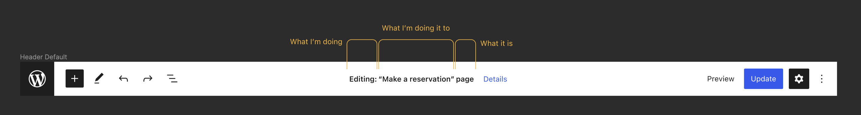
I've been toiling over this for a little while now (Actually, more than a little while; Probably way too long.) as I want to provide a path forward that accounts for the accessibility concerns while making progress towards full site editing. The biggest hurdle with my previous design above is that the label of the button is representing a value rather than an understandable action. As discussed here (and elsewhere) adding an -- After way to many design explorations, I may have found a (incredibly obvious in hindsight) solution; We separate the document title from the button. Here's a GIF that shows how that could work in the context of editing a page:
The document title becomes a normal text label with no interactions; Next to it is an arrow for the document details dropdown, which allows you to edit the document's title and permalink along with changing the document's template. -- When editing a template directly the dropdown would adjust as needed. The biggest change is related to the editable values; Theme provided templates can't be renamed and don't have a permalink. We can use the details as a way to provide a description of the template, along with some actions like duplicating, exporting, or trashing. When selecting a template part, the document title updates to reference the template part and the document details menu goes away. Here's a GIF that shows how that could work:
|


|
If the button is only going to be an icon (which already is not ideal), it should be an icon that more clearly conveys the action. A chevron is definitely not the right one. We're already using that in too many unrelated ways:
A pencil icon would better convey the idea of "editing". Of course, that might be a bit confusing since the Tools/Modes on the left also happen to use a pencil icon to represent the "Edit mode/tool". But I'd argue that the Tools/Modes dropdown toggle shouldn't even look the way it does right now, because right now it has the same problem that the earlier mockups of this "title editing" UI had: it's incorrectly using state as a label. So if we can fix the Tools/Modes button to use a better label, we can make this UI work better. Also, the idea of removing the document details button when a template part is selected doesn't sound right to me. The user can access the top toolbar at anytime via a keyboard shortcut, and to have the template/document settings there sometimes but not all the time is confusing for sighted users and even more confusing for screen reader users. |
The chevron is used in many places as an affordance to indicate a dropdown. It seems to fit well here. I can see an argument for the accordions using a different icon, but I don't think the movers are a problem; They are visually represented as two related shapes: up and down next to each other.
This is an indicator and reminder that, while editing a template part, you're not editing the root document. |
Currently, almost every button that opens a dropdown doesn't use a chevron. The only things that do are the "More formatting tools" button and The former seems to only use a chevron because it wants to avoid having two ellipsis icons next to each other. And that itself just speaks to the issues with using icons alone to visually label controls. (Perhaps a new icon that better describes "more formatting tools" should be introduced... perhaps an ellipsis with a fancy serif "T" in the corner?) The latter is a common UI convention, though perhaps a pencil icon might be more appropriate? Otherwise, I think we should consider changing the mover buttons to normal (tailed) arrows so that they don't use the same icon. A button ought to have some kind of clear visible label that is semantically attached to it. The chevron icon conveys very little info, and in fact, it may confuse the user into thinking it is a Thinking about it some more, what if we just made the "Template settings" button look/act similar to the "Document settings" button in #25353? Since the template part indicator is semantically unrelated to the "Template settings" button, why are we even showing them next to each other? In other words, I'm suggesting to move the "Template settings" button over to the right side of the top bar, but to keep the "currently selected thing" indicator where it is right now in your mockup. How does that sound?
If you alter the content of one of the template parts inside a template, then technically you are modifying the template, albeit indirectly. And in terms of showing/hiding the template controls, I think there should always be a button to access them, just like there's always button to access document settings in the post editor. (Albeit indirectly, due to it opening a sidebar that also includes unrelated block controls. But that's a separate a11y issue that I'm trying to help fix in #25353.) The top bar generally acts like a toolbar for the entire document. Therefore, conditionally hiding controls related to the entire document/template sounds like unexpected behavior to me. (Showing the block toolbar inside the top bar when the "Top toolbar" option is enabled is of course the exception here. But judging by the discussion in #20592, that option is likely to change in behavior to showing the block toolbar below the main top bar.) |
With which icon? The cog and ellipsis are already in use there. Anything else feels questionable. We'd essentially be moving from something that feels fairly intuitive, to something that is less intuitive but (debatably) more semantically correct. Is that a win? Seems somewhat subjective. For me, many of the problems you touch upon can essentially be summed up by saying the the iA of the top bar is sub-optimal, which on balance I would probably agree with. The lack of clear structure there is likely why these discussions keep occurring. But addressing those failings is way beyond the scope of this issue. So personally I would vote for getting this feature in using existing patterns (which Shaun's design achieves), and addressing the more widespread issues of the top bar separately. |
I'd totally agree on the first part. Not sure I agree on the second one as I don't think text / controls in the center of the toolbar are an "existing pattern". Maybe they're proposed in other designs for other features but they do not exist yet. That said, separating the text representing the edited object from the button is a good first step, thanks for that! However, I think there's room for further improvements. As usual, when it comes to accessibility there's the need to make a little effort and try to not think visually. Imagine you can't see and a software is reading the page content for you. At some point, the software reads out:
As a user, I wouldn't be sure what that "About" is meant to indicate. Sure, in some way I navigated to this view and selected the About page but what that text means? It's just text, not a heading or whatever and doesn't seem to communicate anything relevant. Instead, visually, that text does communicate something more relevant because it's visually prominent. T convey the same information to assistive technology users, there's the need to communicate the same importance also semantically by using better text and HTML. First of all, as a used, I'd like to have this information available as the very first thing in the main section of the page: before any toolbar or other controls. This text communicates the object currently being edited and in a logical flow I need to know what I'm editing before any other info. I do realize this would need a design change but I'd strongly recommend to think to a better information architecture that is not only visual. A good information architecture needs to be conveyed also and foremost in the HTML. Worth noting that there's an ongoing exploration to split the editor toolbar in two separate toolbars in #20592 and I'd like to suggest to consider that same pattern here, even if it would be used for different purposes. By having two toolbars, many of the problems related to information architecture, controls grouping, available space, etc. mentioned in this thread would have more chances to be solved. Back to our software that announces what's on the page. Looking at the last mockup, to my understanding the text and the button labels are "dynamic" depending on the edited object. So the software would announce, for example:
or
This would still be confusing for non-sighted users and potentially for other users (non-tech-savvy users, users with cognitive impairments, low vision, etc.). The first part of the text still doesn't tell what it is. The button label still doesn't communicate the available action (which is "Edit"). To communicate the missing info there's the need to use more meaningful text. Imagine again you can't see and a software is reading out the content of the page. As a used, I'd like to have answers to a few questions as first thing:
To translate this "conversation" in markup, I'd place these info as first things in the page:
As per the icon: there's a lot of space in the toolbar: why use an icon-only button in the first place? To me, the debate regarding the icon in this thread just proves one of the points the accessibility team always pointed out: icons don't have an universal meaning. Since they're also an accessibility anti-pattern, I'd recommend to just use plain text: a button with visible text "Edit details". |
 afercia
added
[Focus] Accessibility (a11y)
afercia
added
[Focus] Accessibility (a11y)
Oh, what's the cog being used for? I assume just the block inspector? If so, perhaps we should change the block inspector button to use a generic block icon or something like that. Using a cog to represent just the block inspector doesn't make much sense if the button is in the top bar, where controls aren't always related to blocks. (It would make more sense if it was in the block toolbar, but that's a bit of a bigger change to try and implement.) But as @afercia just pointed out, this really just boils down to icon labels being difficult to understand, so we ought to just use a text label for the Template settings button regardless of where we put it. |
Just to clarify, I was referring to the dropdown-from-a-chevron pattern. It's not perfect but it does exist, so we can use it now to close this issue, then address the separate issues that particular UI pattern presents all in one go, in a subsequent issue. As before, most of the other feedback really falls in to the territory of fixing foundational problems with the top bar iA. I am very keen to fix that as well, but not in this issue as it is a huge project. (Thanks for the link btw, I'm going to dive in to that now 🏊♂️).
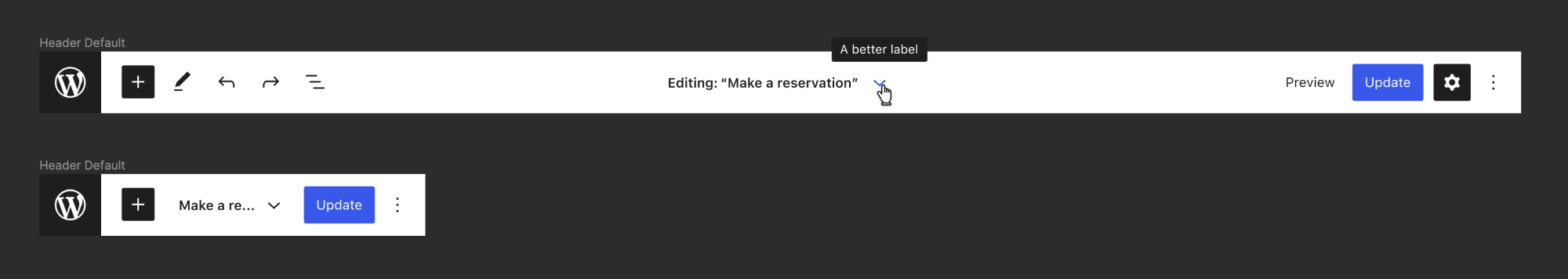
What is the best way to do this in a way that elegantly scales down to mobile? It seems as though something like this would be preferred: The challenge with this is fitting all the information into a single row on mobile. We'd probably have to eliminate the "Editing" and "page" text, just so a truncated part of the document title and the "details" link are visible: But this doesn't account for languages in which that "Details" link might be a longer word... it's not hard to imagine a situation where the document title is hidden entirely. We could put this information on it's own row, or put the details link elsewhere, but then we're just back at the overall iA discussion again. And we shouldn't be making decisions that effect the overall iA with just the context of this one issue, as it is a much bigger discussion with further reaching implications that affect both accessibility and design. Is there a middle-ground interim? Perhaps adding the "Editing" prefix and keeping the chevron, but adding a better label: |
|
When adding this element it'd be important indeed to group things semantically. In the current designs above we should at least be able to define three groups, with page title as the most prominent hierarchically. I think this is an example were |
How about just "show template details" in this case? (You know, for when the dropdown would show template details.) That would change it to:
Alternatively, "show details" feels very clear:
|
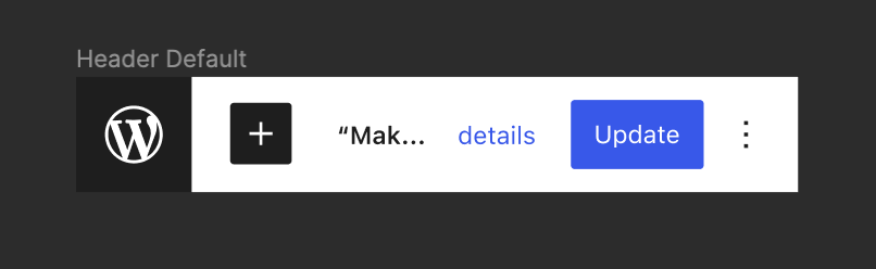
I'd totally agree but this is a problem also with the very first mockups at the top of this thread. A single top bar doesn't provide enough space on mobile to contain all that information. Truncating text isn't a great solution because it makes the title not meaningful enough to identify the edited object. In the last mockups above, the page title "Make a reservation" becomes "Mak..." or in the best case "Make a re...", not to mention the icon-only button. Overall, I'm afraid that whatever exploration we can try a single top bar won't ever be ideal. Also, I don't think that truncating or "squeezing" content to make it fit in a UI is the best path forward. User interfaces should be designed around the content, not the other way around. To me, this whole issue just proves that a single top bar doesn't suit our needs.
I'd totally agree with @mtias that the page title should be prominent hierarchically. However, we can't use flex-order because it would affect the tab order. Worth reminding that visual order and DOM order must match, when they affect meaning or operation. See WCAG 1.3.2 and 2.4.3. |
|
As I read and reread this issue a few times, one thing that I think is making the discussion more confusing is the fact that we're referring to the same element in different ways: "top bar", "header", "toolbar". It's definitely not a toolbar. It's a header/region element with widgets inside, including a toolbar (
This could be tested. But I don't think it's a good idea to have the tab order different than the visual order, especially for sighted keyboard users. I would try other things first. 😊 The best way to represent hierarchical information, especially because we're talking about a "page title", is by using heading elements. This page title element should be an Another thing we can explore is referencing this heading in the Screen reader users would hear something like |
|
As per the layout, I wonder if it's worth exploring something in this direction (needs to be polished 😅):
This way we would have a clear visual hierarchy and a flexible space for toolbar items (the toolbar could also be scrollable on mobile as it is today). |


|
Thanks @diegohaz for reminding that headings are still today the main tool screen reader users use to find information on a page. See latest WebAIM survey (data from September 2019): https://webaim.org/projects/screenreadersurvey8/#finding Headings have always been used as navigational tools by screen reader users and that's the pattern the work done in core to refactor the headings hierarchy and clean up the headings content has been based on. Similarly, more headings in Gutenberg and in the new block-based pages (Widgets, Navigation, FSE) would greatly help. |
Im confused why we cannot use flex Reading the qualifying conditions for these codes: The page/document name is the most relevant piece of information when navigating into the editor, it makes sense that it would be the first tab-navigation into the header (much more sense than the toolbar on the left). While it would be preferable to preserve visual tab order, we cannot both do that and have the title appear first hierarchically unless we actually remove the toolbar on the left. Until that is agreed upon and completed, flex
|
|
As this issue has become very long. It would be great with a kind of status update/summary. I believe there are multiple actionable issues/PR's that have also picked up the thread from this issue. |
It seems to me that we have consensus around the design of this component in isolation, and indeed those designs have now been implemented in the Site Editor 🎉 So in the interest of actually moving forwards, how about we implement that same component in the standard editor as well? We can then close this issue, and investigate any subsequent iA problems in a separate issue. Personally I would be in favour of condensing all top-bar-related concerns in to a single issue that considers all the functionality therein. At the minute there seem to be several separate conversations around top bar + X, or top bar + Y, or top bar + Z, etc. In my opinion, to address these concerns in a scalable and sustainable way we need to consider top bar + A - Z all at once. |
I am also in favor of a new issue to consider the top bar information architecture holistically instead of in pieces. |
Since the initial version of this has been implemented in the site editor, and based on the comment reactions so far, it seems like it should be fine to close this. Feel free to reopen the issue if I'm wrong. |
Since the very beginning, we have attached the permalink function to the title of the post. This had the intention of making it a bit more prominent — particularly for pages — compared to just having it in the sidebar panel.
It was also stated at the beginning that in the future the title would become a block, and thus the permalink function would need to move away. We have also discussed many times the idea of bringing features that used to exist in the document panel closer to more relevant places in the post (featured image being an obvious one).
There's also the cases where the design of a post / page template doesn't include the title for whatever reason. We don't have a clear way of showing that the title is not just visual but also important semantic data (even if a title should not be shown, we don't want users to end up with "(No title)" in their post list.
In this issue I'd like to suggest absorbing the title and permalink flow in the editor header:
This would open a dropdown containing some of the most relevant elements from the "status" panel: permalink, date, visibility, author, delete. It would also give a visible and consistent place for the document title.
In the context of full-site editing we have a "template" dropdown in the top left area showing what the current template you are editing is (single, page, archive, etc). I'd propose exploring a way to combine this so that the relationship is more clear:
And extend it to all the different types of content and templates you might have:
Of course, we need a better way to handle the top-toolbar option, but I'd argue that's already becoming the case with the header growing in functionality and it being able to contain any number of plugin extensions.
Thoughts? Ideas?
The text was updated successfully, but these errors were encountered: