New icons for Post blocks #24175
Comments
Here's a couple quick ideas:
|

|
I like those explorations, @shaunandrews and it seems like we can venture out of the double line icon pattern because both the Post Tags block and the Post Date block use regular icons. Is that the case, @pablohoneyhoney, or is this set of icons strongly encouraged to follow the double line pattern for Post blocks? |
|
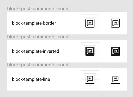
After some discussion, I was encouraged to drop the double line pattern for the Post blocks icons due to the image not communicating very clearly. I've taken @shaunandrews' suggestions above and have iterated further.
Some notes regarding the iteration:
|
|
The last iterations tend to be more evident about the meaning, but they are a bit crowded. Is there a chance we can reduce further and see them in context? That might help to understand better the complexity or clarity needed. |
|
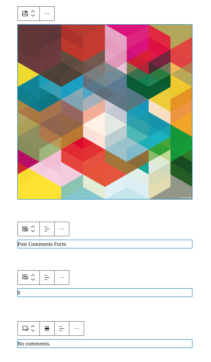
The comments-related icons do feel a little crowded. I was balancing the unification of the comment-related icons with that. However, the featured image icon, and the post comments icon work well IMO. Here's how they look in context with their block.
Here's an iteration to lessen the crowded appearance. I've pulled the smaller icon out of the comment shape and revised them a bit.
|
|
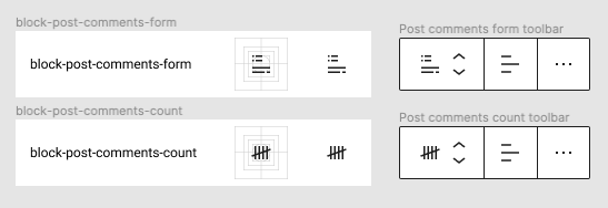
A few more iterations keeping the comment icon, but dropping the added line indicating multiple comments.
|
|
There's a great deal of complexity in a very small space, and none of them read very well to me. It's an open question whether they need to be perfectly representative given they are somewhat rarely used page builder blocks. But if we can't well represent the topic in the icon, at least the icons should not add further complexity to the visual appearance. There's some rhythm in the initial offering of the icon and then lines of text that feels like it makes the blocks group together, which they do given they all relate to post meta templates. But I wonder if instead of lines of text, we could use the bubble comment icon as the denominator, rhythm creator, and then add iconography for each aspect of the topic in a similar layout. Topic wise, Shaun's versions feel like they approach something that better resembles forms, featured images. The non-stacked comment icon also feels sufficient. |
Yep, this was my sentiment as well and why I chose that direction in my last set of iterations. Post Featured Image icon
Post Comments Form icon
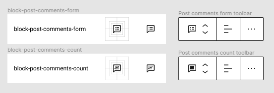
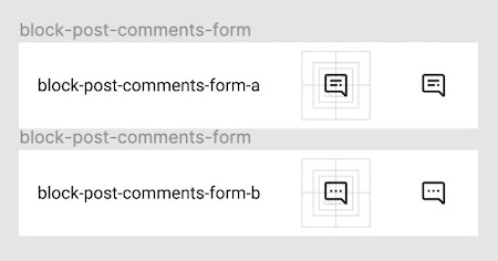
It doesn't communicate "form" to me. I'm not sure what to make of a rectangle inside of a comment bubble. But again, I can be convinced otherwise. :) I did attempt another iteration that uses the comment bubble and also displays a minimal form inside rather than what could have been interpreted as a bulleted list.
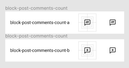
Post Comments Count icon While I agree the scratches icon was leaning toward too much complexity, I've since simplified it. It represents "count" quite well, and inside the comment bubble, it unifies with comment count.
But alas... it can also be interpreted as stitching... Ugh. 😄 |


My reluctance is mostly that the square with a mountain and a bookmark looks like a mix between Cover and Image, while also being complex. For all of the icons, the biggest issue I perceive is that it's very hard to find a metaphor that accurately represents the subject matter as just an icon. And in the absense of us finding those, I don't think we should add visual complexity. There is more than just the icon to denote a block type, and in that light it feels more important that these icons not only look different from each other, but given they are all template related, perhaps look grouped together. In that vein, going back to the initial instinct of "small basic icon plus group indicator below". The first version had lines of text below, but is there a way to denote template better than text? Perhaps a stylized puzzle piece? I.e. featured image: small image plus puzzle piece. Comment form: comment plus puzzle piece. Comment count: count plus puzzle piece. |
|
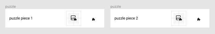
I tried out the puzzle concept, @jasmussen. It gets pretty tight when dropping below 10px for the puzzle piece to work as an icon addition. But I wanted to share these and get your feedback. 😄 Post icons
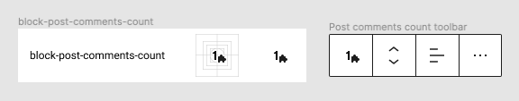
Post Comments CountAs I mentioned above, figuring out the best icon to represent "count" is difficult. For the ones above, I used an icon representing an abacus. But with concern about complexity, I tried a few variations with just numbers and settled on the number 1 as best representing a "count".
The puzzle piece additionThe puzzle piece is tricky at that size. While initially, I built it with smaller appendages, I iterated to add 0.5px larger appendages for more definition. You can see the difference (maybe?) below.
|

|
I think that can work. But I miss the stacked silhouette you started with way at the top. Here's a riff:
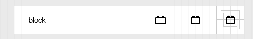
The puzzle piece is slightly fuzzy, but the layout and repeatable pattern / "belonging" these share feels valuable. Is it worth trying out? As an alternative, it could be worth trying to miniaturize the generic "Block"/LEGO brick icon and use in place of the puzzle piece:
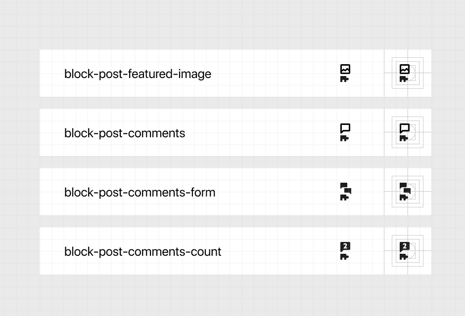
SVGs: Featured Image Post Comments: Comments Form: Comment Count: |
|
Many nice icons! I especially like the different "counting icons". :) Thank you for sharing the Figma-files. Here are a few ideas I would like to add (Figma): Template IconsIt's certainly a good idea to mark "template blocks" differently. The "stacked" design makes it a bit difficult to see the icons above them. So I find the insertion of the puzzle icon into the icon more coherent. I just wonder if an additional icon is scalable enough for all future blocks? I have looked for more neutral solutions, like the already used "two lines" at the bottom.
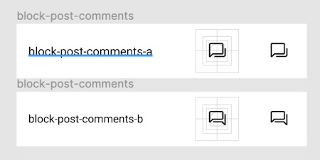
Post CommentsIn general I find it very useful if all comment related blocks share a speech bubble as a common icon, because in my opinion they belong together very much. CountSince the block at the end is a variable number, I wonder if setting it to a "1" is ideal. So I like the tally sheet (with 5 lines) much better! Maybe it could also be useful to set an asterisk in the sense of a variable parameter? CommentsI find the icon that displays stacked comments very useful and as far as I remember it also fits well e.g. to block groups. As another suggestion, the underlying comment could also be displayed as another stylized speech bubble.
FormI have two thoughts on this:
|
|
Good thoughts, Mario! I think there are two aspects to consider, one is the need for the icons in this thread, and the other is the larger thought of a special treatment for "template icons". It seems the puzzle piece idea did not catch on, perhaps it was simply too much complexity as alluded to, or maybe it's all just blocks and no treatment necessarily. Here's another round to address the 4 specific icons here:
These try to capture some of the simplicity of the very first offering, but are not beholden to any "template part pattern". SVGs. Featured image: Post comments. Comment count: Post comments: I'd love for us to be able to wrap this one. The icons don't need to be perfect because we can always update them again, but more importantly we shouldn't feel blocked on the icon pipeline. |
|
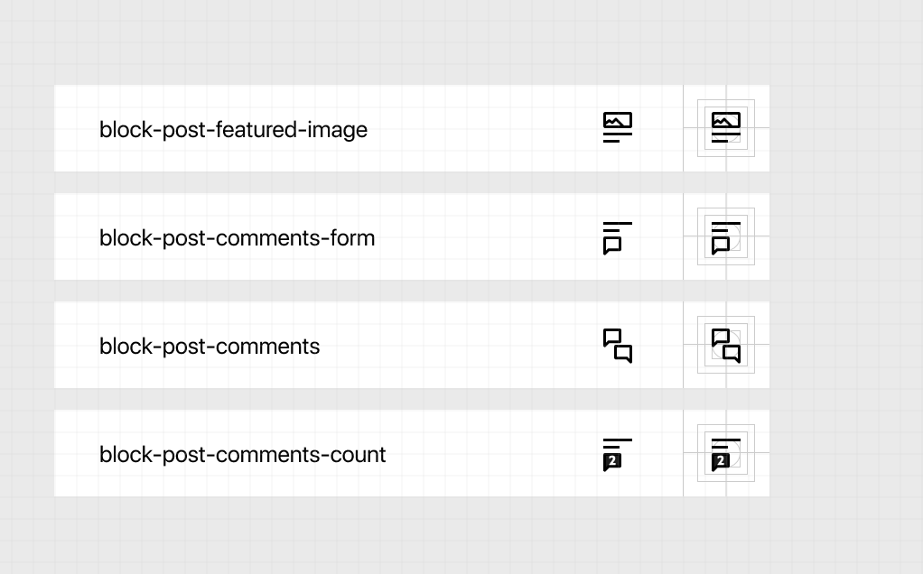
@jasmussen I like the featured image icon! Good call on extending it across. Moving the lines above the comment icons helps to visually identify the comments as being below the post. 👍 I'll get a PR going here and make sure the Figma icons get updated as well. |
* Closes #24175. Adds icons and descriptions to Post blocks.

* Addressed comments and removed spacing and extra lines in icon files.

* Worked on spaces and enters again to fix errors. This is getting silly.
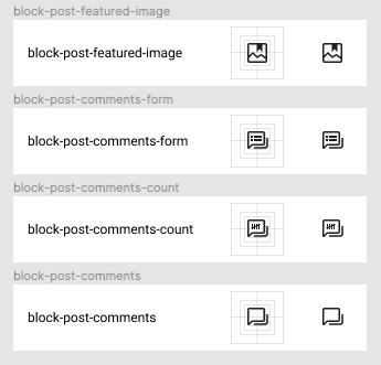
We currently have several Post blocks that do not have custom icons created for them. I'm beginning this process and submitting a few icons for review to be used for these Post blocks and to be added to the Figma library. I've designed these to maintain the common post blocks icon structure with the two lines below.
The Post blocks that do not have custom icons include:
Figma file
cc @pablohoneyhoney @jasmussen @noahshrader
The text was updated successfully, but these errors were encountered: