Advancing the Editor Interface #24341
Comments
 ItsJonQ
added
[Package] Components
ItsJonQ
added
[Package] Components
|
The demo Storybook is impressive! I like how you can configure it on the fly and experiment with settings - very powerful way to play with the UI! |
|
Components x Design Tools Jam Session with Q |
|
@marekhrabe Thank you so much! I'm glad you're liking it so far :). Based on your feedback, I've started adding more user configurable controls to the Storybook examples. I agree in that I think it's a powerful (and wonderful) way to interact with the library. @paaljoachim Thank you so much for recording and sharing the Zoom call! ❤️ |
|
Some interesting updates! I'm continuing to integrate some a11y essentials into the core system of the library. Newest additions include improved "reduced motion" mode and color blind support!
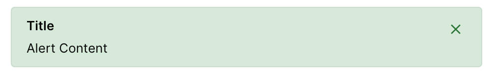
Component libraries usually rely on colours in components like Alerts, Tags, and Badges. Alerts are important as the visual significance relies 100% on colour. And these colours are usually red, yellow, green (which are often challenging). As a solution, I drew inspiration from Trello! They use different patterns to differentiate colours. Having this at the core level means that anything requiring coloured backgrounds as signifiers will get supported automatically. This also applies to reducing motion! It's not as thoroughly integrated as Dark Mode, High Contrast Mode, and Color Blind Mode - not yet! Below are some links to running notes: Improved Color Blind Support Reduced Motion: System level support |

 ZebulanStanphill
added
the
Needs Accessibility Feedback
ZebulanStanphill
added
the
Needs Accessibility Feedback
|
Updates! I hosted a hallway hangouts session where I attempted to provide system-level support for to recognize a preference for "reduced motion" (provided either from device/machine settings or by manual app settings). (Thanks to @annezazu and @shaunandrews for joining!) The results are that (Assuming animations are written using the
(Demo link: https://g2-components.xyz/?path=/story/animations-flip--default) Here's a link to the recorded video from today's session! |

|
Hi there @ItsJonQ! This is really exciting to see! I was wondering, have you thought about how the block controls might sync up with third-party design systems? At my job, our design system is only used on theme front-end code, and we are starting to consider how to build options for components into the editor that will carry through to the theme front-end, and keeping options in the block inspector and saving attributes vs. using block styles or detecting values from the toolbar so far seems promising for us. Seeing this work, my mind is buzzing with ideas for APIs driven by design tokens – for example, the outside design system provides JSON containing lists of allowed values for each property (and perhaps the ability to add additional properties via JSON according to the design system's language). The values selected from the editor could be saved as attributes, and the outside design system can do as it pleases with that data – for example, generating CSS output assigning the selected values to custom properties that are used in the existing system components, or outputting utility classes in a template. Thanks for sharing this!! Looking forward to seeing how it develops. |
|
@laras126 Haiii! Thanks for commenting :D
OoOoo. That's got me thinking as well! At the moment the "design tokens" (still WIP) of the library are stored here: There's some dynamic stuff going on - mainly for high-performance referencing and color generation. Ignoring the boring implementation details (lol)... Ultimately, the values generate a flat JSON object that contain either values (e.g. That's probably the most important part as that's how most systems tend to work. This data is then passed into the library's (With that context out of the way)
That's how the customize popover is able to change the libraries configuration:
Something like this: const customTheme = { colorAdmin: 'red }
...
<ThemeProvider theme={customTheme} />All this being said, this is limited to just the Editor's admin UI (not the front-end site). |

|
@laras126 Psst!! Your post about design tokens inspired me take a deeper look into colors (how they are generated and referenced). This led me to creating a pretty neat color system in the project! |
|
I love all of this. |
|
Haiii! 👋 As a visual learner myself, it always helps to have live examples, videos, or diagrams for things. To help visualize the various systems and mechanics at flow, I've illustrated a flow chart for an example Like this one:
Here it is!
There are 4 main systems which are represented by a colour:
The arrows that link the topics/keywords are colour coded to match their respective system. It's kind of cool seeing this all laid out!! Not surprisingly, the Style system has the most activity, at least, in the context of this project. There's a ton of stuff that happens in the libraries it uses. |

|
Thinking outside the standard core editor used in the page and post screens. What would the design tools look like for instance in the widgets and the customizer screens? It is very intriguing thinking about this, and I might just need to take a closer look at visualizing this aspect. I did a little writeup here in relation to a comment made in the core media channel by Carike. |
@paaljoachim Haiii!! Ideally, the components + designs should be extensive and flexible enough to accommodate common UI patterns and use-cases. We can custom tailor it to better accommodate WP Admin, since the goal of this library is support the Gutenberg + WP ecosystem. An example would be how a library like Material UI is able to construct many Android/Google experience out-of-the-box.
The biggest challenge would be to provide + streamline the React-based development workflow within WP Admin. This includes Webpack compiling, local dev workflow, and secure access to WP admin data endpoints (which hopefully the WP REST API can provide) Assuming folks have a React + JS dev workflow working, they should be able to use this library just like they would any JS library 👍 . (e.g. ☝️ All this is theory of course! I'm not saying we have to do this :). |
|
Somehow Joomla feeling. :) |
Advancing the Editor Interface
Earlier today, I created a Zoom session where I talked about my recent experiences in regards to the Editor's UI.
https://wordpress.slack.com/archives/C02QB2JS7/p1596483182199800
(Thank you @bph , @paaljoachim , @shaunandrews , and @MichaelArestad for dropping by!)
There, I showcased an experimental component library project that embodied spirit of the editor design refresh.
Link to Github Repo
https://github.com/ItsJonQ/g2
Link to Live Demos
https://g2-components.xyz/
The project is a from-scratch reimagining of
@wordpress/componentsto accommodate the ever-growing and ever-expressive needs of the Editor and the platform. The ultimate goal is to provide a first class workflow to empower developers and designers (both core and 3rd party) to create cohesive, robust, and delightful user interfaces.These components (and their sub-systems) have been uniquely developed to meet the need of integrating seamless into Gutenberg and WordPress. The UI's native-like aesthetic also allows them to be easily customized used outside of the Editor - potentially for 3rd party WordPress plugins and beyond!
The Inspiration
As of November/December of 2019, WordPress Gutenberg has been working on redefining and updating it's design language. It's a movement that refines the experience of the editor, while celebrating the incredible of expressive features unlocked by the humble block.
Since the initial proposal (and rounds of feedback), we began rolling out UI updates to the Editor - starting with the Toolbar. (I was one of the lucky one who helped. What an exciting and experimental experience!). We tried a lot. We iterated a lot. We learned a lot!
The biggest challenge was to apply these updates in systematic way (as far as UI code goes). To do it in a way that made existing implementations more feature-rich and robust, with net-negative regressions as time goes on. A way that simplified implementations for both core contributors and 3rd party block developers.
A way that allowed us to make seemingly simple superficial style changes without arbitrarily and unknowingly breaking 3 UI pieces somewhere else (Haha).
In other words...
To pay the component code the same level of examination and attention to detail as we've done for the Editor's visual designs back in November.
The Systems
The project identifies several core systems that work in concert to tackle the many challenges of crafting user-interfaces:
A11Y
To start, the project relies on Reakit to properly coordinate markup/JS events for a11y needs. Having an robust and reusable A11Y layer helps ensure that it gets correctly implemented across the entire system. (This is just a start!)
Animations + Gestures
Animations are incredibly difficult or orchestrate, maintain, and scale. This library provides highly intelligent, flexible, and easy to use components that help power core experiences (like fade/collapse on remove) or custom experiences like position shuffling!
Context
This system establishes "awareness" for the various components. Depending on where/how they're implemented, they may need to behave differently. Having an interconnected context system natively creates these relationships. This all works without the developer using these components having to do anything.
Styles
An extraordinary amount of consideration was placed on styles, which is often difficult to work with and/or breaks - it's worse when it breaks usability/accessibility. It's extensive (and ultimate) use of CSS variables enables flexible system-wide adjustments.
These systems use a combination of existing battle-tested solutions as well as custom solutions. In order to improve development experience, these systems work were designed to be as "out of the way" as possible. They're available to be used and adjusted through simple interfaces.
Demos
Dark Mode/High Contrast
Creating this components from the ground-up (while identifying and implementing core systems) allows us to have dark mode built-in. Not only that, we can offer a high-contrast mode (which can be used together with dark mode):
Animations
The Animation system provides an easy way to create delightful (high performant) experiences:
Rich Experiences
The goals is to provide a cohesive, expressive, and engaging experience to the Editor (and beyond). This is enabled by offering feature-rich components, out-of-the-box:
Designs
I drew inspiration from the "G2 Designs" Figma file (as well as mockups shared on Github issues + PRs):
https://www.figma.com/file/fnyj380i05vGzuuH60frLQ/G2-Design?node-id=81%3A30
I also drew inspiration from various app + OS interfaces.
More design goal was to create something that felt native-like.
Note: Nothing is set in stone - especially the visual designs. I gave it my best shot ✌️ . Totally open to changes! The more important thing was to work on the various systems to create/render the designs + interactions.
This is just a start!
This experimental/research project was started roughly 2 weeks. The majority of the work involved working on the core systems. (It's still on-going). Thankfully a large portion of the core systems architecture has been solidified, allowing for a rapid explosion in the development of components.
What's Next?
With a base collection of components completed (basically completed), I'm starting to cobble them together to recreate/reimagine Block controls with the Editor:
https://g2-components.xyz/?path=/story/examples-blocks--cover
This enables to me better see how I could better refine the components to accommodate real world (Block) control use-cases.
The libraries have been published to npm (primarily for me to test out the build process, but also to test external integrations).
This means, that anyone is free to give it a try. CodeSandbox is a great platform to tinker with!
https://codesandbox.io/s/wp-g2-yo5gp?file=/src/App.js
Resources / Research
A special thanks to the various folks who have supported me so far! From folks showing enthusiasm/interest in the ideas to folks suggesting features or cool ideas 😎 . Also thanks to all of the projects listed below.
Below is a collection of projects that I've worked on, researched, used, evaluated, or inspected (source code). They're ranked based on my familiarity with them.
Component Libraries
Style Systems / Compilers
Animation/Gesture Libraries
A11Y Systems
The text was updated successfully, but these errors were encountered: