Columns Block: Make responsive, make editor and theme match #10541
Conversation
 mtias
added
[Feature] Blocks
mtias
added
[Feature] Blocks
Perhaps this PR would be the appropriate time/place to remove the Beta designation? i.e. change Columns (beta) to Columns. |
|
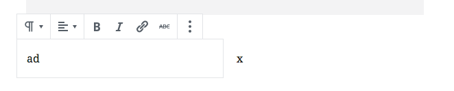
This is what I see in this branch: 6 columns: 2 empty columns: |


|
Oh the placeholder text needs to be elided. Applying overflow: hidden; and text-overflow: ellipsis; would probably address that. Though this is the same in master, isn't it? |
|
I will double check later, I just leave my observations since we removed |
|
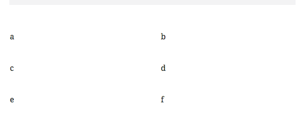
I can confirm that the issues I shared are regressions. This is how they look in 6 columns: 2 empty columns: |


|
Some other things that don't quite work as expected: Sidebar overlaps columns (6 columns case):
Edit: that's actually not an issue, it's a feature, you need to click on the block first, sorry about confusion :(
Edit: I can't reproduce anymore after rebasing with |

|
I'm getting totally lost trying to sift through the columns here and to suss out what CSS is targeting what. I don't think this is a regression—I've gotten painfully lost every time I've tried to test the columns block, but it's making it super difficult for me to provide helpful feedback and/or suggestions here. I'm seeing a lot of overlapping elements:
I'm not sure if this is intended behaviour, but it's contributing to the overall feeling of lost-ness. Hiding all the placeholder content (so both "Write your story" and "Add text or type / to add content") would help clean things up a bit, since this seems to pop up all over the place and often in unexpected spots. I can't select the ellipsis menu for any of the individual columns at the right, or those columns that are below another column block, and I have a lot of difficulty selecting the parent column block:
What's the rationale behind making each individual column selectable, as well as the parent column? Is this an extensability thing, or is it just so you can apply CSS classes to the columns individually? Can we simplify by removing this ability? Would it make sense to include a hairline outline of the columns, so that people could explicitly see the column structure at work and better understand where each column begins and ends? Using an embed block seems to break the columns out of the editor window:
Columns don't span the full width of the screen if the content in them is short—this may also be by design, but I would have expected a full-width sort of deal here:
I'm not certain how much of this is helpful or specific to this PR at this stage, but I can test a bit more later today to see if I can't suss out some of these issues in more detail. Offhand, I wonder if using grid instead of flexbox might make some of these behaviours a bit more consistent and reliable. |


|
This issue exists on
|

|
Yep, that's what happening here. Since it isn't a regression it's probably not strictly important to fix here. I tried fixing it by applying an |
As the parent column is also a block, it needs to be selectable for accessibility reasons (keyboard nav) but also so you can select it to change settings. Some of these seem less regressions since they work on master. There is a lot of stuff to test here. 😒 @sarahmonster showed me (in-person) thus far the only fix that consistently works needs to be applied high enough in the DOM that it clips the block toolbar 😢 |
|
The tricky thing here is that UI freeze is tomorrow. If we can get this in, we can fix bugs later. If we don't get this in, I'm not sure. The css here is complex, and the block as a whole needs love in phase 2. However for basic things it's hugely valuable. If we feel this PR improves what's in master and doesn't introduce new issues, I feel it's worth merging as an iterative improvement and then track anything missing. @mtias any thoughts? |
|
I am usually for improvements that still have bugs but don't cause regressions. 😄 Columns block in general though needs more work I think. I'd rather leave a beta label and |
|
The Columns block is, for non-technical-users, almost entirely useless with responsive columns, so I say merge this if there are no regressions but leave the (Beta) label until the block becomes less buggy. What exactly does "UI freeze" mean? |
|
Responsiveness = totally an improvement. I'm on board with "ship it now, fix it later". |
|
This one actually is responsive. But I'm okay with adding back the beta label. |
|
I would +1 to adding in with beta, or whatever it takes get this in as responsive. It's asked for a lot in feedback and feels like a win. |
 gziolo
force-pushed
the
try/columns-fixes
branch
from
gziolo
force-pushed
the
try/columns-fixes
branch
from
dcccc1f
to
cfba143
Compare
|
Added 1ca6139 Before After: |
|
Added: 632dcfe BeforeEditor: Frontend: AfterEditor: Frontend: |


|
I added some tweaks to the PR. There are still some outstanding issues on the mobile view. However they aren't related to the responsive mode at all. See screencast recorded on
|

|
|
|
https://make.wordpress.org/test/ Responsiveness looks good! I have a few other minor things that I noticed... Inserting a block inside the column is not done so on the left side as it the usual approach but on the right side. It would be good to keep it consistent. |
…s#10541)

* Add basic responsiveness.

* Refactor columns metrics. Level the playing field in editor and frontend.

* Add space between colums.

Fixes WordPress#7818.
Fixes WordPress#6048.

* Remove "beta" designation from columns block.

* Columns block: Fix column width when editing

* Column block: Improve padding for the first and last item in a row

* Tests: Rename Columns block name also in e2e tests
This PR does a number of things.
Editor:
Theme:
Dimensions:
Responsive:
There is some overlap with the column blocks due to the fact that this PR makes them more or less lose their footprint, which makes the hover outlines overlap at times. Perhaps the longer term fix here is to make those blocks actual pass-through blocks so they don't have hover outlines, or can be selected. But in the mean time, this PR intends to make the columns block ship-ready for 5.0.
Please test it thoroughly and decide if you agree!