Skip to content
New issue

Have a question about this project? Sign up for a free GitHub account to open an issue and contact its maintainers and the community.

By clicking “Sign up for GitHub”, you agree to our terms of service and privacy statement. We’ll occasionally send you account related emails.

Already on GitHub? Sign in to your account

Components: Allow to apply isPressed prop to Button and SVG components to indicate the state of the button #17748

Merged
merged 5 commits into from Dec 9, 2019

Conversation

gziolo
Copy link
Member

@gziolo gziolo commented Oct 3, 2019

Description

This PR promotes __unstableActive prop from SVG component to the stable prop called isToggled. It reflects that it relates to the toggled state of the button. This is mostly for the usage in mobile apps, but it also exposed is-toggled class name for the web to make styling easier.

At the same time this PR refactors code to use isToggled prop is used consistently for all Button components and it's variations like IconButton. This ensures that the same CSS class name is used in all places – is-toggled and aria-pressed is provided in case when isToggled is set to true for DOM elements making them more accessible.

Testing

There should be no difference in how the web and mobile apps operate. All buttons should look and behave the same.

UI elements to test:

  • URLInputButton - never used in the code
  • Code block - custom toolbar buttons are no longer there - I removed unused styles
  • HTML block - custom toolbar buttons
    Screen Shot 2019-12-03 at 15 03 19
  • Heading block - the dropdown with levels
    Screen Shot 2019-12-03 at 15 53 33
  • Image block - Edit image button in the toolbar
    Screen Shot 2019-12-03 at 15 51 16
    Screen Shot 2019-12-03 at 15 52 14
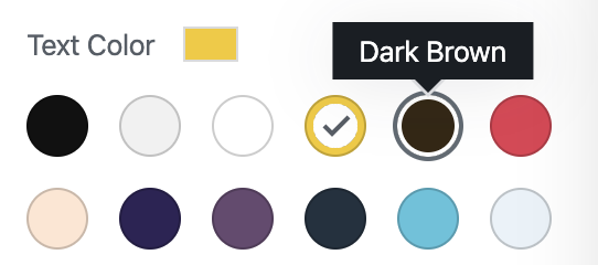
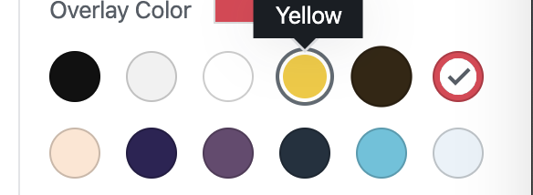
  • Cover block - all color and gradient pickers
    Screen Shot 2019-12-03 at 16 14 34
  • DateTime components - AM/PM switch
    Screen Shot 2019-12-03 at 15 55 53
    Screen Shot 2019-12-03 at 15 55 47

@gziolo gziolo added [Type] Technical Prototype Offers a technical exploration into an idea as an example of what's possible [Status] In Progress Tracking issues with work in progress labels Oct 3, 2019
@gziolo gziolo requested a review from marecar3 October 3, 2019 12:19
@gziolo
Copy link
Member Author

gziolo commented Oct 3, 2019

@marecar3 - I'm not sure whether this solves the issue you are patching in #17747. However, this is a good base to further investigate how it can get applied.

@gziolo
Copy link
Member Author

gziolo commented Oct 3, 2019

I'm curious whether #17719 (comment) will help here as well.

This change do solve the issue with the buttons though. I don't see other possibly change on #17228 that could have triggered this problem

-    <Icon icon={ icon } />
+    { isString( icon ) ? <Icon icon={ icon } />  : icon }

@gziolo gziolo added Mobile App - i.e. Android or iOS Native mobile impl of the block editor. (Note: used in scripts, ping mobile folks to change) [Package] Block library /packages/block-library [Package] Components /packages/components labels Oct 3, 2019
@gziolo gziolo requested a review from etoledom October 3, 2019 13:22
@gziolo
Copy link
Member Author

gziolo commented Oct 4, 2019

@etoledom and @marecar3 - is this still an issue with #17228 merged into master? I have a feeling that it might fix the issue you had :)

I also rebased this branch to have the changes from #17228.

@etoledom
Copy link
Contributor

etoledom commented Oct 4, 2019

@gziolo - #17228 On its own won't solve the wordpress-mobile/gutenberg-mobile#1398 issue.
Just tested using current gutenberg:master.

@marecar3
Copy link
Contributor

marecar3 commented Oct 4, 2019

@gziolo @etoledom I tested both latest gutenberg:master and this PR but they aren't fixing the problem with toolbar button text color.

@gziolo
Copy link
Member Author

gziolo commented Oct 7, 2019

I tested both latest gutenberg:master and this PR but they aren't fixing the problem with toolbar button text color.

Thank you. I will resume my explorations next week after WP 5.3 RC1 is out. I really need to spin off a native app to dive deeper 👍

@marecar3
Copy link
Contributor

marecar3 commented Oct 7, 2019

Thank you. I will resume my explorations next week after WP 5.3 RC1 is out. I really need to spin off a native app to dive deeper 👍

Thanks for the help @gziolo and please let me know if you need any support/help with running/building native app.

@etoledom
Copy link
Contributor

etoledom commented Oct 8, 2019

@gziolo - #17676 merged 👍

@gziolo gziolo mentioned this pull request Oct 30, 2019
@gziolo gziolo self-assigned this Oct 30, 2019
@gziolo gziolo force-pushed the try/fix-toolbar-active-svg branch 2 times, most recently from aa49770 to 76648d9 Compare November 29, 2019 15:35
@gziolo gziolo requested a review from nerrad as a code owner November 29, 2019 16:19
@gziolo gziolo added the [Focus] Accessibility (a11y) Changes that impact accessibility and need corresponding review (e.g. markup changes). label Dec 3, 2019
@gziolo gziolo force-pushed the try/fix-toolbar-active-svg branch 2 times, most recently from f4ddd55 to 88599b3 Compare December 3, 2019 15:05
@gziolo
Copy link
Member Author

gziolo commented Dec 3, 2019

I noticed one regression which probably predates this PR which applies to the text color:

this branch

Screen Shot 2019-12-03 at 16 09 19

Screen Shot 2019-12-03 at 16 16 02

Screen Shot 2019-12-03 at 16 16 13

Gutenberg 7.0

Screen Shot 2019-12-03 at 16 10 55

Screen Shot 2019-12-03 at 16 19 42

Screen Shot 2019-12-03 at 16 19 51

@gziolo
Copy link
Member Author

gziolo commented Dec 4, 2019

I noticed one regression which probably predates this PR which applies to the text color:

this branch

Screen Shot 2019-12-03 at 16 09 19 Screen Shot 2019-12-03 at 16 16 02 Screen Shot 2019-12-03 at 16 16 13

Gutenberg 7.0

Screen Shot 2019-12-03 at 16 10 55 Screen Shot 2019-12-03 at 16 19 42 Screen Shot 2019-12-03 at 16 19 51

I managed to fix the specificity issue with the color picker button in a5ef4c2. This is how it looks like now:

Screen Shot 2019-12-04 at 08 42 48

@gziolo gziolo requested a review from hypest December 4, 2019 08:15
@etoledom
Copy link
Contributor

etoledom commented Dec 4, 2019

@gziolo - Testing with current gutenberg-mobile:develop and checking out this branch, all buttons and their states/styles seems to be working as expected 🎉

I did a smoke test. Now I will continue testing and checking code more closely to be sure, and come back with a final result 👍

@gziolo gziolo mentioned this pull request Dec 5, 2019
6 tasks
@gziolo
Copy link
Member Author

gziolo commented Dec 6, 2019

I renamed this prop from isToggled to isPressed as pointed out by @Tug. It works exactly the same.

@gziolo
Copy link
Member Author

gziolo commented Dec 6, 2019

I also reverted some changes were I removed some styles which are still necessary. There is #18931 opened by @diegohaz where I hope to clean this up.

@gziolo gziolo changed the title Components: Allow to apply isToggled prop to SVG components to indicate the state of the button Components: Allow to apply isPressed prop to Button and SVG components to indicate the state of the button Dec 6, 2019
@@ -134,7 +134,7 @@ Name | Type | Default | Description
`isDestructive` | `bool` | `false` | Renders a red text-based button style to indicate destructive behavior.
`isLarge` | `bool` | `false` | Increases the size of the button.
`isSmall` | `bool` | `false` | Decreases the size of the button.
`isToggled` | `bool` | `false` | Renders a toggled button style.
`isPressed` | `bool` | `false` | Renders a pressed button style.
Copy link
Member Author

Choose a reason for hiding this comment

The reason will be displayed to describe this comment to others. Learn more.

I didn't keep the old name because it only applied the is-toggled class name which was never styled. I can bring it back, but I don't feel like it's a good idea to keep it. It's only confusing.

const tagProps = tag === 'a' ? { href, target } : { type: 'button', disabled };
const tagProps = tag === 'a' ?
{ href, target } :
{ type: 'button', disabled, 'aria-pressed': isPressed };
Copy link
Contributor

Choose a reason for hiding this comment

The reason will be displayed to describe this comment to others. Learn more.

Do we have default styles for the isPressed variation of the Button

Copy link
Member Author

Choose a reason for hiding this comment

The reason will be displayed to describe this comment to others. Learn more.

As commented: no, we don’t, we should do it as the follow up.

Copy link
Member

Choose a reason for hiding this comment

The reason will be displayed to describe this comment to others. Learn more.

Looks like isBoolean is the convention adopted by Gutenberg, right? Should disabled be isDisabled as well? I see that both are used in the project (for example, ToolbarButton currently accepts isDisabled and passes it to the disabled prop on Button).

Copy link
Member Author

Choose a reason for hiding this comment

The reason will be displayed to describe this comment to others. Learn more.

@aduth - do you have recommendations here? I don't think we made it the rule. I'm happy to open a follow-up to update if necessary. disabled will always work because it's HTML attribute ... but it would be nice to follow conventions.

I also want to have isFocusable prop so we don't have to use <Button aria-disabled={ true } /> as a workaround for <Button isDisabled isFocusable />.

Copy link
Member

Choose a reason for hiding this comment

The reason will be displayed to describe this comment to others. Learn more.

I used to prefer the un-prefixed disabled over an isDisabled, given that it aligned better with expectations around how attributes apply to HTML elements, but over time I've come to regard this as an alignment that we shouldn't want to try to reinforce. In the worst case, it can mislead a developer to think that their disabled prop would be guaranteed to apply a disabled HTML attribute somewhere, which isn't always the case (we should embrace that a component can be an abstraction not directly tied to some specific DOM implementation). Conversely, we lose any benefit that we can gain from "signalling" an expected prop value; a prop named foo could be interpreted to be any value, but an equivalent isFoo is more clearly expecting a boolean.

My recommendation would be to prefer to name new boolean props using the isFoo convention.

Copy link
Contributor

@youknowriad youknowriad left a comment

Choose a reason for hiding this comment

The reason will be displayed to describe this comment to others. Learn more.

Still hesitant between isToggled or isPressed and I feel the button component should have default styles for these.

@gziolo
Copy link
Member Author

gziolo commented Dec 6, 2019

https://material-ui.com/api/toggle-button/ - they use selected prop for the active state
https://material.io/components/buttons/#toggle-button - they use pressed state for the actual intermediate transition but rather refer to active as a final state

Naming is hard. The aria way to mark active/selected/pressed is aria-pressed 😅

the button component should have default styles for these

I agree but I also don’t seem to be the best skilled person to perform this refactor.

@diegohaz
Copy link
Member

diegohaz commented Dec 6, 2019

When in doubt, I always refer to the ARIA spec since they've already done a good job on naming things. So I agree with @gziolo on isPressed.

@gziolo gziolo merged commit 383248a into master Dec 9, 2019
@gziolo gziolo deleted the try/fix-toolbar-active-svg branch December 9, 2019 21:56
@youknowriad youknowriad added this to the Gutenberg 7.2 milestone Jan 6, 2020
@afercia
Copy link
Contributor

afercia commented Apr 19, 2020

The aria way to mark active/selected/pressed is aria-pressed

This is a common misconception. The aria-pressed attribute identifies the button as a "toggle button". A toggle button is a specific semantic-type of button with its specific expected interaction. It's a two-state button and its state is persistent until users toggle it again. Quoting from the spec:

Indicates the current "pressed" state of toggle buttons.
Toggle buttons require a full press-and-release cycle to change their value.

I'm seeing this attribute is now used inappropriately in some cases and in other cases it's used in combination with aria-expanded, which is not appropriate as well. Will create a new issue.

Sign up for free to join this conversation on GitHub. Already have an account? Sign in to comment
Labels
[Focus] Accessibility (a11y) Changes that impact accessibility and need corresponding review (e.g. markup changes). Mobile App - i.e. Android or iOS Native mobile impl of the block editor. (Note: used in scripts, ping mobile folks to change) [Package] Block library /packages/block-library [Package] Components /packages/components
Projects
None yet
Development

Successfully merging this pull request may close these issues.

None yet

8 participants