Change the URL Input label to match Classic #9893
Conversation
|
The UrlLink button is always a tricky component to tweak. I noticed some regressions on this PR
Also, I think it's probably better to keep the smaller size for mobile. |

|
I'm moving this PR to 4.0 feel free to merge though if it makes the 3.9 cut |
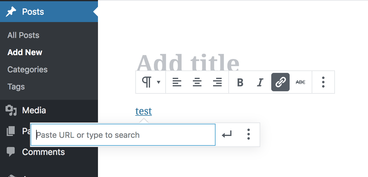
…; Increase the width of the button component input form to match the url input;
0216b8e
to
0c42a89
Compare
|
@youknowriad thank you for the feedback, @pento and I have fixed those visual bugs and restricted the width increases to non-mobile devices. |
There was a problem hiding this comment.
Looks good to me from a code point of view, but I noticed this overlapping is quite pronounced now, so would prefer if a designer decided whether to approve the change:
It does also happen in master, but not to the same degree. The popover does have some logic to stop it escaping the browser window's bounding box - maybe it's possible to change that so that it stays within the editor's bounding box instead.
|
Note that a submenu will enter the editor bounding box and cause the issue of a popover appearing over it too. 🤷♂️ |
|
Yep. If this works fine on mobile, then go for it. |
Description
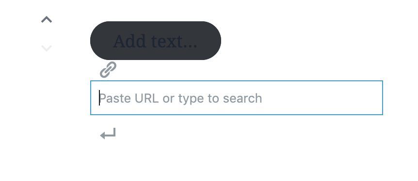
The current URL input label "Paste URL or type" doesn't actually say what typing does, and it hides the ability to search for posts/pages to link to.
Changing it to match the label in Classic, "Paste URL or type to search" tells the author what it is that typing will do, and makes the search functionality more discoverable.
In order to make the longer label fit, this change increases the width of the URL input box.
Screenshots
Checklist: