Made By Yifeng Tang
GitHub Page
The National Center for Science and Engineering Statistics NCSES has tons of interesting data sets. Some of the tables from present detailed data on the demographic characteristics, educational history, sources of financial support, and postgraduation plans of doctorate recipients. In this dashboard application, the goal is to analyze and visulize the data realted to Science and Engineering PhDs awarded in the US. The application shows details about the data set named "Doctorate-granting institutions, by state or location and major science and engineering fields of study: 2017". Since there are messy headers in the original xlsx file, I have made some changes to the data set. You can access the xlsx file used in the dash board PHDofEng&Sci.
Click HERE to open the dash board.
Users could run the dash board on their local machines. You could find the code to build the application HERE.
==============
The following are required packages and the versions to run the dashboard:
dash==2.0.0
pandas==1.2.2
numpy==1.20.1
plotly==5.3.1
dash_bootstrap_components==0.13.1
===============
Make sure dowanload the appropriate packages before runing the application.
To successfully run the application on locals, you may need to create a virtual environment for this application. You could use Docker to achive that.
The dash board have three parts:
OVERVIE OF GRANTING DOCTORS BY STATES,
OVERVIEW OF GRADING DOCTORS BY INSTITUTES AND MAJORS,
OVERVIEW OF GRADING DOCTORS BY FACULTY
In the first states part:
I created a Choropleth map of US. Users could easily observe the number of fresh graduated PhDs major in sience and engineering by states.
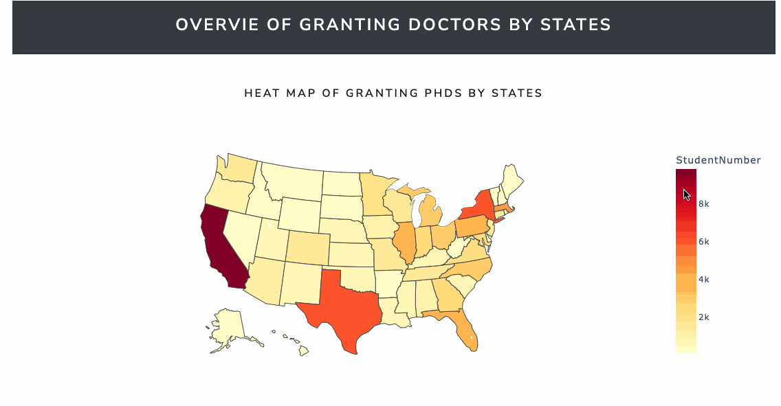
Here is the code to achieve the Choropleth map of US:
dbc.Row([      #command Row indicates there is another new line here:
        dbc.Col(html.H5(children='Heat Map of granting phds by states', className="text-center"),
                className="mt-4")]),  # graph title
#create choropleth graph:
        dcc.Graph(id='geograph',
                  figure=px.choropleth(data_frame=dff1,
                                       locationmode='USA-states',
                                       locations='Code',
                                       scope="usa",
                                       color='StudentNumber',
                                       hover_data=['StudentNumber'],
                                       color_continuous_scale=px.colors.sequential.YlOrRd,
                                       labels={'Pct of Colonies Impacted'}))
In the second part, there are four plots.
The first one is a histogram to show the distribution of number of graduated fresh PhDs in different majors.
Here is the code to achive the bar plot:
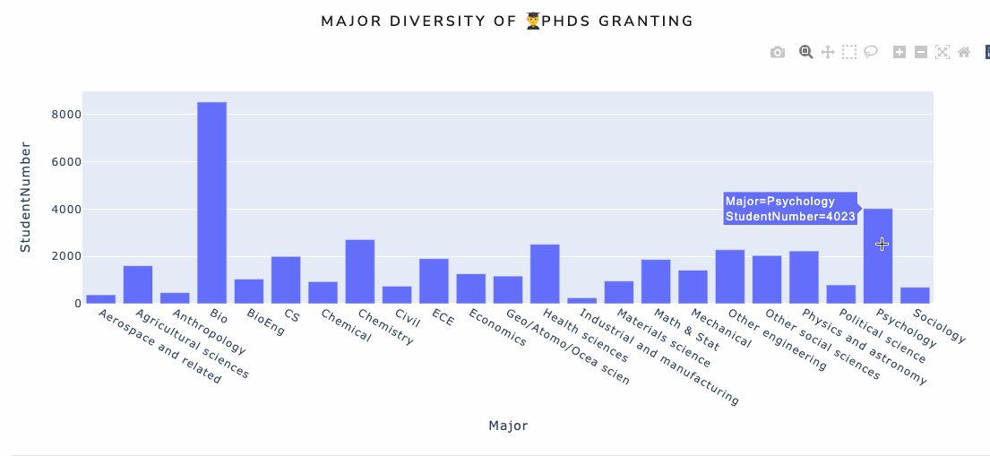
#title:
dbc.Row([dbc.Col(html.H5(children='Major Diversity of 👨🎓PhDs Granting', className="text-center"), className="mt-4")]),
#draw the plot
dcc.Graph(id='bargraph',figure=px.bar(dff2, x='Major',y="StudentNumber")) # notice the id hereThe second one is histogram to show the number of fresh PhDs major in different majors in the selected institution. There is a drop-down list on the top of the histogram. Users could either select the school in the list or type the key words of names to find the school.
This one is slightly different from the previous one, since we have a drop-down list here.
To achieve this feature, we need to define a dropdown first:
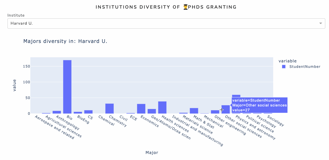
dbc.Col(html.H5(children='Institutions Diversity of 👨🎓PhDs Granting', className="text-center"), className="mt-4")]),
html.Div(children=[html.Div(children="Institute", className="menu-title"),
# Here is the code to define the dropdown:
dcc.Dropdown(id="ins-filter", #id is an important parameter, we will talk about it later
options=[{"label": region, "value": region} for region in np.sort(df_institu["Institute"].unique())],
value="Harvard U.",
clearable=False,
className="dropdown",),]),When we have the dropdown, we need to create an according plot here, I choose to draw a bar plot:
dcc.Graph(id='inst_graph',config={"displayModeBar": False}) To connect the draop_down and the plot, we need to use the call back function. Call back could combine the feature part and graph plot by id.
We will talk about call back later.
The third and forth include two plots, a pie chart and a stacked histogram. Users could select as many schools and majors as possible to see the ditributions. In the pie chart, users could observe the distributions of graduated PhDs from selected school by selected majors. While in the histogram, users could observe the distribution of number of graduated PhDs by majors in selected schools. The different colors in each bar represent selected majors, and each bar represents one selected school.
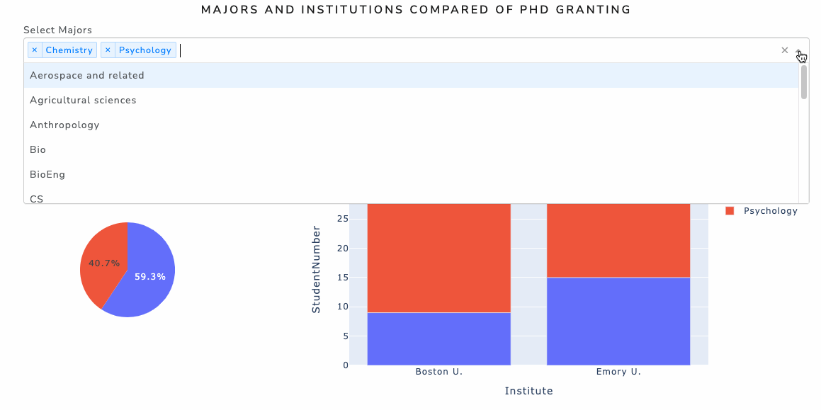
This one is interesting. We have two drop downs here, and every drop_down would have effects on both of the plots.
First, we define the drop_down, they include majors and schools:
html.Div(children=[html.Div(children="Select Majors", className="menu-title"),
                   dcc.Dropdown(id='major_select', value=['Chemistry','Psychology'], multi=True,
                   options=[{'label': x, 'value': x} for x in df_major_ins["Major"].unique()])]),

html.Div(children=[html.Div(children="Select Institutes", className="menu-title"),
                   dcc.Dropdown(id='ins_select', value=['Boston U.','Emory U.','Harvard U.'], multi=True,
                   options=[{'label': x, 'value': x} for x in df_institu["Institute"].unique()])])
And we create two plots:
dbc.Col(dcc.Graph(id='pie-graph', figure={}, className='six columns'), width=4),
dbc.Col(dcc.Graph(id='my-graph',
        figure={}, clickData=None, hoverData=None,
        config={'staticPlot': False,
                'scrollZoom': True,
                'doubleClick': 'reset',
                'showTips': False,
                'displayModeBar': True,
                'watermark': True,},
        className='six columns'), width=8)])
You could notice the two ids of drop down are "major select" and "ins_select", while the ids of graph are "pie-graph" and "my-graph".
Here is a call_back function to connect them:
@app.callback([Output(component_id='pie-graph', component_property='figure'),
               Output(component_id='my-graph', component_property='figure')],
              [Input(component_id='major_select', component_property='value'),
               Input(component_id='ins_select', component_property='value')])

def draw(major_chosen, ins_select):
    df_two_1 = df_major_ins[df_major_ins["Major"].isin(major_chosen)]
    df_two_1 = df_two_1[df_two_1["Institute"].isin(ins_select)]

    fig = px.bar(df_two_1, x='Institute', y='StudentNumber', color='Major', title="Stack Histogram analysis")
    fig2 = px.pie(data_frame=df_two_1, values='StudentNumber', names='Major', title='Pie chart ANALYSIS')
    return fig2, fig
In the callback, we have two input values, they are the ids of dropdown lists. Also we have two outputs, they are the ids of graphs. The input means the actions you want to act to change the graph, while the output is the new appearance of the plot. How to interprate the plots based on the input? We need the function below the callback part. In this function, we have two inputs, they are just the input from drop down (Attention here, the order of the input should also be the same as you defined in call back part). After changing the plots based on the input, we have two outcomes. The outcomes you created in the function are exactly the plot that will show in the page.
Try to write the call back function for the previous plot. You could check the call back function in the recourses folder.
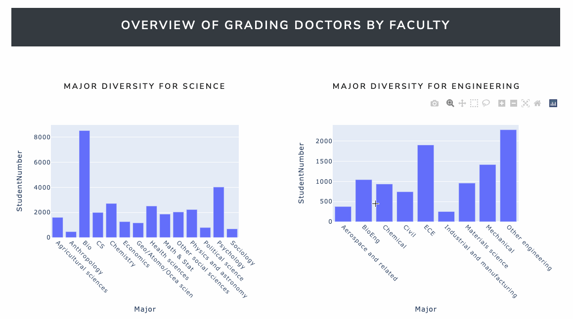
In the third part
There are two histograms to show number of graduated students by majors. One plot is for students gradyated in science field, and anotherone is for engineering field.
If you want to deploy your dash board on a public web so that you could share it with your friends, you could use Heroku to achieve that.
Before you get started, make sure you’ve installed the Heroku command-line interface CLI and Git. You can verify that both exist in your system by running these commands at a command prompt (Windows) or at a terminal (macOS, Linux):
$ git --version

$ geroku --version
The output may change a bit depending on your operating system and the version you have installed, but you shouldn’t get an error.
When you finished preparation work, we could start to deploy your dash board. First, please define a variable named server in the code, just below your initialization of the app: (For my dash, I have already defined the server variables on line 162)
app = dash.Dash(__name__, external_stylesheets=external_stylesheets)
server = app.server
This addition is necessary to run your app using a WSGI server. It’s not advisable to use Flask’s built-in server in production since it won’t able to handle much traffic.
Next, in the project’s root directory, create a file called runtime.txt where you’ll specify a Python version for your Heroku app, for example:
python-3.9.1
When you deploy your app, Heroku will automatically detect that it’s a Python application and will use the correct buildpack. If you also provide a runtime.txt, then it’ll pin down the Python version that your app will use.
Next, create a requirements.txt file in the project’s root directory where you’ll copy the libraries required to set up your Dash application on a web server. For my application, you need to add the following information:
dash==2.0.0
pandas==1.2.2
gunicorn
numpy==1.20.1
plotly==5.3.1
dash_bootstrap_components==0.13.1
dash_bootstrap_components==0.13.1 is a package to read in xlsx file
Then, create a file named Procfile with the following content:
web: gunicorn app:server
Where app is the name of your dash board py file.
Finally, type the following commands in the cmd:
$ git init
$ git add .

$ git commit -m "add application to web"

$ heroku create AppName
git push heroku master
heroku ps:scale web = 1
When it set up, you can access the web to share it with your friends. To access your app, copy https://AppName.herokuapp.com/ in your browser and replace AppName with the name you defined in the previous step.
====End