

Using the standalone python script, you can create your own visualization:
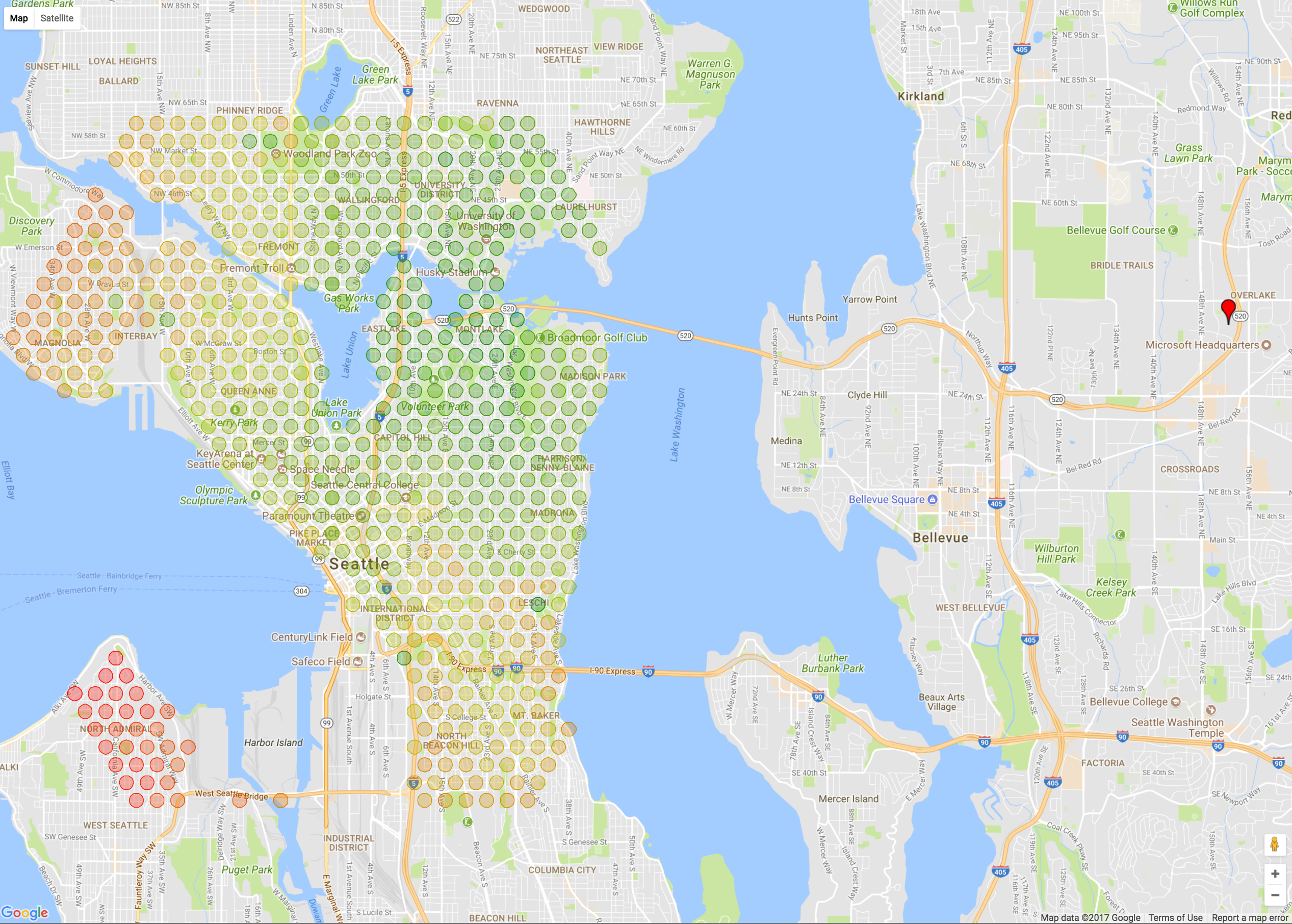 Fares surrounding a certain location (first attempt at visualizing fares):

Get data --> visualize data
Microsoft office locations:
- Redmond
- Bellevue
- Seattle
From each office, we want to visualize how Uber's fares change within a certain radius. Perhaps we'll see price spikes at points of interest (POIs)... Perhaps we'll see a nice gradient... It'd also be interesting to see how the fares change over time, if they change at all.
That said, here's the flow of information: Coordinate points of addresses -> Get fare estimate from origin to address -> visualize fares on a map. Here's our data sources:
- Addresses - From list of coordinates, remove those that don't correspond to a valid address.
- From origin to every lat lng pair, call Uber API to get a fare estimate.
Plot [lat, lng, fare] on a map.
Pretty straightforward!