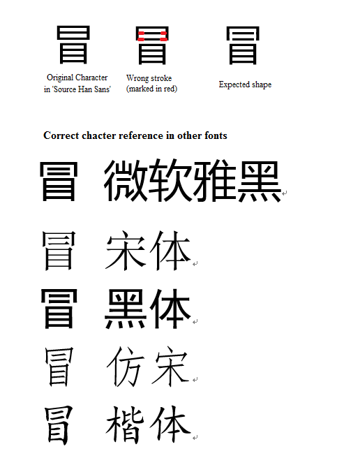
Character 冒( U+5192) is wrong #4
Comments
|
The shape in TWHK variant is identical to what you expect. Below is a comparison with Japanese fonts Meiryo and M+, and TWHK variant: |

|
Thanks for your comment, I am using the OTF version, which using the same shape with Japanese version. |
|
And, I found that U+2F8D2 is in CJK Compability Ideograph. I haven't find out what it differs from U+5192. However, Source Han Sans doesn't provide the glyph in U+2F8D2. |
|
Sorry, just a mistake in the Unicode number, it should be U+5192. |
|
If you are using the multilingual OTF, you must mark the text as other language (via supported software like InDesign), or it will use Japanese version. Try region-specific subset OTF or OTC instead. See this http://sourceforge.net/adobe/source-han-sans/wiki/Home/ for more detail. |
|
U+2F8D2 corresponds to a character in CNS 11643 Plane 6, and is thus outside the scope of Source Han Sans. About U+5192, the others are correct in that the appropriate font must be used, or if the multilingual OTFs are used (whose default language is Japanese), an application that supports the 'locl' GSUB feature (such as InDesign) must be used, and the text must be properly language-tagged. Only the Japanese fonts and OTC font instances use 日 (U+65E5) as the top component. The other three supported languages use the form that you are expecting. So yes, please use the appropriate region-specific subset OTFs, or the appropriate OTC font instance (if your environment supports OTCs, which is pretty much anything but Windows). |
|
Because this is user error, I am closing this issue. |
The upper part of 冒 is wrong. It comes from the character 冃 (U+5183), not 日(U+65E5) or 曰(U+66F0). The two horizontal lines should not be connect to the two vertical lines. That is, there should be a small amount of space to pad those horizontal lines.
Here is the comparison of different typeface
The text was updated successfully, but these errors were encountered: