From my article: https://css-tricks.com/hexagons-and-beyond-flexible-responsive-grid-patterns-sans-media-queries/
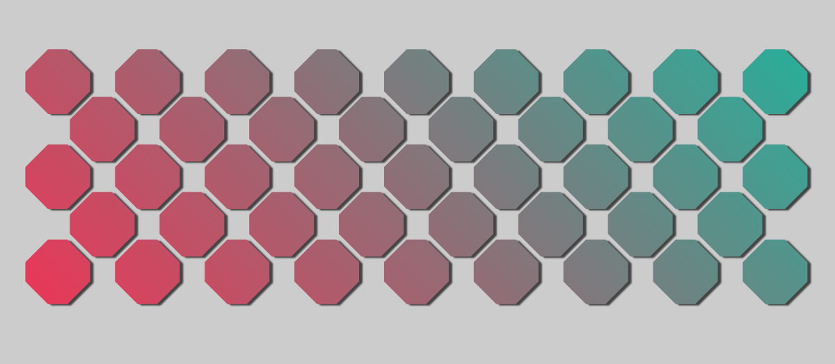
Create a CSS-only responsive grid without using media query. It does support different shapes (Octagon, Hexagon, Rhombus, etc). It's built using inline-block elements and float (yes, the old float!) combined with shape-outside. You can easily adjust the different parameters using CSS variables
Each item of the grid is a single div (where you can put any content) and we need 2 wrapper. The HTML code looks like below:
<div class="main">
  <div class="container">
    <div>...</div>
    <div>...</div>
    <div>...</div>
    ..
  </div>
</div>
For the CSS we have the following. All you have to do is to update a few CSS variables to control the grid.
.main {
  --s: 100px; /* size of the shape */
  --r: 1;     /* ratio */
  --mv: 4px;  /* vertical margin  */
  /* clip-path parametres*/
  --h: 0.25;
  --v: 0.35;
  /**/

  /* You don't need to touch the below */
  --hc: calc(clamp(0,var(--h),0.5) * var(--s)) ;
  --vc: calc(clamp(0,var(--v),0.5) * var(--s) * var(--r));
  --mh: calc(var(--mv) + (var(--s) - 2*var(--hc))/2); /* horizontal margin */
  --f: calc(2*var(--s)*var(--r) + 4*var(--mv)  - 2*var(--vc) - 2px);
  /**/
  display:flex;
}

.container {
  font-size: 0;
}
.container div {
  width: var(--s);
  margin: var(--mv) var(--mh);
  height: calc(var(--s)*var(--r));
  display: inline-block; /* or inline-grid, inline-flex, etc */
  font-size:initial;
  clip-path: polygon(var(--hc) 0, calc(100% - var(--hc)) 0,100% var(--vc),100% calc(100% - var(--vc)), calc(100% - var(--hc)) 100%,var(--hc) 100%,0 calc(100% - var(--vc)),0 var(--vc));
  margin-bottom: calc(var(--mv) - var(--vc));
}
.container::before {
  content: "";
  width: calc(var(--s)/2 + var(--mh));
  float: left;
  height: 135%;
  shape-outside: repeating-linear-gradient( #0000 0 calc(var(--f) - 2px),#000  0 var(--f));
}
Find all the details in my CSS-tricks article