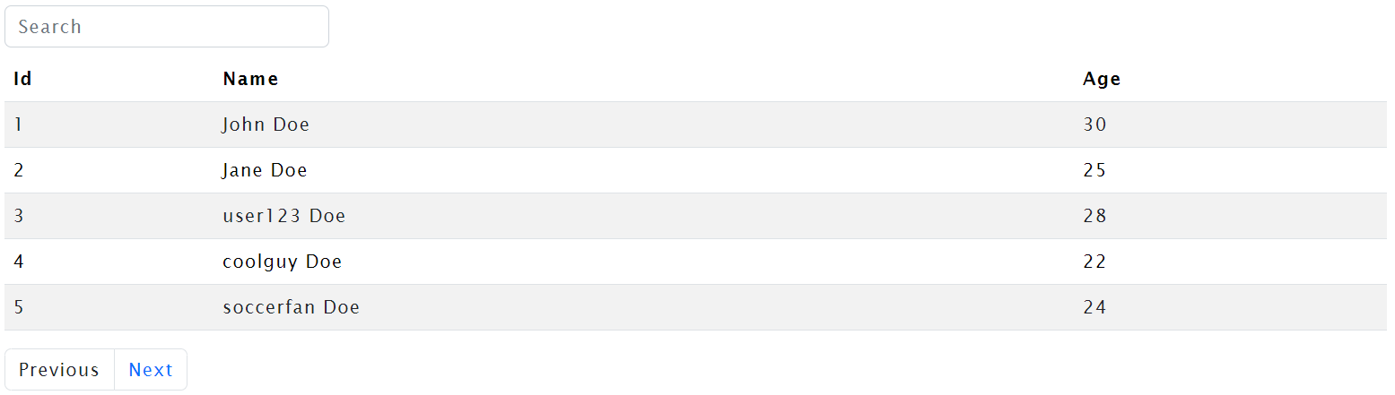
The LabGrid component is a flexible and reusable data grid component built using Razor Pages. It is designed to display tabular data with features like pagination and search functionality. The component is highly customizable, allowing you to easily integrate it into your web applications.
To use the LabGrid component, follow these steps:
- Copy the
LabGrid.razorfile into your Razor Pages project. - Include the
LabGridcomponent in your Razor page or component.
<LabGrid Data="@yourData" GridClasses="table-striped table-hover" />The LabGrid component is designed to be straightforward to use. Simply pass your data to the Data parameter, and the component will handle the rest. You can customize the appearance and behavior of the grid using various parameters.
<LabGrid Data="@yourData" GridClasses="table-striped table-hover" />The LabGrid component supports the following parameters:
- Data: The collection of objects to be displayed in the grid.
- GridClasses: Additional CSS classes to apply to the grid table.
- Classes: Additional CSS classes for custom styling purposes.
- SearchBoxClasses: Additional CSS classes for styling the search input box.
<LabGrid Data="@people" GridClasses="table-striped table-hover" />This example demonstrates the basic usage of the LabGrid component with a default set of data.
<LabGrid Data="@people" GridClasses="custom-grid" Classes="custom-styles" SearchBoxClasses="custom-search-box" />In this example, custom CSS classes are applied to the grid table, allowing for easy styling customization.
<LabGrid Data="@customData" GridClasses="table-striped" />You can use the LabGrid component with any custom collection of objects by passing the desired data to the Data parameter.
- The component infers column headers and data types automatically based on the provided data.
- Pagination is enabled by default with a page size of 5 records. You can customize the page size by modifying the
pageSizeparameter in the component code. - Search functionality allows users to filter records based on a search term entered in the search input box.
- The component is designed to handle a scenario where no records are found, displaying a user-friendly message in such cases.
Feel free to customize and extend the LabGrid component to suit the specific requirements of your web application.
The InputBox component is a flexible and customizable input field for your Blazor applications. It allows users to input various types of data with optional features such as labels, placeholders, and validation indicators.
To use the InputBox component in your Blazor application, follow these steps:
-
Add the
InputBox.razorcomponent to your project. -
Include the component in your razor page or component using:
<InputBox @bind-Value="exampleValue"
          Placeholder="Enter your text"
          Type="text"
          Label="Text Input"
          Help="This is a sample text input box."
          IsRequired="true" />
-
Ensure you have the necessary styles for the component. You may customize the styles as needed.
- Value (bindable): Represents the current value of the input field.
- ValueChanged (bindable): Event triggered when the input value changes.
- Placeholder: Placeholder text displayed when the input field is empty.
- Label: Label for the input field.
- Help: Additional information or guidance to assist users.
- Type: Specifies the type of the input field (default is "text").
- IsRequired: Indicates whether the input is required, displaying a validation indicator if true.
- Classes: Additional CSS classes to customize the input box.
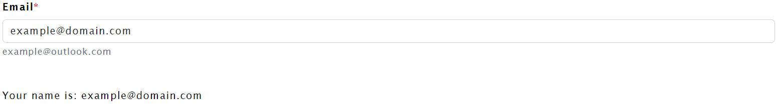
<InputBox @bind-Value="exampleValue"
          Placeholder="Enter your email"
          Type="email"
          Label="Email"
          Help="example@outlook.com"
          IsRequired="true" />
In this example, we have created an InputBox for entering an email address. The input is required, and a label and help text are provided for user guidance.
<p class="mt-5">Your email is: @exampleValue</p>Additionally, you can display the entered value elsewhere in your page or component.
Feel free to customize the component according to your application's styling needs. Adjust the CSS classes and styling within the InputBox.razor file to match your application's design.
-
The
Typeproperty allows you to specify different input types, such as "text," "email," or "password." -
The
ValueChangedevent is triggered whenever the input value changes, providing a hook for additional functionality. -
The component supports required field validation, indicating the user when a required field is not filled.
The LabAccordion component is a versatile and customizable Blazor component designed to create responsive and interactive accordion-style panels. It is particularly useful for presenting information in a collapsible and organized manner. This documentation provides a detailed overview of the component, its parameters, and usage examples.
To use the LabAccordion component, follow these steps:
-
Include the Component in Your Blazor Project: Ensure that the
LabAccordion.razorfile is part of your Blazor project. -
Add the Component to Your Razor Page: In the desired Razor page or component, include the
LabAccordioncomponent with the necessary parameters. Example:<LabAccordion Accordions="accordions" />
Below is the code for the LabAccordion component:
<div class="accordion @AccordionClasses" id="@AccordionId">
    @foreach (var accordionItem in Accordions)
    {
        var collapseId = GetAccordionId(accordionItem);
        <div class="accordion-item @AccordionItemClasses">
            <h2 class="accordion-header">
                <button class="accordion-button collapsed @AccordionTitleClasses" type="button" data-bs-toggle="collapse" data-bs-target="#@collapseId" aria-expanded="true" aria-controls="@collapseId">
                    @accordionItem.Title
                </button>
            </h2>
            <div id="@collapseId" class="accordion-collapse collapse" data-bs-parent="#@AccordionId">
                <div class="accordion-body @AccordionBodyClasses">
                    @accordionItem.ContentText
                </div>
            </div>
        </div>
    }
</div>

@code {
    [Parameter] public IEnumerable<ExpandablePanel> Accordions { get; set; }
    [Parameter] public string AccordionClasses { get; set; } = string.Empty;
    [Parameter] public string AccordionItemClasses { get; set; } = string.Empty;
    [Parameter] public string AccordionTitleClasses { get; set; } = string.Empty;
    [Parameter] public string AccordionBodyClasses { get; set; } = string.Empty;

    private string AccordionId;

    protected override Task OnInitializedAsync()
    {
        AccordionId = GenerateAccordionId();
        return base.OnInitializedAsync();
    }

    private string GetAccordionId(ExpandablePanel accordionItem)
    {
        return $"accordionCollapse_{Guid.NewGuid():N}";
    }

    private string GenerateAccordionId()
    {
        return $"accordionContainer_{Guid.NewGuid():N}";
    }

    public class ExpandablePanel
    {
        public string Title { get; set; }
        public string ContentText { get; set; }
    }
}Below is an example of how to use the LabAccordion component in a Blazor page:
<LabAccordion Accordions="accordions" />
@code {
private IEnumerable<ExpandablePanel> accordions;
protected override Task OnInitializedAsync()
{
accordions = new List<ExpandablePanel>()
{
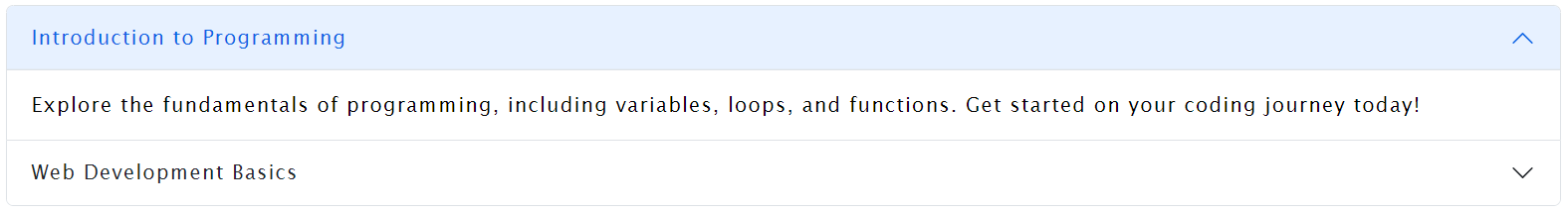
new ExpandablePanel
{
Title = "Introduction to Programming",
ContentText = "Explore the fundamentals of programming, including variables, loops, and functions. Get started on your coding journey today!"
},
new ExpandablePanel
{
Title = "Web Development Basics",
ContentText = "Learn the essentials of web development, covering HTML, CSS, and JavaScript. Build your first website and enhance your skills."
}
};
return base.OnInitializedAsync();
}
}In this example, the LabAccordion component is used to display two accordion panels with titles and content. Customize the component by adjusting the parameters as needed for your specific use case.
-
Accordions (
IEnumerable<ExpandablePanel>): A collection ofExpandablePanelobjects representing the accordion panels. Each panel consists of a title (Title) and content text (ContentText). -
AccordionClasses (
string): Additional CSS classes to be applied to the outer accordion container. -
AccordionItemClasses (
string): Additional CSS classes to be applied to each accordion item. -
AccordionTitleClasses (
string): Additional CSS classes to be applied to each accordion title button. -
AccordionBodyClasses (
string): Additional CSS classes to be applied to each accordion body (content).
Feel free to customize the component further by modifying the CSS classes, adding styles, or adjusting the HTML structure based on your project's requirements.
The LabAccordion component offers a flexible and easy-to-use solution for implementing accordion-style panels in your Blazor applications. Experiment with the provided examples and tailor the component to suit your specific needs.
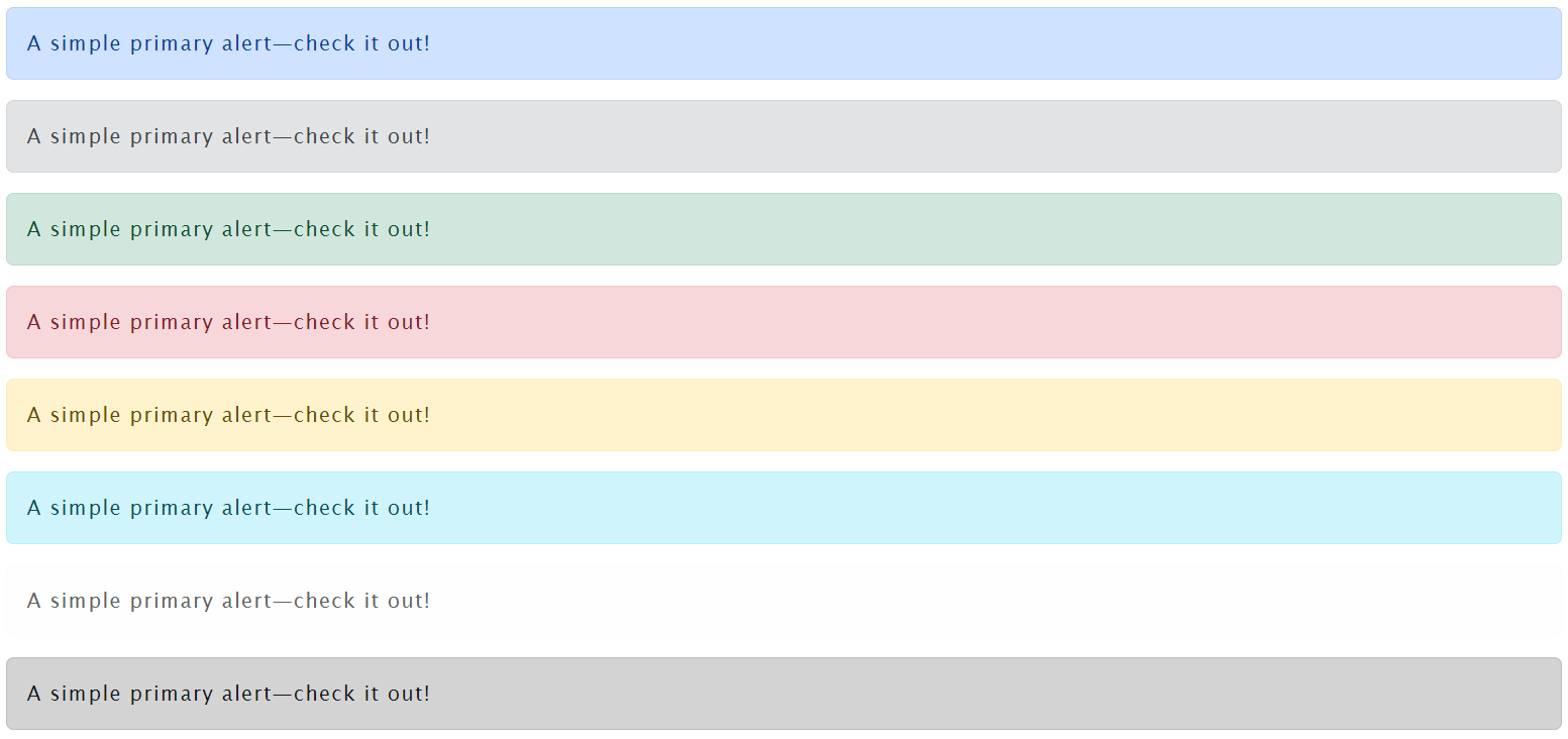
The LabAlert component is a versatile alert component that allows you to display various types of alerts with customizable styles. This documentation provides details on how to use the component and includes examples for each supported alert type.
<!-- LabAlert.razor -->

<div class="alert @Classes" role="alert">
    @Text
</div>

@code {
    [Parameter] public string Text { get; set; } = string.Empty;
    [Parameter] public string Classes { get; set; } = string.Empty;
}To use the LabAlert component, include it in your Razor markup and provide values for the Classes and Text parameters. The Classes parameter determines the style of the alert, and the Text parameter specifies the content of the alert.
<!-- ExampleUsage.razor -->

<LabAlert Classes="alert-primary" Text="A simple primary alert—check it out!" />
<LabAlert Classes="alert-secondary" Text="A simple secondary alert—check it out!" />
<LabAlert Classes="alert-success" Text="A simple success alert—check it out!" />
<LabAlert Classes="alert-danger" Text="A simple danger alert—check it out!" />
<LabAlert Classes="alert-warning" Text="A simple warning alert—check it out!" />
<LabAlert Classes="alert-info" Text="A simple info alert—check it out!" />
<LabAlert Classes="alert-light" Text="A simple light alert—check it out!" />
<LabAlert Classes="alert-dark" Text="A simple dark alert—check it out!" /><LabAlert Classes="alert-primary" Text="A simple primary alert—check it out!" /><LabAlert Classes="alert-secondary" Text="A simple secondary alert—check it out!" /><LabAlert Classes="alert-success" Text="A simple success alert—check it out!" /><LabAlert Classes="alert-danger" Text="A simple danger alert—check it out!" /><LabAlert Classes="alert-warning" Text="A simple warning alert—check it out!" /><LabAlert Classes="alert-info" Text="A simple info alert—check it out!" /><LabAlert Classes="alert-light" Text="A simple light alert—check it out!" /><LabAlert Classes="alert-dark" Text="A simple dark alert—check it out!" />Feel free to customize the LabAlert component further by adjusting the provided parameters and styles to meet the specific requirements of your application.

The LabButton component is a versatile button component designed for integration into Blazor applications. It allows developers to create customizable buttons with ease, providing parameters for controlling button type, text, classes, and disabled state.
<button type="button" class="btn @Classes" disabled="@IsDisabled">@Text</button>

@code {
    [Parameter] public string Type { get; set; } = "button";
    [Parameter] public string Text { get; set; } = string.Empty;
    [Parameter] public string Classes { get; set; } = string.Empty;
    [Parameter] public bool IsDisabled { get; set; } = false;
}- Type (optional, default: "button"): Specifies the type of the button (e.g., "button", "submit", "reset").
- Text (optional, default: empty string): Sets the text content of the button.
- Classes (optional, default: empty string): Defines additional CSS classes for styling the button.
- IsDisabled (optional, default: false): Determines whether the button is disabled.
<LabButton Text="Click me" /><LabButton Classes="btn-primary" Text="Primary Button" /><LabButton Text="Disabled Button" IsDisabled="true" /><LabButton Type="submit" Text="Submit Form" />-
Import the
LabButtoncomponent into your Blazor page or component.@using YourNamespace.Components
-
Utilize the
LabButtoncomponent with the desired parameters in your markup.<LabButton Text="Click me" Classes="btn-success" />
-
Customize the button appearance and behavior by adjusting the parameters.
For more information on Blazor components and parameters, refer to the official Blazor documentation.
The LabCard component is a flexible and customizable card element designed for use in Blazor applications. It provides a simple and organized structure for displaying information with a title, body, and optional footer.
To use the LabCard component in your Blazor application, follow these steps:
- Copy Component Code:
Copy the code for the
LabCardcomponent, including both the Razor component and the associated code block.
<div class="card @CardClasses">
    <div class="card-header">
        @Title
    </div>
    <div class="card-body @CardBodyClasses">
        @Body
    </div>
    @if (Footer != null)
    {
        <div class="card-footer @CardFooterClasses">
            @Footer
        </div>
    }
</div>

@code {
    [Parameter] public string CardClasses { get; set; }
    [Parameter] public string CardBodyClasses { get; set; }
    [Parameter] public string CardFooterClasses { get; set; }
    [Parameter] public string Title { get; set; }
    [Parameter] public RenderFragment Body { get; set; }
    [Parameter] public RenderFragment Footer { get; set; }
}-
Paste Component Code: Paste the copied code into a new or existing Razor component file within your Blazor project.
-
Use the Component: Now, you can use the
LabCardcomponent in your Blazor pages.
Here's an example of how you can use the LabCard component in your Blazor application:
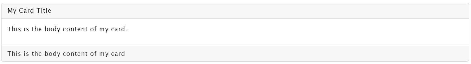
<LabCard Title="My Card Title" CardClasses="custom-card" CardBodyClasses="custom-body" CardFooterClasses="custom-footer">
    <Body>
        <p>This is the body content of my card.</p>
    </Body>
    <Footer>
        This is the footer content of my card.
    </Footer>
</LabCard>
In this example, we've created a LabCard with a custom title, body content, and footer content. Additionally, custom CSS classes (custom-card, custom-body, and custom-footer) have been applied to the card, body, and footer sections, respectively.
Feel free to customize the component by adjusting the parameters and applying your own styles to meet the specific requirements of your application.
- CardClasses (string): Custom CSS classes for the card element.
- CardBodyClasses (string): Custom CSS classes for the card body element.
- CardFooterClasses (string): Custom CSS classes for the card footer element.
- Title (string): Title of the card.
- Body (RenderFragment): Content of the card body.
- Footer (RenderFragment): Content of the card footer (optional).
- The
LabCardcomponent is designed to be flexible and adaptable to various content and styling needs. - Make sure to include any necessary CSS styles for the custom classes applied to the component elements.
- Utilize the
Title,Body, andFooterparameters to dynamically set content for each section of the card.
Feel free to explore and integrate the LabCard component into your Blazor application for a clean and organized way to present information.
LabCheckbox is a flexible and customizable Blazor component designed to handle checkbox and switch functionalities. It provides a clean and intuitive way to integrate checkboxes and switches into your Blazor applications.
To use LabCheckbox in your Blazor application, follow these steps:
- Copy the
LabCheckbox.razorcomponent code into your project. - Make sure to adjust the namespace or folder structure according to your project's organization.
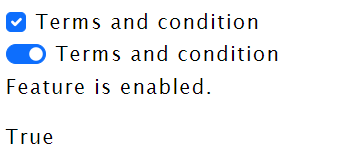
<LabCheckbox Label="Terms and Conditions" @bind-IsChecked="featureEnabled" /><LabCheckbox Type="switch" Label="Terms and Conditions" @bind-IsChecked="featureEnabled" />- Label: Specifies the label text for the checkbox.
- Help: Optional. Adds a help text below the checkbox.
- Name: Optional. Sets the name attribute for the checkbox input.
- Type: Accepts values "checkbox" or "switch" (default is "checkbox").
- IsDisabled: Optional. Disables the checkbox if set to true.
- Classes: Optional. Adds custom CSS classes to the checkbox input.
- IsChecked: Binds the checkbox state to a boolean variable.
- IsCheckedChanged: Invoked when the checkbox state changes.
<LabCheckbox Type="switch" Label="Terms and Conditions" @bind-IsChecked="featureEnabled" />
<p>Feature is @(featureEnabled ? "enabled" : "disabled").</p>
<p>@featureEnabled</p>

@code {
    private bool featureEnabled = false;
}The LabCheckbox component uses parameters to customize its appearance and behavior. The Type parameter determines whether it functions as a checkbox or a switch. The IsCheckedChanged event is raised when the checkbox state changes.
You can apply custom styling by utilizing the Classes parameter, allowing seamless integration with your application's design.
- Ensure you have the necessary dependencies and compatibility with your Blazor version.
- Refer to the official Blazor documentation for any additional integration or configuration requirements.
The LabModal component is a reusable Blazor component designed to simplify the implementation of modal dialogs in your Blazor applications. It provides a flexible and customizable modal with built-in support for displaying a title, header, body, and footer. The component also includes callback events for handling modal visibility changes and save button clicks.
- Customization: Easily customize the appearance of the modal by providing parameters such as title, header classes, body classes, and footer classes.
- Event Handling: Respond to modal visibility changes and save button clicks using callback events.
- Reusability: Use the
LabModalcomponent across different parts of your application to maintain a consistent modal experience.
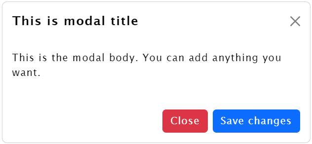
<button type="button" class="btn btn-primary" @onclick="ShowModal">
    Launch demo modal
</button>

<LabModal ShowModal="@showModal"
          ShowModalChanged="HandleShowModalChanged"
          SaveClicked="HandleSaveClicked"
          Title="This is modal title"
          HeaderClasses="border-0"
          FooterClasses="border-0">
    <Body>
        <p>This is the modal body. You can add anything you want.</p>
    </Body>
</LabModal>
<p>@saveClicked</p>

@code {
    private bool showModal = false;
    private bool saveClicked = false;

    private void ShowModal()
    {
        showModal = true;
    }

    private void HandleShowModalChanged(bool newValue)
    {
        showModal = newValue;
    }

    private void HandleSaveClicked(bool value)
    {
        saveClicked = value;
        // Handle the save button click event here
        // You can perform additional actions or update the UI as needed
    }
}<LabModal ShowModal="@showModal"
ShowModalChanged="HandleShowModalChanged"
SaveClicked="HandleSaveClicked"
Title="Customized Modal"
HeaderClasses="bg-primary text-white"
BodyClasses="custom-body-style"
FooterClasses="bg-light">
<Body>
<p>This is a customized modal with a different header and body style.</p>
</Body>
</LabModal>Title: The title of the modal.HeaderClasses: Additional CSS classes for the modal header.BodyClasses: Additional CSS classes for the modal body.FooterClasses: Additional CSS classes for the modal footer.SaveButtonText: The text to display on the save button (default is "Save changes").CancelButtonText: The text to display on the cancel/close button (default is "Close").ShowModal: Boolean indicating whether the modal is visible.ShowModalChanged: Event callback for modal visibility changes.SaveClicked: Event callback for the save button click.Body: Render fragment for the modal body content.
HideModal(): Hides the modal and invokes theShowModalChangedevent.SaveChanges(): Hides the modal, invokes theShowModalChangedevent, and asynchronously invokes theSaveClickedevent.
The SelectBoxComponent is a reusable Blazor component designed to provide a flexible and customizable dropdown select box for use in web applications. It allows users to select from a list of predefined items and provides search functionality for easy item navigation.
To use the SelectBoxComponent in your Blazor application, follow these steps:
-
Add the component to your project or reference the existing code.
-
Use the component in your Blazor page or component by including the
<SelectBoxComponent>tag and providing the necessary parameters.
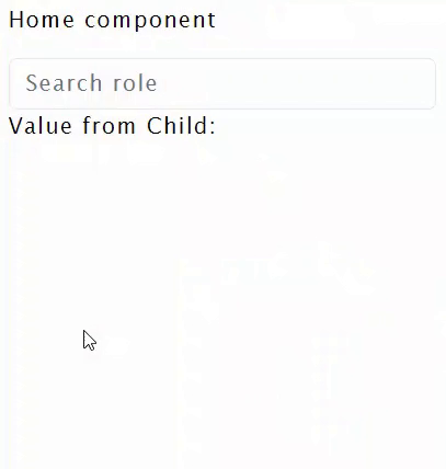
<SelectBoxComponent Items="roles" ValueChangeEvent="(e) => OnChangeHandler(e)" SelectedId="5" />
<p>Value from Child: @selectBoxObject?.Text</p>-
Items: IEnumerable (Required) - The list of items to populate the dropdown.
-
ValueChangeEvent: EventCallback (Optional) - A callback function triggered when an item is selected.
-
SelectedId: string (Optional) - The ID of the initially selected item.
-
SelectBoxClasses: string (Optional) - Additional CSS classes for styling the select box.
-
SearchFieldClasses: string (Optional) - Additional CSS classes for styling the search input field.
-
OptionItemClasses: string (Optional) - Additional CSS classes for styling the individual option items.
-
Search Functionality: Users can search for items in the dropdown, making it easy to locate specific options.
-
Custom Styling: Customize the appearance of the select box, search input, and option items by providing CSS classes.
-
Event Handling: Respond to item selection by handling the
ValueChangeEvent.
The component provides default styling, but you can customize it by providing your own CSS classes. Below are the key styles that can be modified:
-
Dropdown Container:
.dropdown-select-65 -
Search Input:
.input-search-select-65 -
List Item Hover:
.list-group-item:hover
The component's code has been optimized for performance and readability. Some key optimizations include:
-
Efficient item filtering using LINQ.
-
Minimized redundant code in the
SetActiveClassValuemethod. -
Proper handling of asynchronous operations.
The provided HomeComponent demonstrates how to use the SelectBoxComponent with a list of roles. Customize the roles based on your application's needs.
@code{
    private IEnumerable<SelectBox> roles;
    private SelectBox selectBoxObject;

    public void OnChangeHandler(SelectBox passedObject)
    {
        selectBoxObject = passedObject;
    }

    protected override async Task OnInitializedAsync()
    {
        roles = new List<SelectBox>
            {
                new SelectBox
                {
                    Id = "3",
                    Text = "Developer"
                },
                new SelectBox
                {
                    Id = "4",
                    Text = "Manager"
                },
                new SelectBox
                {
                    Id = "5",
                    Text = "Tester"
                },
                new SelectBox
                {
                    Id = "6",
                    Text = "Designer"
                },
                new SelectBox
                {
                    Id = "7",
                    Text = "Analyst"
                }
            };

        await base.OnInitializedAsync();
    }
}
Feel free to add more details, such as additional features, configuration options, or any other relevant information based on the specifics of your component and your project's needs. Additionally, include a proper license file and credit contributors appropriately.
This project is licensed under the MIT License. Feel free to modify and use it in your projects.
Feel free to add more details, such as additional features, configuration options, or any other relevant information based on the specifics of your component and your project's needs. Additionally, include a proper license file and credit contributors appropriately.