discoverability improvements #1704
Conversation
There was a problem hiding this comment.
Excited for this! Hopefully it helps a lot with discoverability. Thanks for spearheading these efforts @annthurium!
| @@ -5,6 +5,7 @@ import BranchView from '../views/branch-view'; | |||
| import BranchMenuView from '../views/branch-menu-view'; | |||
| import PushPullView from '../views/push-pull-view'; | |||
| import ChangedFilesCountView from '../views/changed-files-count-view'; | |||
| import GithubStatusBarTile from '../views/github-status-bar-tile'; | |||
There was a problem hiding this comment.
Here's a suggestion for the class name based on package convention (ending with the word "view") and context (being in the status-bar-tile-controller.js file) -- GitHubTileView. And the file could be github-tile-view.js.
Similarly, since you changed the tile for opening the Git panel it might be more appropriately named something like GitTileView and the file git-tile-view.js.
Corresponding test files would need to be changed accordingly.
There was a problem hiding this comment.
good call! I'll change the name.
| <Octicon icon="diff" /> | ||
| {label} | ||
| <Octicon icon="git-commit" /> | ||
| {`Git (${this.props.changedFilesCount})`} |
There was a problem hiding this comment.
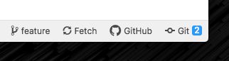
This pull request changes the icon and text in the status bar to say "Git (n)" where n is the number of changed files
Interestingly, when I first saw this my initial thought was that n was the number of git commits... I notice currently we have the number as well as the word "Files" which makes it very clear that the number refers to the changed file count. I wonder if there's a way we could make it more clear with your new version... adding the word "Files" might take up too much space. I think it would even be fine to just drop the file count...
@simurai do you have 💭s?
There was a problem hiding this comment.
I think it would even be fine to just drop the file count...
That would be the least confusing, but we'd miss out on informing the user that there are uncommitted changes, which might be important information to keep.
adding the word "Files" might take up too much space.

Hmm.. yeah.
Or how do you like some sort of "notification badge":
Atom IDE uses something similar. It could also be just grey to be a bit more subtle.
There was a problem hiding this comment.
Good points, you two! Some thoughts...
-
Anecdotal data point: I showed my partner the new interface and asked what he thought
Git (2)referred to. He correctly guessed "the number of uncommitted changes I have made." I asked if having that information at a glance would be useful, and he said yes. When I showed him the old interface, he was not sure what the2 filesreferred to. -
I like the bright color on the badge and think it might encourage users to click, but if the goal is to clarify what "2" refers to it doesn't help.
-
I'd like to ask users about this in the context of an actual research session and let that inform the road we choose to take. If they don't know what the changed file count refers to but would find that information useful, we can add the word "files" back in. It's slightly crowded but not horrible. If they wouldn't find that information useful, we can drop it entirely. Sound good?
There was a problem hiding this comment.
Sounds good to me! Would we do this UXR prior to merging? Or just prior to releasing?
Edit: I see that your intention is to merge soon, so the answer is not prior to merging. I'm totally cool with that. Just curious what our plan would be for doing this research before shipping.
There was a problem hiding this comment.
good question. my intention is to do research before next release, with enough time to make additional changes if necessary. Since we have a month before next release I think that's do-able. I finished the uxr script just now, so next I'll focus on rounding up some users.
lib/views/github-status-bar-tile.js
Outdated
| } | ||
|
|
||
| handleClick() { | ||
| addEvent('click', {package: 'github', component: 'GithubStatusBarTile'}); |
There was a problem hiding this comment.
Not sure what convention we're going with for event names (or if we have even discussed one yet)... I had the thought that a more descriptive event name could be handy, something like toggle-github-tab. That way whoever is combing through the data we're collecting can more easily infer what the events are for in terms of extracting information about user behavior.
There was a problem hiding this comment.
That said, I can also see the value in simply stating that we're capturing a click event on a particular view element...
Oh okay, so we want to decouple the UI action (click on an element) from the effect of the action (toggling the tab). We've instrumented the reveal and hide methods of the TabTracker which tells us the number of times a given tab is opened/closed. We also want to know what method was used to reveal/hide the tab, which is what we're doing here. Does that sounds about right?
There was a problem hiding this comment.
we already record an event for toggling the git and github tabs, in the RootController. 😸
This additional event allows us to know that the button is clicked. If the tabs are toggled a lot, but these buttons are never clicked, we have an additional data point to know that these buttons aren't helping users discover the tabs.
lib/views/github-status-bar-tile.js
Outdated
| <button | ||
| className="github-StatusBarTile inline-block" | ||
| onClick={this.handleClick}> | ||
| <Octicon icon="mark-github" /> |
| @@ -88,6 +94,7 @@ export default class StatusBarTileController extends React.Component { | |||
| return ( | |||
| <Fragment> | |||
| {this.renderTiles(repoProps)} | |||
| <GithubStatusBarTile didClick={this.props.toggleGithubTab} /> | |||
There was a problem hiding this comment.
How about moving the GitHub tile to the far right?

Then it's more in order of this typical 🤔 workflow:
- Choose a branch
- Make sure it's up-to-date
- Make changes
- Create PR
There was a problem hiding this comment.
@simurai if we move the GitHub tile to the far right, we run the risk of disrupting flows for users who have grown accustomed to "click on the thing on the far right" to open the Git pane.
Then again, this would force those users to discover the GitHub pane. 😆
There was a problem hiding this comment.
@annthurium That's a good point, although the "far right" sometimes gets used by the "updates" and "blue squirrel".
Another option would be to move "GitHub" to the left, before the branch name:
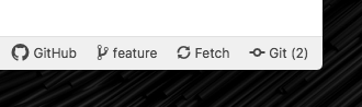
Just so that "GitHub" doesn't get sandwiched between the Git "actions" and the Git tab.
| return ( | ||
| <button | ||
| ref="changedFiles" | ||
| className="github-ChangedFilesCount inline-block" | ||
| onClick={this.handleClick}> | ||
| <Octicon icon="diff" /> | ||
| {label} | ||
| <Octicon icon="git-commit" /> |
There was a problem hiding this comment.
I think changing the icon from diff to git-commit isn't a good choice. The pane is about changed files, it tells you how many files have local changes, yet it uses the symbol for commits. When I first saw the new layout, I'd expected to get the equivalent of git log and were confused about what the number is going to tell me.
There was a problem hiding this comment.
The Git panel includes different things:
- Changes
- Commit message editor
- Recent commits
The "Recent commits" is some sort of mini git log:
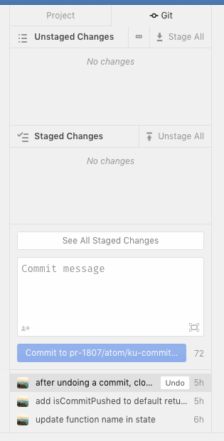
So it doesn't seem easy to find a good icon that fits everything. Using the git icon should hint at: "Create and view commits".
There was a problem hiding this comment.
I'd agree, that for the pane the git commit icon is a better fit, but I'm talking about the status bar button.
The issue is, you're optimizing this for people who aren't even using it. And in doing so, you are breaking the current UI for the users you already have. You shouldn't take that lightly. The new layout doesn't convey more information, nor does it free up precious space in the status bar. Once you found out that the Git(Hub) pane exists and that the buttons will open those panes, these buttons take up space because they got bulky.
I agree that the "n files" label wasn't perfect. What I'd suggest is merely splitting up the buttons. Make one button with just the diff icon and the number of changed files as the label. And a second button with the git-commit icon and git as its label. Both buttons open the diff/commit git pane on click, but the information is logically split. Plus, users who already discovered the git pane can hide the git button without losing functionality. Additionally, all buttons should have a tooltip like every other thing in the status bar does.
I'd even make a PR for that if you like that idea.
There was a problem hiding this comment.
nor does it free up precious space in the status bar.
What I'd suggest is merely splitting up the buttons. Make one button with just the diff icon and the number of changed files as the label. And a second button with the git-commit icon and git as its label.
Here a mockup:

But wouldn't two buttons take up even more space than just a single button?

Also since the two buttons do the same thing, could that be confusing? People would click on both and then think something must be broken since in both cases it opens the same panel. Maybe this could be made less confusing if the focus moves to the changes and the recent commits. Like this:

But having the focus in two different places seems less useful for users that use the mouse to open the git panel.
Description of the Change
There are a lot more Atom users than there are users of the Git/Github package. This points to a discoverability problem. There are menus and commands to open the Git/GitHub panes, but in order to do that you have to know the panes exist.
This pull request changes the icon and text in the status bar to say "Git (n)" where n is the number of changed files, and the icon is a diff icon. This pull request also adds a GitHub icon and text to the status bar, which toggles the GitHub tab when clicked.
Alternate Designs
I thought about not showing the GitHub status bar icon if there are no GitHub.com remotes present. The GitHub tab isn't very useful in that case. It's not really doing any harm to show the GitHub tab -- it's just not a great use of real estate. Thus, I decided the complexity of hiding the icon wasn't worth the hassle.
Benefits
Hopefully, more users will learn that the git and github panes exist, use them, and find the meaning that's been missing from their lives.
We plan on doing usability testing to validate the assumption that the UI improves discoverability.
Possible Drawbacks
If we keep adding stuff to the status bar, eventually it's going to get too crowded. For right now, it's fine.
Applicable Issues
#1573
Metrics
When a user clicks on the GitHub status bar icon, we record an event.
Tests
Unit tests to validate that...
ChangedFilesCountView:GithubTileView:StatusBarTileController:Manual testing to validate that...