This is a quick hack to create static html files that provide an interactive visualization for the evolution of loss functions during neural network training. These html files just contain the underlying time-series data, and plot this data with javascript using Mike Bostock's excellent D3 library .
To get you started, two ways of generating these html files are provided:
-
A bash script to that creates visualizations directly from Caffe log files.
-
Python and MATLAB interfaces to accumulate
plotcalls, and flush them to a single html file.
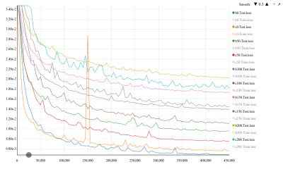
Open the generated html file in a modern browser like Chrome. The file can be loaded from a local directory, or served from a web-server. The visualization allows the following interactions:
-
X Axis: In most cases, loss values in initial iterations will be very high and skew the range of your y axis. Click on the X-axis to pick a "starting point", and only loss values from that iteration on will be used to compute limits for the y axis.
-
Legend: You can click on any of the losses in the legend to toggle their visibility. The y axis limits are always recalculated to be based only on the shown losses.
-
Smooth: Click on the arrows on the top right to increase or decrease the level of smoothing.
-
Zoom: Click on the + button on the top right to toggle between a normal plot, and cartesian fisheye zoom on mouseover.
-
Export: Click on the arrow on the top right to export to a non-interactive SVG that can be saved (using
File, Save As). This export removes all the interactive controls, and only keeps legend entries for visible losses.
When you interact with the visualization, it updates a hash in the url
of the file to reflect your selected options (your url will say
out.html#xxx_yyy_zzz). This means that if you refresh your page
to reload the html file, you won't lose your settings (like subset of
losses selected, smoothness level, etc.). Any saved bookmarks will
also preserve settings when you return to them.
These static html files are self-contained, which means that you can e-mail them to your collaborators and have them interact with the data. The visualization should also work on the browser in most smartphones, if you choose to serve the generated html file from a web-browser.
If you just want to create visualizations, it is sufficient to
download one of the files from the generators/ directory.
Put the generators/cfviz.sh file somewhere in your path. Then, when running caffe, redirect its output to a log file. E.g.,
$ caffe train -solver solver.prototxt &>> train.logFinally, use cfviz.sh on one or more log files (including when
caffe is still running) to generate a static html file. E.g.,
$ cfviz.sh out.html train.log
# This will include all (training and test) losses from train.log
$ cfviz.sh out.html exp1/train.log exp2/train.log
# Losses from both files will appear in out.html, with f1 and f2 as label prefixes.
$ cfviz.sh out.html exp1/train.log:exp1 exp2/train.log:exp2
# Same as above, except that the user-specified prefixes exp1, and exp2Tip: You can run the script in a loop to update your visualization as the log files are updated. E.g.,
$ while true; do
    cfviz.sh out.html exp1/train.log:exp1 exp2/train.log:exp2;
    sleep 180;
done
This will keep refreshing out.html every three minutes. The
script silently ignores absent log files. This is useful if you are
tracking jobs submitted to a cluster that may only start sometime in
the future.
Download the generators/ntplot.py or
generators/ntfigure.py file, and put it
somewhere in your Python / MATLAB path. Then, in either language,
create an object of the provided classes, make multiple plot
calls (providing x, y, and label), and finally a save to create
the visualization.
Python Example:
import numpy as np
import ntplot as ntp

# Generate example data
x = np.asarray(range(100),dtype=np.float32)
y1 = 10 - np.exp((-x/100)**2) + np.sin(x/10*np.pi)/16
y2 = 10 - np.exp((-x/100)**2) + np.cos(x/10*np.pi)/16
x2 = x[::2]+10
y3 = 10 - np.exp((-x2/100)**2/2)+ np.cos(x2/10*np.pi)/16

# Make visualization
plt = ntp.figure()
plt.plot(x*1000,y1,'x.y1')
plt.plot(x*1000,y2,'x.y2')
plt.plot(x2*1000,y3,'x2.y3')

plt.save('pyex.html')
MATLAB Example:
x = [0:99];
y1 = 10 - exp((-x/100).^2) + sin(x/10*pi)/16;
y2 = 10 - exp((-x/100).^2) + cos(x/10*pi)/16;

x2 = x(1:2:end)+10;
y3 = 10 - exp((-x2/100).^2/2)+ cos(x2/10*pi)/16;


plt = ntfigure();
plt.plot(x*1000,y1,'x.y1');
plt.plot(x*1000,y2,'x.y2');
plt.plot(x2*1000,y3,'x2.y3');
plt.save('matex.html');
These examples generate the following html file: pyex.html
The format of the static html files is very simple, and involves only setting a data array variable in an expected format. It should be fairly straight-forward to write scripts to generate these visualizations from other toolkits---the python version is probably a good starting point to understand the data format.
The current caffe and python generators will create html files with
links to the ntviz.js and ntviz.css files on the project's
github page. If you would like to use a different address (for
example, to work with a locally modified copy, or to make the HTML
files work when offline), please either set the NTVPATH
environment variable to the directory or URL where these files are stored:
$ export NTVPATH="/home/jdoe/gitclones/ntviz/"