[UX] Installer: Revamp the language selection page #3975
Comments
|
...ideally, at some point in the future, we should implement a feature where the installer is able to download languages from the translation server. This fieldset should still be shown, to account for custom languages (Klingon anybody? 😄), or languages that have not been translated yet. |
|
@klonos Thanks for the PR! I like the collapsed fieldset at the beginning, but was confused to see the "Install in another language" fieldset again, after adding a language file. To see the (quite prominent) heading again, it felt like I missed something when I had added the language file. Here are screenshots of the process: 1. Started without having a language file in the respective directory:
2. Opened the fieldset:
3. Added language file and clicked "Reload this page":
In my opinion, when I just have provided a language file, the "Install in another language" section isn't needed (or at least too prominent). |


|
Here's an idea: When a language file has been provided, we could change the wording of the field set. See in comparison: Step 3, as in the PR:
Step 3, proposal (collapsed):
Step 3, proposal (expanded):
|


|
Another idea: make the field set heading less promiment. Mockup:
|

|
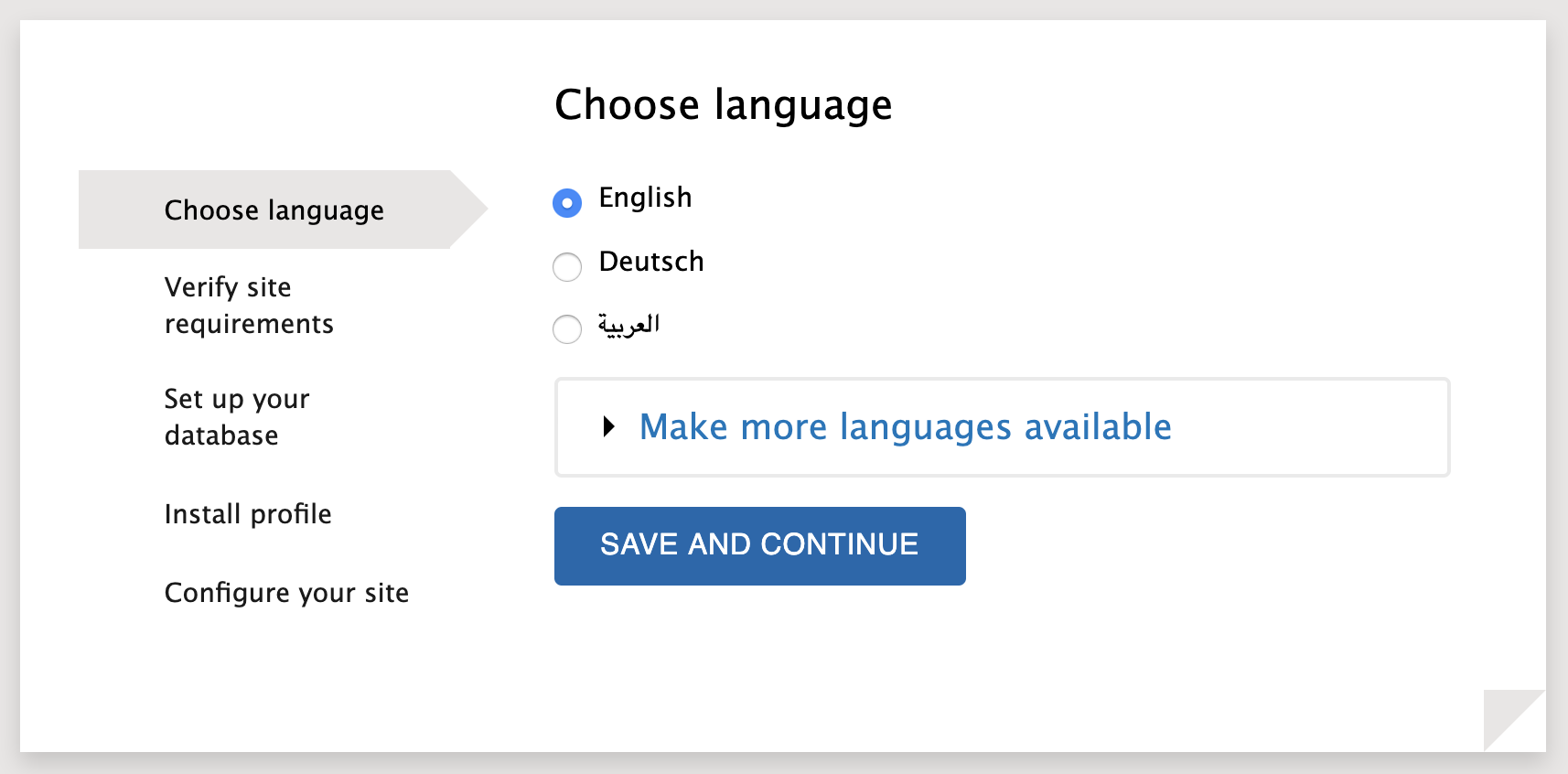
Thanks for the feedback @olafgrabienski and sorry for not responding earlier. I see the point you are making re the wording of the fieldset, but I find it simpler to make it always be "Make more languages available". Besides, "Install in another language" implies that you can select other languages; whereas what is actually happening is you are given instructions on how to enable more. Another UX issue is with the dropdown when there's only a single language available:
The user is asked to Choose a language -> they click on the dropdown -> there is only a single option -> waste of clicks/time 👎 (which is basically the same as #1442). I was thinking that perhaps we could render the select as radios if there are say 3 or less languages:
...then switch to dropdown if more (which I believe will be a rare case btw):
As for making the fieldset label lowercase, I will wait for more feedback, since that is how the Seven admin theme renders fieldsets. |


Agreed!
Nice idea. Would we use this pattern only here (for the time being), or are you considering to make it a more general rule which applies here and in other places?
Yes, I guess it makes sense to open a separate issue for the upper vs. lowercase question of fieldsets in Backdrop. |
Only here. The most common use case would be for 1 or 2 additional languages to be added, so making them a set of radio options would be one less click (and there is no vertical space issue that we need to be concerned with here). This select has the potential to grow to a big number of options though (if all possible languages are added), so falling back to a select after a threshold seems logical to me. I have filed a new PR to implement this: backdrop/backdrop#2930 I also changed the fieldset label to always be "Make more languages available".
|
|
Here's some screenshots from my local (with #4125 applied): Most people will only ever see this: ...with this if they expand the fieldset: ...if they add 1 or 2 language files: ...and if they add more language files: |


|
@klonos You were asking me in backdrop/backdrop#2814 (comment) if I could move my comment about the URL to the translation server here so we can get more feedback re the URL to use. Here it is:
|
Steps To Reproduce
Actual behavior vs. expected/ideal behavior
The "Learn how to install Backdrop in other languages" link opens another installer page, but does not change the "Choose language" step on the sidebar (although there was a page refresh). That is not that bad I guess, but I expected the link to open another tab to a b.org handbook page; otherwise, why not have it be a button instead?
If all we are doing is to merely show a page with only textual info and links, with the intention being not to bloat the main page, then why not make the link a fieldset, which would present that info w/o any page refresh?
The page title with the textual info is also "Choose language", whereas there clearly is no such option in this page. If we are to keep this as a separate page, then why not have its title be "Install Backdrop in other languages" instead?
The "Follow these steps to translate Backdrop into your language" bit is not accurate. Following these instructions in not translating Backdrop; it is enabling another language (which Backdrop has already been translated to) for the installer, and the site once the installation has finished.
I would expect a 3rd step (bullet point), which would say something like "Refresh the installer page. The language you installed in the previous step should now be available in the language selection menu."
The "For more information..." bit is injected into a place that stops the natural flow of things in that page. I would prefer it at end of all that text, or preferably at the top, as an
infomessage.The links in the "How should the installation continue?" section feel like should have been action buttons instead. I understand that they may have been added added as links because of their lengthy text, but still feels wrong.
Proposed solution
Include the "Follow these steps ..." text in the "Choose language" step, as a collapsed-by-default fieldset:
...expanded:

PR by @klonos: backdrop/backdrop#2930
The text was updated successfully, but these errors were encountered: