


A modern approach to an auto complete component for ReactJs
import React from 'react'
function App () {
let list = [ { name: 'Foo' }, { name: 'Far' }, { name: 'Faz' } ]
let options = { propKey: 'name' }
return (
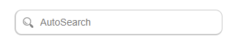
<AutoSearch
list={list}
options={options}
onSelect={ value => val = value }
/>
)
}npm install --save autosearchDo you like what we made? Support it by donating, creating an issue or pull request.
Value: Array<{ [prop: string]: string } | string>
Type: Array<String>: no action required in AutoSearchOptions
Type: Array<Object>: specify propKey value in AutoSearchOptions
- The list used for the AutoSearch algorithms
Default: () => {}
Arguments: value: String
- Invoked when the user changes the input value.
Default: () => {}
Arguments: results: Array<T>, active: Number
- Invoked when keyboard listeners react to user navigation of results list.
Default: () => {}
Arguments: value: String, results: Array<T>
- Invoked when the user selects an item from the results list.
Default: Object<AutoSeachOptions>
Value: Object
- Used throughout AutoSearch as conditional options and values
Default: 'item'
- Used to find the iteration value by the AutoSearch algorithms
Default: 'steelblue'
- Used as the primary color for active result indication
Default: 'AutoSearch'
- Attribute applied to the root input placeholder value
Default: false
- Attribute applied to the root input autoFocus value
Default: false
- Used in the AutoSearch algorithms to match search value
Default: 10
- Max number of results to render in the results list
Default: true
- Used to determine if the search icon is rendered in the input

A log of recent updates and notes can be found here
The future plans are under deliberation within the core team.
This project is licensed under the terms of the MIT license