[Multi-Pipeline View] Thumbnail preview on red pipelines #1462
Comments
|
This might be a stupid question, but are you going to introduce now the concept of a "pipeline"? I know, that technically what you're building is a pipeline, but concourse doesn't actually know anything about that. So, when you're trying to indicate "for how long a pipeline has been failing", what does that mean? That not all jobs in that pipeline have been green at the same time for an amount of time? Or is this really a concept of the same inputs flowing from "beginning to end"? I'm asking this, because e.g. for github badges and similar purposes, up to now there was no notion of getting the state of an entire pipeline, and I'm wondering how this is calculated or introduced. Thanks! |
|
Good question @voelzmo ! We're actually using this thumbnail view as a way to play around with new visualizations of the pipeline. To your point, Concourse itself, specifically the ATC, doesn't "know" about the shape of the pipeline. In this dashboard view, our first attempt to answer the question " how long a pipeline has been failing" was to simply record how long a job in the pipeline has been in the "red" state. This has some value to teams but most people will probably want to know more about (i.e. how long did something take to run, when was the last time it ran, etc.) These are valid questions that we're going to tackle specifically in our next set of issues: pipeline visualization. We're still trying to formalize our thinking on this, but I think some of the best ways to surface this information is going to be in how we present information in the resource itself (i.e. how long has a resource spent in a run state vs the "pipeline") |
|
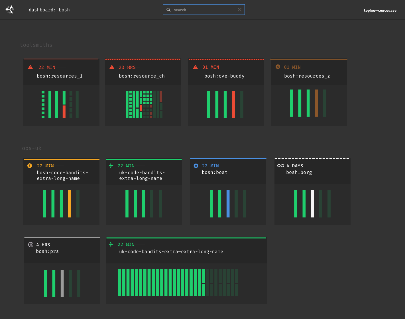
We noticed that a 5px margin looks pretty good for both small pipelines and "realistic" medium-sized pipelines (like ci.concourse.ci), however in some extreme examples the margin overwhelms the actual pipeline, which leaves jobs pixel then and can even leave the thumbnail blank.
I don't think we should optimize for this use case - it looks pretty good for..."normal" pipelines:
One idea: |


|
We spiked for a bit on another idea, which is to have the box expand if the pipeline grid has a certain number of columns:
This is kinda similar to tiling approaches used by Windows 8+. Downsides/gotchas:
|

|
Solution to the interference of the duration is aligning it with the icon and then the pipeline name below. Showing duration for all states in this example there would be a new icon of an infinity loop for a pipelines that is hanging forever. |
- Update pipeline duration text

concourse/concourse#1462

Signed-off-by: Gabriel Dumitrescu <gdumitrescu@pivotal.io>
|
such iteration, much wow |
- Update pipeline duration text

concourse/concourse#1462

Signed-off-by: Gabriel Dumitrescu <gdumitrescu@pivotal.io>
Feature Request
What challenge are you facing?
Based on the research the Concourse team has done interviewing folks, and the huge list of issues everyone has reported; we're finally going to do a multi-pipeline view for Concourse users. A lot of the specific research and aggregation of tickets can be found in issue #1259 .
A Modest Proposal
Failing pipelines rise to the top of the "list" of pipelines per team [Multi-Pipeline View] Failing Pipelines should rise to the top of the team pipeline list #1491Animated time display [Multi-Pipeline View] Animate the broken pipeline timer #1495Thumbnail abstraction of execution stages [Multi-Pipeline View] Run progress visualization of thumbnail #1493The text was updated successfully, but these errors were encountered: