This issue was moved to a discussion.
You can continue the conversation there. Go to discussion →
Dashboarding enhancements #565
Comments
|
Folks tracking this issue, if you have a favorite in the list above, could you please make a mention in the comments? Some may carry over to 4.2 and beyond, so feedback will help prioritize these. Thanks :-) |
|
Additional color palettes for warnings would be great |
|
4.1 is getting substantial - there's quite a bit from this ticket and others that we'd like to start getting into people's hands: https://github.com/datalust/seq-releases/milestone/75?closed=1. I've broken out one more of the TODO items from above - single-valued charts - and assigned this to 4.1. I think the rest of this ticket can move to 4.2. Please jump in if you're hoping to see any of the incomplete items above in the 4.1 milestone. Thanks! :-) |
|
It would be great if you could have two scales on a single chart. I have the min, max, mean of query times and the count of the number of queries. The aggregates are in the 1-5 mark while the count is up at 100-200 mark. |
|
What I would like to have is some kind of comparing a chart (or a complete dashboard) with the same one at a different period in the past. Typical cases are : compare this week with last week or the week before last / compare this month with last month etc . I can't really think exactly of how that would materialize in the UI though :-/
... I like option 2 best :) I guess that for this to make it really useful , Seq would need to also support timereanges other than "last X days" and gain some kind of understanding about "when a week starts" (the good old "Sunday" or "Monday" -based :p) , "when did the month start", in order to have time ranges like "this week", "this month", "this year", "last month", "last week", "the week before last" etc ... |
|
I'd vote for making Dashboard charts available as rendered images (PNG or, maybe, SVG) through API. This would be a great way to present log-based status in third-party monitoring applications, as well as providing visual access to application metric to departments, that are not necessarily involved in development. |
|
It is somewhat annoying that the selected (or deselected) properties on a chart are reset when the Refresh fires. I expect that they would remain in the prior state between refreshes. Maybe this is something we can add to the dashboard enhancements. Thanks
|
|
Super interested in these two: Login-free dashboards; e.g. put an API key parameter in the dashboard URL so that it can be viewed on information radiators without needing a logged-in Seq session. |
|
I'd like the ability to "lock" a dashboard's range & group by dashboard ID. There are some signals that only get fired daily and some that are fired on the minute, but if one dashboard is set to "Last 2 days by hour", it seems all dashboards are. |
|
Hi, any updates to the "Request a chart as .PNG through the Seq API" feature? We'd really love to show our end users some of our dashboard widgets containing important metrics from our backend systems in their frontend apps. Really looking forward to this feature! |
|
Hi @jonnepmyra - thanks for the nudge. No movement on this one as yet, but it's definitely on the radar 👍 |
|
Hi. Wondering if any progress is made on "Request a chart as .PNG through the Seq API" feature request? |
|
@stanisls not currently, but thank you for the +1 👍 |
|
It would be great if you could allow the legend to go larger. We have some dashboards where there is a large amount of room spare around a pie chart that could allow the legend to fill the space and show all the labels. |
|
I would like to vote for the custom time ranges, since we like to realize some kind of reporting, e.g. "How many errors | warnings | log messages | <custom properties> did we have today | yesterday | last week".
|
|
Another thought I had was it would be nice to be able to have 2 time ranges for comparison. Eg Today vs Yesterday. |
|
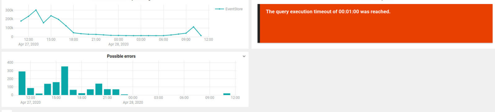
Nice to have: refresh single chart in a dashboard, when it goes in timeout. |
|
@bard83 thanks for the suggestion! If you're hitting timeouts when rendering a chart, sometimes moving the condition from Query > If that doesn't help, please feel free to get in touch with |
This issue was moved to a discussion.
You can continue the conversation there. Go to discussion →
Tracking issue for a number of things that didn't make the 4.0 cut.
nullwhen no data is present in a time range. Show a nice subtle icon instead ofnullwhen no data is present in a time range #627Make chart titles easier to read at low resolutions, e.g. wall-mounted TVs.Make chart titles easier to read at low resolutions, e.g. wall-mounted TVs #625Rowset-valued charts on dashboard #628having,order byandlimitsupport on chartshaving,order byandlimitsupport on dashboard charts #798min,maxetc.I'm sure there's more to add here, we'll update this list as feedback comes in :-)
The text was updated successfully, but these errors were encountered: