Data are pulled directly from Johns Hopkins CSSE into an interactive chart with both log and linear options, breakouts by state, and graphs of changes from day to day of reported deaths and confirmed cases.
See the live covid-19 chart at covid19chart.org.
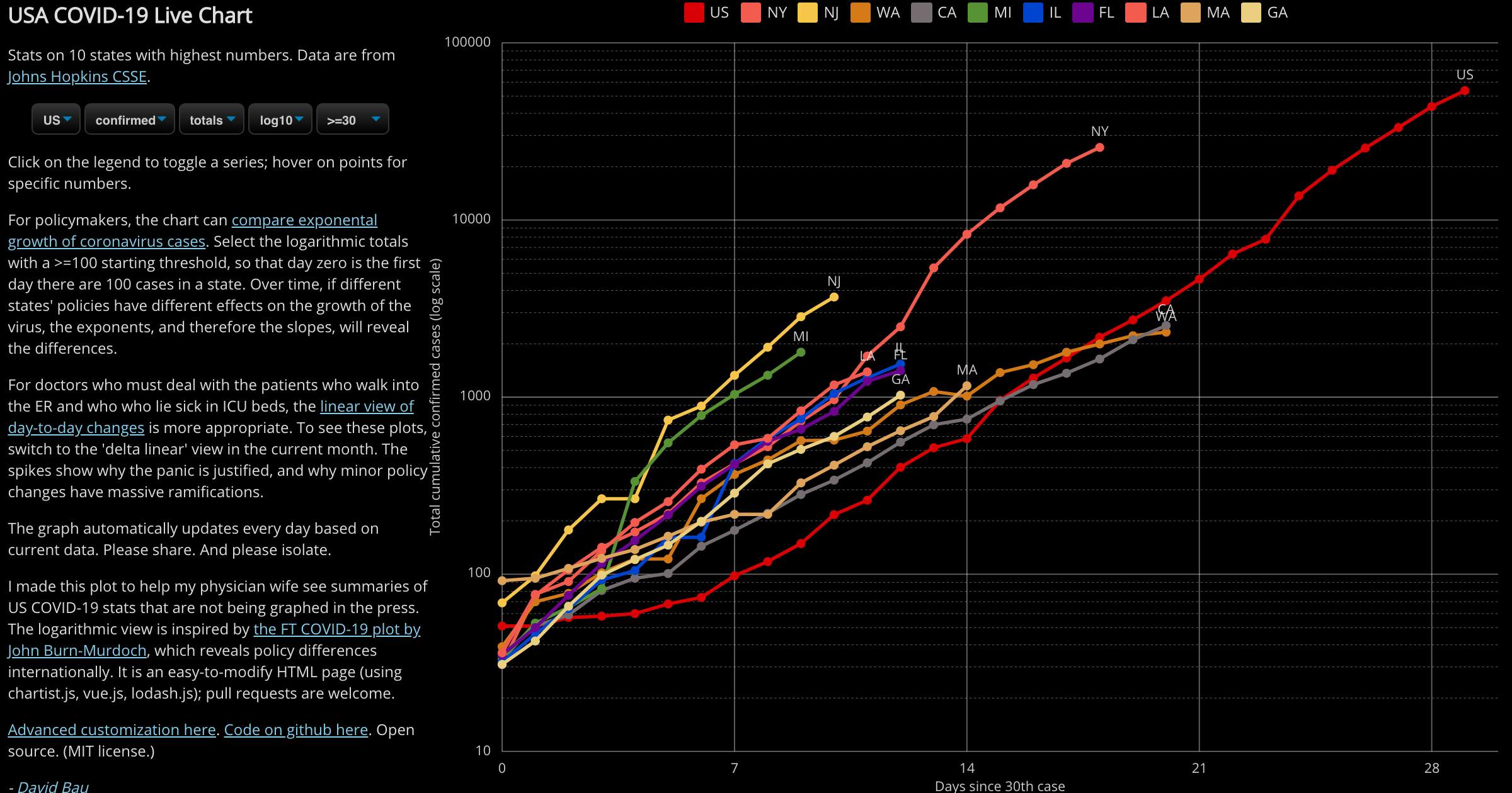
My physician wife wanted to see some summaries of U.S. covid-19 stats that are not graphed in the press, so I wrote this short HTML page to create those rollups. I have now packaged it as an API so that it can be used to make more customized live graphs and embed them in dashboards for local decisionmakers.
This page just one small HTML+JS page, using chartist.js (with legend, tooltip, and logaxis extensions), vue.js, lodash.js, and papaparse. Pull requests are welcome.
Code is at https://github.com/davidbau/covid-19-chart.
Open source. (MIT license.)
The URL can be linked to save a chart. Although legend selection states are not saved, a graph with particular countries or states can be created by directly using the URL API.
domain: US or Intl.series: confirmed or deaths.stat: totals or deltas.scale: linear or log10.norm: none, first (normalized by first day), or pop (per million population).start: a date or >= expression as in the menu.top: integer how how many top states or countries to include.include: semicolon-separated list of counties/states/countries to include.select: semicolon-separated list of localities to highlight in graph.theme: dark, white, or paper, to match your dashboard.advanced: show a simple form for customizing the graph.bare: set to 1 to show just the chart (e.g., for embedding).
The URL can be edited directly, or the "Advanced options" link can be used to toggle the advanced customzization form. More information in this blog post.
Thanks to David Ebbo for improving the selection UI, and thanks to David Maymudes for adding per-population normalization!
Thanks to the support of MIT Quest.