Make case details sidebar responsive #7534
Assignees

Comments
 ghost
added
the
ghost
added
the
va-bot
pushed a commit
that referenced
this issue
Nov 19, 2018
Resolves #7534 ### Description Makes case details sidebar responsive. Sidebar collapses to top and sticks to top of page when scrolled to, and main content section assumes full width. Sidebar links jump to appropriate section with scroll offset. Question: - Made the sidebar text size smaller per the design in #7534 (`13px`). Is the text size too small? 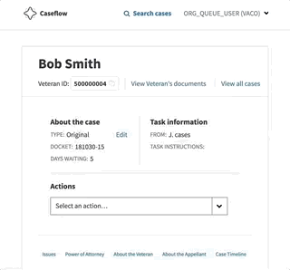
Sign up for free
to join this conversation on GitHub.
Already have an account?
Sign in to comment
Currently, at small screen widths the table of contents sidebar become hard to read and rob us of valuable screen real estate. This ticket exists to make the sidebar collapse into a smaller version of itself at small screen widths.
Current state
Future mocks
The text was updated successfully, but these errors were encountered: