guide layout with clarity angular
The purpose of this guide is to get a basic understanding of creating layouts Angular Clarity in a devon4ng application. Angular Clarity is a HTML/CSS framework.
We start with opening the console(in the Devon distribution folder) and running the following command to start a project named AngularZorroLayout.
devon ng new AngularClarityLayout
Select y when it asks whether it would like to add Angular routing and select SCSS when it asks for the style sheet format. You can also use the devonfw IDE CLI to create a new devon4ng application.
Once the creation process is complete, open your newly created application in Visual Studio Code. Try running the empty application by running the following command in the integrated terminal:
devon ng serve
Angular will spin up a server and you can check your application by visiting http://localhost:4200/ in your browser.
Next we will add Angular Clarity to our application. In the integrated terminal, press CTRL + C to terminate the running application and run the following command:
Generate a new Angular application (if you haven’t already):
ng new my-app
Navigate to the directory:
cd my-app
Run the ng add command for Clarity:
ng add @clr/angular
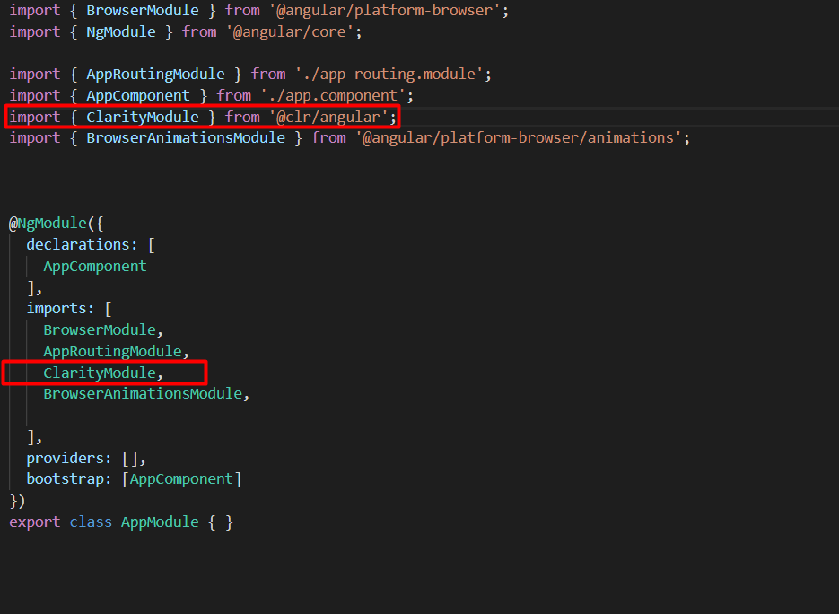
After that we can see that the module is imported on app.module.ts
import { ClarityModule } from '@clr/angular';
@NgModule({
  declarations: [
    AppComponent
  ],
imports: [
    ClarityModule,
 ],
  providers: [],
  bootstrap: [AppComponent]
})
export class AppModule { }
After installed the library we can start to develop the code.
Adding styles in styles.css
body {
margin: 0;
font-family: "Segoe UI", Roboto, sans-serif;
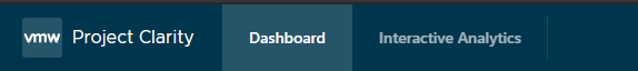
}First thing that we need to do is the menu
<header class="header-6">
  <div class="branding">
    <a href="..." class="nav-link">
      <clr-icon shape="vm-bug"></clr-icon>
      <span class="title">Project Clarity</span>
    </a>
  </div>

  <div class="header-nav">
    <a href="..." class="active nav-link"><span class="nav-text">Dashboard</span></a>
    <a href="..." class="nav-link"><span class="nav-text">Interactive Analytics</span></a>
  </div>
  <div class="header-actions">
      <form class="search">
        <label for="search_input">
          <input id="search_input" type="text" placeholder="Search for keywords...">
        </label>
      </form>
        <clr-dropdown>
          <button class="nav-text" clrDropdownTrigger aria-label="open user profile">
            devonfw@clarityangular
            <clr-icon shape="caret down"></clr-icon>
          </button>
          <clr-dropdown-menu *clrIfOpen clrPosition="bottom-right">
            <a href="..." clrDropdownItem>Settings</a>
            <a href="..." clrDropdownItem>Log out</a>
          </clr-dropdown-menu>
        </clr-dropdown>
<clr-dropdown>
  <button class="nav-icon" clrDropdownTrigger aria-label="toggle settings menu">
    <clr-icon shape="cog"></clr-icon>
    <clr-icon shape="caret down"></clr-icon>
  </button>
  <clr-dropdown-menu *clrIfOpen clrPosition="bottom-right">
    <a href="..." clrDropdownItem>About</a>
    <a href="..." clrDropdownItem>Preferences</a>
  </clr-dropdown-menu>
</clr-dropdown>
  </div>
</header>
The framework has its own css classes.
For example, the first class that we can see is the header-6 that one is a css style that change the color from the menu.
Also, we can see it that the framework has some icons where we can choose, where the tag is
<clr-icon shape”vm-bug></clr-icon>
The next div on the menu will have the navigation header.
As with all this framework we can see that has is own css class <div class=”header-nav”
We can see 2 <a> tags with a different css class
The first one has the activated class. The difference between both of them shows like this.
After seeing this piece of code, can see that the other part of the menu has another css class.
<div class=”header-actions”>
After this all divs inside the last one, they are going to be aligned to the right.

To do this search bar, just need to create a form with the class search
<form class=”search”>
To shows the icon we use the tag <label for="search_input"></label>
And the normal input with the id=”search_input” to match with the previous label
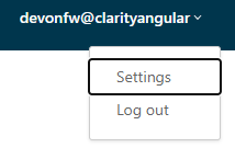
To do the menu-dropdown , we use the tag owned by the framework called
<clr-dropdown>
 <clr-dropdown>
          <button class="nav-text" clrDropdownTrigger aria-label="open user profile">
            devonfw@clarityangular
            <clr-icon shape="caret down"></clr-icon>
          </button>
          <clr-dropdown-menu *clrIfOpen clrPosition="bottom-right">
            <a href="..." clrDropdownItem>Settings</a>
            <a href="..." clrDropdownItem>Log out</a>
          </clr-dropdown-menu>
</clr-dropdown>The attribute clrDropdownTrigger is needed because if not, we cannot do the tag <clr-dropdown-menu> because that tag is going to be activated just if the clrDropdownTrigger is activated too.
Also, with the attribute clrPosition when can decided where will be positioned the dropdown.
The other part the menu, check the next figure.
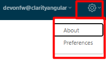
It’s pretty much the same code but we just change the attribute aria-abel and the icons`
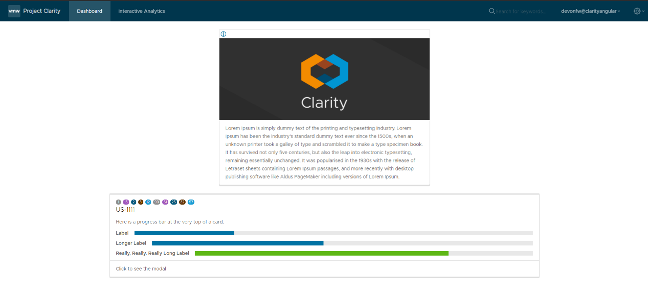
After we have the whole menu finished, time to see the card.
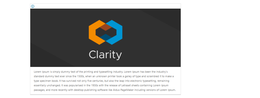
In the first figure, all the elements are aligned to the center.
To do this, we just need to use the classes by the framework.
<div class="clr-main-container">
The first css class is giving the style to the main container.
<div class="clr-row clr-justify-content-center">
This one, is saying that its going to be sorted by rows and all the content inside of this div will be in the center
<div class="clr-col-lg-4">
And the last one it’s the size of the div. This framework has as maximum 12, is like bootstrap.
More examples in:
https://clarity.design/documentation/grid
To create the card with his border and all the properties we just call the class
<div class=”card”>
To do the tooltip, check next figure.
We just need to do an <a> tag with this attributes
<a href="…" role="tooltip" aria-haspopup="true" class="tooltip tooltip-bottom-right">
The class is giving us the toltip and his position.
After that we have the:
<clr-icon shape="info-circle" size="24"></clr-icon>
That is giving us the icon and the size
And the content of the tooltip is coming from the:
<span class="tooltip-content">
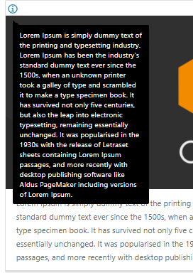
After the tooltip done, we just need to add a image and the text.
To do it we just need to code
<div class="card-img">
            <img src="../assets/images/clarity.png">
          </div>
          <div class="card-block">
            <p class="card-text">
              Lorem Ipsum is simply dummy text of the printing and typesetting industry. Lorem Ipsum has been the industry's standard
              dummy text ever since the 1500s, when an unknown printer took a galley of type and scrambled it to make a type specimen
              book. It has survived not only five centuries, but also the leap into electronic typesetting, remaining essentially
              unchanged. It was popularised in the 1930s with the release of Letraset sheets containing Lorem Ipsum passages, and more
              recently with desktop publishing software like Aldus PageMaker including versions of Lorem Ipsum.
            </p>
          </div>
For the next card, check next figure
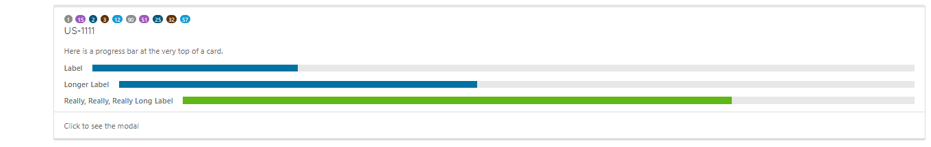
We are using the same class from the card that we used before. But to do the numbers on the top we used : <span class="badge"> And to give some colors we used: <span class="badge badge-purple"> for example
The next step is do the bars with the progress, to do it we just need to create a div with the class “progress-block”
      <div class="progress-block">
            <label>Label</label>
              <div class="progress-static">
                <div class="progress-meter" data-value="25"></div>
              </div>
</div>“progress-static”
And finally to change the color and the value is with the class “progress-meter” and “progress success”
Depends with class are we using, we will have different attributes to put the value
If we have the progress-static we will use
<div class="progress-meter" data-value="43"></div>
If we have the progress success we need to use:
<progress value="75" max="100" data-displayval="…%"></progress>
As you can see, the card has a footer. Check next picture

We just need to add a div with this class inside of the card div
<div class="card-footer">
And will link to the card:
<a class="card-link" (click)="send()">Click to see the modal</a>
And the method send() its just a method to convert the variable basic to true when is false and false when its true:
basic = false;
send(): void {
  this.basic = !this.basic;
}<div *ngIf="basic">
<clr-modal [(clrModalOpen)]="basic"><div class="modal-body">
<p>But not much to say...</p>
</div>
<div class="modal-footer">
<button type="button" class="btn btn-primary" (click)="basic = true">OK</button>
<button type="button" class="btn btn-outline" (click)="basic = false">Cancel</button> </div>
</clr-modal><div class="modal-body">
And to create the footer
<div class="modal-footer">
We can see that the footer has 2 buttons, with different style coming from the framework and with 2 methods with different values
(click)="basic = true" on OK button, this button won’t change the variable value so would not do anything.
(click)="basic = false" on Cancel button. This button will change the value of the variable and will leave the modal.
This documentation is licensed under the Creative Commons License (Attribution-NoDerivatives 4.0 International).
