guide layout with ng zorro layout
The purpose of this guide is to get a basic understanding of creating layouts using NG ZORRO in a devon4ng application.
Starts with opening the console(in the Devon distribution folder) and running the following command to start a project named AngularZorroLayout.
devon ng new AngularZorroLayout
-
devon ng new AngularZorroLayout
Select y when it asks whether it would like to add Angular routing and select scss when it asks for the style sheet format.
Once the creation process is complete, open your newly created application in Visual Studio Code. Try running the empty application by running the following command in the integrated terminal:
-
devon ng serve
Angular will spin up a server and you can check your application by visiting http://localhost:4200/ in your browser.
Next we will add Angular Material to our application. In the integrated terminal, press CTRL + C to terminate the running application and run the following command:
-
ng add ng-zorro-antd
Or if we would like to customize our workflow we can install it with:
-
npm install ng-zorro-antd
After run that command, need to import the pre-build styles in angular.json
"styles": [
    "src/styles.scss",
    "node_modules/ng-zorro-antd/src/ng-zorro-antd.min.css",
    "node_modules/ng-zorro-antd/resizable/style/index.min.css"
],
Once the dependencies are installed, need to import the BrowserAnimationsModule in our AppModule for animations support.
BrowserAnimationsModule in AppModule
import {BrowserAnimationsModule} from '@angular/platform-browser/animations';

@NgModule({
  ...
  imports: [BrowserAnimationsModule],
  ...
})
export class AppModule { }The default language of ng-zorro-antd is Chinese . If you want to use other languages, you can follow the instructions below. You can also set the language with ng add ng-zorro-antd when creating project.
ng-zorro-antd provides several configuration tokens for global configuration of international copy and date, NZ_I18N for international copy.
import { NZ_I18N, en_US } from 'ng-zorro-antd/i18n';
@NgModule({
...
providers: [
{ provide: NZ_I18N, useValue: en_US },
...
})
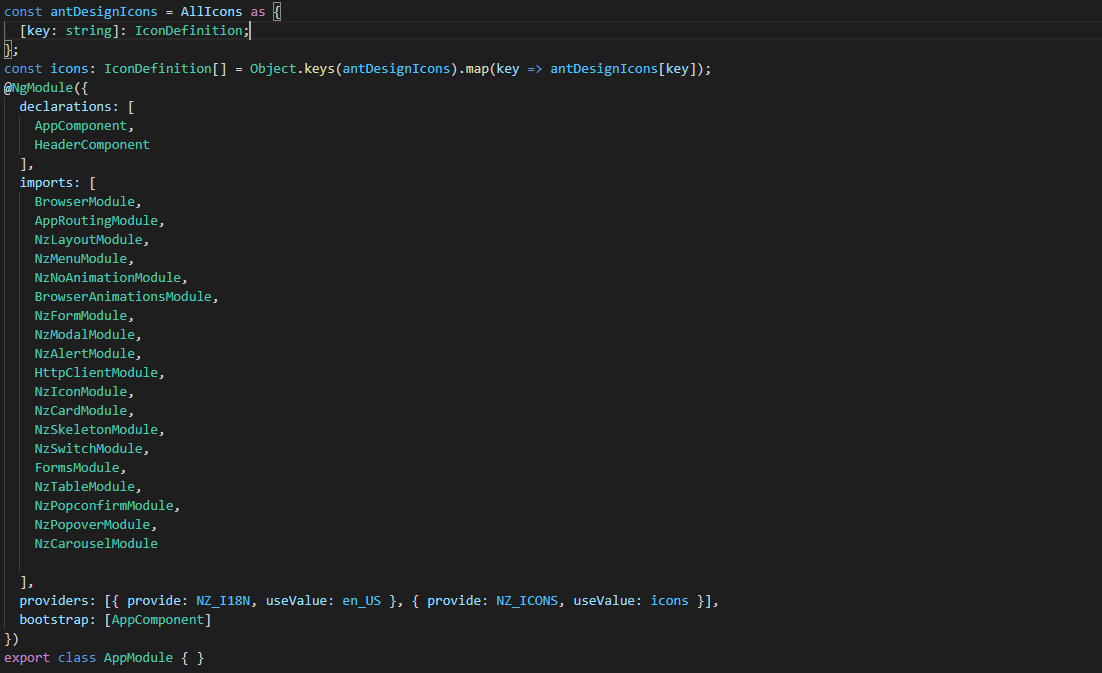
export class AppModule { }To finish the configuration, we need to import the icons from the Library.
import * as AllIcons from '@ant-design/icons-angular/icons';

const antDesignIcons = AllIcons as {
  [key: string]: IconDefinition;
};
const icons: IconDefinition[] = Object.keys(antDesignIcons).map(key => antDesignIcons[key]);We have all the NG ZORRO related dependencies set up in our project, we can start coding.
body {
  margin: 0;
  font-family: "Segoe UI", Roboto, sans-serif;
}
Next step is to create a component for the header. We will create it with the next command. We will create a folder component to have a good practices.
ng generate component components/header
In this component, we are going to create the menu.
First, we need to import the menu module on app.module.
import { NzMenuModule } from 'ng-zorro-antd/menu';And we will create the header with this code:
<ul nz-menu nzMode="horizontal" class="container">
  <li nz-menu-item nzSelected>
    <i nz-icon nzType="mail"></i>
    Navigation One
  </li>
  <li nz-menu-item nzDisabled>
    <i nz-icon nzType="appstore"></i>
    Navigation Two
  </li>
  <li nz-submenu nzTitle="Navigation Three - Submenu" nzIcon="setting">
    <ul>
      <li nz-menu-group nzTitle="Modals">
        <ul>
             <li nz-menu-item nz-button (click)="info()"> Info</li>
               <li nz-menu-item nz-button (click)="success()">Success</li>
             <li nz-menu-item nz-button (click)="error()">Error</li>
             <li nz-menu-item nz-button (click)="warning()">Warning</li>
        </ul>
      </li>
      <li nz-menu-group nzTitle="Item 2">
        <ul>
          <li nz-menu-item>Option 3</li>
          <li nz-submenu nzTitle="Sub Menu">
            <ul>
              <li nz-menu-item nzDisabled>Option 4</li>
              <li nz-menu-item>Option 5</li>
            </ul>
          </li>
          <li nz-submenu nzDisabled nzTitle="Disabled Sub Menu">
            <ul>
              <li nz-menu-item>Option 6</li>
              <li nz-menu-item>Option 7</li>
            </ul>
          </li>
        </ul>
      </li>
    </ul>
  </li>
  <li nz-menu-item>
    <a href="https://ng.ant.design" target="_blank" rel="noopener noreferrer">Navigation Four - Link</a>
  </li>
</ul>
Note
The menu has some properties like nzTitle, nzButton, nzDisabled or nzSelected.
And modify the styles on header.component.scss
.container{
  margin: auto;
  text-align: center;
}
The library has enough styles and we don’t need to change to much. We’ll be like:
In the menu, we added an example of a modal
To use it we need to import that module on app.module.ts
import { NzModalModule } from 'ng-zorro-antd/modal';In the HTML file we just need to create a method on (click) to call the modal.
<li nz-submenu nzTitle="Navigation Three - Submenu" nzIcon="setting">
  <ul>
    <li nz-menu-group nzTitle="Modals">
      <ul>
           <li nz-menu-item nz-button (click)="info()"> Info</li>
             <li nz-menu-item nz-button (click)="success()">Success</li>
           <li nz-menu-item nz-button (click)="error()">Error</li>
           <li nz-menu-item nz-button (click)="warning()">Warning</li>
      </ul>
    </li>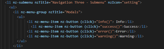
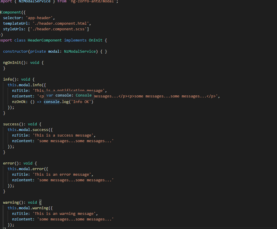
And now, we just need to create those methods in the file header.component.ts
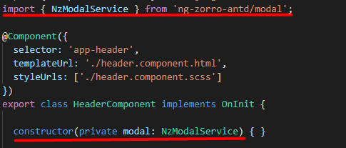
Also, need to import the modal service and we use it in the constructor of the class.
import {NzModalService} from 'ng-zorro-antd/modal';
constructor(private modal: NzModalService){}
info(): void {
  this.modal.info({
    nzTitle: 'This is a notification message',
    nzContent: '<p>some messages...some messages...</p><p>some messages...some messages...</p>',
    nzOnOk: () => console.log('Info OK')
  });
}

success(): void {
  this.modal.success({
    nzTitle: 'This is a success message',
    nzContent: 'some messages...some messages...'
  });
}

error(): void {
  this.modal.error({
    nzTitle: 'This is an error message',
    nzContent: 'some messages...some messages...'
  });
}

warning(): void {
  this.modal.warning({
    nzTitle: 'This is an warning message',
    nzContent: 'some messages...some messages...'
  });
}
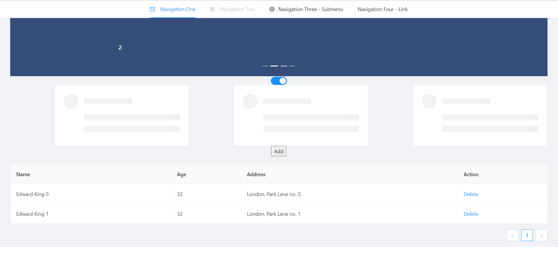
Once the header is done, time to create the main component. In this case will be those elements.
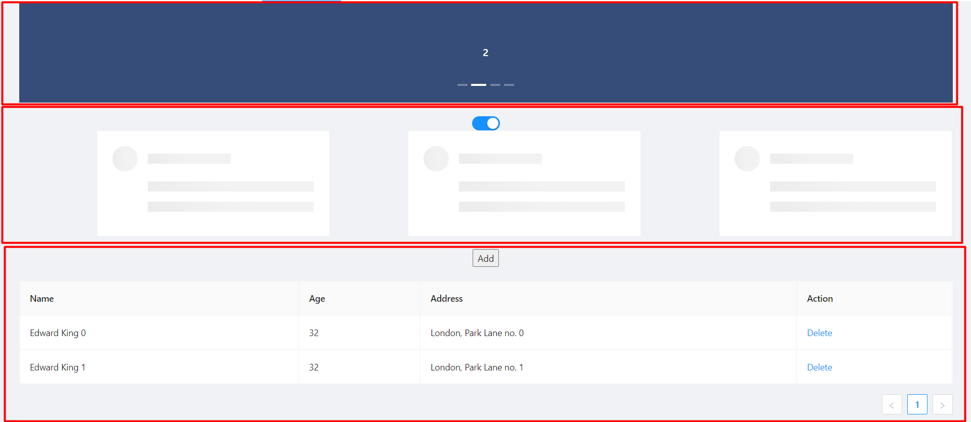
The first element that we can see, it’s a carousel. To implement it on the code, we just need to do the same that we done before, import the module and import the component. Do we import the next module on app.module
import { NzCarouselModule } from 'ng-zorro-antd/carousel';And use the label “nz-carousel” to create the Carousel, it has some attributes coming from the library.
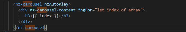
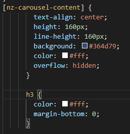
**NOTE The loop that we are doing its how many images we will have. And finally, we will give some styles.
.container{
  margin: auto;
  text-align: center;
  margin-top: 20px;
}
[nz-carousel-content] {
        text-align: center;
        height: 160px;
        line-height: 160px;
        background: #364d79;
        color: #fff;
        overflow: hidden;
      }

      h3 {
        color: #fff;
        margin-bottom: 0;
      }

nz-content{
  padding: 0 30px 0 30px;
}
Next element, the cards
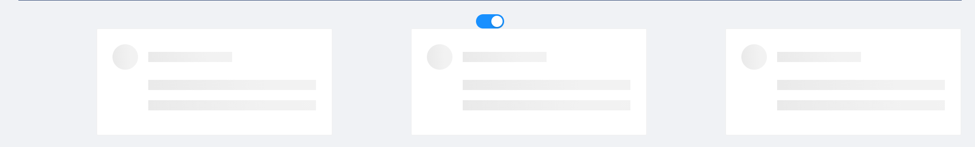
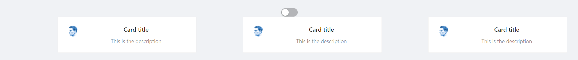
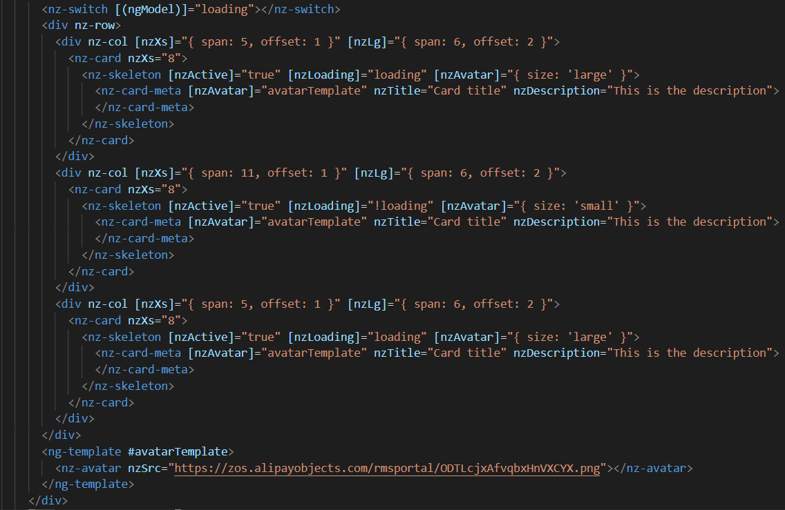
We will have a button to activate or deactivate the cards. To do it, we will write the next code in our file html.
      <div nz-row>
        <div nz-col [nzXs]="{ span: 5, offset: 1 }" [nzLg]="{ span: 6, offset: 2 }">
          <nz-card nzXs="8">
            <nz-skeleton [nzActive]="true" [nzLoading]="loading" [nzAvatar]="{ size: 'large' }">
              <nz-card-meta [nzAvatar]="avatarTemplate" nzTitle="Card title" nzDescription="This is the description">
              </nz-card-meta>
            </nz-skeleton>
          </nz-card>
        </div>
        <div nz-col [nzXs]="{ span: 11, offset: 1 }" [nzLg]="{ span: 6, offset: 2 }">
          <nz-card nzXs="8">
            <nz-skeleton [nzActive]="true" [nzLoading]="!loading" [nzAvatar]="{ size: 'small' }">
              <nz-card-meta [nzAvatar]="avatarTemplate" nzTitle="Card title" nzDescription="This is the description">
              </nz-card-meta>
            </nz-skeleton>
          </nz-card>
        </div>
        <div nz-col [nzXs]="{ span: 5, offset: 1 }" [nzLg]="{ span: 6, offset: 2 }">
          <nz-card nzXs="8">
            <nz-skeleton [nzActive]="true" [nzLoading]="loading" [nzAvatar]="{ size: 'large' }">
              <nz-card-meta [nzAvatar]="avatarTemplate" nzTitle="Card title" nzDescription="This is the description">
              </nz-card-meta>
            </nz-skeleton>
          </nz-card>
        </div>
</div>The first thing that we can see, it’s a button to switch between see it or not.
So,first thing, we need to import that switch.
import { NzSwitchModule } from 'ng-zorro-antd/switch';
Next step, that we need to do its write the `HTML code. It’s simple:
<nz-switch [(ngModel)]="loading"></nz-switch>
So now, in the ts file we just need to create a Boolean variable.
With the ngModel and the switch, each time that we will click on the button the variable will swap between true or false.
After create the button, we are going to create the card.
Need to import the following module on app.module
import { NzCardModule } from 'ng-zorro-antd/card';
And after that we need to write the HTML code
We will find a lot of attributes. We can find their explication in the api: NG ZORRO
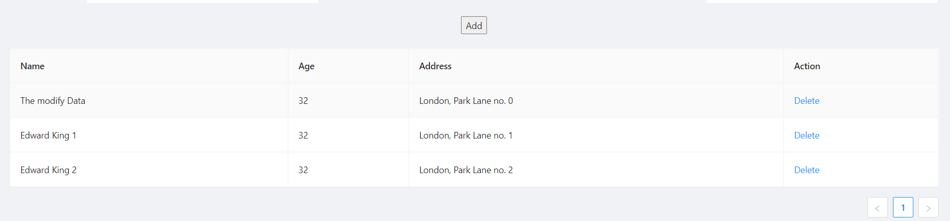
Last Element, the table
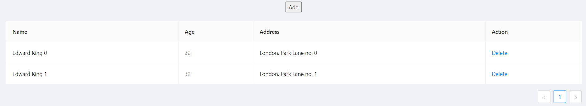
We need to import the module
import { NzTableModule } from 'ng-zorro-antd/table';
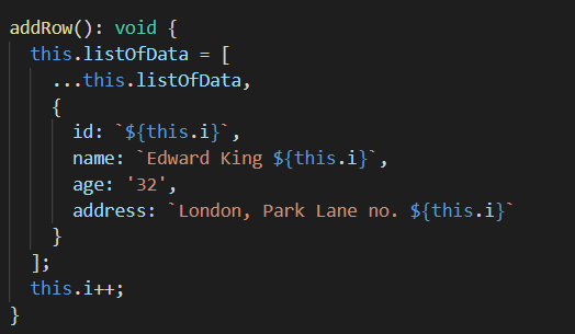
After that we can see a button, this is just to create a new row in the table. The button only has a method to add a new value to our array
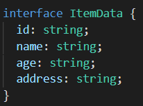
Table Interface
interface ItemData {
  id: string;
  name: string;
  age: string;
  address: string;
}
Add Row Method
addRow(): void {
  this.listOfData = [
    ...this.listOfData,
    {
      id: `${this.i}`,
      name: `Edward King ${this.i}`,
      age: '32',
      address: `London, Park Lane no. ${this.i}`
    }
  ];
  this.i++;
}
After that we need to create the table
<nz-table #editRowTable nzBordered [nzData]="listOfData">
          <thead>
            <tr>
              <th nzWidth="30%">Name</th>
              <th>Age</th>
              <th>Address</th>
              <th>Action</th>
            </tr>
          </thead>
          <tbody>
            <tr *ngFor="let data of editRowTable.data" class="editable-row">
              <td>
                <div class="editable-cell" [hidden]="editId === data.id" (click)="startEdit(data.id)">
                  {{ data.name }}
                </div>
                <input [hidden]="editId !== data.id" type="text" nz-input [(ngModel)]="data.name" (blur)="stopEdit()" />
              </td>
              <td>{{ data.age }}</td>
              <td>{{ data.address }}</td>
              <td>
                <a nz-popconfirm nzPopconfirmTitle="Sure to delete?" (nzOnConfirm)="deleteRow(data.id)">Delete</a>
              </td>
            </tr>
          </tbody>
</nz-table>To create the table we need to use the tag <nz-table> and after that is like a Html table, with the <thead> and <tbody>
How it shows with the for, we are showing the data from the array created before. In the first cell we can see, that we have a method to edit the value.

This documentation is licensed under the Creative Commons License (Attribution-NoDerivatives 4.0 International).
