New issue
Have a question about this project? Sign up for a free GitHub account to open an issue and contact its maintainers and the community.
By clicking “Sign up for GitHub”, you agree to our terms of service and privacy statement. We’ll occasionally send you account related emails.
Already on GitHub? Sign in to your account
Evenly distribute form sidebar boxes #1769
Comments
|
Where is this behaviour visible, considering the test data we have? |
|
You can insert a fake-key for the Textlab API, create a file Then restart the server, enable HIX in a region and after that, the widget should be shown (although a bit smaller because there is an error due to the incorrect token)... you can however manually increase its size to simulate the production UI by temporarily adding the class |
|
Peter and me searched for a solution using "column-2" class from tailwind. |
diff --git a/integreat_cms/cms/fixtures/test_data.json b/integreat_cms/cms/fixtures/test_data.json
index 9425818b4..c9983d9fd 100644
--- a/integreat_cms/cms/fixtures/test_data.json
+++ b/integreat_cms/cms/fixtures/test_data.json
@@ -226,7 +226,7 @@
       "admin_mail": "augsburg@integreat-app.de",
       "created_date": "2019-08-12T07:48:17.997Z",
       "last_updated": "2019-08-12T07:48:17.998Z",
-      "statistics_enabled": false,
+      "statistics_enabled": true,
       "matomo_id": null,
       "matomo_token": "",
       "offers": [1, 2, 3]
diff --git a/integreat_cms/cms/templates/pages/page_form.html b/integreat_cms/cms/templates/pages/page_form.html
index 6d30fdc91..4b03be08e 100644
--- a/integreat_cms/cms/templates/pages/page_form.html
+++ b/integreat_cms/cms/templates/pages/page_form.html
@@ -63,7 +63,7 @@
                 </div>
             {% endif %}
         </div>
-        <div class="md:grid grid-cols-2 3xl:grid-cols-[minmax(0px,_1fr)_400px] {% if page %} 4xl:grid-cols-[minmax(0px,_1fr)_400px_400px]{% endif %} gap-4">
+        <div class="gap-4">
             <div class="col-span-2 3xl:col-span-1 flex flex-wrap flex-col flex-auto">
                 {% include "_form_language_tabs.html" with target="edit_page" instance=page_form.instance content_field="page_id" %}
                 <div class="w-full rounded border border-blue-500 bg-white shadow-2xl flex flex-col flex-auto">
@@ -160,7 +160,7 @@
                     </div>
                 </div>
             </div>
-            <div class="flex flex-wrap flex-col gap-4">
+            <div class="columns-2 gap-4 break-after-avoid">
                 {% if language.slug in TEXTLAB_API_LANGUAGES and request.region.hix_enabled and TEXTLAB_API_ENABLED %}
                     {% include "../hix_widget.html" %}
                 {% endif %}
@@ -273,9 +273,7 @@
                         {% endif %}
                     </div>
                 </div>
-            </div>
             {% if page %}
-                <div class="mt-4 lg:mt-0 3xl:col-end-3 4xl:col-end-auto flex flex-wrap flex-col gap-4">
                     {% if can_edit_page %}
                         <div class="rounded border border-solid border-blue-500 shadow-2xl bg-white">
                             <div class="rounded p-4 bg-water-500">
@@ -447,8 +445,8 @@
                             </a>
                         </div>
                     </div>
-                </div>
             {% endif %}
+            </div>
         </div>
     </form>
     {{ media_config_data|json_script:"media_config_data" }}
See how the section Settings of the page is seemingly cut at API access token and put into the next column. (Please ignore my chromium inverting the page) |
|
Hmm, I'm not very convinced, I think this makes it a bit harder to use, I think the contents of one box should not overflow into the next column. I'm not sure whether this is a stupid idea - but maybe we could somehow re-arrange the boxes dynamically with JS, so that we inspect the |
|
As for the function to determine a correct partition, I suggest e.g. this brute-force algorithm to find a suitable distribution: Then, give this function all the heights of the boxes (as received from and it tells you how to partition them: |
|
But this is probably where we leave the "good first issue" scope 😄 |
|
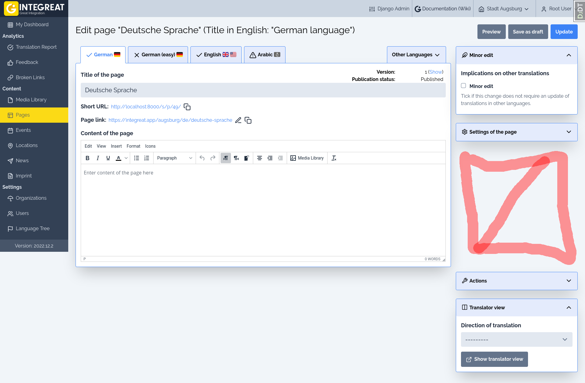
After #1876 is merged, we may have a different kind of problem: |


Motivation
Right now our sidebars in the content forms have a different behavior on different screen sizes. With the addition of the HIX widget the height is no longer aligned and we should think of some stable alignment mechanism for all content forms.
This depends on:
The text was updated successfully, but these errors were encountered: