Link styles #43
Link styles #43
Conversation
Visual improvement of underlines; hover interactivity.
|
Cool stuff! A couple questions.
|
|
Probably the background-position % needs some fine tuning but unfortunately I don't have access to Safari in order to do that. |
|
I can take a look at Safari and mobile Safari once it's merged. A separate branch with a separate PR would be perfect for the hover styles. I'd like some discussion on whether A) they're a good idea regardless of color and B) what the ideal color is. I'm absolutely open to changing it but I'd like some community and expert input. |
Visual improvement of underlines.
|
Thanks for the quick revision. This is really solid work. Thank you. I am going to think on this one a little while. Right now, to me, the underline looks better even though it interferes with the leading. The text-shadow dodging the descenders just grabs my eye in a bad way. And though I understand this may seem like a non-issue, it also looks weird when highlighting text, which a lot of people do compulsively. More concretely, I'm concerned about the performance implications of |
|
(Regarding the performance concerns, they may only be a problem when rendering dynamically, which we don't do. I'm still researching the problem. Empirical tests using documents with lots of links could help.) |
|
Opera has long since switched to rendering with webkit so desktop users should be fine, however I just tested with Opera Mini for Android and the underline is not visible. User adoption of Opera Mini used to be high some years ago, but then again, few things on the modern web work on it anymore. Reportedly Safari 8.0 already renders text-underline as such, but it’s eventually a matter of preference, so I can't argue more for them. :) Performance with many too many links may be indeed an issue, and the publishers of the technique, mentioned in the first post, write:
|
|
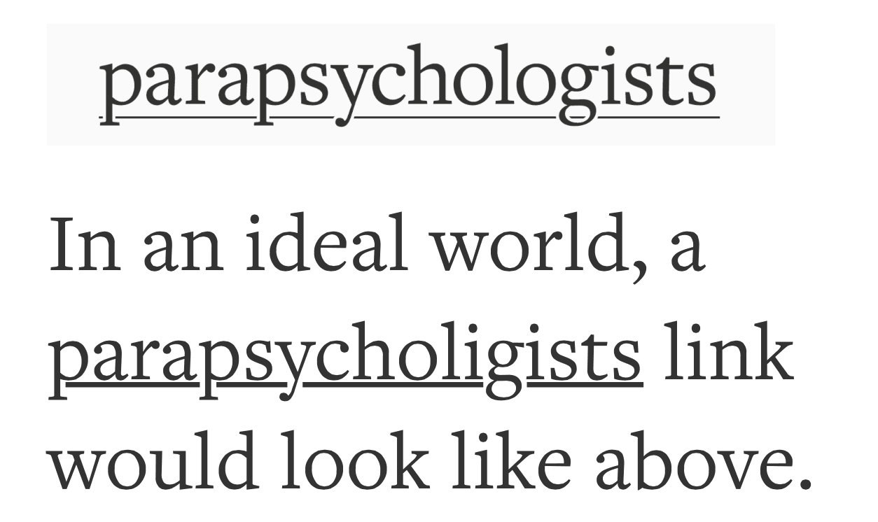
I like the effort, but it's a little wonky at times like here with a
I think the desired effect looks great, which would be an underline like this: But, I also wonder if there isn't a better way to style links than with underlines: Some examples: http://tympanus.net/Development/InlineAnchorStyles/ |


|
Hey, we ended up doing this independently, which makes this PR superfluous. I still appreciate your contribution, so thanks. I'll be keeping an eye on performance issues, but I doubt it'll be an issue for most docs. |
Current link styles use border-bottom , but the line is in the middle of the leading, and thus becomes obtrusive.
This pull requests is based on a technique of styling the links using CSS gradients and text-shadow.
This solution however requires additional selection styles and limits the colors that may be used for the background.
Also added hover styles to better inform the viewer that the link is clickable.