Add Inkscape's Distributions Icons #911
Conversation
There was a problem hiding this comment.
Thanks for working on these!
distribute-graph looks great. Nice work here.
I think distribute-randomize might need more objects to make it clearer. With only three objects it's difficult to see that these are placed randomly. I can see why the original icon uses twice as many objects.
It seems like it might be important for the objects in distribute-unclump to be different sizes so you can illustrate that it equalizes edge-to-edge distances and not center-to-center
|
This is how the icons look under elementary's light theme There is some things that is still in the file that I use in the design process of these icons. I'll be cleaning them up once these are finalized and approved. |


|
Is there any more revision you'd like to see or is this done? @danrabbit |
|
This is how the icons look under elementary's light theme Symbolic icons is unchanged. Refer to previous screenshots. There is some things that is still in the file that I use in the design process of these icons. I'll be cleaning them up once these are finalized and approved. |
There was a problem hiding this comment.
Hey thanks for making changes here. I feel like we're getting really close.
I think distribute-randomize might still look too evenly distributed. You'll notice in the default Inkscape icon that some objects are clumped closer together than others.
In looking at the original icon for distribute-unclump it seems like having some of the objects be rectangles is important. Remember we're trying to show that these will be spaced by edge distance, not center distance. So having an object where those are nearly the same makes it hard to see that distinction.
Hmm, you're right. I'll be working on it. |
|
Here they are. I changed both of the square at the bottom and the top to a rectangle in |


|
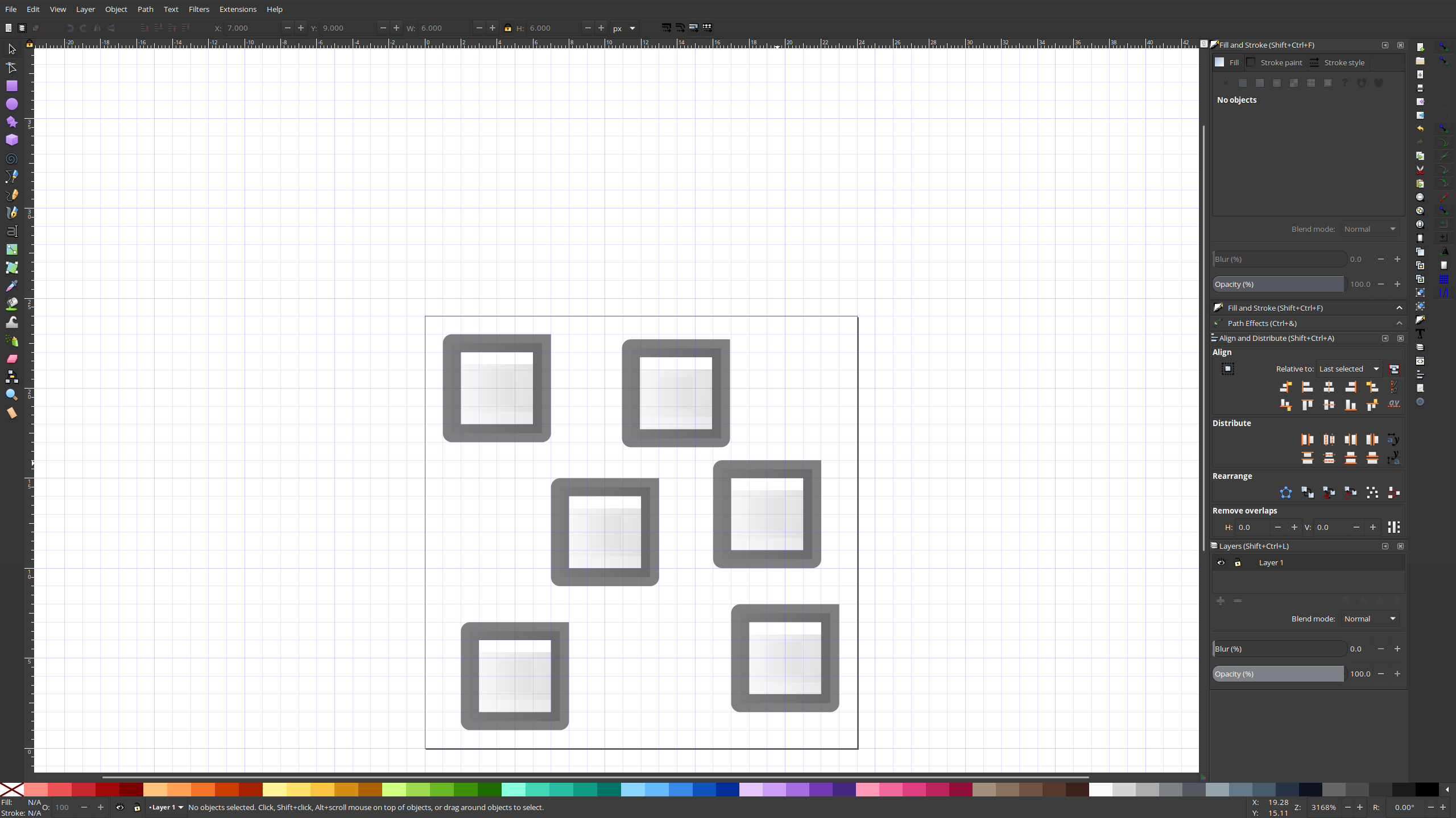
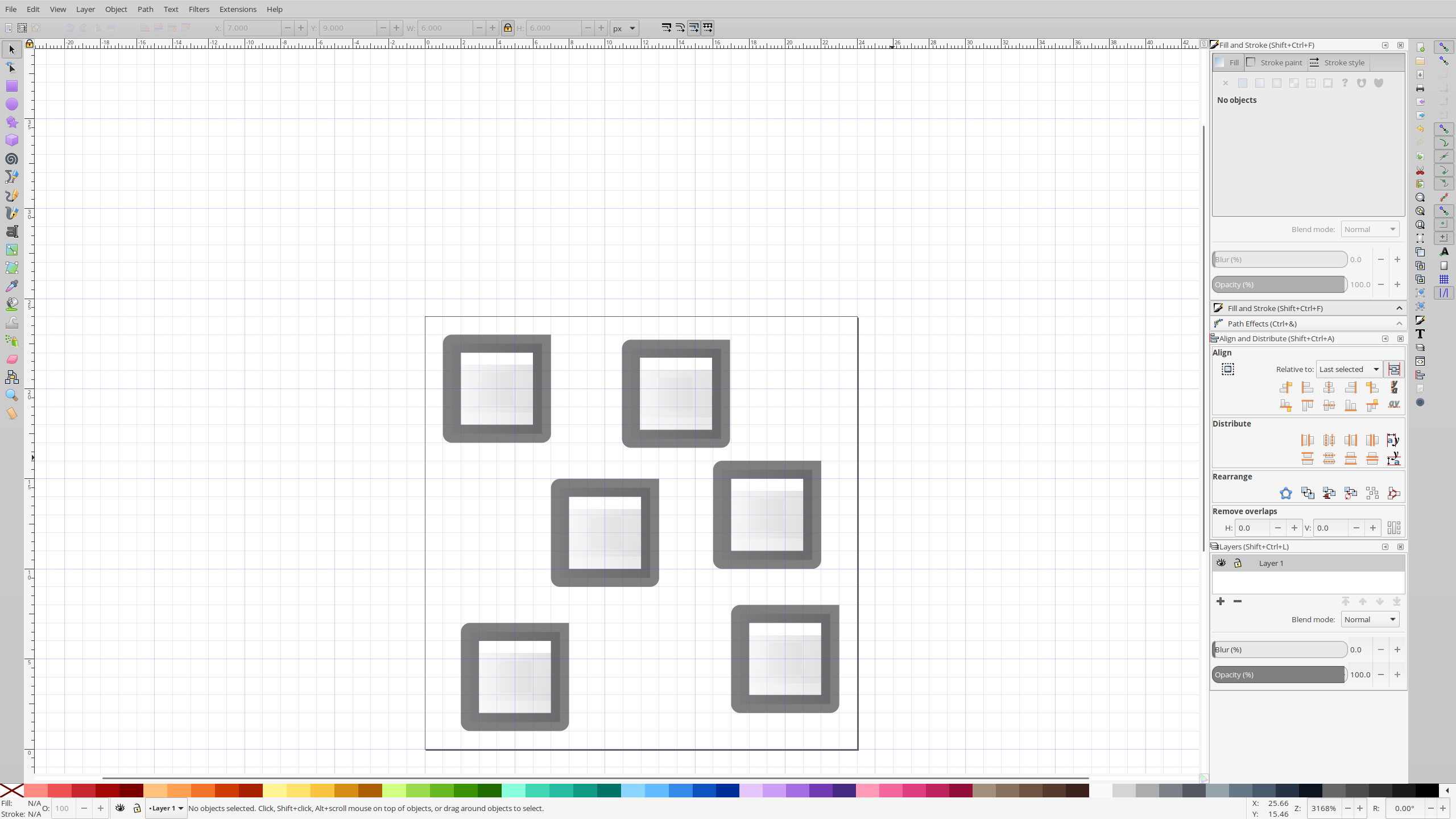
The distribution on the randomize icon looks a lot better. Just be sure you align items to the pixel grid. Make sure highlight strokes are 1px wide On the unclump icon, it would probably be better to not have these rectangles both in landscape orientation. One in portrait orientation would probably help. And also, it's pretty clear that these are no longer equidistant from each other's edges :) |
|
Here's how it looked like now. |
Fixes #763 and then some. It also add `distribute-graph and symbolic icons of them.
This is how the icons look under elementary's light theme


This is how the icons look under elementary's dark theme
This is how the symbolic icons look under elementary's light theme
This is how the symbolic icons look under elementary's dark theme
There is some things that is still in the file that I use in the design process of these icons. I'll be cleaning them up once these are finalized and approved.