Create visually pleasing and helpful "banners" with your projects custom logo and any additional useful information.
Add custom actions, read and display local JSON/YAML data, and easily customize using styles.

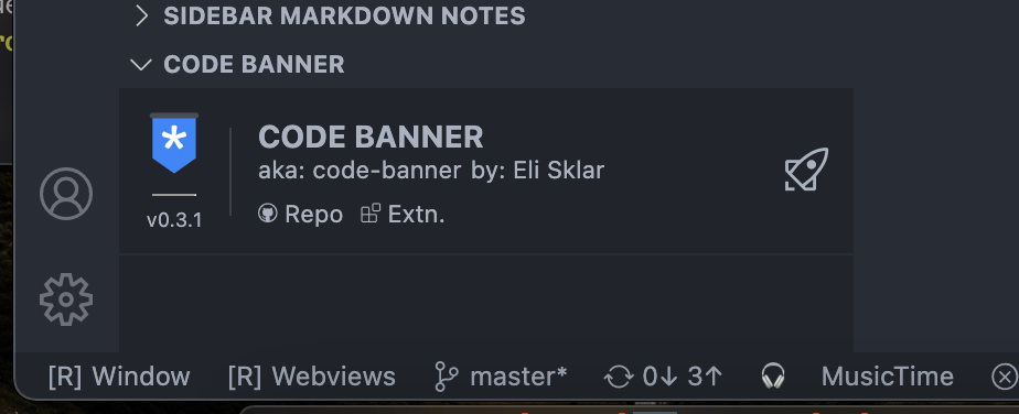
VSCode extension to add identifiable and useful information and actions to VSCode sidebare panels and status bar:
Instantly add the information you need to have it available at a glance exactly when needed!
- 👨🎤 Highly customizable
- 🎢 Custom actions and shortcuts
- 🗺 Nested configuration
- 🪄 Markdown, plain text, and smart tags
- ⏱ Fast and responsive
- ⌗ Read and display data from
package.jsonor any yaml/json file - 🖼 Templating support and templates for common use cases
- 💾 Custom data context - read and display data from any file
After installation the extension you will have a new panel in your explorer, debug, and scm views named CODE BANNER.
This panel's content is entirely controlled by the content of your workspace, allowing you to display information such as text, images, json data, or any combination of those and preferform custom actions all defined in .cb or .pb files in your workspaces.
Set up a basic code banner by opening the command palette (CMD/CTRL+SHIFT+P) and typing code banner. This will give you three options:
Will create a .cb file with a basic banner set up, which you can edit the code of to reflect your project. This banner will be shown in every file of your project in the sidebar.
Will create a .cb file with a more advanced banner set up. This set up will inlcude a code banner that will show on every file, but also a code banner that will only show up when a .cb or .js file is open. Use this template to customize your code banner how you see fit.
Opens this README.md for future reference to the documentation
Install the Code Banner VSCode extension from the marketplace (alternatively you can download .vsix packed extension from the release section, or build it locally).
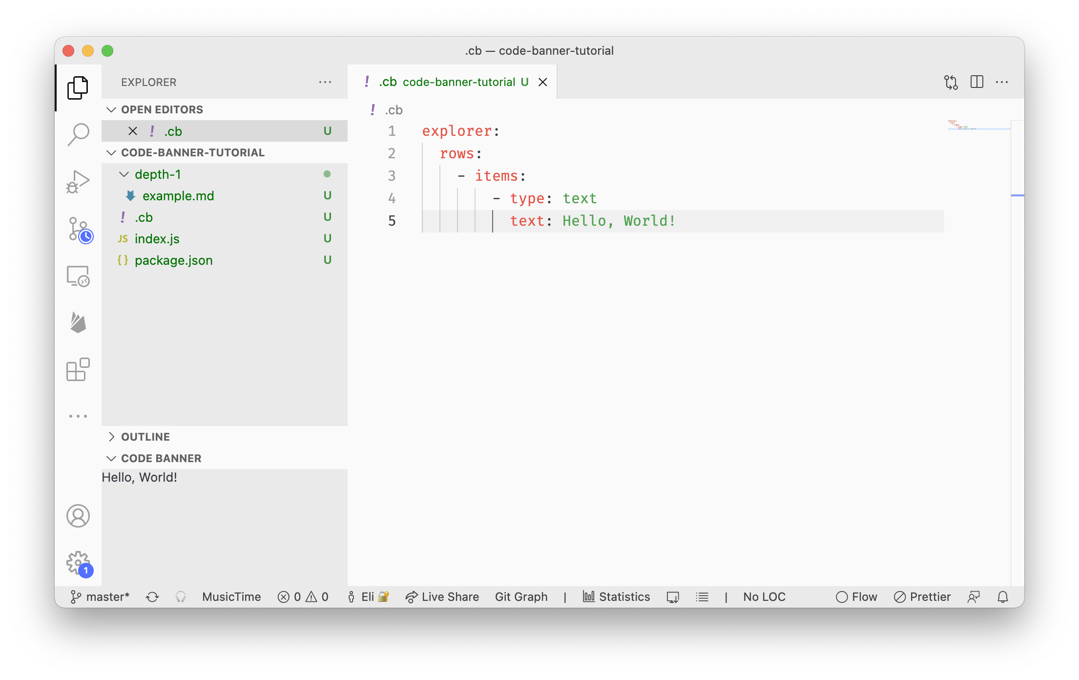
Next add to your workspace a .cb (dot cb) file at the root of the workspace directory, open the file with vscode and change laguage mode to YAML.
Add to your new .cb file the following:
explorer:
  rows:
    - items:
        - type: text
text: Hello, World!Note: If you're not a fan of YAML you can use
.cb.jsonfiles instead, or if you need more functionality and customizability and the workspace is a trusted workspace you can use.pbfiles instead which are treated as plain javascript files.
Once the file is save, and you have the sidebar open on the Explorer section, and the Code Banner panel is visible and open, you should see your Hello, World!
And you're done!
Go a head an explore below the different things you can do with code banner and create the perfect setup for your project!
The extension supports several file formats that all evetually compile to a sigle configuration setting for Code Banner from the different files.
In this section we'll refer to conf, config, or configuration files to ay supporting format.
Code Banner's cofiguration consists of .cb files (and other supporting formats as listed below) sprinkled in your project directories.
The location of the conf file is critical becuase it dictates to the extensio how to treat the various setting and options listed in the conf file in regards to the current context (active and visible editors, active file type, editor state, etc').
Configuration files in workspace root directory are considered Top Level and will persists thruoughout the project regardless of the context (unless configured otherwise).
These are useful to provide the overall branding for your project, including some useful information such as project name, logo, author, curret package version, etc', and relevant project actions such as starting debug, executing NPM script, or any other supported action you can think of or a combination of actions.
Any nested configuration file will automatically be triggerred and activated (can be configured otherwise), and any panels or statusbar in the config will appear when the user navigates to a file in the configuration's file directory or any of its subdirectories.
Code Banner currently supports three file formats: javascript (?.pb files), YAML (?.cb and ?.cb.yml), and JSON (?.cb.json) that can be used to provide Code Banner with the cofiguratio it needs.
A configuration file evetually is expected to represent a configuration object with the following properties:
{
  "explorer": { ... }, // Configuration for the explorer panel
  "scm": { ... }, // Configuration for the source control panel
  "debug": { ... }, // Configuration for the debug panel
  "explorer|scm": { ... }, // Share configuration for the explorer and source control panels
  "debug|scm|explorer": { ... }, // Share configuration for the debug, source control, and explorer panels
  "statusbar": { ... }, // Configuration for the statusbar
  "context": { ... }, // Configuration for the data context
  "templates": { ... }, // Configuration for the templates
}
If you're using a plain file configuration such as YAML or JSON you only need to structure the object properly.
If you're using an executable configuration (very limited support currently, as of v0.3.0) you can either expors = { explorer: { ... }, statusbar: { ... }} or alternatively you can supply a function to each of the section to generate the configuration, like so:
exports.explorer = () => {
  return {
    rows: [
      {
        items: [
          {
            type: 'text',
            text: 'Hello, World!'
          }
        ]
      }
    ]
  }
}

exports.statusbar = () => {
  return {
    items: [
      {
        name: 'example',
        text: 'Hello, Status Bar!',
        priority: 20000,
        visible: true
      }
    ]
  }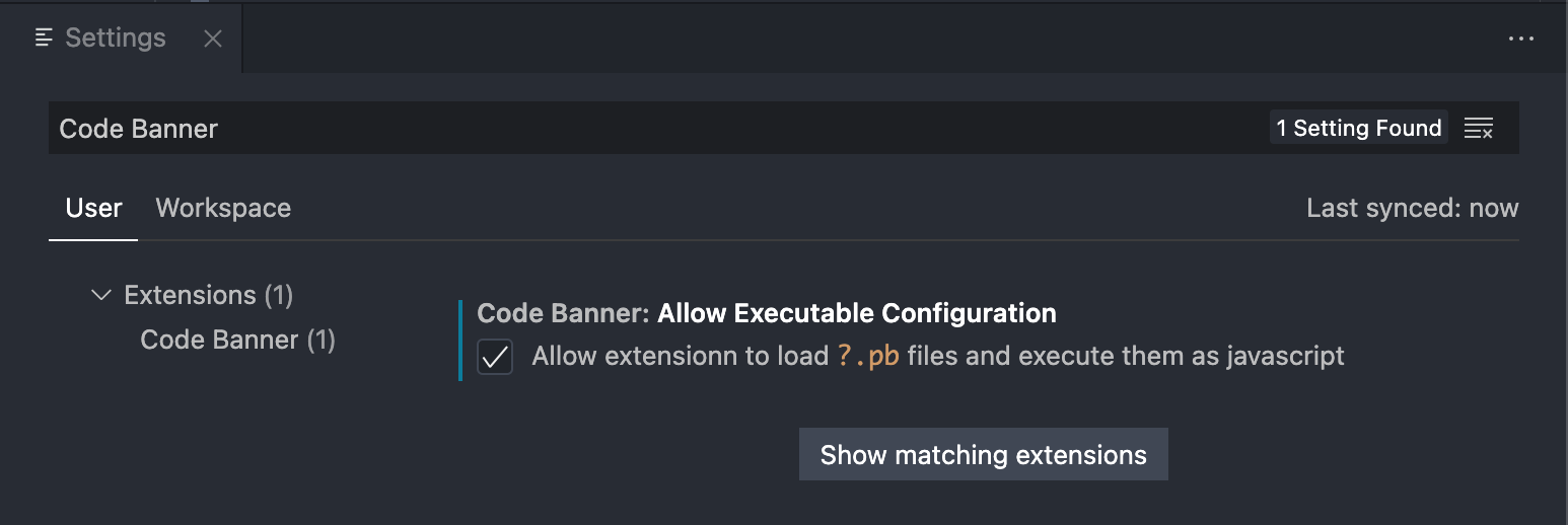
}Note: Use executable configuration at your own risk! Currently (as of v0.3.0) Code Banner does not have any securities in place to verify the security or origin of the executable code!
To enable executable configuration files you have to explicitly set it in the settings (
codeBanner.allowExecutableConfiguration = true)
Banners are quite capable and support several different type of items you can utilize and very powerful contextual support so you can display the right info and tools in-context.
Below is an example of a banner in the Explorer view:
explorer:
  rows:
    - items:
      - type: text
        text: Text in explorer!
A slightly more involved example:
explorer:
  rows:
    - glob:
        - "**/.cb"
        - "**/*.js"
      items:
        - type: svg
          style:
            flex: 0 0 30px
            padding: 4px
          elementStyle:
            borderRadius: 3px
            overflow: hidden
          svg: https://cdn.worldvectorlogo.com/logos/logo-javascript.svg
        - type: svg
          style:
            flex: 0 0 30px
            padding: 4px
          elementStyle:
            borderRadius: 3px
            overflow: hidden
            transform: rotate(180deg)
          url: https://cdn.worldvectorlogo.com/logos/visual-studio-code-1.svg
        - type: markdown
markdown: This will show only when `*.js` or `.cb` files have visible editorsCurrently Code Banner supports three different panel locations for your banner: Explorer view (explorer), Debug view (debug), and Source Control view (scm). These corrispond to the sidebar section the user can navigate to in VSCode.
If you want to display your banners anywhere in those views provide them as top level objects, like so:
explorer:
  rows:
    ... # rows defined for the Explorer view
scm:
  rows:
    ... # rows defined for the Source Control view
debug:
  rows:
    ... # rows defined for the Debug view
Additionally there's experimental support for using shared configurations like so:
explorer|scm:
  rows:
... # rows shared by Explorer and Source control viewsEach Banner row in your configuration will be displayed by Code Banner as an individual line with the items it contains displayed as columns one after the other - this is all cofigurable and your individual rows can accept custom style (CSS-like syntax) that will applied to it.
-
items:arrayRowItem[]An array of items to be displayed - see below on item types and configuration
Example:
explorer:
  rows:
    - items:
      - type: text
        text: This is a text item!
      - type: markdown
        markdown: "*This* ~is~ a [markdown](https://google.com/?q=markdown) `item`!"
-
style:objectReact.CSSPropertiesObject containing
camelCase(not CSS standardkebab-case!) CSS properties to be applied to the row as a wholeExample:
explorer:
  rows:
    - style:
        display: flex
        justifyContent: space-between
      items:
        - type: codicon
          codicon: rocket
        - type: codicon
          codicon: github
Note: Check out the full list of all available VSCode CSS variables here: VSCode Webview CSS Variables
-
classes:stringstringA string of classes to be appended to the element container.
Useful for working with CSS frameworks like tailwind.css.
Note:
tailwind.csshas been added to Code Banner in version v0.3.8Example:
explorer:
  rows:
    - type: container
      items:
        - type: text
          classes: text-xs sm:text-xl text-green-800 sm:text-red-400
          text: this text will be small and green on small panels, and large and red in large panels
-
glob:string | arraystring | string[]Restricts the visibility of the row to the specified glob pattern(s)
Example:
explorer:
  rows:
    - glob: "**/.eslintrc"
      condition: editor.isActive
      items:
        - type: svg
          url: https://cdn.worldvectorlogo.com/logos/eslint-1.svg
          elementStyle:
              width: 32px
        - type: text
          text: `.eslintrc` is visible
    - glob:
        - "**/.eslintrc"
        - "**/.prettierrc"
      items:
        - type: svg
          url: https://cdn.worldvectorlogo.com/logos/prettier-2.svg
          elementStyle:
              width: 32px
        - type: text
          text: This will be shown if the files `.eslintrc` or `prettierrc` are visible
-
priority:numberHigher priority rows will appear higher on the list
Example:
explorer:
  rows:
    - priority: 10
      items:
        - type: text
          text: This will appear second
    - priority: 20
      items:
        - type: text
          text: This will appear first
-
sensitivity:numberHigher sensitivity rows will appear
nlevels down - e.g. a row located in a file insrc/depth-2/depth-3/.cbwith sensitivity of2will also appear for files insrcandsrc/depth-2as well as the standardsrc/depth-2/depth-3that would be applied here.Example:
explorer:
  rows:
    - sensitivity: 3
      items:
        - type: text
          text: This will appear three level up!
    - priority: 1
      items:
        - type: text
          text: This will appear even at the parent dir level!
-
condition:stringCondition for the row to be displayed (paired with
globproperty).The only supported condition is
editor.isActivewhich will display the row if the editor matching the glob option is active.Example:
explorer:
  rows:
    - condition: editor.isActive
      glob: "**/*.md"
      items:
        - type: text
          text: This will appear only when you're focused on a markdown file!
Row items are simple objects containing at the very least a type property which dictate to Code Banner what and how to display.
Common options that are shared between the various types of items available:
-
type:stringType of the item, supported types:
text,container,codicon,hr,image,svg,markdown, andspan -
style-objectReact.CSSPropertiesObject containing key-value pairs of CSS Properties as they are accepted by React - see: https://www.npmjs.com/package/csstype
-
hoverStyle-objectReact.CSSPropertiesSame as style but will be applied on
onMouseEnterand removed ononMouseOut, effectively providing with a hover effect -
activeStyle-objectReact.CSSPropertiesSame as style but will be applied on item as long as it's click action is being performed
-
click-stringAn action to perform
Execute Command:
click: command:vscode.openFolder:../some/other/path- see: https://code.visualstudio.com/api/references/commandsOpen External URL:
click: open:https://google.com
Several type of row items support Smart Text replacements using the $(...) activation pattern.
Dependending on the content of the activation pattern Code Banner will replace the text with the result of the pattern provided.
Supported patterns:
Read the top-most workspace package.json file's data.
Example:
explorer:
  rows:
    - items:
        - type: text
          text: "Package author: $(package.author.name, Not Provided)"
        - type: text
text: "Package version: $(package.version)"Read data from a given JSON/YAML file path in the first argument, relative to the current configuration file, using the path given in the second argument, or return a default value provided in the third argument.
The path to traverse the data file (JSON/YAML) is using the object-path notation.
Example:
explorer:
  rows:
    - items:
        - type: text
          text: "Latest: $(some/data.json, path.to.object, Default Value)"
        - type: text
text: "Greatest: $(another/data.yaml, alter.nativ, Not Found)"Note: By default the second argument, the object path, is used as a single value to the second argument of
objectPath.getfunction.To provide the
objectPath.getfunction with an array value, you can provide the second argument with colons as seperators;e.g.:
$(another/data.yaml, a:b.c:d, Not Found)which will match a value in:{ a: { 'b.c': { d: 'some value' } } }This way it is possible to access properties that have dot in their key
Will replace with a Codicon.
Example:
explorer:
  rows:
    - items:
        - type: text
          text: "Github Icon: $(codicon:github, 32, black)"
        - type: text
text: "Is Everthing Alright: $(codicon:check-all, 26px, green)"A simple text block to write anything useful.
Note: Some item types support Smart Text and will replace $(codicon:github) with the github icon, see more in the Smart Text section String - supports Smart Text replacements Example:
explorer:
  rows:
    - items:
        - type: text
          text: This is my custom text!
          style:
            fontSize: 24px
            color: blue
        - type: text
          text: Current version: $(package.version)
          style:
            fontSize: 24px
            color: blue
Options:
-
text:stringThe text to display - use
$(...)(AKA Smart Text) to
A simple div container that can have any number and type of additional items, and with some clever styling can be used to acheive sofisticated layouts.
Example:
explorer:
  rows:
    - items:
        - type: container
          style:
            display: flex
            flexDirection: row
            padding: 3px
            columnGap: 3px
          items:
            - type: svg
              elementStyle:
                width: 32
              url: https://cdn.worldvectorlogo.com/logos/bitcoin.svg
            - type: container
              style:
                display: flex
                flexDirection: column
                rowGap: 3px
              items:
                - type: text
                  text: Line One
                - type: text
                  text: Line Two
Options:
-
items:arrayRowItem[]A list of items to display
Display an image or an SVG file
Example:
explorer:
  rows:
    - items:
        - type: image
          elementStyle:
            width: 56px
          url: https://picsum.photos/56
        - type: svg
          elementStyle:
            width: 56px
          path: local/file.svg
Options:
-
url:stringURL of the file to load
-
path:stringPath of the file to load
-
elementClasses:stringClass names to apply to the image element
Render markdown content (using the excellent React Markdown).
Example:
explorer:
  rows:
    - items:
        - type: markdown
          markdown: *The* _Revolution_ Will Be **Typed**
Options:
-
markdown:stringValid markdown syntax
Simple Horizontal Rule (<hr />)
Example:
explorer:
  rows:
    - items:
        - type: image
          elementStyle:
            width: 56px
          url: https://picsum.photos/56
        - type: hr
          vertical: true
        - type: svg
          elementStyle:
            width: 56px
          path: local/file.svg
Options:
vertical:bool
Simple span (<span />) used to span the entire available space
Example:
explorer:
  rows:
    - items:
        - type: image
          elementStyle:
            width: 56px
          url: https://picsum.photos/56
        - type: span
        - type: svg
          elementStyle:
            width: 56px
          path: local/file.svg
Options:
vertical:bool
Code Banner can be used to provide advanced visual indicators and custom action in the status bar.
A common usecase can be for a VSCode extension developer to need to reload either the window or the webviews at a single click, and with Code Banner it's just a few lines in any existing project.
Example:
statusbar:
  items:
    - name: reload window
      options:
        text: "[R] Window"
        visible: true
        priority: 20002
        command: "workbench.action.reloadWindow"
    - name: reload webviews
      depth: 4
      options:
        text: "[R] Webviews"
        visible: true
        priority: 20000
        command: "workbench.action.webview.reloadWebviewAction"
Status bar items work pretty much like the banner row item do with some exceptions.
Status items require a unique name.
Status Bar Item Properties:
-
name:stringUnique name of the status bar item
-
depth:numberLimit the status bar item to the
nth depth relative to the configuration file -
options:objectStatusBarItemOptionsAn object containing a list of options passed on to the tooltip service or used to style the tooltip. See Status Bar Item Options below
-
text:stringThe text to show for the entry. You can embed icons in the text by leveraging the syntax:
My text
$(icon-name) contains icons like $ (icon-name) this one.Where the icon-name is taken from the ThemeIcon icon set, e.g. light-bulb, thumbsup, zap etc.
-
alignment:stringvscode.StatusBarAlignmentOptions:
left,rightDefault:
leftAlign item to left/right side of the sidebar
-
priority:numberThe priority of this item. Higher value means the item should be shown more to the left (for left align elements, or more to the right for right aligned elements).
-
visible:booleanDefault:
falseSet the visibility of the item
-
color:stringForeground (text) color for the item
-
backgroundColor:stringThe background color for this entry.
Note: only the following colors are supported:
statusBarItem.errorBackgroundstatusBarItem.warningBackgroundMore background colors may be supported in the future.
Note: when a background color is set, the statusbar may override the
colorchoice to ensure the entry is readable in all themes. -
command:stringCommandor identifier of a command to run on click. -
name:stringThe name of the entry, like 'Python Language Indicator', 'Git Status' etc. Try to keep the length of the name short, yet descriptive enough that users can understand what the status bar item is about.
Note: This property is not the same as the name property of StatusBarItem
-
tooltip:stringMarkdownStringThe tooltip text when you hover over this entry.
-
id:stringThe identifier of this item.
Providing a context to the configuration file allows to use variables in the configuration file, load data from json/yaml files, and more.
Example:
context:
  some:
    data:
      value: "Hello, World!"

explorer:
  rows:
    - items:
        - type: text
          text: ${some.data.value}
Notice the similar syntax to the Smart Tags mentioned earlier - these two features work very differently and are not related even if some of the functionality is similar.
Accessing context data is done using the ${} syntax, similar to Javascript template literals.
Data loaded in context section is available to all other sections, and can be overridden in any other sections' context property. Thing includes any templates and their properties.
Context values can be transformed into other values using the various directives available.
Directives are invoked by providing a string in the following format: directiveName:directiveArgument|directiveArgument|...
Available directives:
Read JSON/YAML data from a workspace file and load it or parts of it into the context.
-
json:path|key?|default? -
yaml:path|key?|default?
-
path:stringRelative path to the json/yaml file
-
key:string- optionalKey to access in the json/yaml file object (dot notation) - see object-path link: https://www.npmjs.com/package/object-path
If key is provided with commas (
,) it will be split and the value will be used as a cloascing request toobject-path.If key is not provided, the entire file will be loaded.
-
default:string- optionalDefault value to use if the key is not found in the json/yaml file or the fail failed to load.
Read a text file or parts of it from the workspace and load it into the context.
Load plain-text file content. If line is provided, only that line will be loaded. If lineEnd is provided, all lines from line to lineEnd will be loaded.
file:path|line?|lineEnd?|default?
-
path:stringRelative path to the file
-
line:number- optionalLine number to read from the file.
-
lineEnd:number- optionalLine number to read to from the file. -
default:string- optionalDefault value to use file doesn't exist or failed to load.
Example:
context:
  readmeTitle: file:README.md|1
readmeContent: file:README.md|2|5Read a list of files/folders from the workspace and load it into the context.
files:path|pattern?|default?
-
path:stringRelative path to the file
-
pattern:stringGlob pattern to match files in the directory.
-
default:string- optionalDefault value to use if the directory doesn't exist or there aren't any files.
The result is an array of objects with the following properties:
[
  [name, vscode.FileType], ...
]
Example:
context:
  packages: files:packages|** # Loads all folders in the packages directory

template:
  packageItem:
    type: text
    text: "Package: packages/${name}"

explorer:
  rows:
    - items:
- each:packages:packageItem|expandDirective:
env:variableName|default?
Arguments:
-
variableName:stringName of the environment variable to load.
-
default:string- optionalDefault value to use if the environment variable is not found
Example:
context:
  user: env:USER
  home: env:HOME
defaultUser: env:DEFAULT_USER|defaultUserLoad environment variables from a file.
env-file:path|name?|default?
-
path:stringRelative path to the file
-
name:string- optionalName of the environment variable to load. If not provided the entire env file is loaded as an object.
-
default:string- optionalDefault value to use if the environment variable is not found or file fails to load.
context:
  env: env-file:.env
  env-with-specific-path: env-file:.env|SOME_VAR
  env-with-specific-path-and-default: env-file:.env|SOME_VAR|not-found
Include another configuration file.
include:path|key?
-
path:stringRelative path to the file
-
key:string- optionalKey to access in the included file object (dot notation) - see object-path link: https://www.npmjs.com/package/object-path
If key is provided with commas (
,) it will be split and the value will be used as a cloascing request toobject-path.If key is not provided, the entire file will be loaded.
context:
  data: include:other-config.cb
data-with-specific-path: include:other-config.cb|some.data.valueIterate over an array or object keys and map their values to a template.
each:arrayOrObject:template|expand?
-
arrayOrObject:stringName of the array or object to iterate over from the context.
-
template:stringTemplate to use for each item.
-
expand:boolean- optionalIf true, the template will be expanded before being used. This is useful if you want to include the results as part of another array of rows/items.
context:
  packages: files:packages|**

template:
  packageItem:
    type: text
    text: "Package: ${name}"

explorer:
  rows:
    - items:
- each:packages:packageItem|expandLoad a value from the context.
context:key|default?
-
key:stringKey to access in the context object (dot notation) - see object-path link: https://www.npmjs.com/package/object-path
If key is provided with commas (
,) it will be split and the value will be used as a cloascing request toobject-path. -
default:string- optionalDefault value to use if the key is not found in the context.
context:
  myJson: json:data.json
fromContext: context:myJson.some.data.valueInterpolate a string with values from the context.
Use ${key} inside any string to access the value of any context key. If the key is not found, the string will be returned as is.
${key[,alt.key?]|default?}
-
key:stringKey to access in the context object (dot notation) - see object-path link: https://www.npmjs.com/package/object-path
If key is provided with commas (
,) it will be split and the value will be used as a cloascing request toobject-path. -
default:string- optionalDefault value to use if the key is not found in the context.
context:
  data: json:data.json
  env: env-file:.env
  env-with-specific-path: env-file:.env|SOME_VAR
  env-with-specific-path-and-default: env-file:.env|SOME_VAR|not-found
  packages: files:packages|**
  fromContext: context:myJson.${data.some.value}.value

templates:
  packageItem:
    context:
      name: value.0
    type: text
    text: "Package: ${name}"

explorer:
  rows:
    - items:
      - type: text
        text: "Context: ${context:data.some.data.value}"
      - type: text
        text: "Env: ${env:SOME_VAR}"

      - type: text
        text: "Packages:"

      - type: container
        style:
          display: flex
          flex-direciton: column
items: each:packages:packagesItemLoad a value from the context and enrich it with context.
Useful in cases where you have an external string/object (such as from package.json) and you'd want to interpolate it with context values.
contextify:key|context?
-
key:stringKey to access in the context object (dot notation) - see object-path link: https://www.npmjs.com/package/object-path
If key is provided with commas (
,) it will be split and the value will be used as a cloascing request toobject-path. -
context:object- optionalContext to use for interpolation. If not provided, the entire context will be used.
// package.json
{
  "name": "my-package",
  "version": "1.0.0",
  "PORT": 3000,
  "open_url": "http://localhost:${PORT}",
  "description": "My package description"
}context:
myJson: json:data.json # { name: 'my-package', version: '1.0.0', PORT: 3000, open_url: 'http://localhost:${PORT}', description: 'My package description' }
port: context:myJson.PORT # 3000
contextified: contextify:myJson.open_url|myJson # results in: "http://localhost:3000"You can refer to context:__dirname or ${__dirname} anywhere in your config to receive the relative file path of the config file.
Example:
context:
  data: json:${__dirname}/data.json
Templates are used to define the structure of a repeating item. They can be used anywhere in the data except for the context section.
Templates can be defined at the top level and at the top level of any explorer, scm, and other sections.
Templates can be defined as a string or an object. If defined as a string, it will be used as the text property of a text type template.
Each Template can have it's own context and local context can refer to the parent context.
context:
  names:
    - Adam
    - Bob
    - Charlie

# Top level template
template:
  topTemplate:
    type: text
    text: "Hello, ${item}"

# Template in explorer
explorer:
  template:
    myTemplate:
      context:
        item: value.0
      ...: template:topTemplate

  rows:
    - items: each:names:topTemplate
    - items: each:names:myTemplate
In certain cases you'd want to expand the results of a template into the parent array/object.
To do so there are two ways depending on the type of the parent.
To expand the results of a template into an array, use the expand tag in combination with the each directive.
context:
  names:
    - Adam
    - Bob
    - Charlie

templates:
	topTemplate:
		context:
			name: context:value
		type: text
		text: "My name is: ${name}"

explorer:
  rows:
    - items:
- each:names:topTemplate|expandTo expand the results of a template into an object, use the ... key in any object in combination with a template directive.
context:
  colors:
    - blue
    - green
    - red

templates:
  colorItem:
    style:
      color: ${color}
    type: text
    text: "Color: ${color}"

  colorRowItem:
    context:
      color: context:value
    ...: template:colorItem
explorer:
  rows:
- items: each:colors|colorRowItemRows and items can be conditionally shown based on the viewport size.
You can declare a custom reposponive object anywhere in your config and use it in the if-responsive property of any row or item.
# Define a custom responsive object
responsive:
  small:
    max-width: 280
  medium:
    min-width: 280
    max-width: 600
  large:
    min-width: 600

explorer:
  rows:
    - items:
      - type: text
        text: This will be shown on all viewports
      - type: text
        text: This will be shown on large viewports
        if-responsive: large
      - type: text
        text: This will be shown small viewports
        if-responsive: small
      - type: text
        text: This will be shown on medium and large viewports
        if-responsive: medium,large
responsive object can be provided anywhere throughout your config - for example in rows and items - to override and define a custom responsive object.
Multiple values can be provide to the if-responsive property to match multiple viewports. The values can be comma separated or an array.
Rows and items can be conditionally shown based on the value of a context key.
You can use the if-context property of any row or item to conditionally show it based on the value of a context key - if the value is truthy the element will show, if the value is falsy the element will not be rendered.
context:
  show:
    first: truthy
    third: truthy


explorer:
  rows:
    - items:
      - type: text
        text: This will be shown
        if-context: show.first
      - type: text
        text: This will not be shown
        if-context: show.second
      - type: text
        text: This will be shown
        if-context: show.second,show.third
Multiple values can be provide to the if-context property to match multiple values. The values can be comma separated or an array.
You can refresh the data in the configuration by providing an option.refresh property at the top-level of your configuration file.
The refresh property accepts a number in milliseconds or a string in the format of 1m 30s (1 minute and 30 seconds).
Example
options:
refresh: 1m 30s-
Nested Configuration
v0.0.1 -
Local Image Support
v0.2.0 -
Multiple Banner Rows per config
v0.3.0 -
Status Bar Items and Actions
v0.2.0 -
Banner Items
- Container
v0.2.0 - Image
v0.2.0 - SVG
v0.2.0 - Text
v0.0.1 - Codicons
v0.2.4 - HR
v0.2.0 - Markdown
v0.2.0 - Span
v0.2.0 - More to come...
- Container
-
Smart Text
v0.2.0 -
Context Aware
v0.2.2 -
Custom Styling
v0.0.1 -
Conditional Banners
- Active Editor
v0.3.0 - Visible Editors
v0.3.0 - Glob Pattern
v0.3.0 - Existing/Missing Files/Directories
v0.4.0 - Responsive
v0.4.0 - Context
v0.4.0
- Active Editor
-
Types
v0.0.1 -
Error Handling
- Parsing Configuration
v0.3.3 - Rows and Items
v0.3.0
- Parsing Configuration
-
Welcome Mode
-
Tests
-
Trusted Workspace Support
v0.3.3 -
Custom Javascript Actions
-
Plugins
-
Shared Styles
v0.4.0 -
Componentize
-
React Component Support
-
Configuration Assistant
-
Live-reload as-you-type for banners
To stay up-to-date on extension capabilities and APIs read the CHANGELOG.md file.
This project is the spiritual successor of Project Banner - I wanted this for the longest while, and I've needed it even longer.
MIT License - See: LICENCE.mds