Updated RedBox screen #22242
Updated RedBox screen #22242
Conversation
|
Thank you for your pull request and welcome to our community. We require contributors to sign our Contributor License Agreement, and we don't seem to have you on file. In order for us to review and merge your code, please sign up at https://code.facebook.com/cla. If you are contributing on behalf of someone else (eg your employer), the individual CLA may not be sufficient and your employer may need the corporate CLA signed. If you have received this in error or have any questions, please contact us at cla@fb.com. Thanks! |
Generated by 🚫 dangerJS |
|
Thank you for signing our Contributor License Agreement. We can now accept your code for this (and any) Facebook open source project. Thanks! |
|
This looks nice !! |
|
This looks awesome, thanks for the PR 👏 |
|
Shouldn't the bottom text on iOS be moved up a bit, It was not designed with IphoneX in mind and it could be annoying to use the buttons? Look way better tho, great work 👍 |
|
This is great. Can we put the hot key under the title in the bottom bar on iOS? More like Androids. That should help keep the buttons from running into each other and the edges. |
|
The author of the original Red Box here :) This is awesome! A couple of minor suggestions:
I understand that addressing this is a little outside of the initial scope of just changing the colors, but I truly believe all this little thing will add up to a much better error message experience. |
|
@Titozzz, @TheSavior that's a good idea. Will update iOS so the layout of the buttons are more consistent with Android. @frantic appreciate your feedback on this PR! I really like your suggestions and agree that these would be good to work on as part of this PR to improve the overall error screen dx. In regards to updating the bottom bar to be black.. I agree with you in principle about the bottom buttons not being as important as the error message at the top. I'll give it a shot and will post a screenshot here so we can compare the two and see which one we like better. Also, the reason the subtitle is red-tinted is so it's easier to read on a black background. But I'll try a shade of gray that might contrast well and see if that works too. And I really like the way you phrased the changelog. Will end up using that instead. Thanks! I'll work on what we talked about above and follow up in a couple days. 🏃 |
|
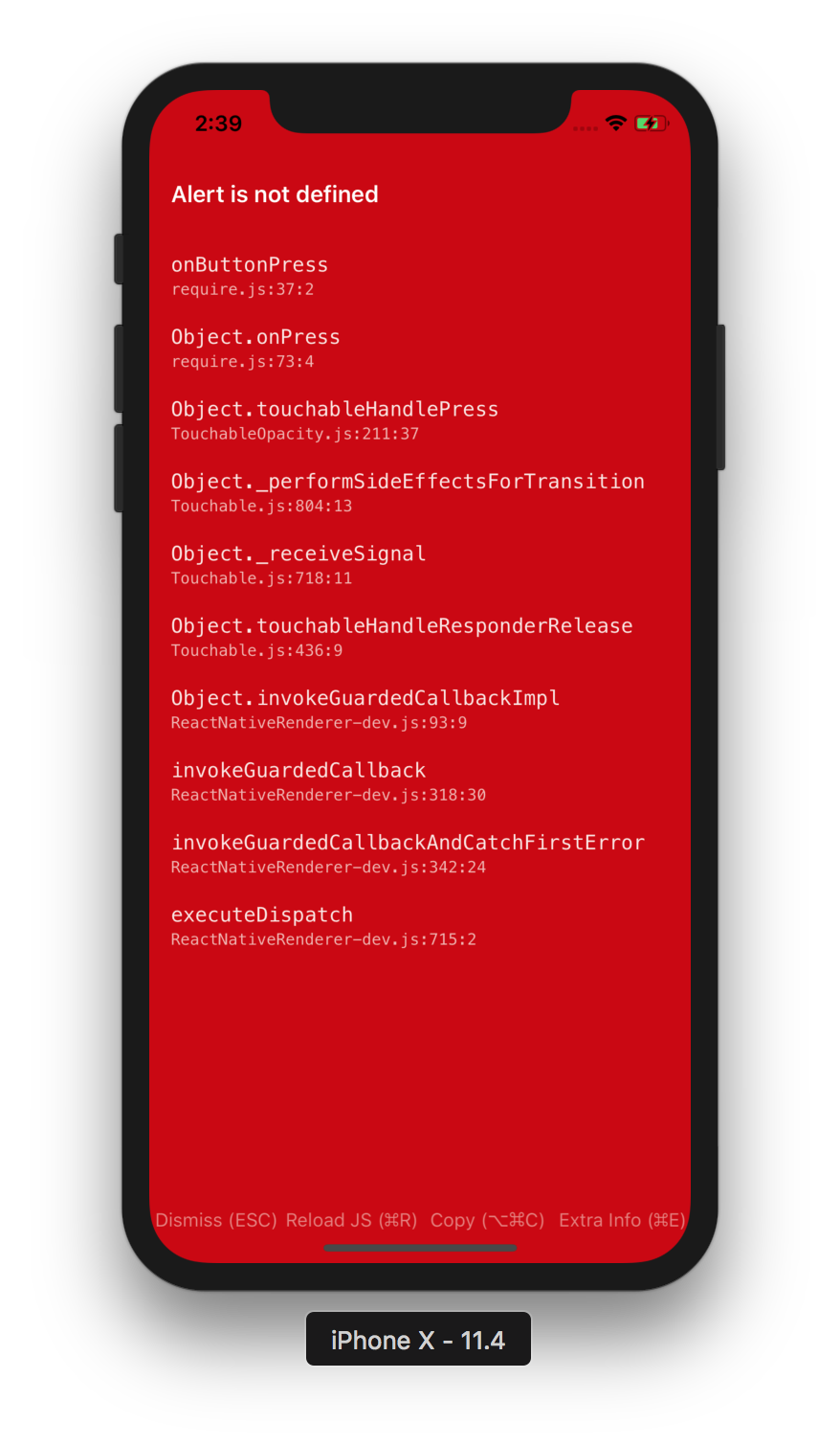
Hmm buttons are too close to bottom of the iPhone X 🤔 |
/cc @frantic please take a look and let me know if you have any other suggestions. Updated ScreenshotsiOS:

Android:
|

| CGSizeEqualToSize(screenSize, iPhoneXMaxScreenSize) || | ||
| CGSizeEqualToSize(screenSize, iPhoneXRScreenSize); | ||
| } | ||
|
|
There was a problem hiding this comment.
@kelset this is not ideal as the code is redundant with RCTDeviceInfo.
RCTDeviceInfo has a func called RCTIsIPhoneX but since I am not very proficient in Obj-C, I couldn't figure out how to reuse it. Any suggestions on how to reuse/improve this code would be appreciated!
There was a problem hiding this comment.
Yeah there's no easy way to reuse that function unless we extract it out to a util module.
I think this could work: safeAreaInsets: according to the docs, if the rootView is part of the view hierarchy, this value should return the extra padding we need to add to our UI.
@shergin what's the best way to do this?
There was a problem hiding this comment.
@frantic quick follow up: when I try to use the safeAreaInsets on the rootview I get 0 on an iPhoneX.
NSLog(@"safeArea: %f", rootView.safeAreaInsets.bottom);
> 2018-12-13 14:42:24.955719-0600 RNTester[37397:1022268] safeArea: 0.000000
I looked up a few issues on stack overflow and I figure out that I need to do this instead:
[UIApplication sharedApplication].delegate.window.safeAreaInsets.bottom;
Hence I came up with this which is pretty abstracted and much better than what I had before. Thanks for the suggestion. 👍
- (NSInteger)bottomSafeViewHeight
{
    if (@available(iOS 11.0, *)) {
        return [UIApplication sharedApplication].delegate.window.safeAreaInsets.bottom;
    } else {
        return 0;
    }
}
| [copyButton setTitleColor:[UIColor colorWithWhite:1 alpha:0.5] forState:UIControlStateNormal]; | ||
| [copyButton setTitleColor:[UIColor whiteColor] forState:UIControlStateHighlighted]; | ||
| [copyButton setTitleColor:[UIColor whiteColor] forState:UIControlStateNormal]; | ||
| [copyButton setTitleColor:[UIColor colorWithWhite:1 alpha:0.5] forState:UIControlStateHighlighted]; | ||
| [copyButton addTarget:self action:@selector(copyStack) forControlEvents:UIControlEventTouchUpInside]; |
There was a problem hiding this comment.
@kelset Also ideally all those buttons should be in a func that just takes a param and returns a UIButton.
This would clean up the code a lot, but I haven’t done Obj-C in a while. Let me know if that makes sense, and if something like would work.
There was a problem hiding this comment.
I think it's okay for now. Refactoring the buttons is probably outside of the scope of this change
There was a problem hiding this comment.
@Monte9 thank you so much for the screenshots, they make it so much easier to review this change!
I've added a few comments inline. The biggest one is detecting iPhone X, we could try to reuse the function from RCTDeviceInfo but would be even better if we could use iOS built-in APIs. I'll ping @shergin for suggestions.
Another thing I'd like to ask you is to change this line from UITableViewCellStyleSubtitle to UITableViewCellStyleDefault, this will make the error text properly vertically aligned.
| [copyButton setTitleColor:[UIColor colorWithWhite:1 alpha:0.5] forState:UIControlStateNormal]; | ||
| [copyButton setTitleColor:[UIColor whiteColor] forState:UIControlStateHighlighted]; | ||
| [copyButton setTitleColor:[UIColor whiteColor] forState:UIControlStateNormal]; | ||
| [copyButton setTitleColor:[UIColor colorWithWhite:1 alpha:0.5] forState:UIControlStateHighlighted]; | ||
| [copyButton addTarget:self action:@selector(copyStack) forControlEvents:UIControlEventTouchUpInside]; |
There was a problem hiding this comment.
I think it's okay for now. Refactoring the buttons is probably outside of the scope of this change
React/Modules/RCTRedBox.m
Outdated
|
|
||
| [rootView addSubview:dismissButton]; | ||
| [rootView addSubview:reloadButton]; | ||
| [rootView addSubview:copyButton]; | ||
| [rootView addSubview:extraButton]; | ||
|
|
||
| if ([self isIPhoneX]) { | ||
| [rootView addSubview:bottomSafeView]; |
There was a problem hiding this comment.
Move lines 160-162 here, so we don't create the UIView in case we don't need it
There was a problem hiding this comment.
@frantic good point. Will update.
| CGSizeEqualToSize(screenSize, iPhoneXMaxScreenSize) || | ||
| CGSizeEqualToSize(screenSize, iPhoneXRScreenSize); | ||
| } | ||
|
|
There was a problem hiding this comment.
Yeah there's no easy way to reuse that function unless we extract it out to a util module.
I think this could work: safeAreaInsets: according to the docs, if the rootView is part of the view hierarchy, this value should return the extra padding we need to add to our UI.
@shergin what's the best way to do this?
React/Modules/RCTRedBox.m
Outdated
|
|
||
| UIView *topBorderExtraButton = [[UIView alloc] initWithFrame:CGRectMake(0, 0, extraButton.frame.size.width, 1)]; | ||
| topBorderExtraButton.backgroundColor = [UIColor colorWithRed:0.70 green:0.70 blue:0.70 alpha:1.0]; | ||
| [extraButton addSubview:topBorderExtraButton]; |
There was a problem hiding this comment.
Instead of creating top border for each button, can we use one full-width view and add it to the rootView directly?
There was a problem hiding this comment.
Yeah, that does sound better. Updated. Cleanup up 20 lines. 💯
|
I really <3 this new design, and am impressed by the community effort here! |
|
Red top bar should expand to the top on iphonex |
|
@Monte9 awesome work! No more flash bangs. Eyes saver. Hope one day YellowBox will be same usable and readable. |
|
@radeno YellowBox was updated this past summer, and it should be easier to contribute to. It's out of the scope of this PR, but feel free to open an issue describing how the design could be improved. That way we won't lose track of the issue once this PR is merged. |
|
@frantic thanks for all the feedback. Def cleaned up & improved the code. I have addressed the feedback. Can you please take a look at it again? @hramos @cpojer this PR should be ready to go once @frantic approves. I'd love to get it out in one of the v0.58 RC's so that we can get some feedback from the community on this improved DX. |
There was a problem hiding this comment.
@cpojer has imported this pull request. If you are a Facebook employee, you can view this diff on Phabricator.
|
Ping @frantic |
|
@hramos @cpojer what else needs to be done in order to get this PR merged in? I have addressed @frantic's comments although he seems to be afk. I see that @cpojer imported this PR.. but not sure what that means? @kelset Can you give me a tl;dr of the lifecycle of a RN PR. (afaik it gets imported into FB's version of RN and is used internally first then it's merged into open source?) |
|
Basically, the tl;dr (or at least my understanding of it) is that once it's imported, someone internally need to 'manually merge it' into the FB monorepo. Once that's done, the bot will close the PR and a commit will appear on master. So it's basically in the internal phase right now, which means that it's probably getting reviewed & tested. It may take a bit longer since probably the team is "fully operative" starting next week. |
|
What @kelset said. I just got back from being away for a few weeks on holiday break - I'll take a look at the imported diff ASAP :) |
Summary:
[Re: RedBox screen is a bit scary - Discussions and Proposals](react-native-community/discussions-and-proposals#42)

Per hramos:
> The RedScreen was inspired by Ruby on Rails's error screen

> I do see the RedBox screen could be made less jarring while still successfully displaying all the information we need.

Hence jamonholmgren came up with the idea that only the header & footer of the RedBox screen could be red. This makes the content a bit more readable as well as makes the screen a little less intimidating.

Also frantic made the suggestion that since the bottom buttons are not as important, they don't need to stand out. Hence only the header of the RedBox screen which displays the error is made red.

Screenshots:
----------

<div style="flex-direction: row">
<img width="325" alt="orginal" src="https://user-images.githubusercontent.com/7840686/48322916-b4958b80-e5de-11e8-9276-33378d1b41c5.png">
<img width="320" alt="redbox_v2_ios" src="https://user-images.githubusercontent.com/7840686/48665300-cce32b80-ea60-11e8-8e8f-88f74bad30ca.png">

</div>

<div style="flex-direction: row">
<img width="300" alt="original_android" src="https://user-images.githubusercontent.com/7840686/48322958-d5f67780-e5de-11e8-891c-1b20bd00e67b.png">
<img width="300" alt="redbox_v2_android" src="https://user-images.githubusercontent.com/7840686/48665312-f13f0800-ea60-11e8-9fb6-47e03c809789.png">

</div>
Pull Request resolved: #22242

Reviewed By: hramos

Differential Revision: D13564287

Pulled By: cpojer

fbshipit-source-id: fcb6ba5e20d863f4b957d20f3787f5b7a365bfdb
Summary:
[Re: RedBox screen is a bit scary - Discussions and Proposals](react-native-community/discussions-and-proposals#42)

Per hramos:
> The RedScreen was inspired by Ruby on Rails's error screen

> I do see the RedBox screen could be made less jarring while still successfully displaying all the information we need.

Hence jamonholmgren came up with the idea that only the header & footer of the RedBox screen could be red. This makes the content a bit more readable as well as makes the screen a little less intimidating.

Also frantic made the suggestion that since the bottom buttons are not as important, they don't need to stand out. Hence only the header of the RedBox screen which displays the error is made red.

Screenshots:
----------

<div style="flex-direction: row">
<img width="325" alt="orginal" src="https://user-images.githubusercontent.com/7840686/48322916-b4958b80-e5de-11e8-9276-33378d1b41c5.png">
<img width="320" alt="redbox_v2_ios" src="https://user-images.githubusercontent.com/7840686/48665300-cce32b80-ea60-11e8-8e8f-88f74bad30ca.png">

</div>

<div style="flex-direction: row">
<img width="300" alt="original_android" src="https://user-images.githubusercontent.com/7840686/48322958-d5f67780-e5de-11e8-891c-1b20bd00e67b.png">
<img width="300" alt="redbox_v2_android" src="https://user-images.githubusercontent.com/7840686/48665312-f13f0800-ea60-11e8-9fb6-47e03c809789.png">

</div>
Pull Request resolved: facebook#22242

Reviewed By: hramos

Differential Revision: D13564287

Pulled By: cpojer

fbshipit-source-id: fcb6ba5e20d863f4b957d20f3787f5b7a365bfdb
Summary:
[Re: RedBox screen is a bit scary - Discussions and Proposals](react-native-community/discussions-and-proposals#42)

Per hramos:
> The RedScreen was inspired by Ruby on Rails's error screen

> I do see the RedBox screen could be made less jarring while still successfully displaying all the information we need.

Hence jamonholmgren came up with the idea that only the header & footer of the RedBox screen could be red. This makes the content a bit more readable as well as makes the screen a little less intimidating.

Also frantic made the suggestion that since the bottom buttons are not as important, they don't need to stand out. Hence only the header of the RedBox screen which displays the error is made red.

Screenshots:
----------

<div style="flex-direction: row">
<img width="325" alt="orginal" src="https://user-images.githubusercontent.com/7840686/48322916-b4958b80-e5de-11e8-9276-33378d1b41c5.png">
<img width="320" alt="redbox_v2_ios" src="https://user-images.githubusercontent.com/7840686/48665300-cce32b80-ea60-11e8-8e8f-88f74bad30ca.png">

</div>

<div style="flex-direction: row">
<img width="300" alt="original_android" src="https://user-images.githubusercontent.com/7840686/48322958-d5f67780-e5de-11e8-891c-1b20bd00e67b.png">
<img width="300" alt="redbox_v2_android" src="https://user-images.githubusercontent.com/7840686/48665312-f13f0800-ea60-11e8-9fb6-47e03c809789.png">

</div>
Pull Request resolved: facebook/react-native#22242

Reviewed By: hramos

Differential Revision: D13564287

Pulled By: cpojer

fbshipit-source-id: fcb6ba5e20d863f4b957d20f3787f5b7a365bfdb
Re: RedBox screen is a bit scary - Discussions and Proposals
Per @hramos:
Hence @jamonholmgren came up with the idea that only the header & footer of the RedBox screen could be red. This makes the content a bit more readable as well as makes the screen a little less intimidating.
Also @frantic made the suggestion that since the bottom buttons are not as important, they don't need to stand out. Hence only the header of the RedBox screen which displays the error is made red.
Screenshots:
iOS
Android:
Test Plan:
Use
RNTesteriOS & Android app to generate an error and test the updated error screen.Changelog:
[General] [Changed] - RedBox Screen has new dark mode design to improve readability.