Browser UI Branding #152
Comments
|
The {
"branding": {
"icons": [
{
"url": "https://icon.example.com/icon-16",
"size": 16
},
{
"url": "https://icon.example.com/icon-32",
"size": 32
}
]
}In all cases, the icons are expected to be square in size, so only a single dimension is returned. All icons returned are required to be maskable (https://www.w3.org/TR/appmanifest/#icon-masks). |
|
Does this allow for SVG icons? If the IDP puts a data-url in |
|
I used |
|
Comment 1: Specifically this section: Comment 2: |
Hey been following this work for a bit now and just saw this issue pop up. In regards to this assumption I'm not sure it holds true for Microsoft's implementation used for SSO (speaking as a user - I don't work for them). From the looks of it when first submitting the email to their outlook page they use standard white branding and then depending on the email domain the branding appears in the password entry page which allows for logos and what appears to be images (might be SVGs, but not sure) as backgrounds. I'm not sure how well that would map to the current user flows suggested, so I'll let someone from their team speak up about it. However, as a user, I do like the ability to see the image or maybe SVGs as a background based on the domain provided in these multi page UIs currently used. It helps me when I'm running multiple outlook accounts to know I've gone to the right place without having to remember different URLs. I can just show up at Outlook.com and figure it out from there. |
|
@pkotwicz about about a base64 encoded image, could that be possible? The generalized request is, can we do a single fetch of the metadata end point and also get the icon at the same time. Saves a network round-trip if we can. |
|
@kdenhartog when you say branding appears, do you mean branding for your enterprise, branding for outlook or something else? We have no plans for general backgrounds, just setting the colour of the button and adding a small logo on the left side of the button. |
|
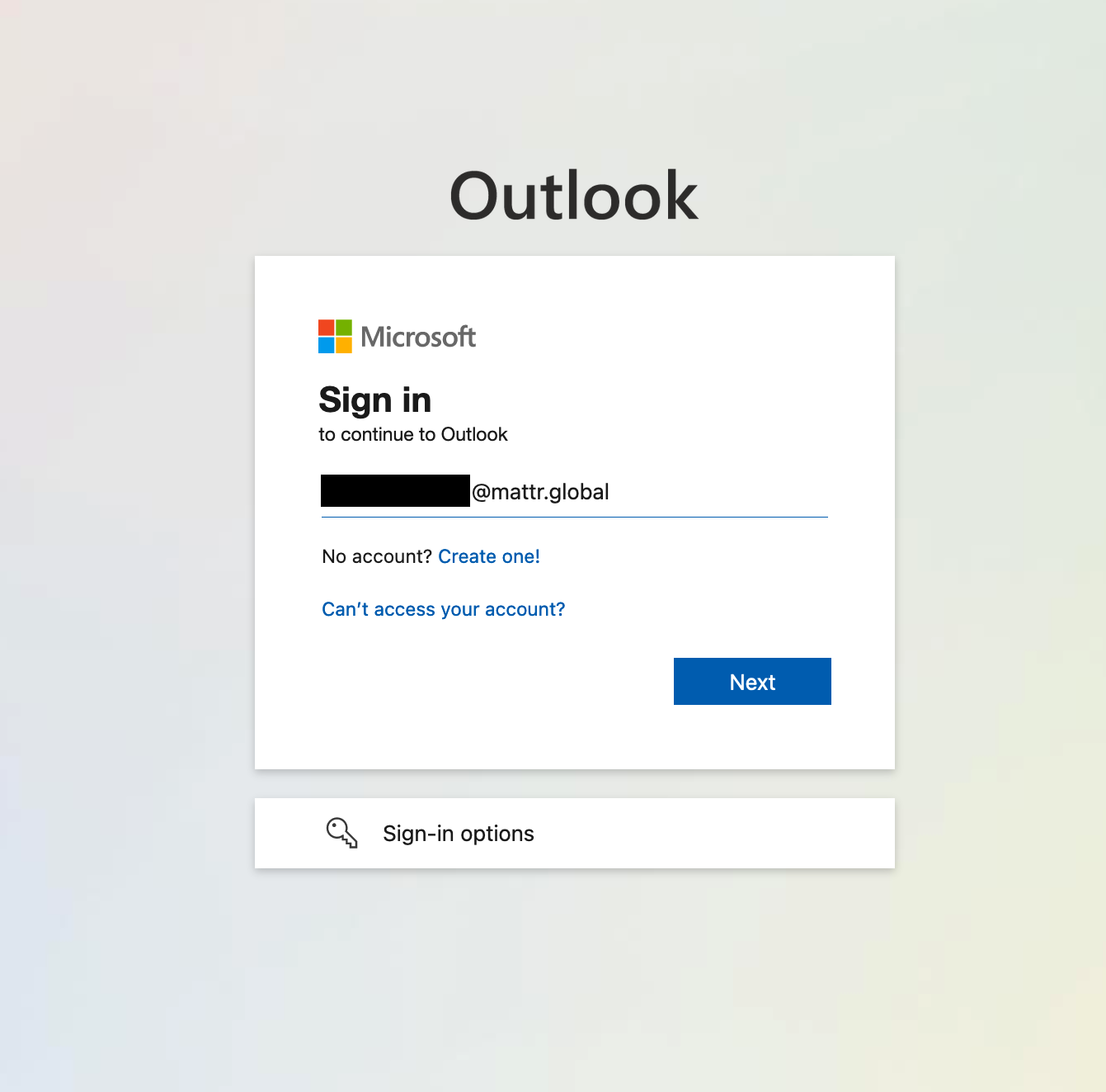
A picture of their flow is probably more useful here because it's essentially both outlook branding and enterprise branding that gets switched out based on the domain. This is the first screen I see on outlook.com
This is the second screen I see:
|

Yes, you're correct. Microsoft models our IDP as a collection of servers owned by specific companies - so if you try to sign in to Outlook using login.microsoft.com/AcmeCorp.com - we show the AcmeCorp branding in the background. We also show the Outlook-specific branding in the foreground. So we have two layers of branding that we'd like to show, specific to both the app and the tenant (both of which are somewhat hidden from us in FedCM, I believe). |
|
Thanks for popping in and confirming @hpsin |
|
So, we really only have one branded item, a button with a small logo on it. Would the preference be for the button to get branded as |
Yes getting the icon from base64 is possible. |
|
SVG is supported in app manifests in Chrome on Desktop and Android: https://twitter.com/quicksave2k/status/1450826163941781520 |
|
@cbiesinger : If I read the tweet correctly, it sounds like SVG is NOT supported in app manifests on Android. |
|
@pkotwicz it sounds like the linked CL in that tweet implements it, no? (also mentioned in the last comment on that bug) |
|
@cbiesinger : It looks like http://crbug.com/1251181 has been marked as fixed. |
This sounds most closely aligned to what my preference would be as a user, but I'm not fully aware of the trade-offs in complexity that would be incurred at this point. |
|
From a notation perspective, I'm wondering about two things: (a) how do we not corner ourselves from further extensions? On (a), I'm wondering what happens when we want to use branding for other parts of the UX. Can we scope e.g. do we need one level of nesting? {
"branding": {
"button": {
"background-color": "#fff",
"foreground-color": "#000",
"icon": {
"url": "https://icon.example.com"
}
}
}On (b), I'm wondering if we could use the same type of terminology that CSS uses for styling. e.g. should we use {
"branding": {
"button": {
"background-color": "#fff",
"color": "#000",
"icon": {
"url": "https://icon.example.com"
}
}
}More generally, would it be possible for this to be isomorphic (the JSON notation seems fine) to a strict a subset of CSS? e.g. this would probably go too far, but worth noting as an option: {
"theme": {
".sign-in button": {
"background-color": "#fff",
"color": "#000",
"icon": {
"url": "https://icon.example.com"
}
}
} |
+1 from my side - this would also enable this API to work better with this use-case fedidcg/use-case-library#7 |
|
A small update here: I'm writing down in the spec here what has been implemented, to give us a baseline to work from. I still think that this is best represented in something separate from the |
|
Marking this is complete. The branding information was added to the spec, and has been moved to the |
With the current spec the browser is presenting UI to the user for them to sign-in to the website. There is desire for that UI to be branded by the IDP in certain ways. Specifically we've been looking at branding the colour of the presented button and adding a small logo to the side of the button.
My assumption is that this branding is the same for all IDP accounts. We do not need to know the user that is signing into the IDP in order to decide which branding to present to the user. If that is not the case then we'll need to move where the IDP data is provided.
Proposal
The IDP data is added into the
.well-known/fedcmmetadata file alongside the various endpoint URLs. If the branding is not present then they default branding (UA defined) will be used.{ "branding": { "background-color": "#fff", "foreground-color": "#000", "icon": { "url": "https://icon.example.com" } }The
background-colororforeground-colorcould both be set or only one of the two set. The colours are a hint to the UA, not a requirement. The UA reserves the right to reject the colours and use the default colours if the provided colours don't fall within accepted usability colour contrast ratios.The text was updated successfully, but these errors were encountered: