Button wrapper for React Native that shrinks/expands when you press it
$ npm i react-native-popin-button --save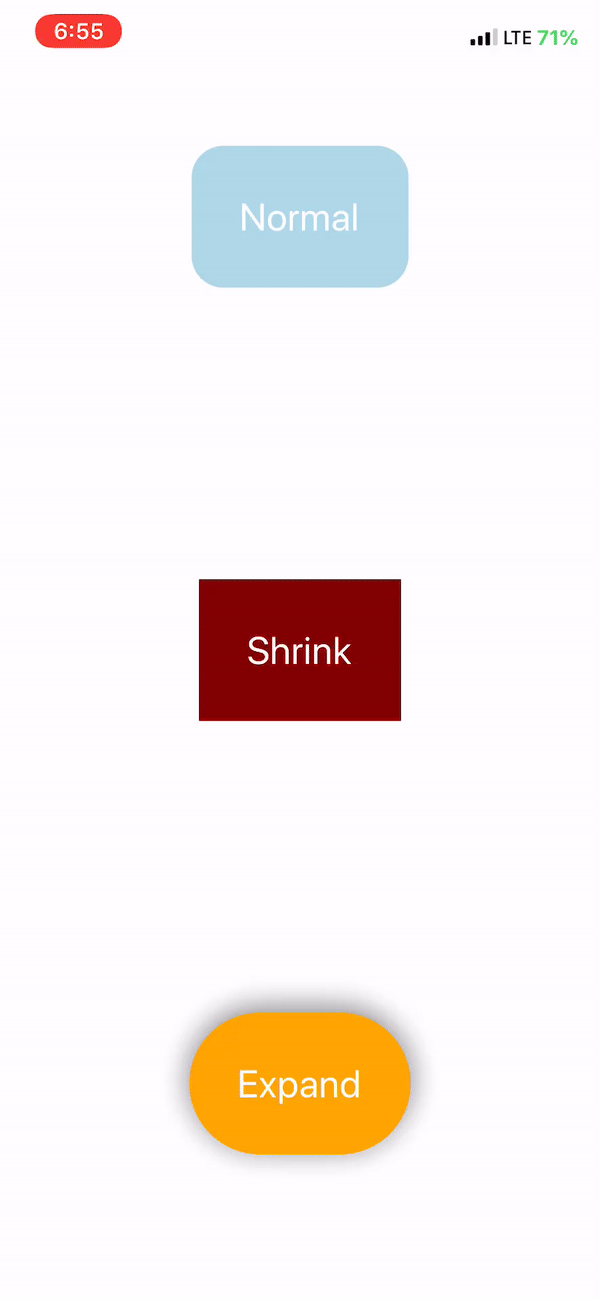
import React from 'react'
import { Text, View } from 'react-native'
import PopinButton from 'react-native-popin-button'

const styles = {
  container: {
    justifyContent: 'space-around',
    alignItems: 'center',
    flex: 1
  },
  roundButton: {
    backgroundColor: 'lightblue',
    padding: 30,
    borderRadius: 20
  },
  shrink: {
    backgroundColor: 'maroon',
    padding: 30,
  },
  big: {
    backgroundColor: 'orange',
    padding: 30,
    borderRadius: 100,
    shadowColor: 'grey',
    shadowOpacity: 1,
    shadowRadius: 10,
  },
  text: {
    color: '#fff',
    fontSize: 24
  }
}

const App = () => {
  return (
    <View style={styles.container}>
      <PopinButton onPress={() => console.log('woohoo')} style={styles.roundButton}>
        <Text style={styles.text}>Normal</Text>
      </PopinButton>
      <PopinButton onPress={() => console.log('small')} shrinkTo={0.5} style={styles.shrink}>
        <Text style={styles.text}>Shrink</Text>
      </PopinButton>
      <PopinButton onPress={() => console.log('big')} shrinkTo={1.5} style={styles.big}>
        <Text style={styles.text}>Expand</Text>
      </PopinButton>
    </View>
  );
};
export default App;| Prop | Default | Type | Description |
|---|---|---|---|
| onPress | N/A | function |
Function to call when pressing button |
| scaleTo | 0.9 |
number |
Size the button will scale down/up to |
| style | N/A | object/array |
Style of the button |
| useNativeDriver | true | bool |
Use Native Driver for animation |
| afterAnimate | true | bool |
True will trigger button after animation False will trigger function on press out |