[brand] Gatsby logo definition #3363
Comments
|
I also took a first shot at defining a vertical version of the logo as mentioned by @SachaG in the t-shirt issue. Here's some WIP shots, also including a white-on-purple version:
|


|
The heavier font weight looks nice to me and the size adjustment makes the logo and word "Gatsby" look like they are more visually connected and "fit together." One thing I realized with the horizontal logo is that there is a repetition of "g's" (the logo is a "g" and gatsby starts with a "g") so this is one reason I find the vertical logo intriguing, because it separates the "g's". However, I think I still find the horizontal one more visually appealing. Very beautiful to see the story behind this! |
|
I like the bolder version too :) |
|
Just a small thing: if I remember correctly the reason I picked the lighter version was to match the letter's width to the logo's stroke width. Also the lighter font seemed more "art deco" somehow. On a purely visual level though I do agree that the thicker weight looks better. But if we do pick it maybe it's worth revisiting the logomark itself to see what it'd look like with thicker strokes as well? |
|
@shannonbux Thank you for your feedback!
Yep, can follow that! The similarity in shapes (logomark and wordmark "G") is the reason why I didn't reduce the whitespace in between them even more – just didn't feel right IMO.
Yes, still a little unsure about the sizes here/not really happy with this.
Yay! "Brand daddy" approval! 🎉
Hey, cool that you mention that – I wondered about what was the base for the monogram "G" when I tried finding a base unit for the clear space stuff. I hear you about "art deco", too – especially since I quickly fiddled around with the curves of the monogram "G" to make it a bit thicker like you suggested. Of course that's the wrong way to skin that cat, and the result showed and I ditched it almost immediately. I wouldn't be too surprised if it might loose the art deco feel even if I do the monogram from scratch with increased weight tho. Let me give it a quick shot with Futura Medium for the wordmark … and maybe a properly constructed monogram with the Demi logotype "G" stroke width. Also happy to put the Adobe Illustrator source online if you want to give it a shot yourself? It's your baby! 👶 😉 😄 |
|
With Futura PT Medium instead of Demi (clearance stuff not adjusted):
Screenshot (Chrome, Retina MacBook Pro) of the current gatsbyjs.org followed by a quick mockup of the "Medium" and "Demi" versions:
|


|
Those navigation size mocks make it painfully obvious that even less whitespace in between mark and type wouldn't be enough at that size. :) |
|
Redrew the logo, matching the original logomark stroke width/geometry ("2x"); the bar now also is exactly 2x thick and fits the grid. Then I tried 2,5x and 3x stroke width for the "G" in the logomark – the latter is nothing worth to explore further IMO. The stroke width of the "Demi" logotype is somewhere between ~2,4x and 2,8x. I also gave redrawing the "G" in the "Demi" logo two quick shots. The first one fully matches the strict geometry (perfect circle) of the logomark. The follow-up slightly increases the thickness of the stress and the lower bowl of the "G", while keeping the "perfect circle" almost fully intact on the outside of the character stroke.
Please note that E. only is about the logomark strokes, all displayed logos use the original "Demi" version of the logotype. |

|
I’m liking the perfect geometry one (second, correct?) and it’s hard to
choose between logomark stroke widths...when the logo is smaller, I like
the bolder one. When the logo is bigger, I like the original thin one. Love
the Art Deco feel in any case!
…On Sat, Dec 30, 2017 at 1:17 PM Florian Kissling ***@***.***> wrote:
Redrew the logo, matching the original logomark stroke width/geometry
("2x"); the bar now also is exactly 2x thick and fits the grid. Then I
tried 2,5x and 3x stroke width for the "G" in the logomark – the latter is
nothing worth to explore further IMO. The stroke width of the "Demi"
logotype is somewhere around 2,8x.
I also gave redrawing the "G" in the "Demi" logo two quick shots. The
first one fully matches the strict geometry (perfect circle) of the
logomark. The follow-up slightly increases the thickness of the stress and
the lower bowl of the "G", while keeping the "perfect circle" almost fully
intact on the outside of the character stroke.
[image: strokes-and-logotype-g]
<https://user-images.githubusercontent.com/21834/34456999-e2bf12ca-eda4-11e7-9c79-4c2a8f4ae626.jpg>
Please note that *E.* only is about the logomark strokes, all displayed
logos use the original "Demi" version of the logotype.
—
You are receiving this because you were mentioned.
Reply to this email directly, view it on GitHub
<#3363 (comment)>,
or mute the thread
<https://github.com/notifications/unsubscribe-auth/Ae9o2jzhlrta6qFBfRXEPwfUHKnJU9BSks5tFppogaJpZM4RPQjA>
.
|
Yep! (And sorry for taking so long to reply!) Re: Logomark stroke widths – what you wrote are almost exactly my thoughts. Since things do not consistently improve, I'd stick to the original stroke widths. /cc @SachaG |
|
To be honest I don't have a super strong opinion. I think the most important thing is just that the solution we choose is a deliberate choice, and not just whatever I happened to draw in 10 minutes back then :) |
|
@SachaG After fiddling around with the logo quite a bit, may I say I think those 10 minutes were spot-on, intuitive greatness?! ;-) I often noticed that the first (creative) idea stands the test of time and alternative proposals. I guess in a lot of cases, "intuitive" is the key aspect. The monogram does a great job in building a "bridge" to what most people might associate when they hear "Gatsby", works great for avatars, profile images etc., has been "out there" for quite some time now getting a lot of positive feedback. We already got a lot here IMO, no need to overthink. And no "challenger" in sight either. So as I mentioned earlier, I'd stick to
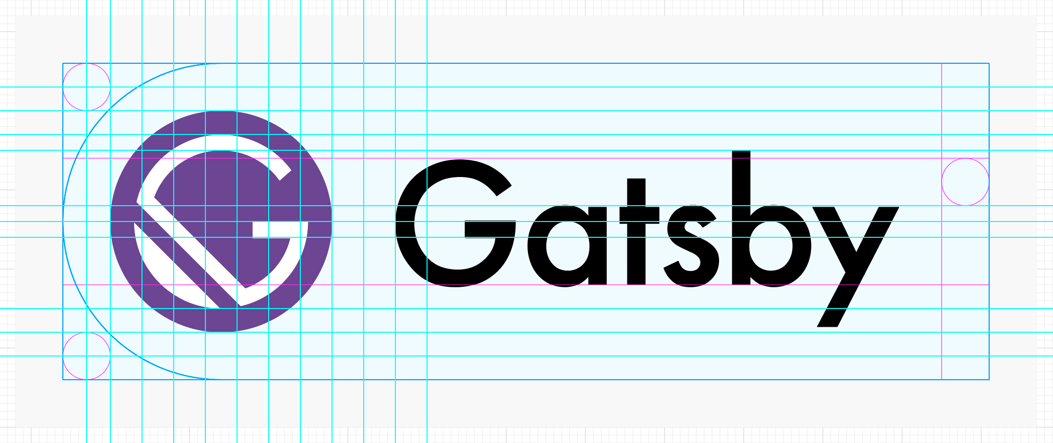
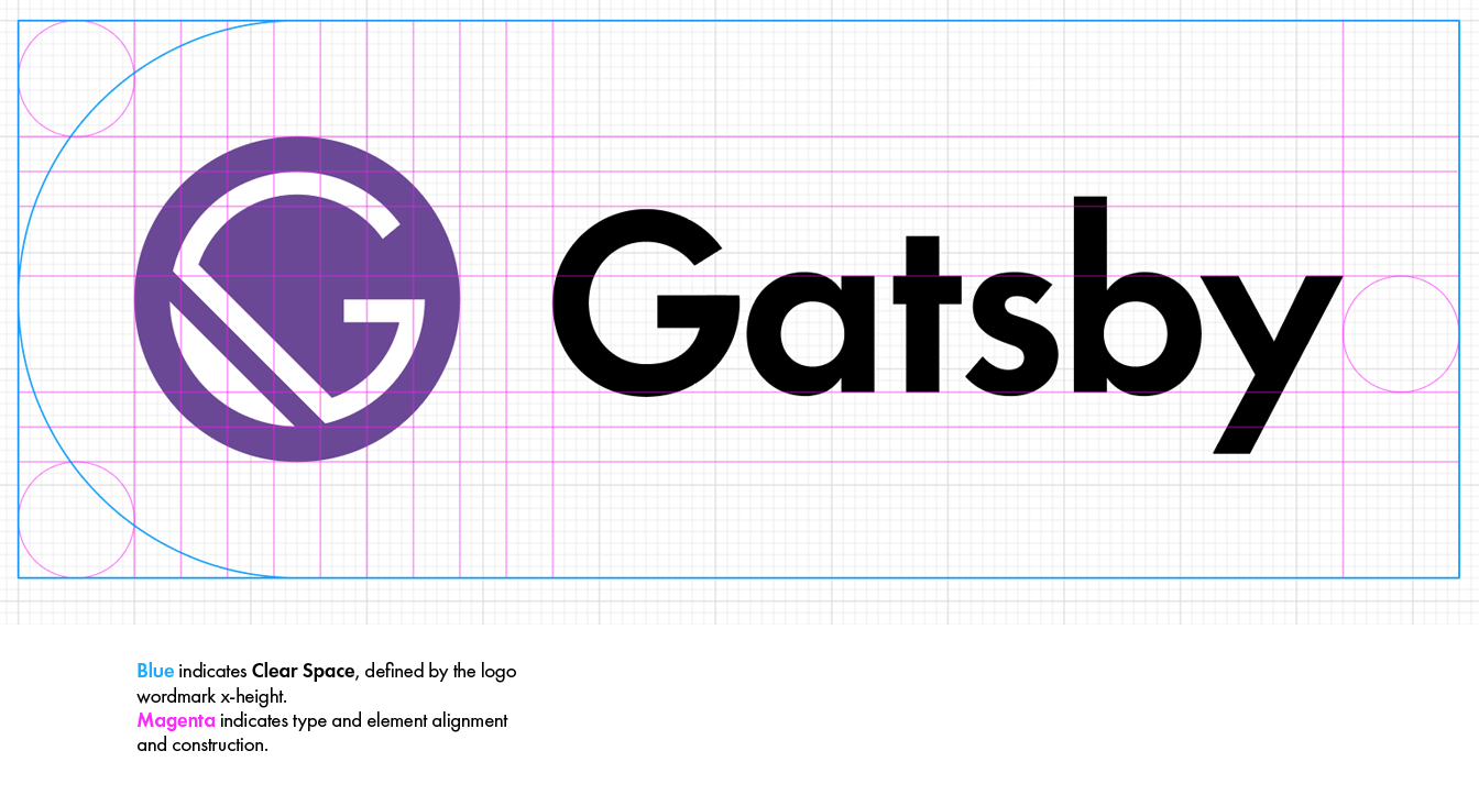
I think those two different weights – "normal" which the monogram "G" is based on, and "demi" used for the wordmark – do not conflict with each other; I actually like the juxtaposition of "classic/art deco monogram" and the "more modern" wordmark. The redrawn "G" of the wordmark reflects the monogram nicely now regarding the strict geometry – boiling things down this was my main issue personally. Over the past days I sat down and removed the gray "safe space", bumped up the clear space to be exactly the wordmark's x-height (10 instead of 6 "base units"), and fixed the last "dirty bits" – e.g. the x-height of the wordmark is now exactly 10 units as opposed to ~10,0375, I revisited kerning, etc. Here's how that looks now, showing variant C from here:
|


|
One thing that I'd like to give another (ideally collective 🤗) look is the "Gatsby Purple". @ArchieHicklin suggested a bolder palette in #1173 (comment). It's also where I borrowed "Mustard" from for the home page accents. I don't think that we should abandon the purple brand color at this point for the same reasons we should stick to the monogram and the art deco style. But I personally would like the "Gatsby Purple" to "pop" a little more, meeting Archie's palette suggestion … mid way. ;-) Choosing a more "standard", less faded, and less green purple might also make finding a "close enough" stock purple shirt for the "white brand on purple shirt" a bit easier. For now I've looked into finding a Pantone match for the original "Gatsby Purple", then picked the next darker Pantone color (middle square/logo), and rebeccapurple 💜 as a quite bold, but still quite close alternative:
I'd appreciate your thoughts! /cc @SachaG @ArchieHicklin @KyleAMathews @shannonbux @calcsam @rdela @m-allanson and everybody 🎉 😃 🤗 |

|
@fk love your analysis! Thanks for all the thinking that's gone into this! It's super nice having such a professionally designed logo/design. I really like rebeccapurple — it definitely "pops" more than the others and still feels in the range where Gatsby purple has been living. And if it helps with sourcing t-shirts, stickers, hoodies, etc. all the better. |
|
I also like rebeccapurple. It's just a nice touch especially with the history behind the color :) |
|
Thanks guys for coming back! I also like rebeccapurple a lot.
🙏, but I merely realigned … a little. @SachaG You're OK with the "demi" wordmark? |
|
Yeah I'm totally fine with your version. And you shouldn't undersell your part of the work, I actually think I did the easiest part. It's like people who are surprised that a simple logo can cost hundreds of thousands of dollars, they don't know all the little iteration/tweaking/discussion/etc. that goes in even once the basic concept is established :) |
|
I am pro rebeccapurple as well. Only remaining qualm I have is what @shannonbux brought up, almost verbatim from my wife Laramie’s thoughts when I showed her, that the G repeats in the horizontal treatment. I think all this means is where possible use the monogram alone or a vertical treatment, but curious what everyone else’s thoughts are. |
I think there's not much we can do about that unless we rethink the whole monogram concept.
Yep, I think the monogram is working great on its own! But: Obviously for people without context/"prior knowledge", it won't even leave them with the brand/product name – unless that is provided along with the monogram somehow, e.g. in the Twitter profile. I don't think there will be a lot of cases where we really need to worry about this though. One example could be a slide presentation on Gatsby where it would be just fine to include the monogram on every slide: At first sight an intro slide with the full logo, or mentioning Gatsby in the presentation title might be fine, and it of course is … Then again a marketing pro once made aware that people can take photos and screenshots of a single slide, too … ;-) |
|
So, here's the final round of logos, will add links to SVGs for logo, monogram, wordmark, and their inverted versions in a bit.
Please note that what you see above is not 100% I increased the whitespace in between monogram and logotype by two base units after working on #3639, making it the same size as the x height of the logotype which we already use to define the clear space/minimum clearance around the logo. |

|
Aaaaand … right after posting above I started to squint and revisit the kerning one last time :/ – moved the "a" away a little from "G" and "sb" a tad closer to "y":
SVGs coming! 🎉 😶 |

|
@fk HERO (as in wow, you are a…) |
|
Thank you Ricky! 🤗 Far from it (and also this stuff is not really in my comfort zone), but doing what I can! I plan on adding some mockups for the basic "OGatsby" shirts later today, but don't let that hold you off of grabbing those logos and using them! Btw., OT: I recently remembered the "Gatsby mandala" idea and noticed that there are a bunch of nicely looking tutorials on YouTube: https://www.youtube.com/results?search_query=mandala+illustrator |
|
I love it, but could you try a version in Comic Sans? Just kidding, great work and I can't wait to see it on a tshirt :) |
|
haha Comic Sans. Have ya'll seen the Ryan Gosling SNL skit on Papyrus? Very
good. Also, I like the re-kerned "a" and "bs", @fk!!! Squinting is a
professionally useful skill :D
…On Wed, Jan 24, 2018 at 6:43 PM, Sacha Greif ***@***.***> wrote:
I love it, but could you try a version in Comic Sans?
Just kidding, great work and I can't wait to see it on a tshirt :)
—
You are receiving this because you were mentioned.
Reply to this email directly, view it on GitHub
<#3363 (comment)>,
or mute the thread
<https://github.com/notifications/unsubscribe-auth/Ae9o2tA_juQabLWEyTlubVCWnBtAIKhWks5tN9wkgaJpZM4RPQjA>
.
|
Not only 😉 in support of the Gatsby t-shirt design contest, I would like to make an effort to settle on a logo definition for the Gatsby brand (starting the "Gatsby Brand Guidelines" I guess).
Ideally, this would eventually result in a section on gatsbyjs.org offering downloads and usage instructions.
Motivation
Seeing the t-shirt mockups by @rdela using the original logo design by @SachaG I felt that for the t-shirt design, the logotype could be a little bigger. On the second look, I started wondering about the logomark font weight. I took another look at gatsbyjs.org – there we use "Futura PT Demi" for the logomark, a heavier weight than what is used in the "OGatsby" version. A little OCD kicked in. 😄 😉
A bit of research
So I started to trace back:
#744C9E.#9D7CBF.#5b2b63. The https://opencollective.com/gatsby has another one:#623F93.Status Quo and personal opinion
The current gatsbyjs.org uses Futura PT, more specifically @KyleAMathews bought the "Book" and "Demi" cuts plus their italic versions. Futura PT Demi is used to substitute "Futura Medium" from @SachaG's designs.
I like the bolder logotype (compared to the "OGatsby" version using "Futura Medium").
I think there's a little too much whitespace in between the gatsbyjs.org logomark and -type.
First shots at a logo definition
Based on the current gatsbyjs.org logo version, I somehow managed to squeeze the current logo into an old brand guideline I found in my (digital) crates. The clearance space currently is defined a little weirdly by cap height minus x-height. I haven't actually validated how well the current definition works and want to take a look at using the logomark x-height as a base for the Clear Space instead and probably get rid of the "Safe Zone".
I held back from really tightening the screws, so a few things are a bit off still – but things are lining up quite nicely already. The whitespace between mark and type are reduced. I think the logomark/-type balance works better when compared to the "OGatsby" version.
What's your opinion? How do you feel about "Futura Medium" vs. "Futura PT Demi"?
The text was updated successfully, but these errors were encountered: