Alert: Redesign with tinted background #66918
Conversation
 torkelo
requested review from
andresmgot,
ashharrison90 and
L-M-K-B
and removed request for
a team
torkelo
requested review from
andresmgot,
ashharrison90 and
L-M-K-B
and removed request for
a team
|
@staton-hyse11 pushed the latest changes, must rush to school now! |
torkelo
changed the title
torkelo
changed the title
torkelo
requested review from
ergoerik and
JoaoSilvaGrafana
and removed request for
amy-super
|
Here is an example of how it really improves large info boxes:
|
| <IconButton aria-label="Close alert" name="times" onClick={onRemove} size="lg" type="button" /> | ||
| <Button |
There was a problem hiding this comment.
What was the reason for changing to Button? Is it just the "squareness" of it? Just curious for our own investigation of unifying these two options
There was a problem hiding this comment.
@JoaoSilvaGrafana yea, two reasons the squareness (which looks good when it matches the shape of the corner it's in) and the color of the hover effect for a secondary fill button is transparent so it takes on the color tint of the background which looks really good.
| @@ -113,6 +120,7 @@ const getStyles = ( | |||
| ) => { | |||
| const color = theme.colors[severity]; | |||
| const borderRadius = theme.shape.borderRadius(); | |||
| const borderColor = tinycolor2(color.border).setAlpha(0.2).toString(); | |||
There was a problem hiding this comment.
This just made me realize that we actually use setAlpha in a bunch of places, so we need to remember this during the color tokens exploration so we can take these into account.
There was a problem hiding this comment.
@JoaoSilvaGrafana yes, if we need this weak colored border in many places it should be added as a token in theme. but so far this and the Badge is are the only two I know of we do this with the border color .
.../app/features/connections/components/ConnectionsRedirectNotice/ConnectionsRedirectNotice.tsx
Outdated
Show resolved
Hide resolved
There was a problem hiding this comment.
LGTM! I've created a backlog item for the follow-up tasks here
|
I love the new design -- I think it draws attention to the information without throwing off the visual balance of the page. We actually used this style with the transparent colored background in a few places already in Cloud products, because the traditional banner style was too overwhelming. Great job!! |
|
thanks @teddyba , yea I really think it makes the UI look a bit more fresh and soft. Not as hard and solid :) |
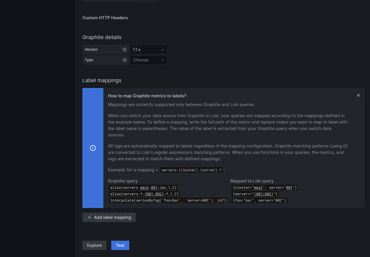
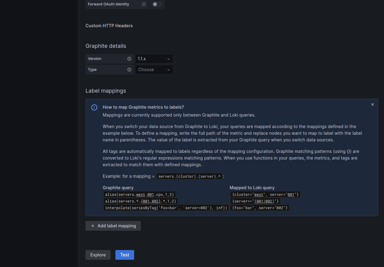
Our current inline banners just look so "meh", and I have been wanting to move to a move "transparent" and common design for years.
Current:


New design (in collaboration with Staton and Erik)