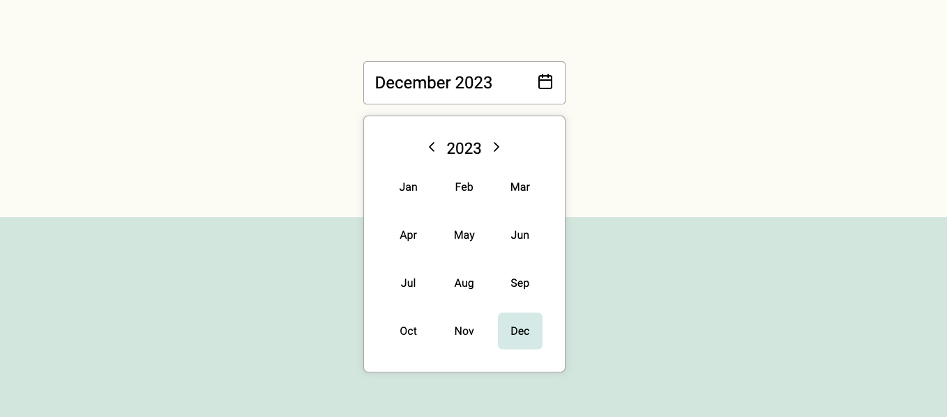
Simple, modern and customizable month picker component for ReactJS.
😀 Simple and easy to use.
🌶 Tiny: Minzipped size less than 1kB.
🧁 Highly customizable: Easily make it fit to your designs.
📅 Accessible: Fully accessible with keyboard navigation. Developed according the WCAG 2.1 accesibility guidelines.
🇫🇮 41 languages supported.
🚫 0 Dependencies: No surprise dependencies included.
Using npm:
npm install react-lite-month-picker --saveUsing yarn:
yarn add react-lite-month-pickerUsing bun:
bun install react-lite-month-pickerimport { useState } from 'react';
import { MonthPicker, MonthInput } from 'react-lite-month-picker';
function Example() {
const [selectedMonthData, setSelectedMonthData] = useState({
month: 9,
year: 2023,
});
const [isPickerOpen, setIsPickerOpen] = useState(false);
return (
<>
<div>
<MonthInput
selected={selectedMonthData}
setShowMonthPicker={setIsPickerOpen}
showMonthPicker={isPickerOpen}
/>
{isPickerOpen ? (
<MonthPicker
setIsOpen={setIsPickerOpen}
selected={selectedMonthData}
onChange={setSelectedMonthData}
/>
) : null}
</div>
</>
);
}
export default Example;Currently selected month data is an object with the following structure:
{
  month: 9,
  year: 2023,
  monthName: 'September',
  monthShort: 'Sep'
}
It will get saved on set parent component state with onChange event.
You can customize the MonthPicker component styles by passing props to it.
| Prop name | Description | Default value |
|---|---|---|
bgColorMonthActive |
Background color of the active month. | #4ea3983e |
bgColorMonthHover |
Background color of the month on mouse hover. | #f4f4f4 |
borderRadiusMonth |
Border radius of the moth element. | 7px |
bgColorPicker |
Background color of the picker element. | #fff |
textColor |
Color of the text. | #000 |
size |
Size of the component. Accepts 'small' or 'large'. | large |
lang |
Language. Accepts ISO 639-1 language code. | en |
You can customize the MonthInput component styles by passing props to it.
| Prop name | Description | Default value |
|---|---|---|
bgColor |
Background color of the input element. | #fff |
bgColorHover |
Background color of the input element on mouse hover. | #fff |
textColor |
Color of the text. | #000 |
size |
Size of the component. Accepts 'small' or 'large'. | large |
lang |
Language. Accepts ISO 639-1 language code. | en |
See full list of supported languages on the website.
MIT © henripar


