Skip to content
New issue

Have a question about this project? Sign up for a free GitHub account to open an issue and contact its maintainers and the community.

By clicking “Sign up for GitHub”, you agree to our terms of service and privacy statement. We’ll occasionally send you account related emails.

Already on GitHub? Sign in to your account

Add Icon to Panel #1589

Open
MarcSkovMadsen opened this issue Sep 17, 2020 · 5 comments
Open

Add Icon to Panel #1589

MarcSkovMadsen opened this issue Sep 17, 2020 · 5 comments
Labels
type: enhancement Minor feature or improvement to an existing feature

Comments

@MarcSkovMadsen
Copy link
Collaborator

MarcSkovMadsen commented Sep 17, 2020

'm working on wrapping the Fast Design components into Bokeh extensions and Panel widgets. A part of this needs support of Icons.

I've looked at how Icons are used and supported today. See #1586. Fast just uses inline SVG and it's also preferred by CSS tricks https://css-tricks.com/pretty-good-svg-icon-system/.

So my thinking is that this is a good a general way to support icons whether they are coming from font-awesome, material, fluid, adobe designer or any other place.

So I have built a prototype. And now the question is where the bokeh extension and widgets should live: Bokeh, Panel or Awesome-Panel-Extensions.

I have suggested adding the bokeh extension to Bokeh here bokeh/bokeh#10502 and I would like to add the Panel widget to Panel.`

Let me know if you would like to accept a PR and help me review it.

A part of the PR would be adding the icon parameter to the Panel Button widget.

svg_icon

POC Panel Widget

"""The SVGIcon can be used to add SVG based icons inline to buttons, menus etc."""
# See https://github.com/holoviz/panel/issues/1586 for motivation, possibilities and requirements.
import panel as pn
import param
from awesome_panel_extensions.bokeh_extensions.svg_icon import SVGIcon as _BkSVGIcon

SPIN_ANIMATION_CSS = """
@-ms-keyframes spin {
    from {
        -ms-transform: rotate(0deg);
    }
    to {
        -ms-transform: rotate(360deg);
    }
}
@-moz-keyframes spin {
    from {
        -moz-transform: rotate(0deg);
    }
    to {
        -moz-transform: rotate(360deg);
    }
}
@-webkit-keyframes spin {
    from {
        -webkit-transform: rotate(0deg);
    }
    to {
        -webkit-transform: rotate(360deg);
    }
}
@keyframes spin {
    from {
        transform: rotate(0deg);
    }
    to {
        transform: rotate(360deg);
    }
}
    """


class SVGIcon(pn.widgets.Widget):
    # pylint: disable=line-too-long
    """The SVGIcon can be used to add SVG based icons inline to buttons, menus etc.

    >>> SVGIcon(
    ...    name="Github",
    ...    value='<svg xmlns="http://www.w3.org/2000/svg" viewBox="0 0 19 20"><path d="M6.71154 17.0776C2.09615 18.4906 2.09615 14.7226 0.25 14.2517L6.71154 17.0776ZM13.1731 19.9036V16.2581C13.2077 15.8089 13.1482 15.3574 12.9986 14.9335C12.849 14.5096 12.6127 14.123 12.3054 13.7995C15.2038 13.4698 18.25 12.3489 18.25 7.20563C18.2498 5.89046 17.754 4.62572 16.8654 3.67319C17.2862 2.52257 17.2564 1.25074 16.7823 0.121918C16.7823 0.121918 15.6931 -0.207776 13.1731 1.51605C11.0574 0.930913 8.82722 0.930913 6.71154 1.51605C4.19154 -0.207776 3.10231 0.121918 3.10231 0.121918C2.62819 1.25074 2.59844 2.52257 3.01923 3.67319C2.12396 4.63279 1.62771 5.90895 1.63462 7.23389C1.63462 12.3394 4.68077 13.4604 7.57923 13.8278C7.27554 14.148 7.04132 14.5299 6.89182 14.9486C6.74233 15.3674 6.6809 15.8135 6.71154 16.2581V19.9036"></path></svg>',
    ...    fill_color="#E1477E",
    ...    spin_duration=2000,
    ... )
    SVGIcon(fill_color='#E1477E', name='Github', spin_duration=2000, value='<svg xmlns="http://www.w3...)
    """
    # pylint: enable=line-too-long
    name = param.String(
        default=None,
        constant=False,
        doc="""The name of the icon. The svg css class will be set to class='icon icon-{name}'
        to enable custom styling""",
    )
    value = param.String(
        doc="""
        A SVG Icon string on the form '<svg ...></svg>' for inline use.

        The viewBox attribute is required

        Use a minifier like [svgminify](https://www.svgminify.com/) to make your svgs compact and
        fast to transfer.
        """
    )
    size = param.Number(
        default=1.0,
        bounds=(1, None),
        doc="The size in em, i.e. a multiplier of the current font-size."
    )
    fill_color = param.String(
        default="currentColor",
        doc="""The fill color of the Icon. Any valid css color like '#eb4034', 'rgb(235, 64, 52)'
        or 'currentColor'. Default is 'currentColor' which is the color of the surrounding text""",
    )
    # For CSS Spin See https://codepen.io/eveness/pen/BjLaoa
    spin_duration = param.Number(
        default=0.0,
        bounds=(0.0, None),
        doc="""The spin duration in miliseconds.
        If greater than 0 the Icon will do a spinning animation. Defaults to 0""",
    )

    _rename = {**pn.widgets.Widget._rename, "name": "icon_name"}

    _widget_type = _BkSVGIcon

POC Test

# pylint: disable=redefined-outer-name,protected-access
# pylint: disable=missing-function-docstring,missing-module-docstring,missing-class-docstring
import panel as pn
import param
from panel.widgets import Button as _PnButton
from yaml.events import NodeEvent

from awesome_panel_extensions.widgets.svg_icon import SVGIcon, SPINANIMATIONCSS


class IconButton(_PnButton):
    icon = param.ClassSelector(class_=SVGIcon)
    _icon = param.Parameter()

    _rename = {'clicks': None, 'name': 'label', "icon": None, "_icon": "icon"}

    def __init__(self, **params):
        super().__init__(**params)

        if self.icon:
            self._icon = SVGIcon._widget_type(
                svg=self.icon.value,
                size=self.icon.size,
                fill_color=self.icon.fill_color,
                spin_duration=self.icon.spin_duration
            )

# pylint: disable=line-too-long
def _svg_icon():
    return SVGIcon(
        name="Github",
        value="""<svg xmlns="http://www.w3.org/2000/svg" class="icon icon-github" viewBox="0 0 19 20"><path d="M6.71154 17.0776C2.09615 18.4906 2.09615 14.7226 0.25 14.2517L6.71154 17.0776ZM13.1731 19.9036V16.2581C13.2077 15.8089 13.1482 15.3574 12.9986 14.9335C12.849 14.5096 12.6127 14.123 12.3054 13.7995C15.2038 13.4698 18.25 12.3489 18.25 7.20563C18.2498 5.89046 17.754 4.62572 16.8654 3.67319C17.2862 2.52257 17.2564 1.25074 16.7823 0.121918C16.7823 0.121918 15.6931 -0.207776 13.1731 1.51605C11.0574 0.930913 8.82722 0.930913 6.71154 1.51605C4.19154 -0.207776 3.10231 0.121918 3.10231 0.121918C2.62819 1.25074 2.59844 2.52257 3.01923 3.67319C2.12396 4.63279 1.62771 5.90895 1.63462 7.23389C1.63462 12.3394 4.68077 13.4604 7.57923 13.8278C7.27554 14.148 7.04132 14.5299 6.89182 14.9486C6.74233 15.3674 6.6809 15.8135 6.71154 16.2581V19.9036"></path></svg>""",
        fill_color="#E1477E",
        spin_duration=2000,
    )

def _icon_button(icon):
    return IconButton(
        name="Click Me",
        icon = icon
    )
# pylint: enable=line-too-long

def test_can_construct():
    _svg_icon()

def test_can_use_in_button():
    icon = _svg_icon()
    return _icon_button(icon=icon)


if __name__.startswith("bokeh"):
    button = test_can_use_in_button()
    pn.Column(button).servable()

if __name__ == "__main__":
    pn.config.raw_css.append(SPINANIMATIONCSS)
    button = test_can_use_in_button()
    pn.Column(button).show(port=5007)
@MarcSkovMadsen MarcSkovMadsen added the TRIAGE Default label for untriaged issues label Sep 17, 2020
@MarcSkovMadsen
Copy link
Collaborator Author

MarcSkovMadsen commented Sep 17, 2020

One thing I cannot see through though is if inlining svgs is too slow because it needs to be transfered from server to client and needs to be layout by Bokeh. It's preferred in the front end world I believe because it general and most easily can be styled and animated.

Maybe the value should also allow being an url to a svg. Or maybe there should be a seperate non-inline SVGIcon for that use case?

@MarcSkovMadsen MarcSkovMadsen changed the title Add inline SVGIcon to Panel Add Icon to Panel Sep 18, 2020
@MarcSkovMadsen
Copy link
Collaborator Author

I will be renaming this from SVGicon request to Icon request because the functionality is more general and also supports for example the Font Awesome .js files. See the example at the bottom.

image

@MarcSkovMadsen
Copy link
Collaborator Author

And this :-)

image

@MarcSkovMadsen
Copy link
Collaborator Author

MarcSkovMadsen commented Sep 18, 2020

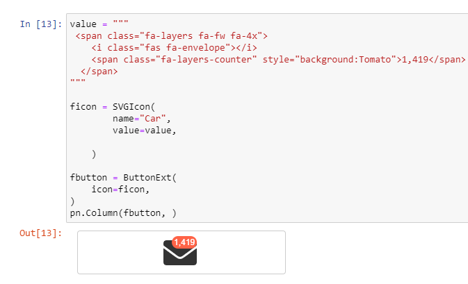
One thing I would also like to add to this request is a button_type flat, icon, neutral, none, link or similar. One that does not have the border.

image

<style>
.bk-root .bk-btn-flat {
    border-width: 0px;
}
</style>```

@philippjfr philippjfr added type: enhancement Minor feature or improvement to an existing feature and removed TRIAGE Default label for untriaged issues labels Sep 25, 2020
@ahuang11
Copy link
Contributor

I wonder if we should implement a reactivehtml / custom panel model or wait for Bokeh?
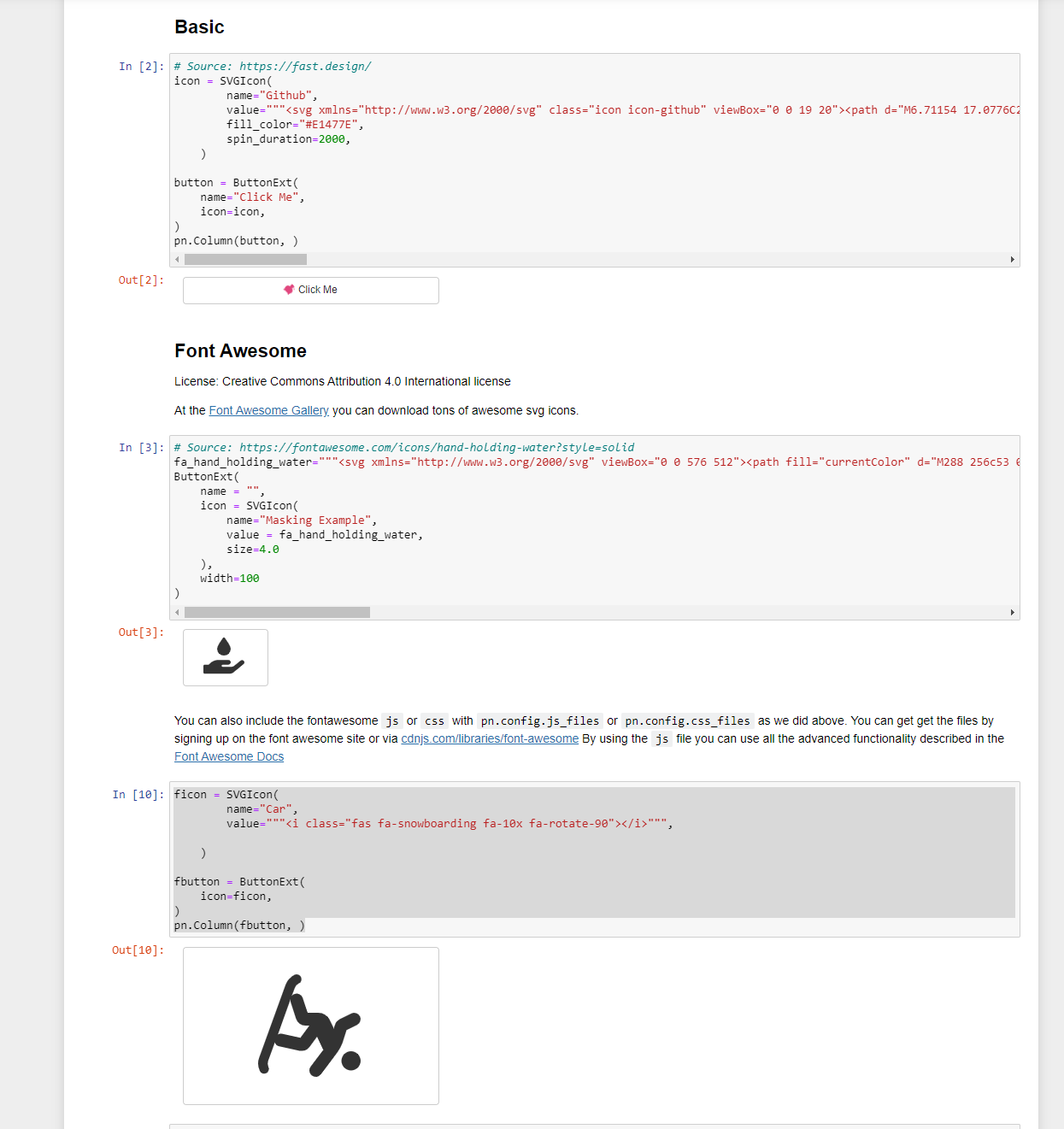
Sign up for free to join this conversation on GitHub. Already have an account? Sign in to comment
Labels
type: enhancement Minor feature or improvement to an existing feature
Projects
None yet
Development

No branches or pull requests

3 participants