Content Tips Tricks
Rather than formatting headings by making text bold, it’s better to make it a hierarchical heading.
In the block editor, insert a "Heading" block and select Heading 2 through Heading 4.
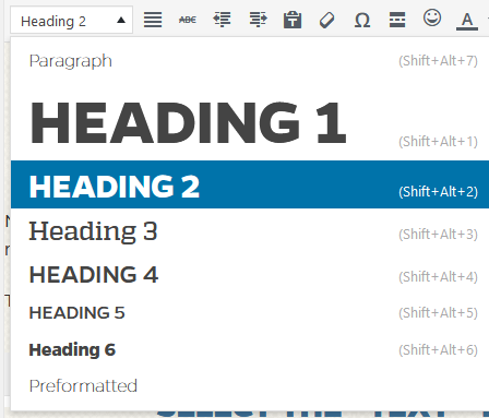
In the classic editor, select or click in the line you wish to make into a heading and use the “Paragraph” dropdown box to select Heading 2 through Heading 5 (Heading 1 is reserved for main page titles).
In the classic editor, mouse over the buttons above the edit window for a brief description of what they do.
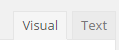 If you wish to edit the HTML code of your page content, select the “Text” tab at the top right of the content edit pane. Otherwise, select the “Visual” tab.
 Links: select the text or image you wish to link, then click the link button and enter the full URL or choose an existing page on the site.
 Bulleted or numbered lists make your content easier to read on the web.
 Blockquote: special formatting for quotes and testimonials.
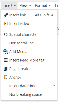 "Insert" menu: allows you to insert horizontal lines to break up sections of content, anchors to link within pages, and other elements.
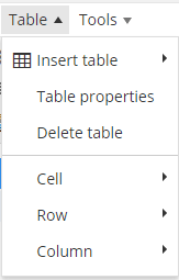 Tables: should only be used for displaying tabular data, not for arranging text or images in columns.
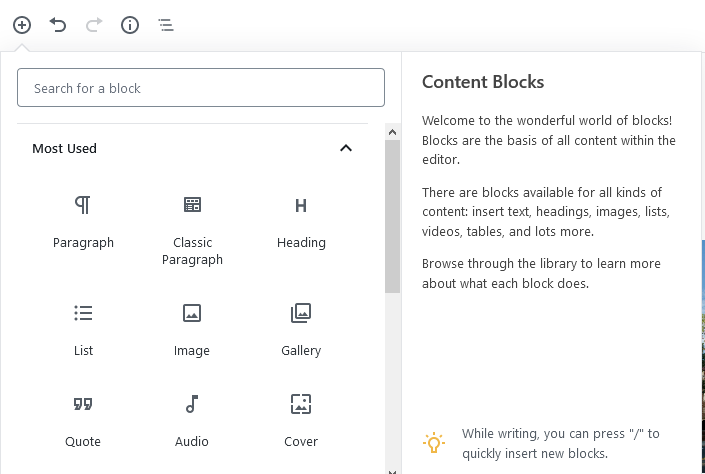
In the block editor, elements can be added as blocks. Choose "Add block" and search for the name to insert a block.
There are several different button formats available in the theme. You can apply these formats by adding a CSS class to a link, a button, or its container, as outlined below.
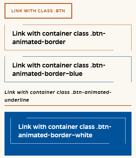
To apply a CSS class to a link or button in the Classic editor, you will need to use the Text tab rather than the Visual tab, and in some cases use a container for your link. HTML code appears below the images.
<p><a class="btn" href="#">Link with class .btn</a></p>
Link with container class .btn-animated-border (orange animated border - best on a light background)
<div class="btn-animated-border">
<p><a href="#">Link with container class .btn-animated-border</a></p>
</div>
Link with container class .btn-animated-border--blue (blue animated border - best on a light background)
<div class="btn-animated-border--blue">
<p><a href="#">Link with container class .btn-animated-border--blue</a></p>
</div>
Link with container class .btn-animated-underline (orange animated underline - best on a light background)
<div class="btn-animated-underline">
<p><a href="#">Link with container class .btn-animated-underline</a></p>
</div>
Link with container class .btn-animated-border--white (white text and animated border - best on a dark background)
<div class="btn-animated-border--white">
<p><a href="#">Link with container class .btn-animated-border--white</a></p>
</div>
<p><button class="btn">Button with class .btn</button></p>
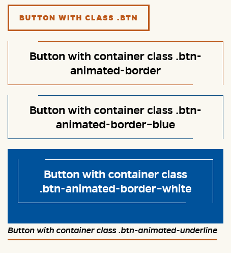
Button with container class .btn-animated-border (orange animated border - best on a light background)
<p class="btn-animated-border"><button>Button with container class .btn-animated-border</button></p>
Button with container class .btn-animated-border--blue (blue animated border - best on a light background)
<p class="btn-animated-border--blue"><button>Button with container class .btn-animated-border--blue</button></p>
Button with container class .btn-animated-underline (orange animated underline - best on a light background)
<p class="btn-animated-underline"><button>Button with container class .btn-animated-underline</button></p>
Button with container class .btn-animated-border--white (white text and animated border - best on a dark background)
<p><button>Button with container class .btn-animated-border--white</button></p>
Use button block, select individual button > Advanced > Add CSS class
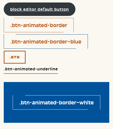
- btn-animated-border
- btn-animated-border--blue
- btn
- btn-animated-underline
- btn-animated-border--white
Ordered lists are specially formatted in the theme CSS. You can define lists that begin at a specific number or count backward by editing your HTML codein the "Text" edit window.
The following rule will begin a list at 8.
<ol style="counter-reset: step-counter 7;">
Define counter-reset as one number lower than the number where you wish to begin the list.
The rule below will count down a list from 4.
<ol class="reversed" style="counter-reset: step-counter 5;">
Since you are counting backwards, define counter-reset as one number higher than the number where you wish to begin the list. Make sure to update your counter-reset value if you add list items.
The <aside> element can be used for content that is indirectly related to a page's main copy, e.g. a pull quote or callout. The theme styles <aside> as right-aligned and 50% width by default; however, you can assign the "alignleft" or "alignnone" class on the <aside> tag, e.g. <aside class="alignleft">