Show column summaries automatically above the im-table #10
Comments
|
@yochannah Note: the charts in the im-table's column summaries only appear (in the HTML, and with overlapping classes) once at a time, when the summary is clicked |
|
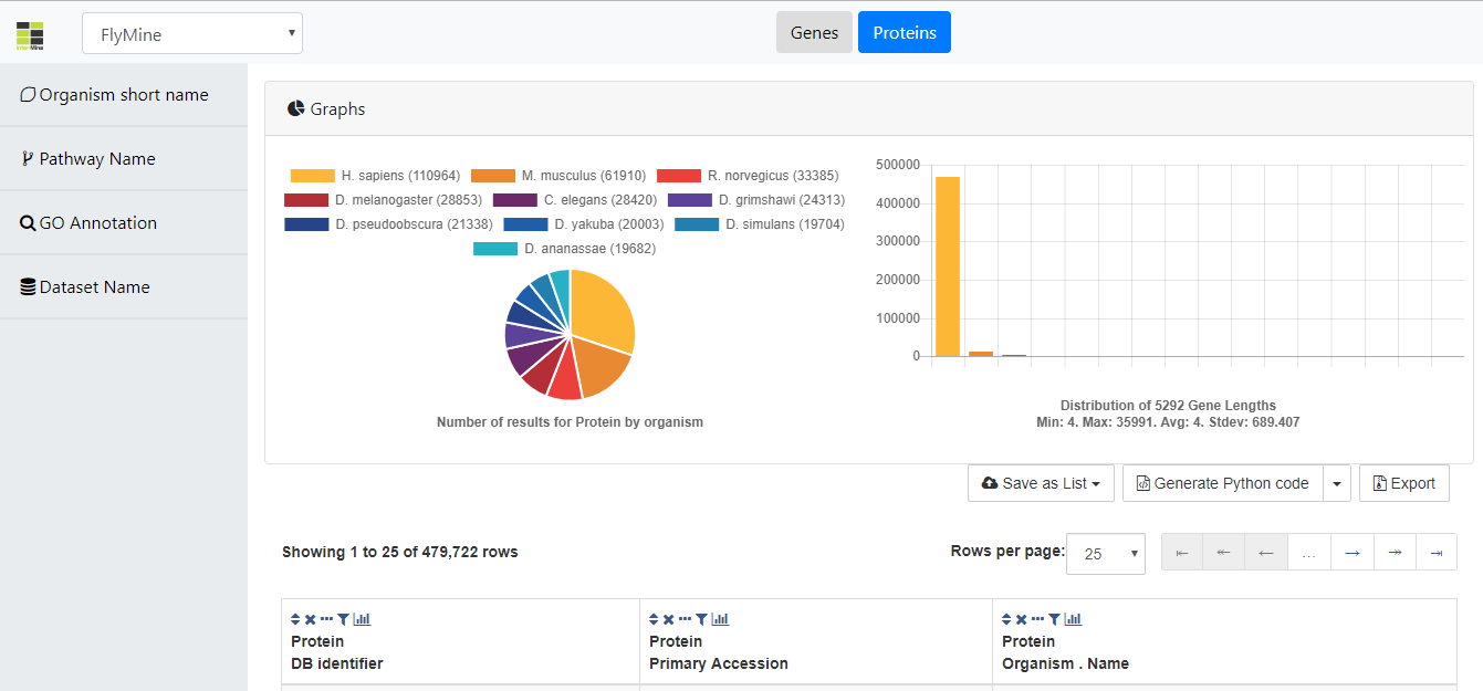
@yochannah Also, in the text above you mention that organism in a pie chart would be interesting, but we already have that, right? |
We could probably hack it to fake a click, then use js to clone it and place it up above, but I don't like that idea. Better options would be either to extend imtables to allow us to display the chart externally, or to simply implement another chart (I'm guessing this is probably the fastest).
Yep! |
|
@yochannah Yes, probably the way to go is to implement another chart and feed it with the Gene.length column summary. We probably don't want the fake click approach (that will show the summary window for a few milliseconds to the user and it's weird). |
|
Hi @yochannah, hope you like it 😄 :
Commit: AdrianBZG@499a9c6 |
|
Thanks @AdrianBZG ! @rachellyne would you be able to take a look too? :) |
|
@AdrianBZG this is a great start!! Some notes:
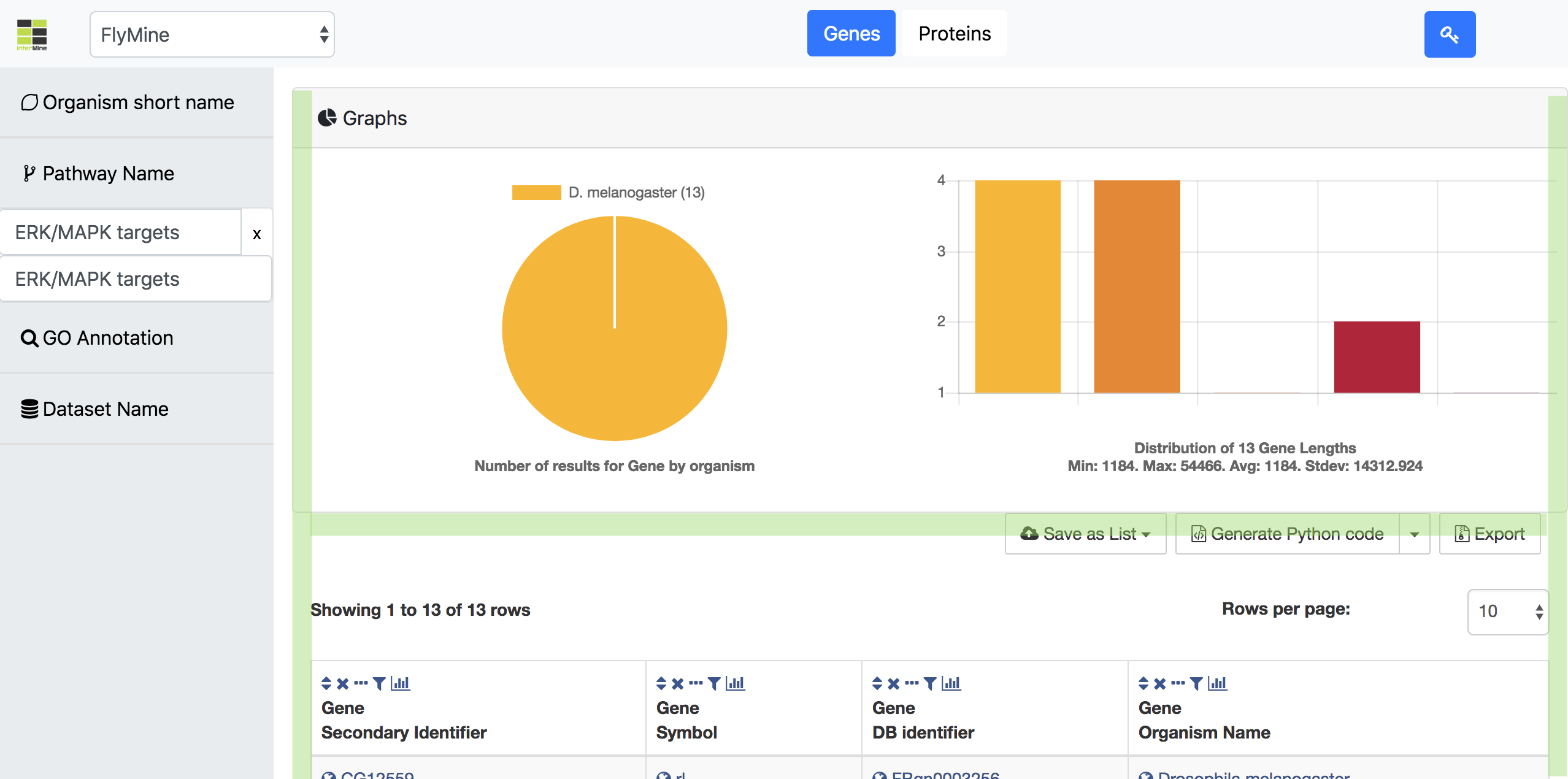
I think we are missing some labels. In the chart as shown, I assume there are 4 genes of some length, 4 of another, 2 in the third bar... and it took me a little while to find the 13th gene. :) So maybe:
And some notes about layout:
for the pie and bar chart it would be nice to see a breakpoint when the screen gets narrow that sets them to be one above another - if I was doing this with flexbox, I'd set Nice job do far though! |


|
@yochannah I'm not sure if we can use another data for the bar chart. What I mean is, currently the data used there is the one given by the Gene length summary, which is divided in groups/buckets, just as the column summary graph from im-table (it's a hand-made replication of that one).
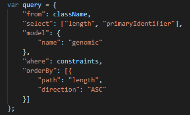
This is the graph from im-table, which is the same as the new one on top. The query to get the data for ours is:
https://github.com/AdrianBZG/InterMine-Data-Browser-Tool/blob/master/routes/statistics.js#L117 Returning this:
So I'm quite not sure which labels and data to use in the bar chart. Do you have an idea? |


|
@yochannah I've addressed all points except the one related to the data (explained in previous comment), can you please take a look when you have some time?: http://im-browser-prototype.herokuapp.com/ Thanks |
|
This took some digging to figure out, but im-tables calculates the bucket start and end values client-side.
so if the range was 0-30 and we had three buckets, bucket 1 would be >0 and <=10 |
|
|

|
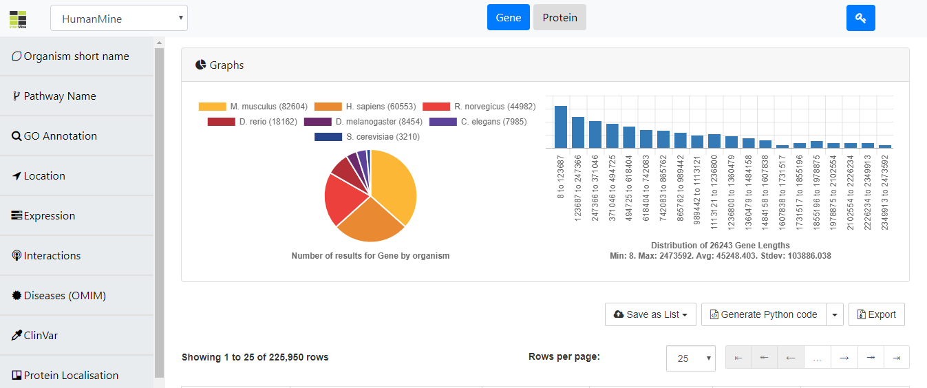
@yochannah Looks better now, the bars have some height even if value is 1, also its using logarithmic scale so all the bars are shown, independently of the first ones having huge values and the others tiny values. Also labels are now properly calculated and displayed. Can you please take a look? 👍 http://im-browser-prototype.herokuapp.com/
|

|
@AdrianBZG This looks great! How are you implementing the log scale? |
|
@yochannah What I'm doing is taking the log2 of the count, plus 1 (https://github.com/AdrianBZG/InterMine-Data-Browser-Tool/blob/master/src/js/common.js#L1235). This value is only used for the height of the bars, but the shown labels are the original counts, so the user doesn't get confused. This avoids two things:
|
|
@AdrianBZG I think that sounds good! @rachellyne what do you think?
|
|
I can't add buttons or links to Chart.js graphs text, so I would need to add that below the graph, and that is not going to look very good :/ |
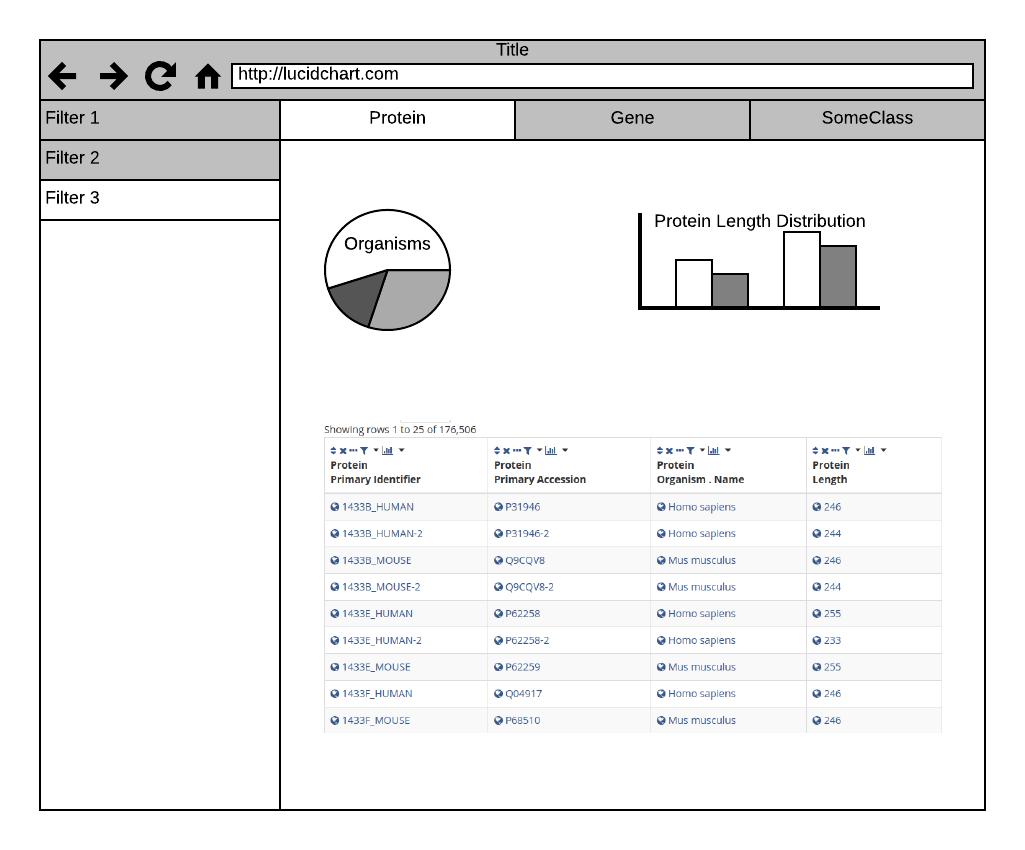
Right now we have a single visualisation, the pie chart. Gos pointed out that we actually already have quite a few nice charts present in im-tables - the column summaries. Not all summaries are innately interesting, so I don't think we want to show each column summary.
This needs to be generic and work for tables that are neither gene nor protein.
Boring graphs:
example:, the Gene page has gene symbol, name, primary and secondary ID - all of which are unique strings or null, which doesn't give us any thing interesting.
Interesting graphs:
gene.length is an integer and can be plotted on a bar graph (interesting)
gene.organism is categorical data that is interesting in a pie or bar.
The same goes for proteins - length and organism name are probably interesting, the rest isn't.
implementation
This could literally take the imtables column summary graphs and place them in the div above the imtable (cloning the elements maybe?) or it could be that we simply add a bar chart that automatically picks up on data types but has nothing to do with the imtables column summaries. We'll need to think a little.
Suggest we only implement this after #8
The text was updated successfully, but these errors were encountered: