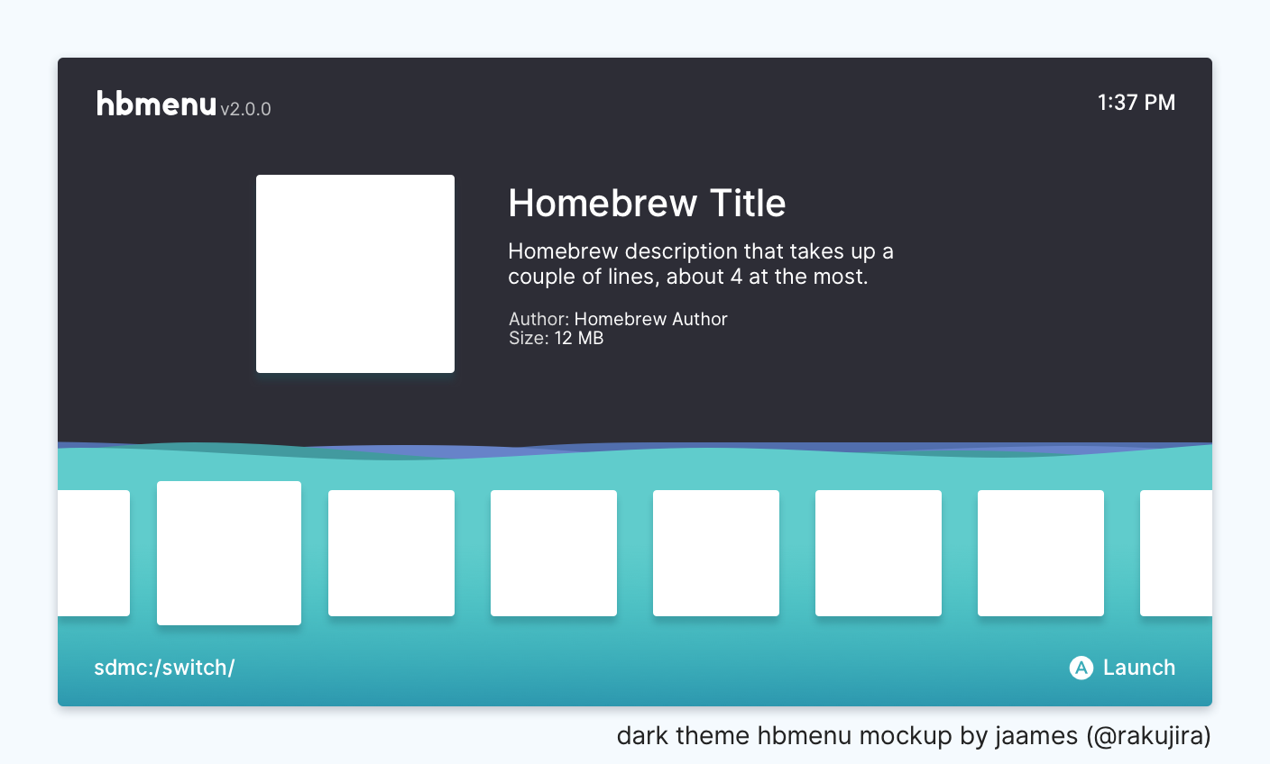
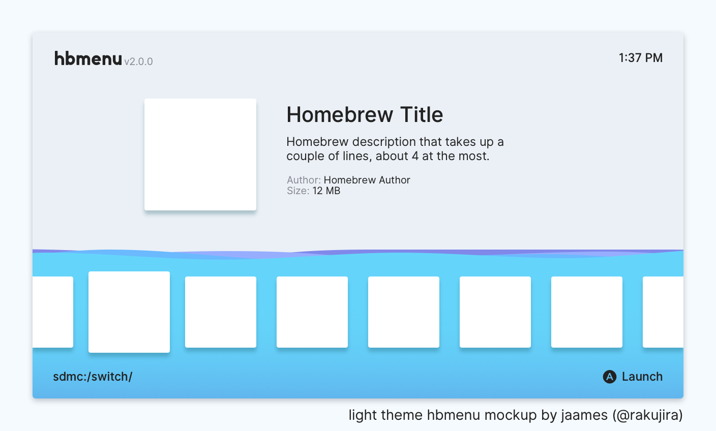
An nx-hbmenu redesign, aiming to continue the "ocean" trend of previous homebrew launchers while also incorporating the modern, minimalist feel of the Nintendo Switch system UI. Most of these designs were incorporated into nx-hbmenu as of v2.0.0
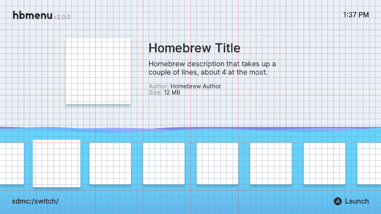
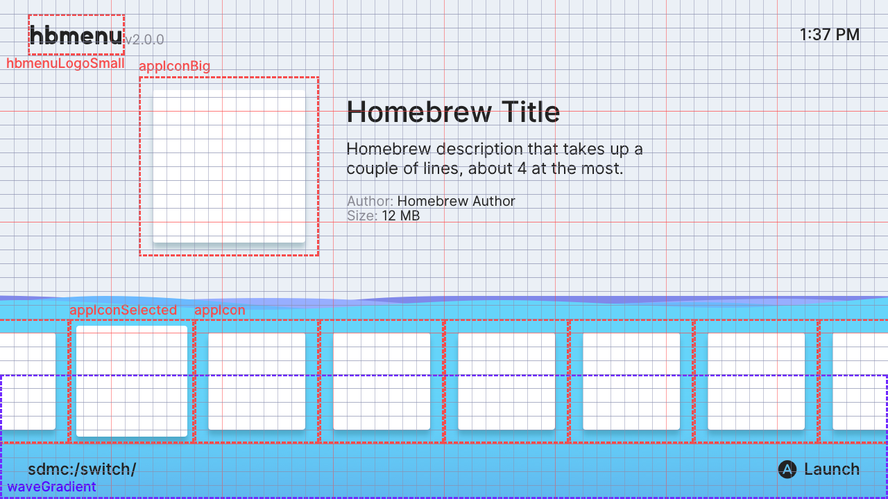
Note: The measurements and assets provided assume that the hbl menu will be rendered at 720p in both handheld and console mode.
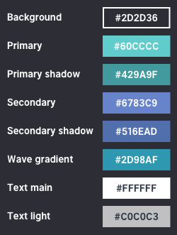
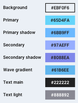
The intention was for hbmenu to match the user's current Switch theme, so two (somewhat) matching themes are provided:
Dark Theme
Light Theme
UI elements are aligned to a 20x20 pixel grid (the red lines in the mockups below mark 8 grid spaces). The elements in each corner of the screen are given relatively generous margins to avoid cropping / overscan issues when displayed on TV screens:
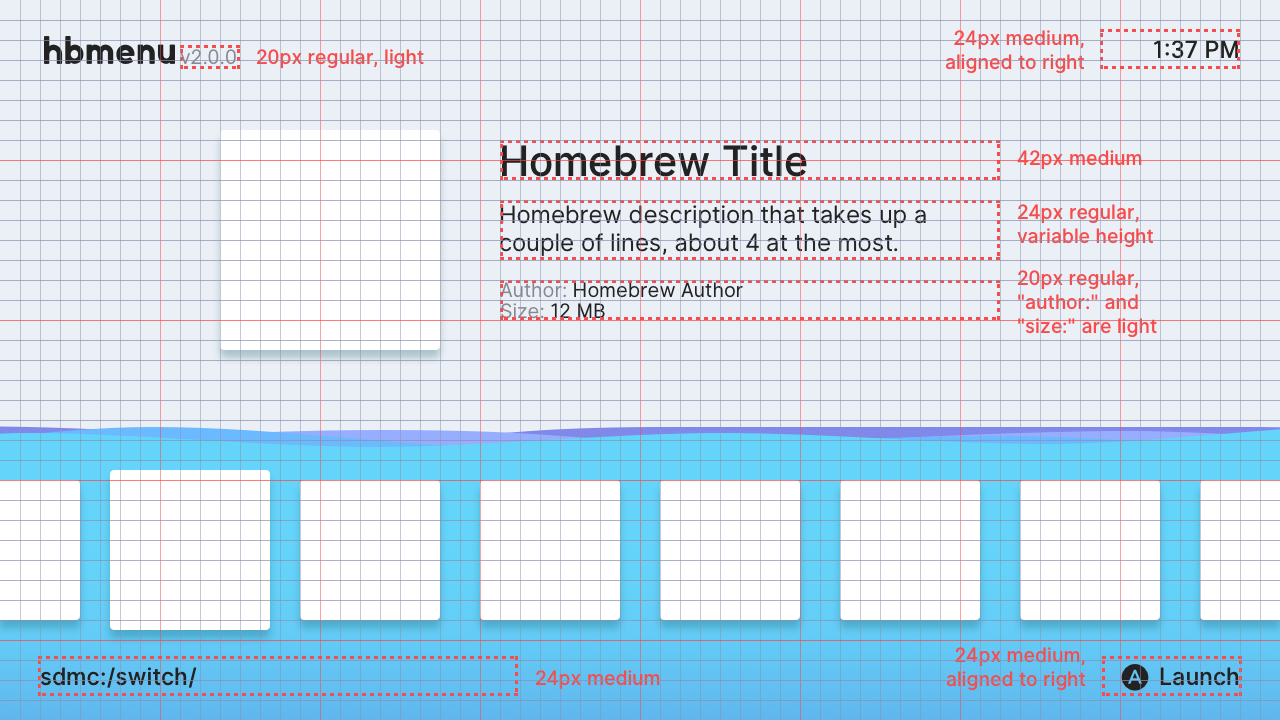
Besides the "hbmenu" logo, all text use the open-source Inter UI font family, in a total of 4 different size/weight combinations:
- 42px medium - titles
- 24px medium - clock, directory path, and action prompts
- 24px regular - main text, used for the app description
- 20px regular - secondary information, like the version string and app author / size
| Dark Theme | Light Theme |
|---|---|
 |
 |
As text for convinience:
Dark Theme: #2D2D36, #60CCCC, #429A9F, #6783C9, #516EAD, #2D98AF, #FFFFFF, #C0C0C3
Light Theme: #EBF0F6, #65D4FA, #6BB9FF, #97AEFF, #8088EA, #61B6EE, #222222, #888892
Image assets for the hbmenu logo, icons, and various UI elements like shadows, gradients, etc are provided in /assets. UI elements are aligned as shown:
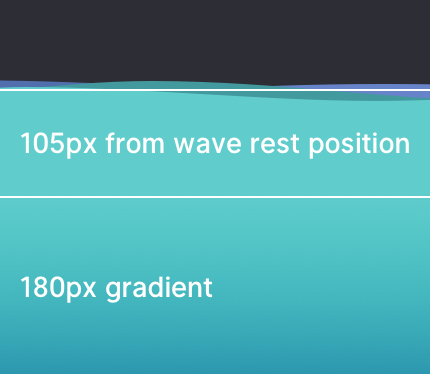
The wave motion should be extremely subtle and calm, with maxiumum wave amplitude being no higher than ~8px or so. Otherwise it may be too distracting (and cause motion sickness :P).
In total there are 4 wave layers, with the order of primary color, primary shadow color, secondary color and secondary shadow color from front to back. Waves should not have transparency unless specified in the theme.
The lower 180px of the wave fades into a slighty deeper color (wave gradient in the color swatches). This is to both give the "water" a sense of depth and to ensure that the lower text is readable:
- Alternate grid layout
- Full homebrew launcher logo
- Sample app icons that follow the same aesthetic?
- Website landing page redesign?