SVG based customizable loading animation. View demo
Download zip from the GitHub repo or install via bower, a client-side code package manager.
bower install svg-loading
# bower install https://github.com/jagjitgill/svg-loading.git#master
Include the required css and the js files:
<link href="bower_components/svg-loading/dist/svg-loading.css" rel="stylesheet"></link>

<script src="bower_components/svg-loading/dist/segment.min.js"></script>
<script src="bower_components/svg-loading/dist/svg-loading.min.js"></script>By default the <button> and <a> will start the animation on click. All the other containers (<p>, <div> etc.) will start the animation upon initialization.
Initialize the animation:
$(function(){
    // Initialize
    var circularLoading = initializeLoading('.my-class');

    // Stop animation
    circularLoading.triggerSuccess();           // Stop with tick mark
    circularLoading.triggerFail();              // Stop with "x"
    circularLoading.triggerSilentSuccess();     // Fade away
});- Via
dataattributes.
<button class="demo-button"
        data-progress="Sending"
        data-success="Done!"
        data-fail="Error!"
        data-reset="Send">
        Send
</button>- Via js (Only success and fail)
circularLoading.triggerSuccess('Action successful');
circularLoading.triggerFail('Action failed');
Position
The animation can be added on left, right, top or bottom of the element. The default value is 'right'. Specific position settings can be passed during initialization. (Use inline for paragraphs and divs)
var loading = initializeLoading('.my-class', { position: 'bottom' });Type
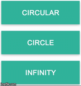
Choose one from 3 available types: circular, circle and infinity. The default value is 'circular'.
var loading = initializeLoading('.my-class', { type: 'circle' });Scale (Inline only)
Available options: x1-5, x2, x2-5 ... x4.
var loading = initializeLoading('.my-class', { scale: 'x2' });This library is made using segment and classie. Feel free to use the source code as an example or in any project of your own. Found a bug? or an enhancement idea? Let's git on it. Inspired by lmgonzalves.