UX: Clearer Read Only Status #7980
Comments
|
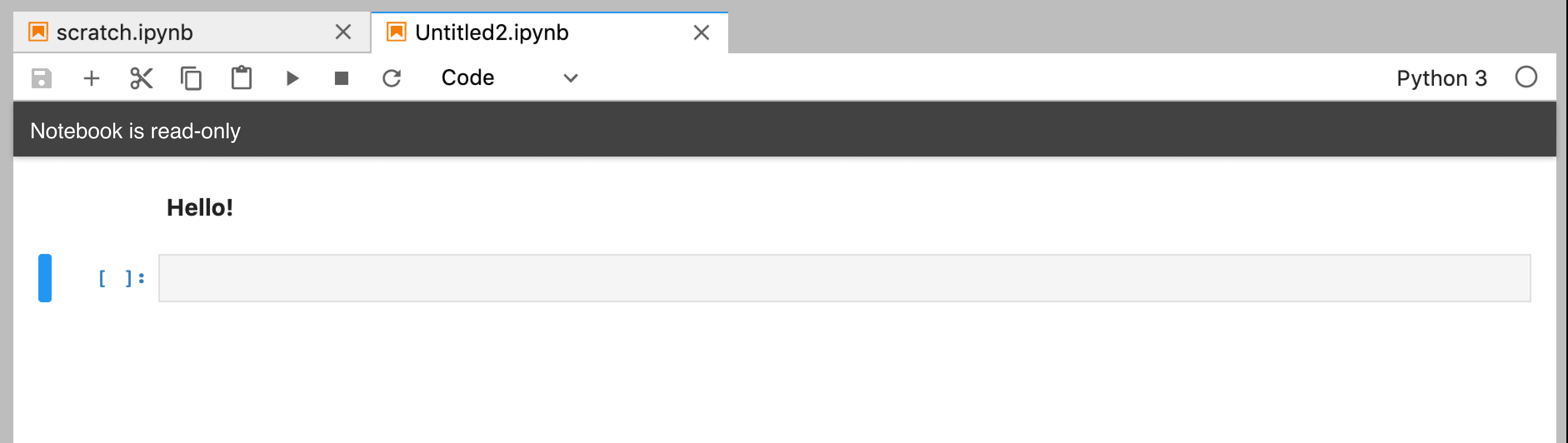
I thought the save toolbar button was grayed out, right? It's not as visible as the above indications, but it is something. |
|
Yes, sorry - the save icon is grayed out. Can we move it back to the no save icon? Grayed out is less in your face so I missed it! Similarly, I still think we should add feedback when a user hits ctrl-s and nothing happens. |
|
I do think it would be great to have clearer readonly status, like you say. |
|
I did some exploration on how to indicate a notebook's status like this a little while back, so here are some mockups for potential solutions.
|


|
Thanks @isabela-pf. FWIW, I like 3 followed by 1. I don't think 2 is clear enough. |
|
I'd advocate for having 1., 2. (but only with the right icon), and 3., and having 3. be able to dismissed by clicking anywhere on the banner. If we are going to combine 1. and 3., then I think another variant of 1. that would be worth exploring would be to echo notebook classic: put a wide "read only" badge to left of our "trusted" icon, which in our case happens to be below the notebook on the status bar. That way, once the user acknowledges/dismisses the initial loud banner at the top of the notebook, they can then continue to use the notebook without much extra visual burden. |
|
It sounds like 1 might be the better option because it is familiar to Notebook users and seems like it would not require the same unique treatment to implement that 3 likely would. I do think 1 and 2 could be combined effectively. I also missed the earlier mention that we might want feedback reminding a user that the notebook cannot be saved if the try and ctrl+s it. That sounds like a good idea to me, but I think we'd have to be careful to make this feedback minimally disruptive. I don't think a dialog is appropriate and I'm not aware of another toast-like or similar feedback system already a part of JupyterLab. |
|
I'm following up on my previous comment with another mockup. The first combines 1 and 2 to provide an approach that might be familiar from Notebook while having an (albeit small) icon indication in the tab as added support.
With toast notifications moving forward in #689, I think this could be a good opportunity to remind users a notebook is read-only if they try to save. I could see this being potentially annoying if it repeats, but since toasts last 10 seconds at most I think it could work if it seems like there should be an additional reminder of read-only status.
|


|
I have been reading the discussion above and am wondering if there been an agreement on the best design for this feature? I agree with the idea of having a toast notification appear if the user tries to save the notebook, otherwise there is a risk of users not understanding and thinking that something is not working. |
Description
Read only notebooks in lab do not have any indication that save is failing nor that they are read only.
In Notebook there are both indications:

The left tag comes when you try and save and the right icon is always visible on read only notebooks.
Proposal:
We add these back in a similar spot (next to the kernel name).
I do not have a good suggestion on what to do for non-notebooks files as there is no real space in the editor. The bottom info bar (where line/col numbers are) seems like the wrong place.
Context
The text was updated successfully, but these errors were encountered: